A breath of fresh air for Profi Personal
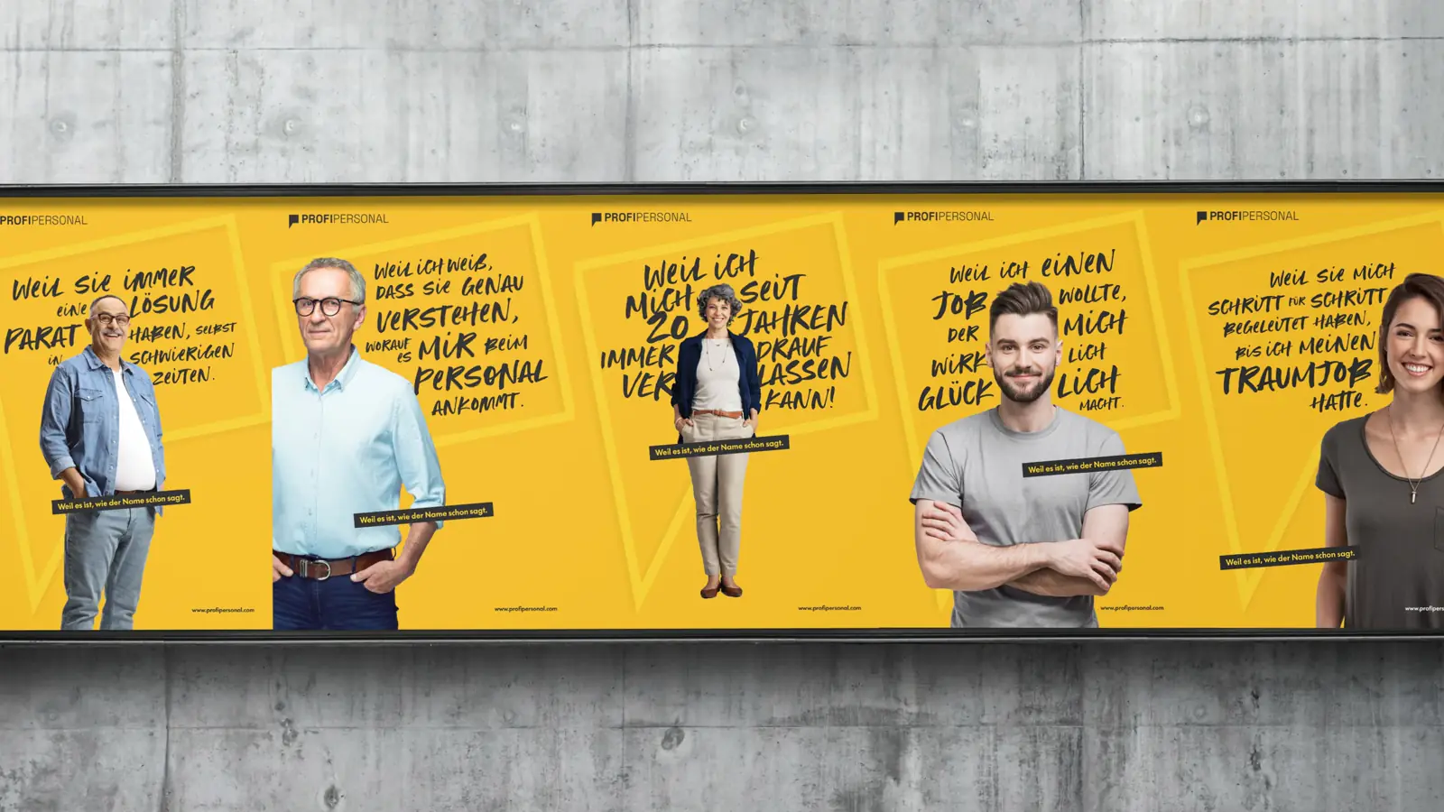
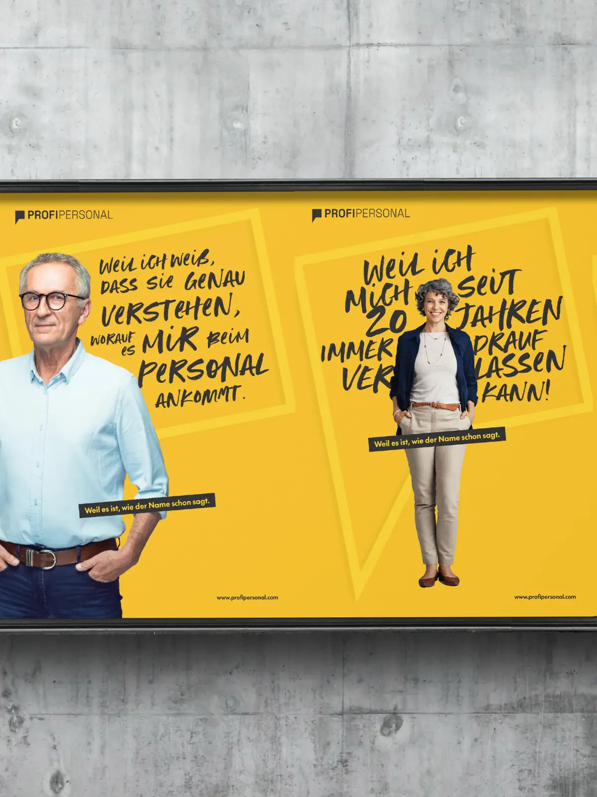
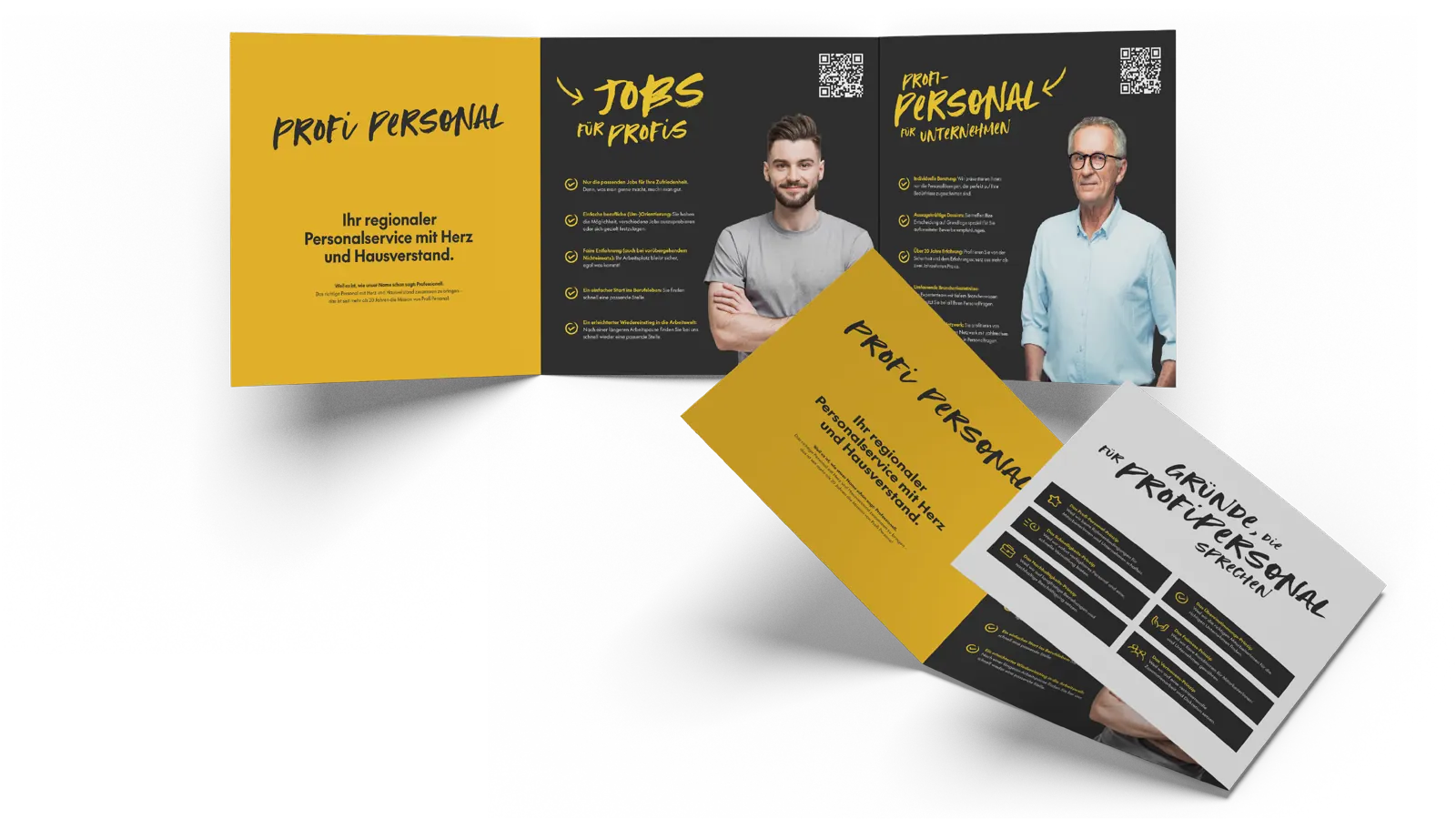
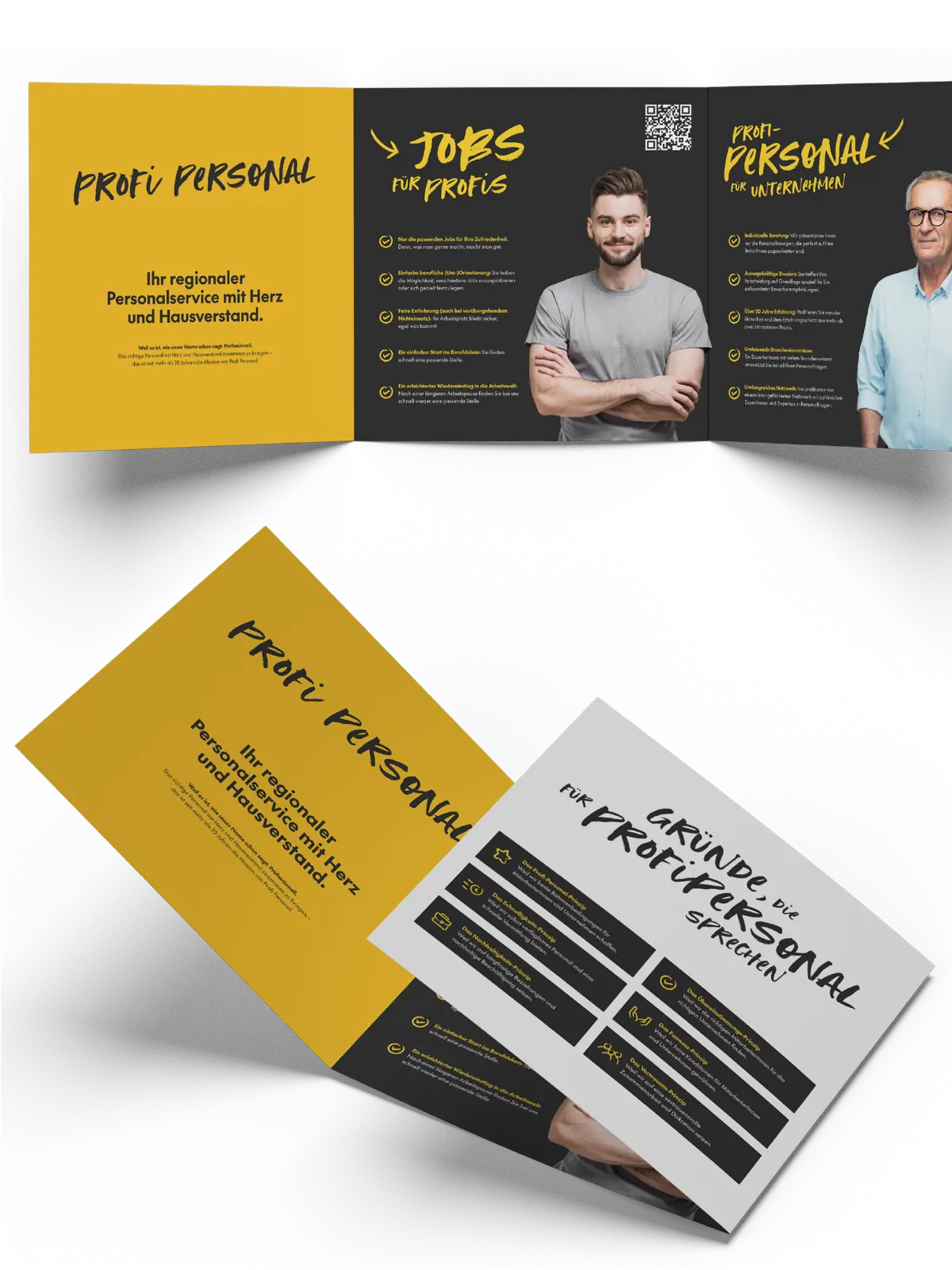
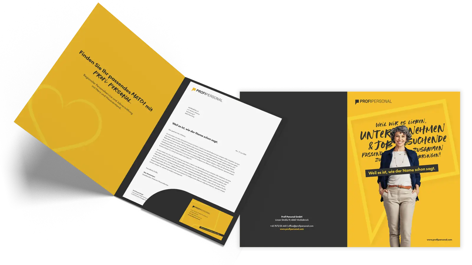
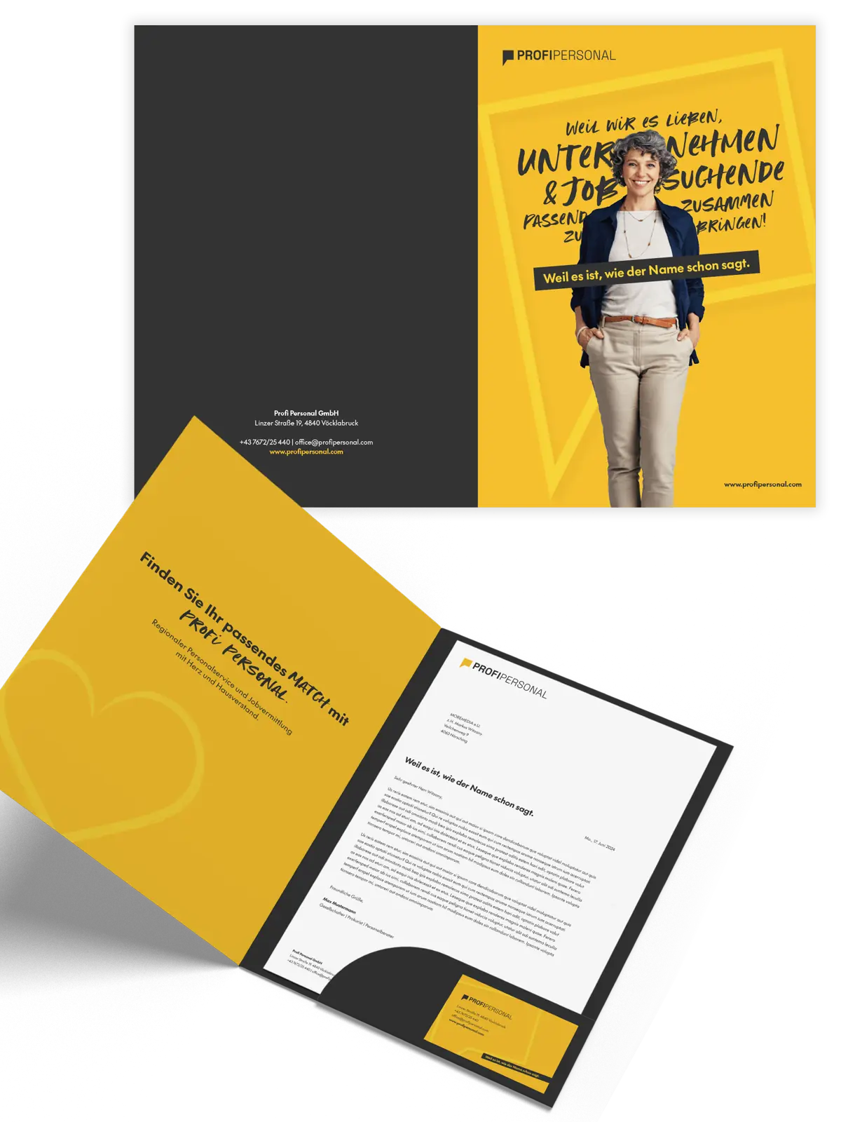
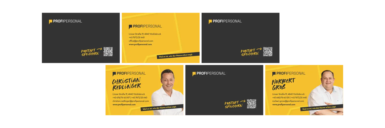
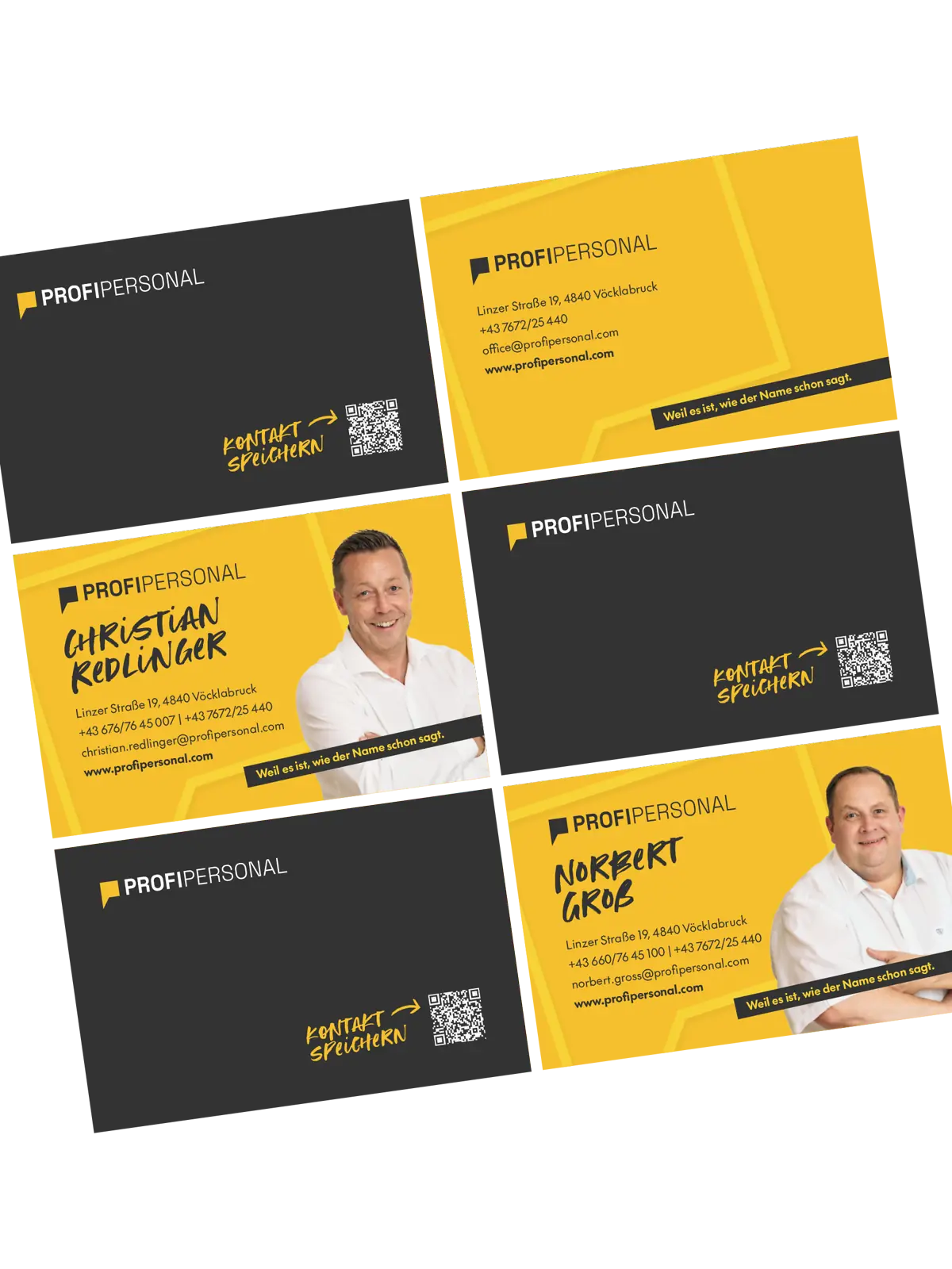
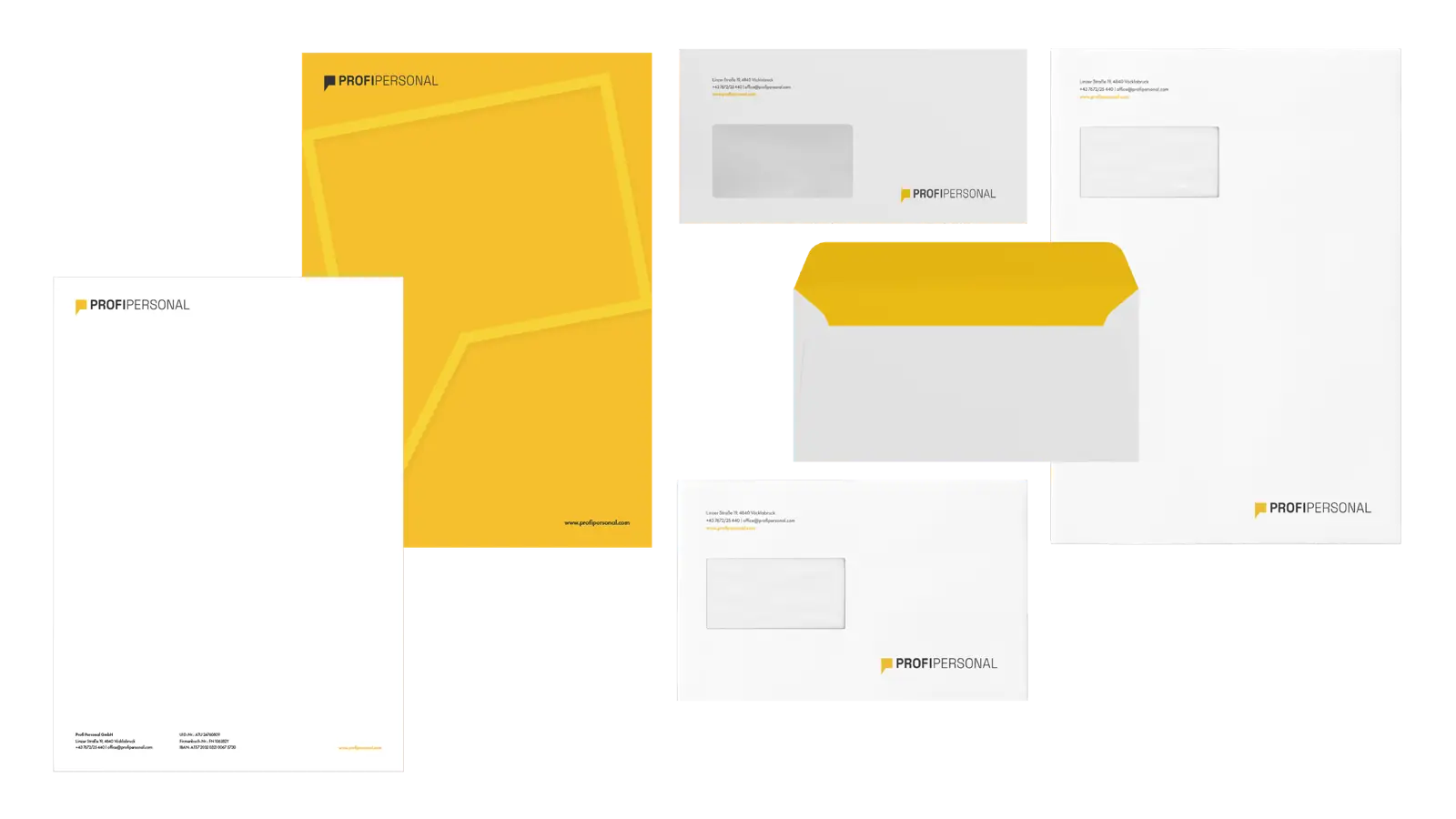
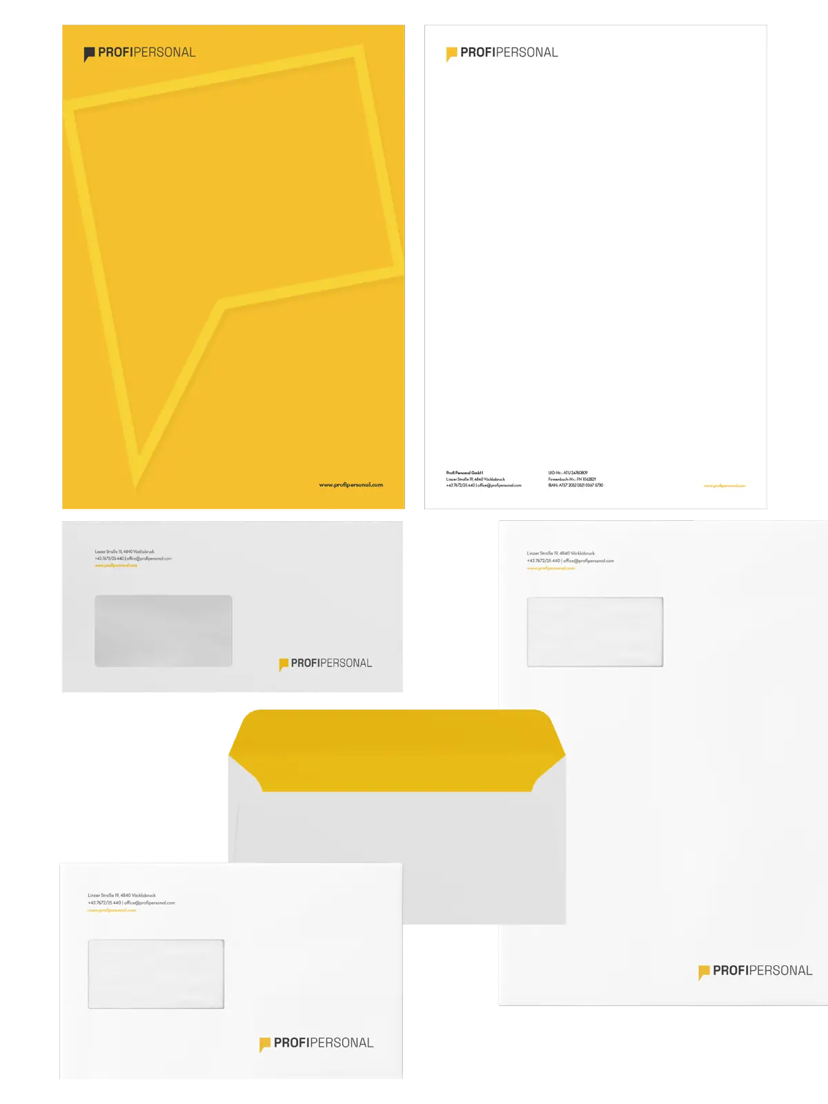
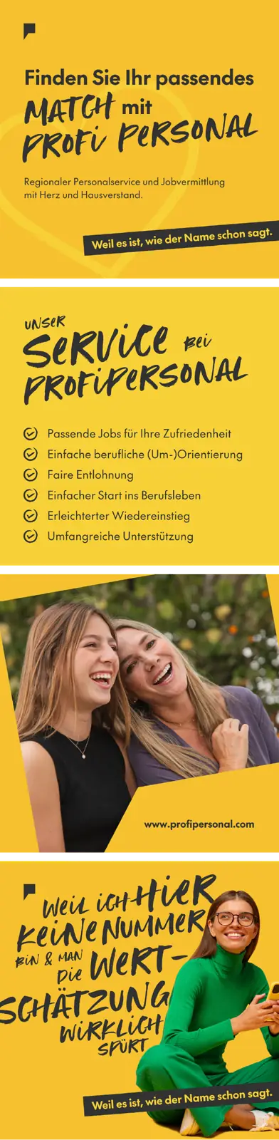
Conceived from the ground up, we created a striking brand identity for Profi Personal. Starting with a precise realignment of the brand positioning, a modern and dynamic corporate design emerged. Radiant yellow meets elegant anthracite, resulting in eye-catching advertising materials and a user-friendly website. Our mission: a visual language that radiates professionalism and reliability and powerfully communicates Profi Personal’s values to the outside world.
A brand identity that builds trust before the first conversation takes place.
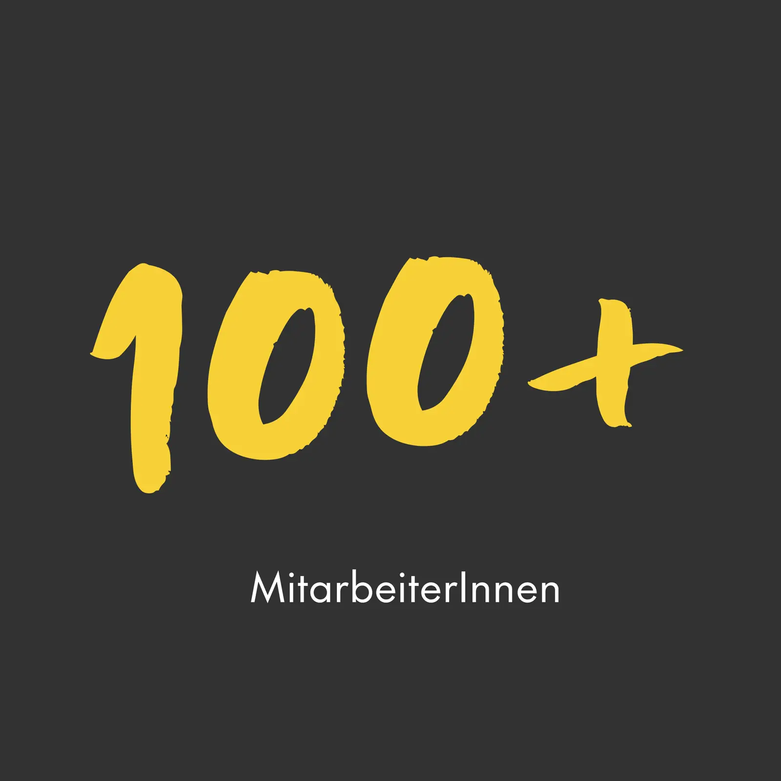
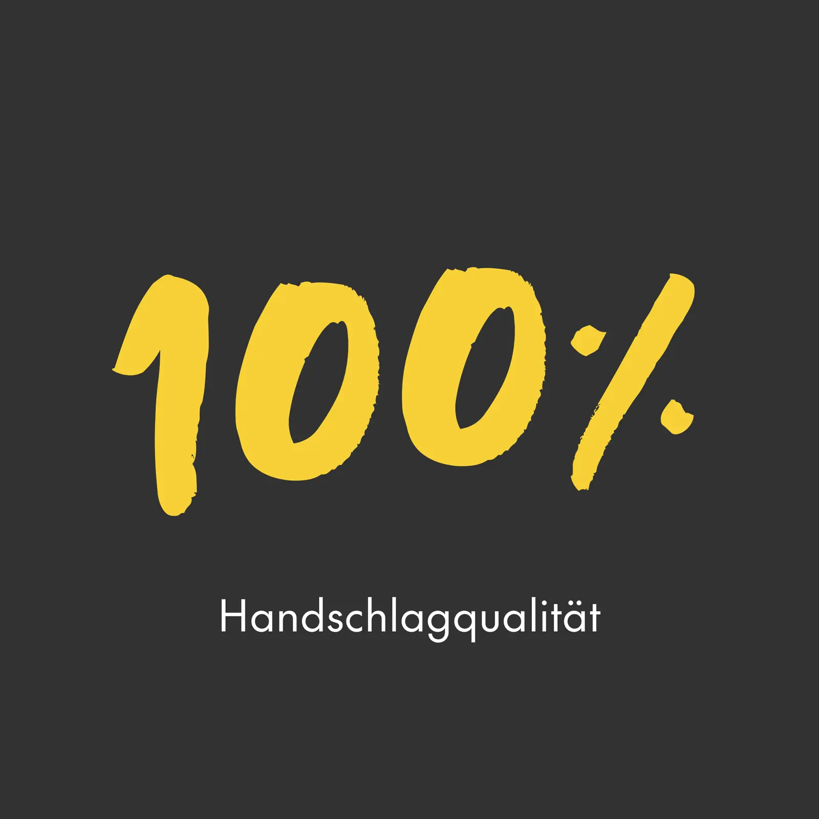


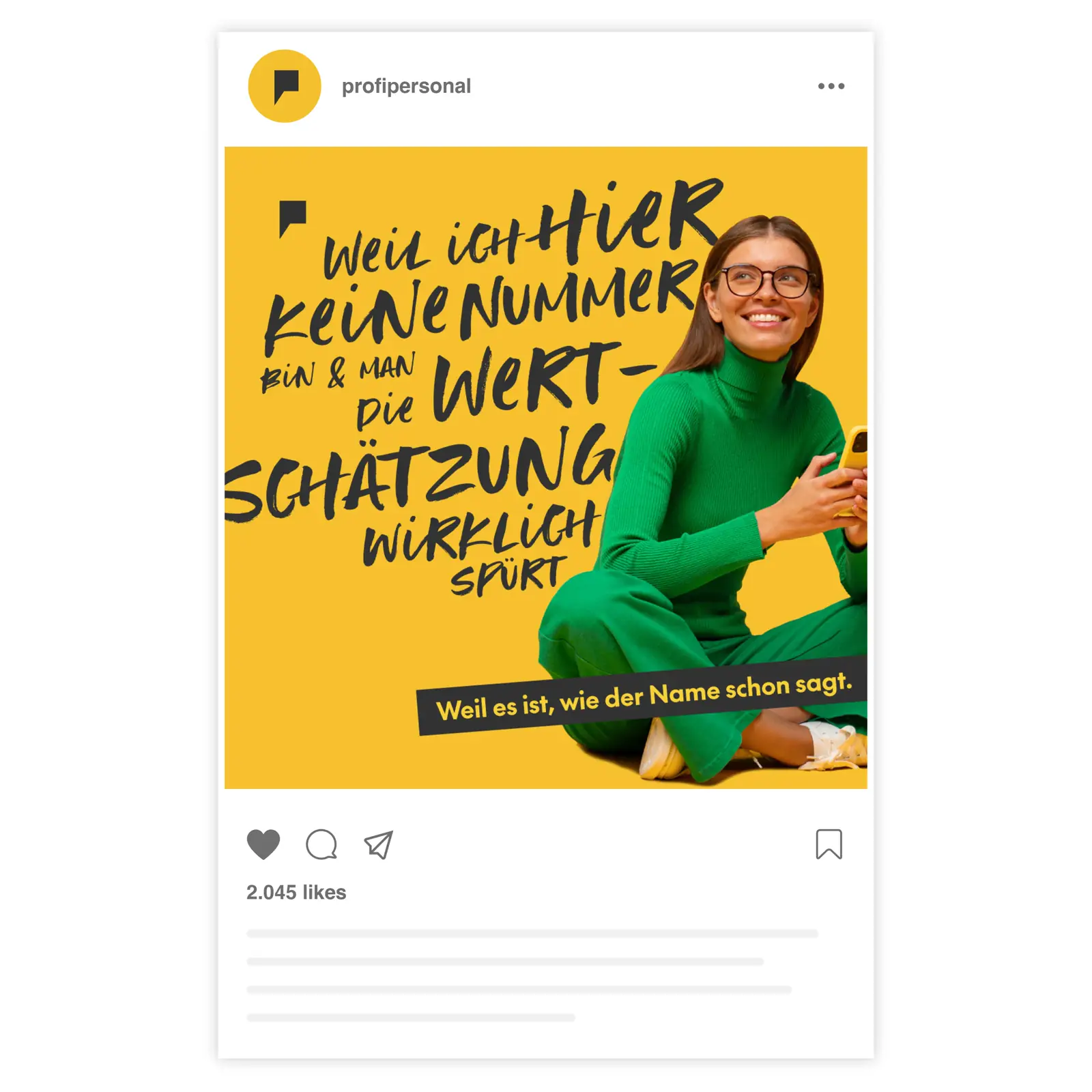
A fresh social media look and full freedom for creative visions
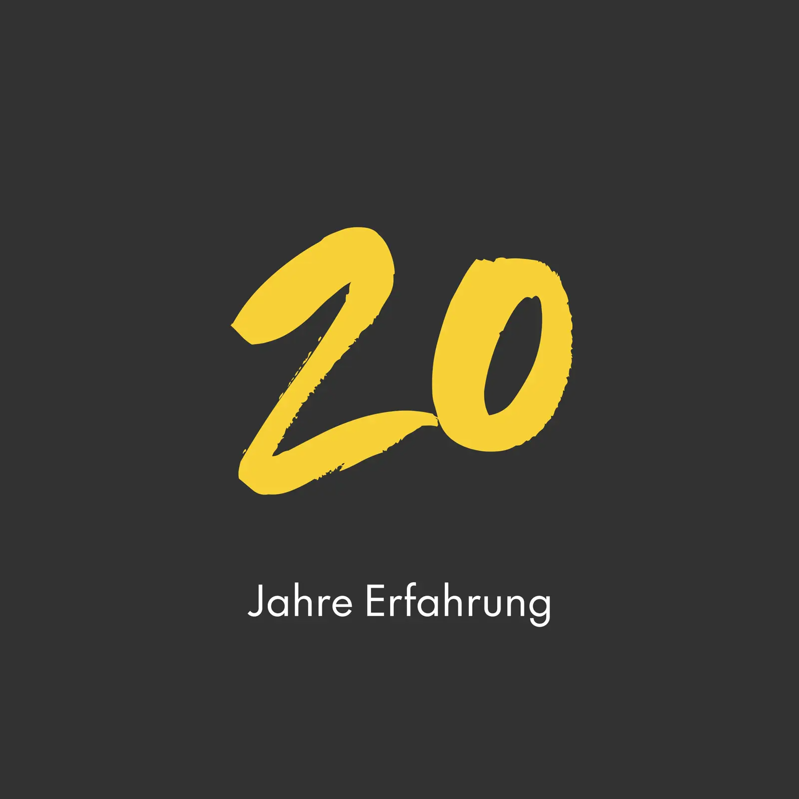
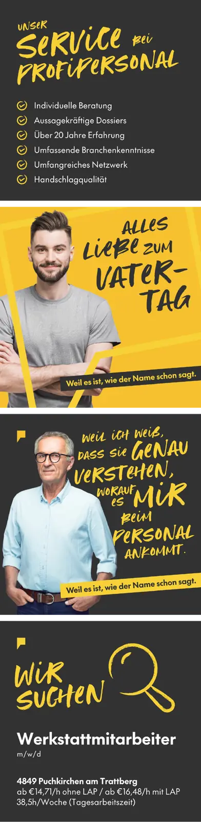
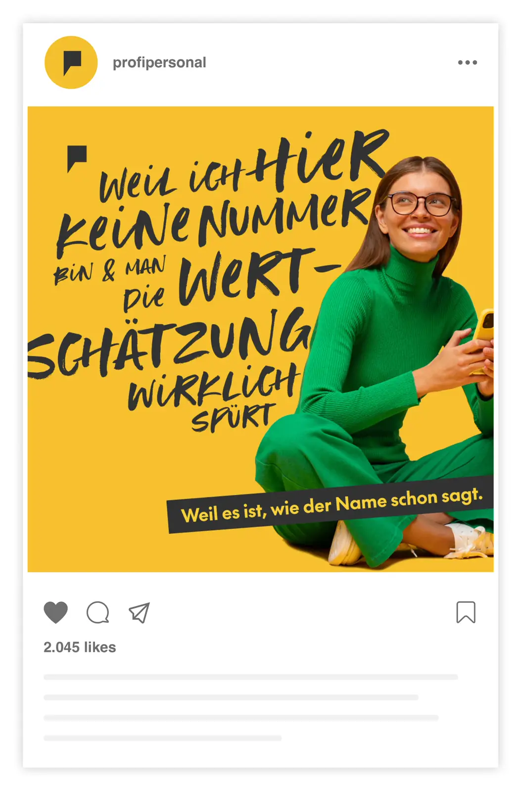
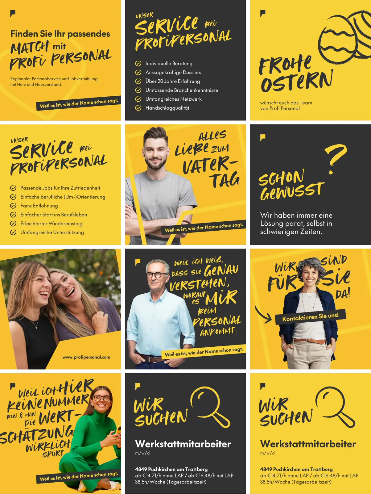
In the style of the new corporate design, we developed a design for Profi Personal that employees can carry forward themselves. With custom-built Canva templates, employees can now independently create appealing, high-quality designs for their posts and stories. These templates ensure a consistent brand presence while offering the flexibility to respond quickly and creatively to current topics.

FAQ
Frequently asked questions
The starting point was a precise realignment of the brand positioning. We worked out the core values and personality of Profi Personal and developed a corporate design from them: modern, dynamic, clear, and confident. The color palette of vibrant yellow and elegant anthracite creates an unmistakable appearance.
The new logo shows a stylized speech bubble in the shape of the letter P – a symbol of communication, clarity, and the company name. The slogan Weil es ist, wie der Name schon sagt! sums up what Profi Personal is all about: competent, reliable, professional.
The typography of Profi Personal thrives on deliberate contrast: the dynamic brush font Hot Ness brings energy and movement to the design, while a clean, timeless typeface ensures readability and structure. This combination creates a visual experience that feels both powerful and professional.
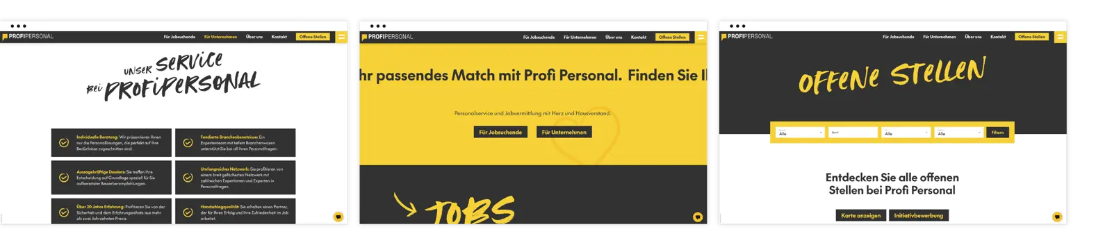
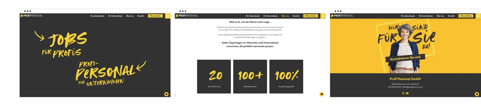
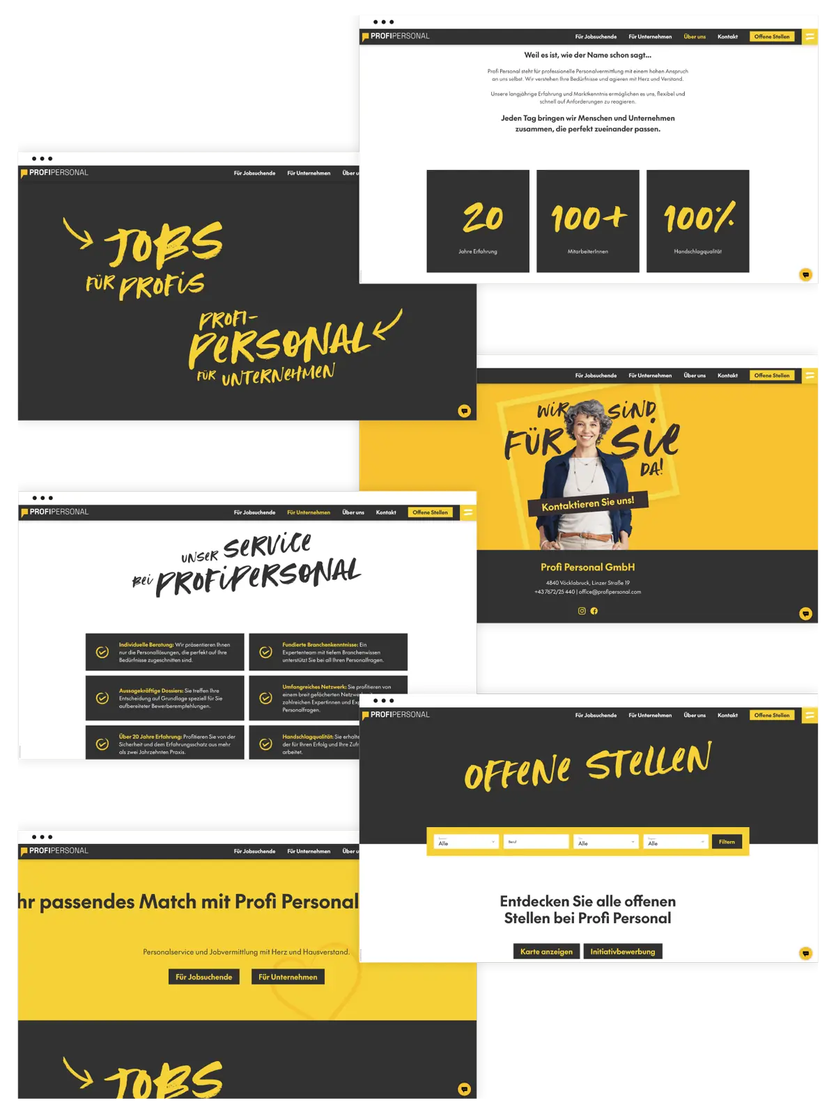
The new website presents itself in the striking yellow-anthracite combination and embodies the company identity consistently on every page. Intuitive navigation and a clear content structure give both companies and job seekers quick access to relevant information.
For Profi Personal, we developed a flexible system of Canva templates that enables the team to create high-quality posts and stories themselves – quickly, easily, and always on-brand.