Client

Stoiber GmbH

Strategic rebranding and a clear design system

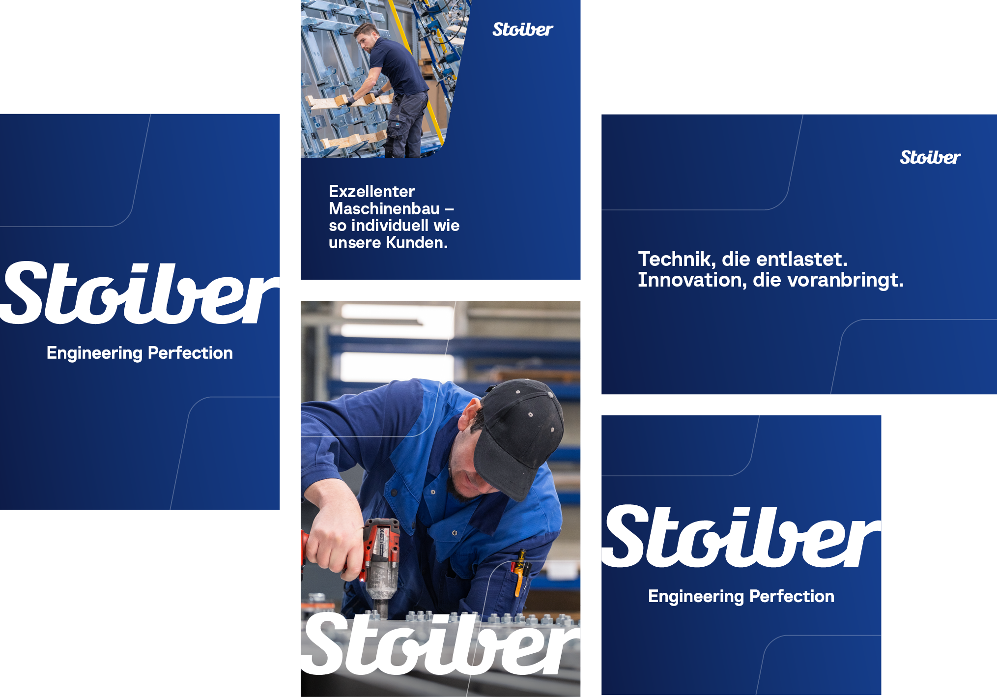
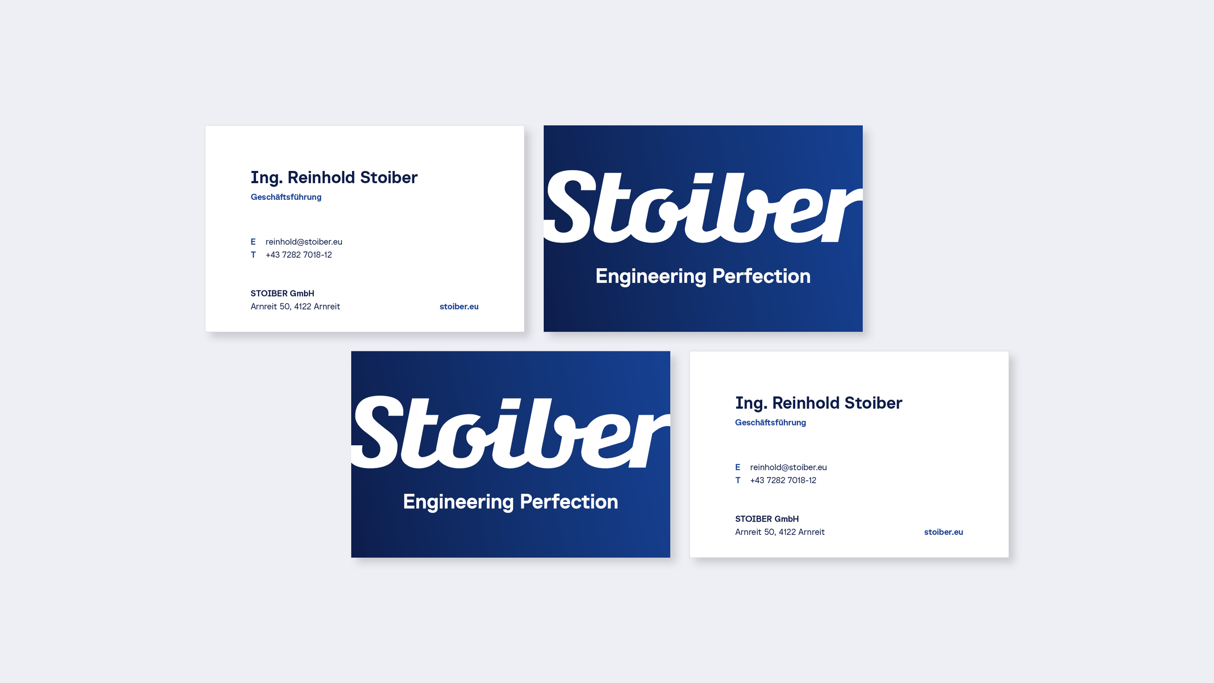
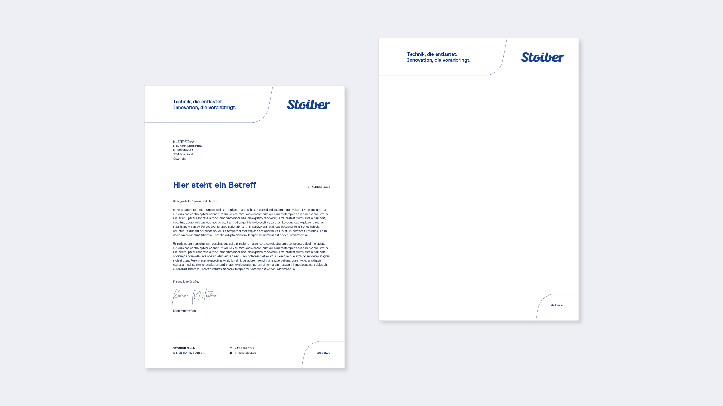
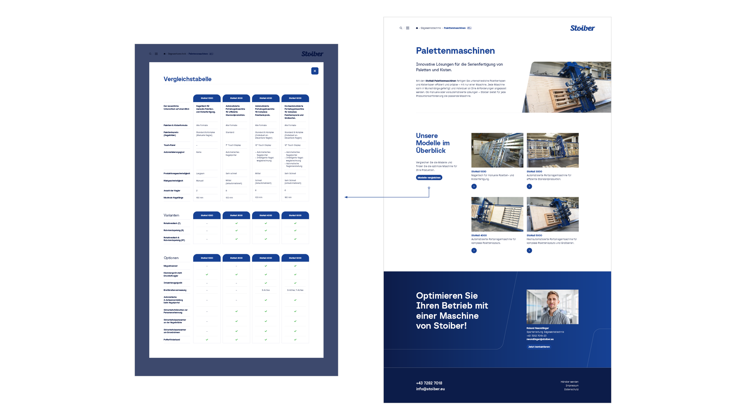
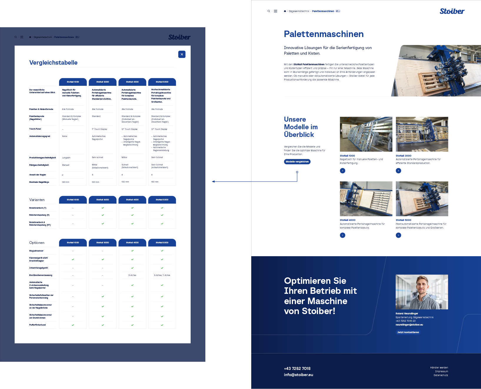
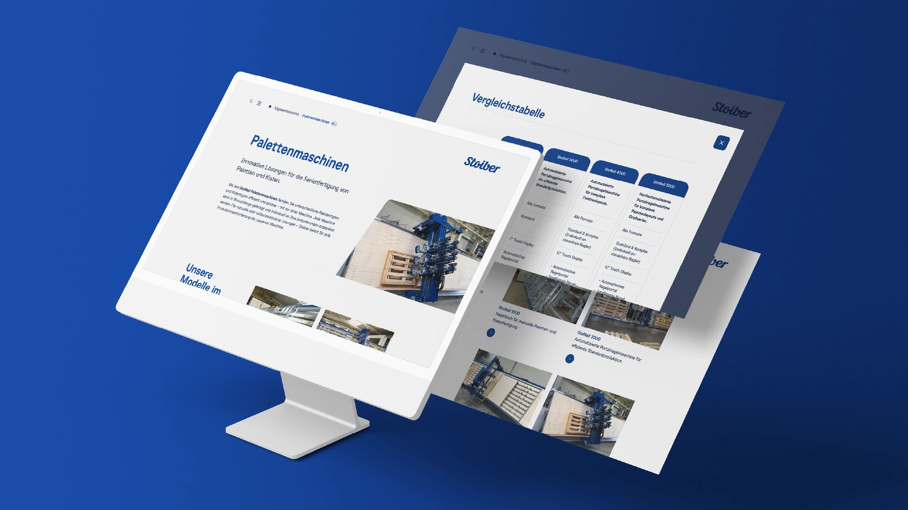
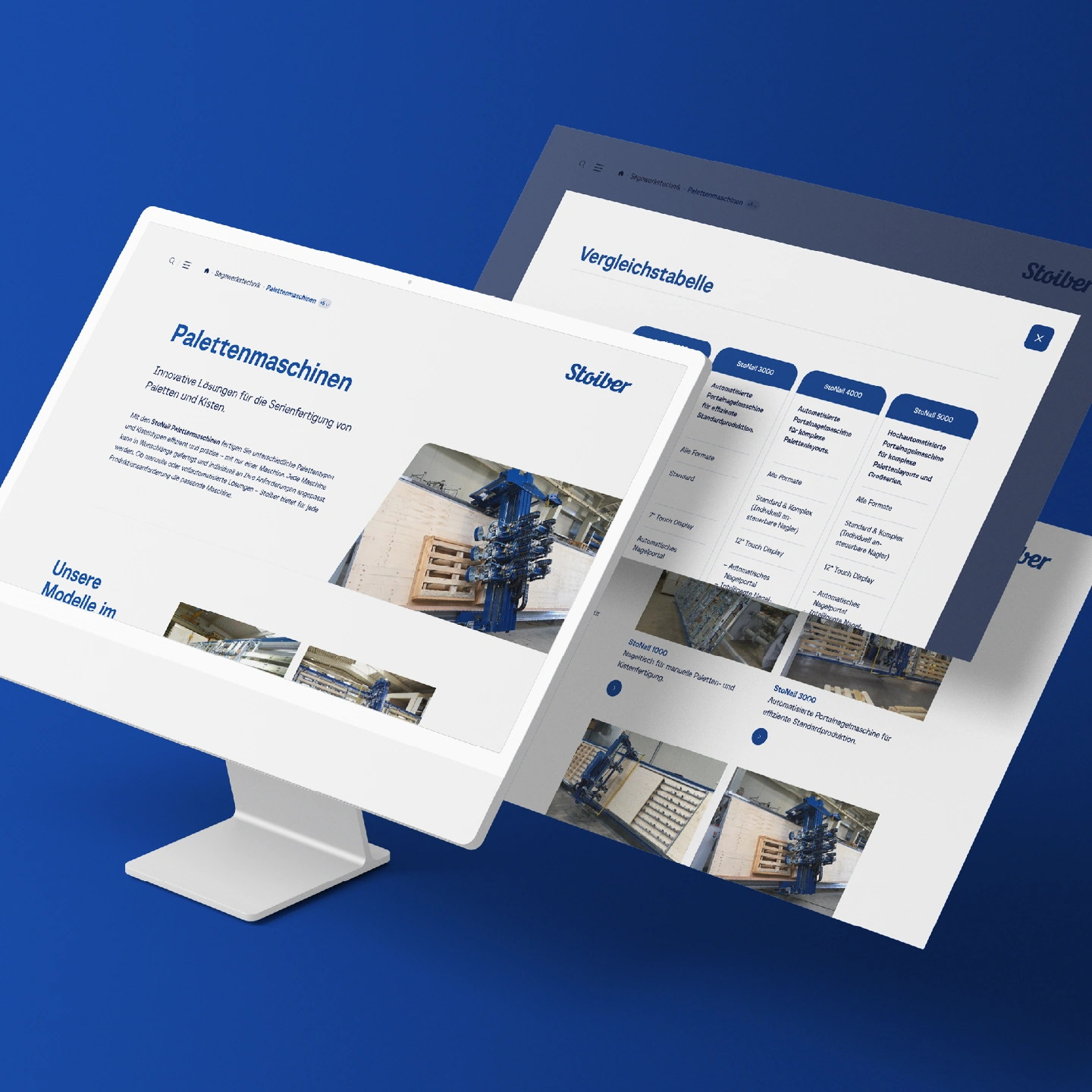
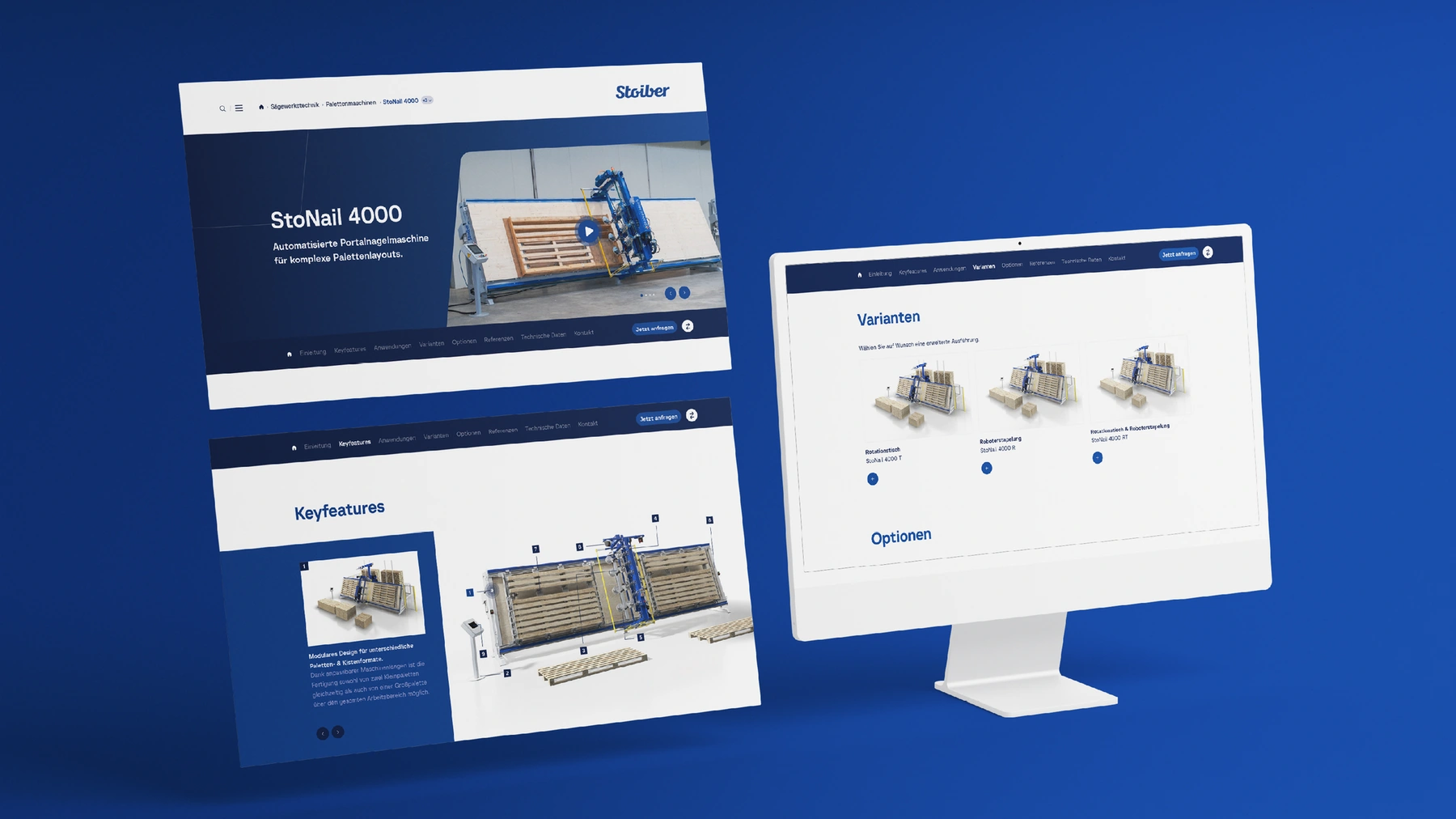
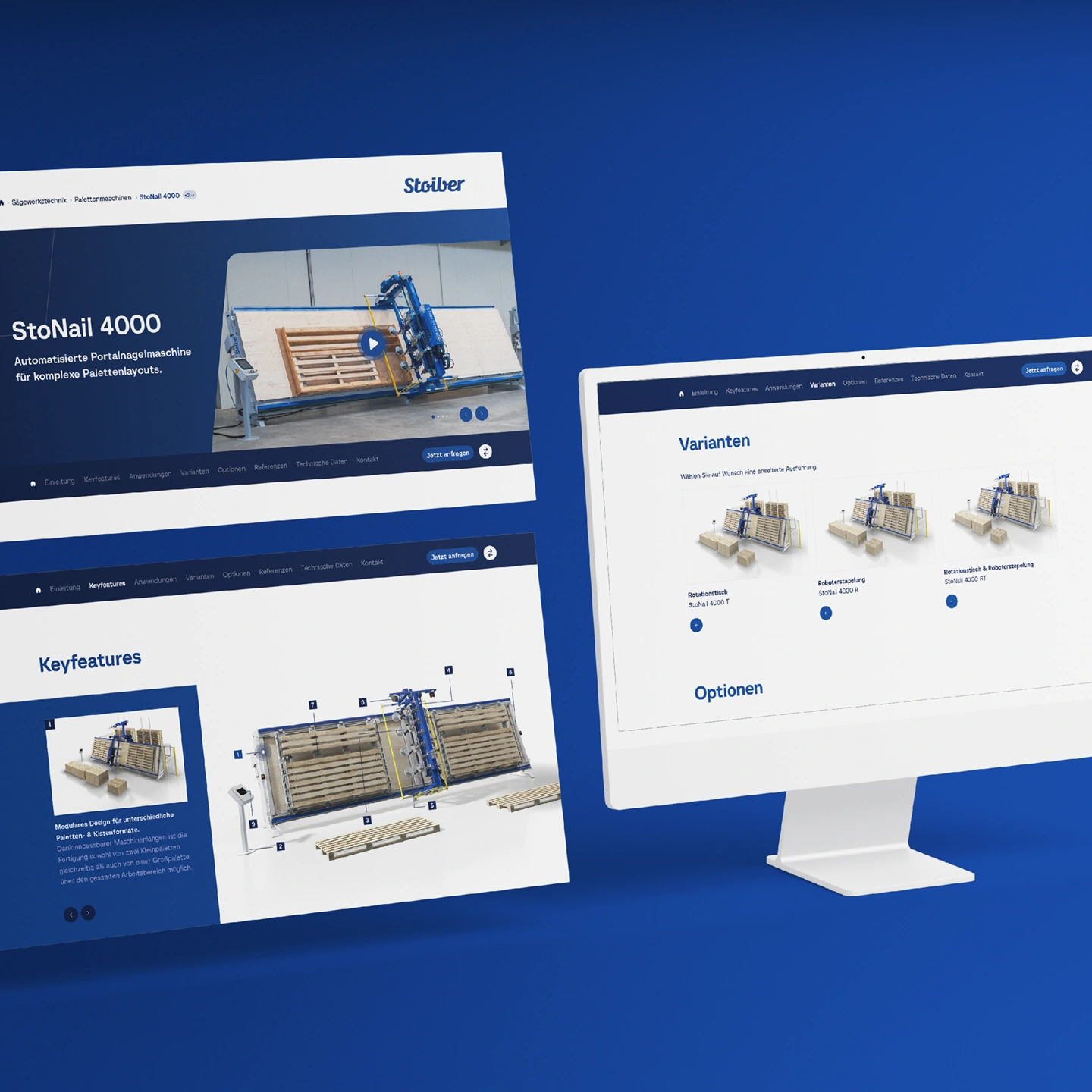
Holistic rebranding for Stoiber Maschinenbau — from brand strategy to the design concept for the future digital presence.

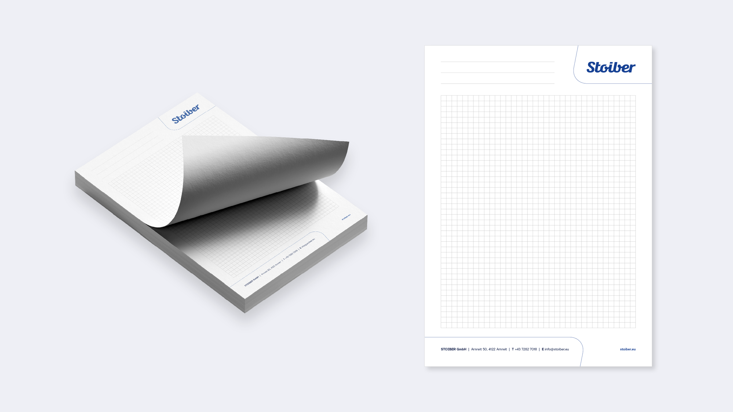
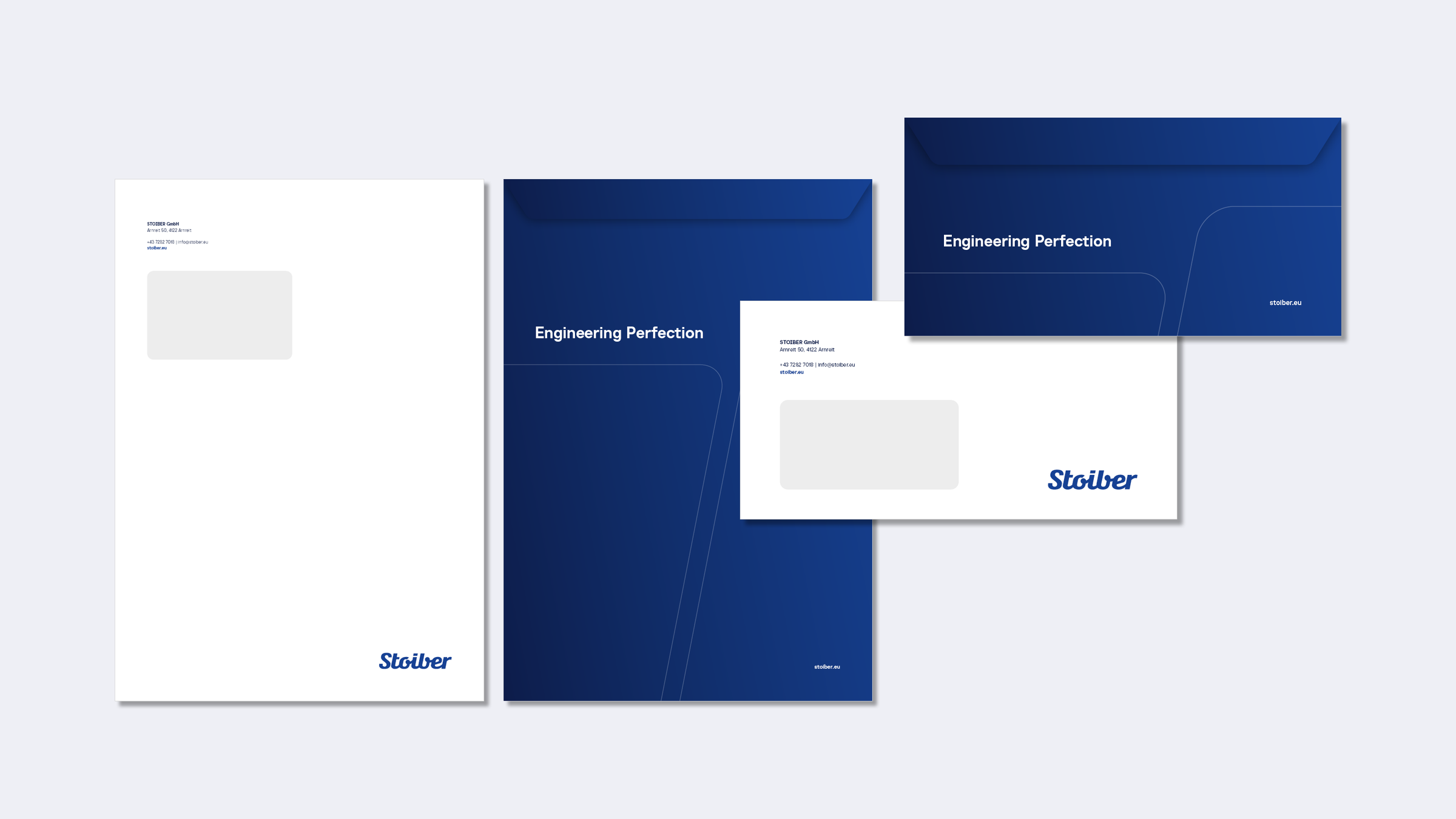
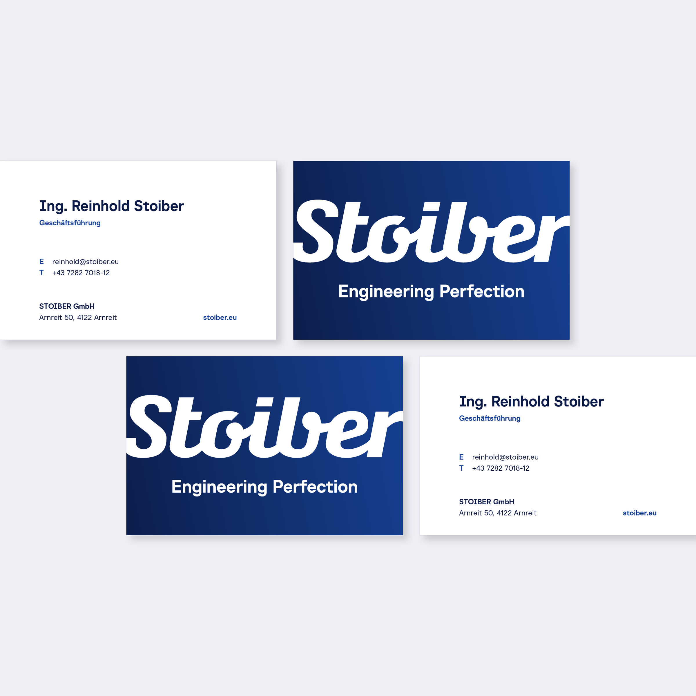
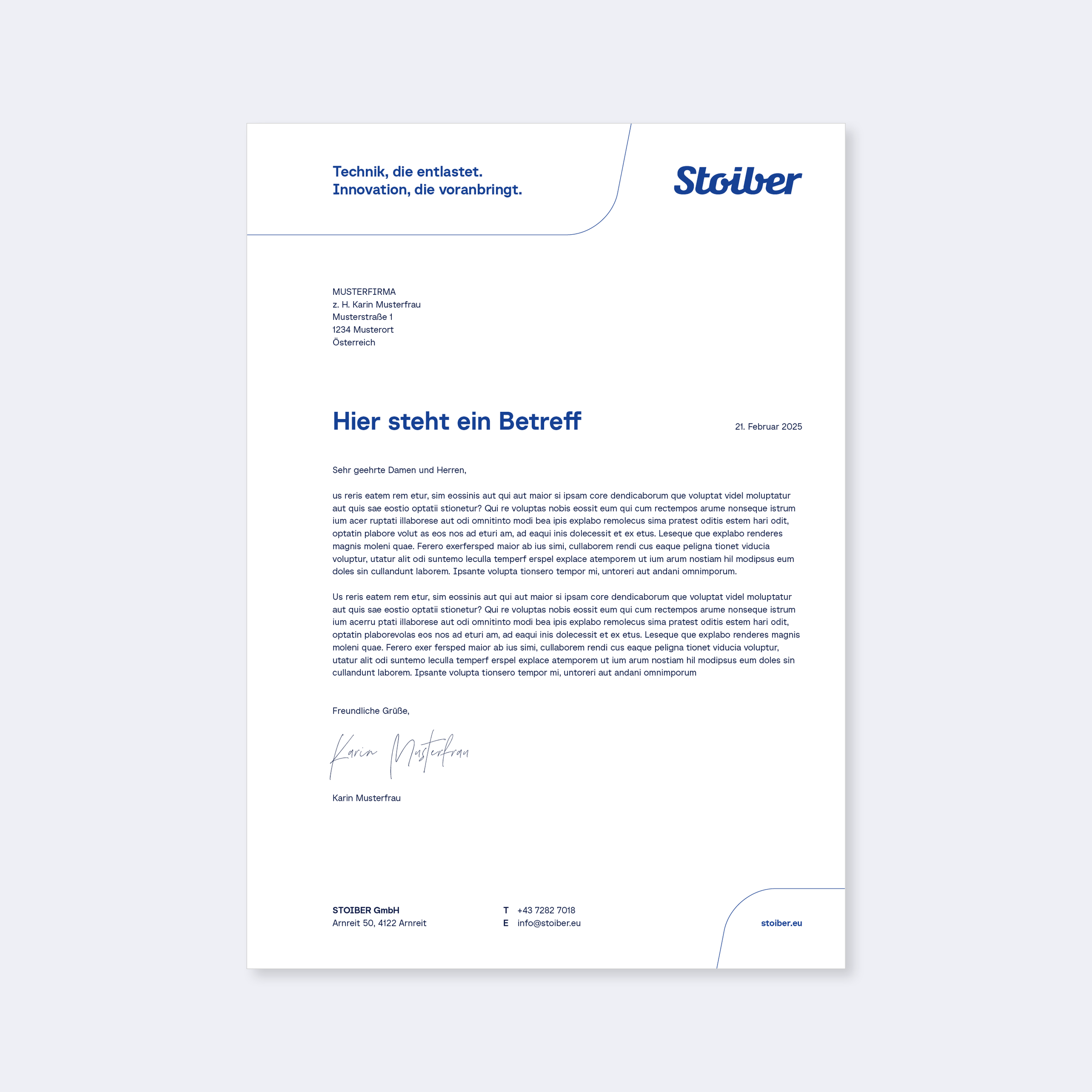
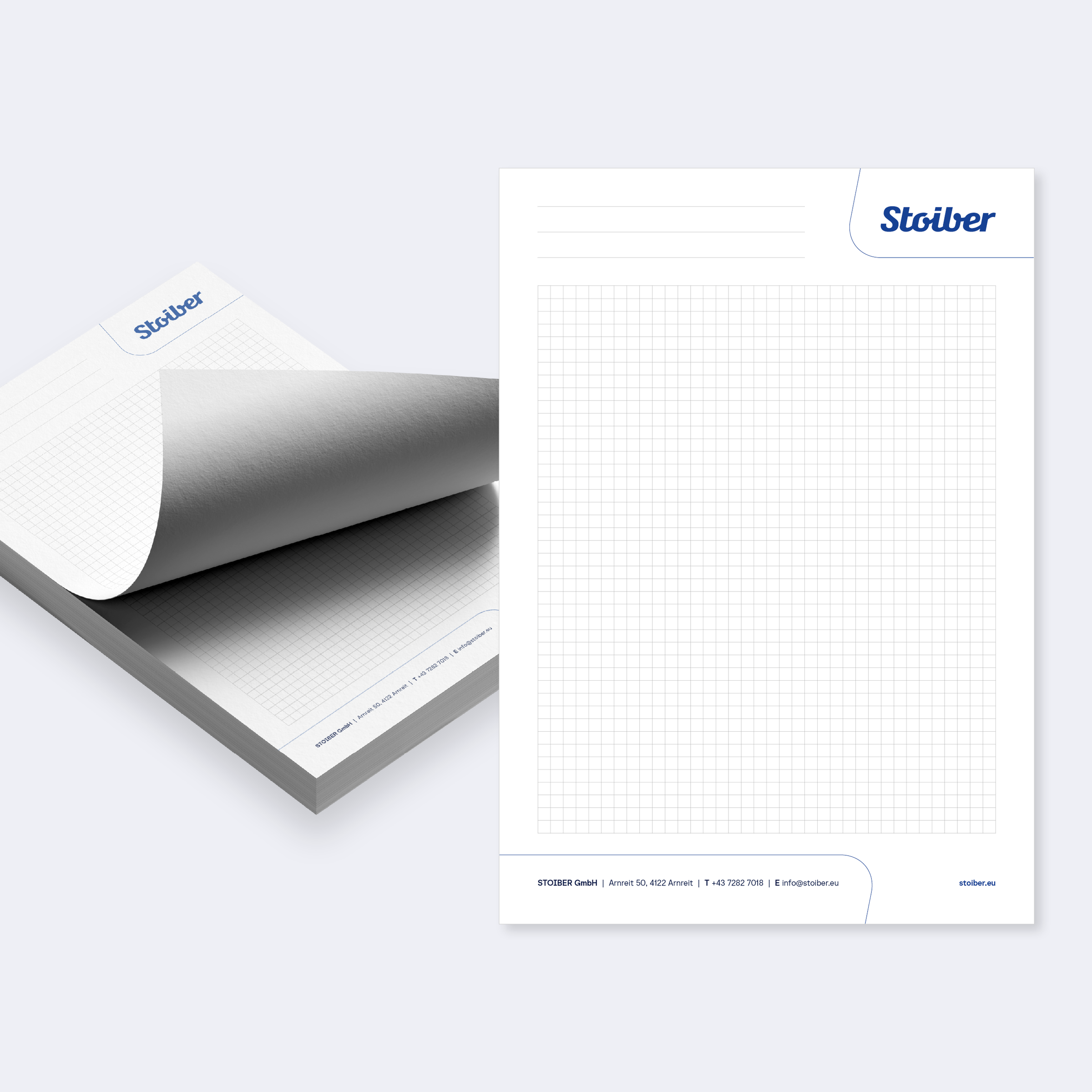
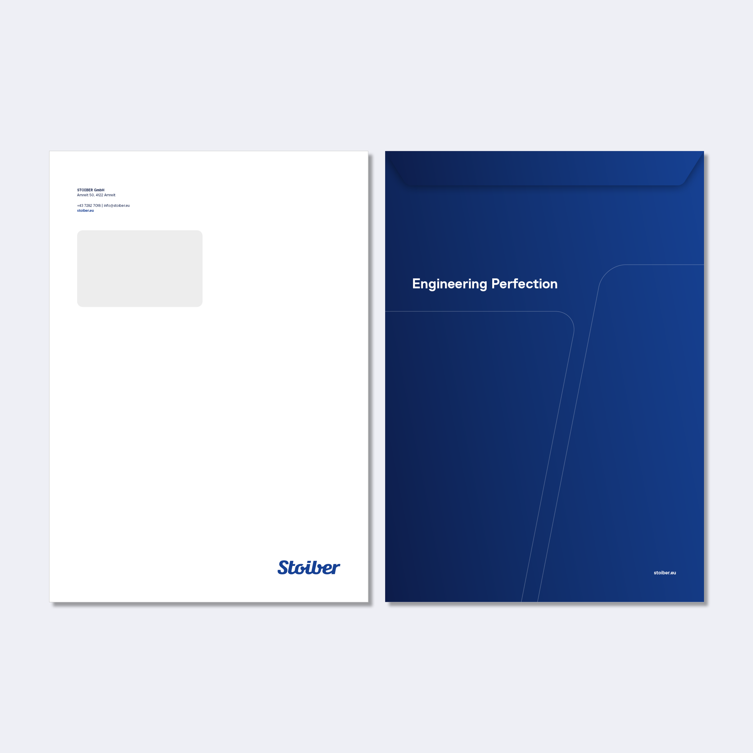
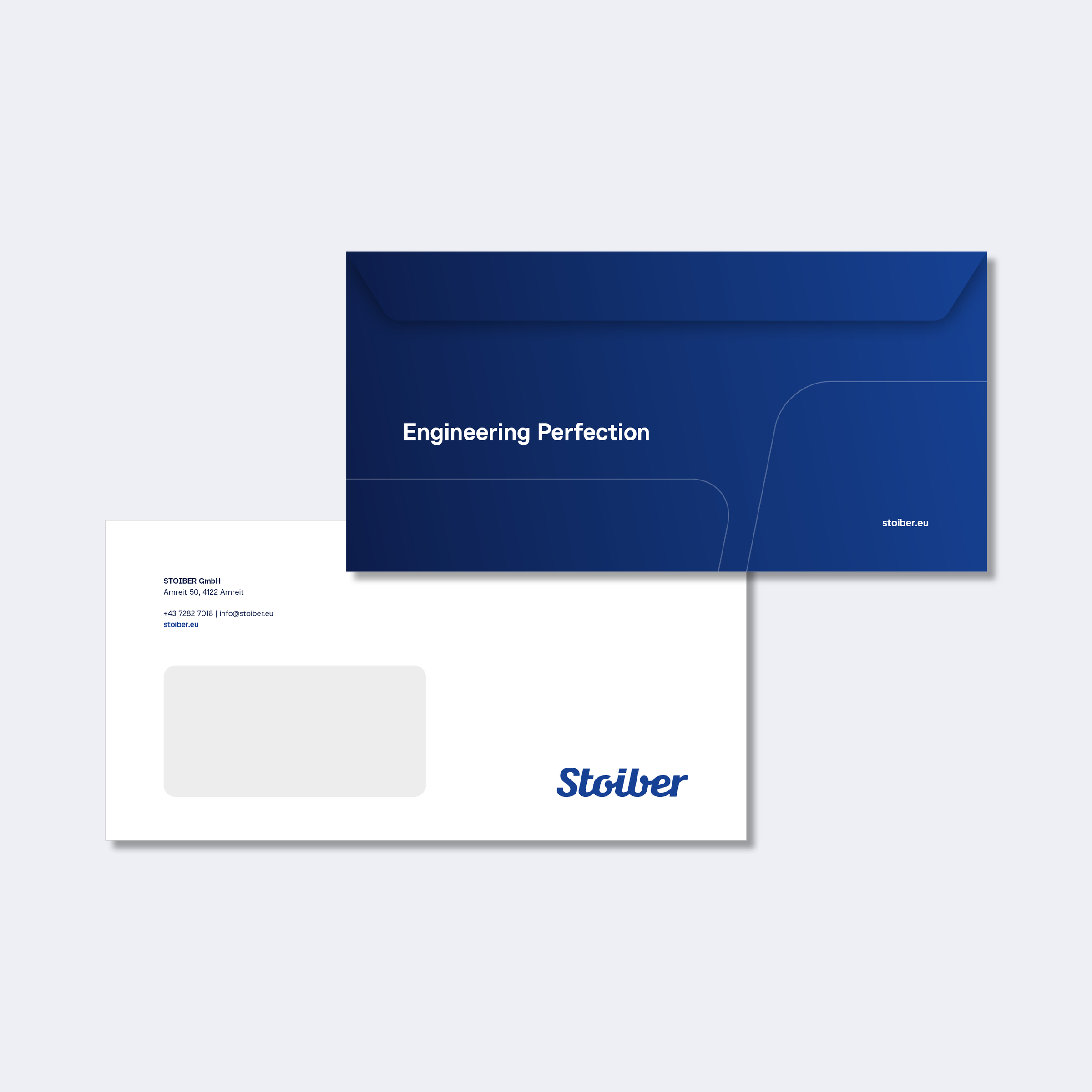
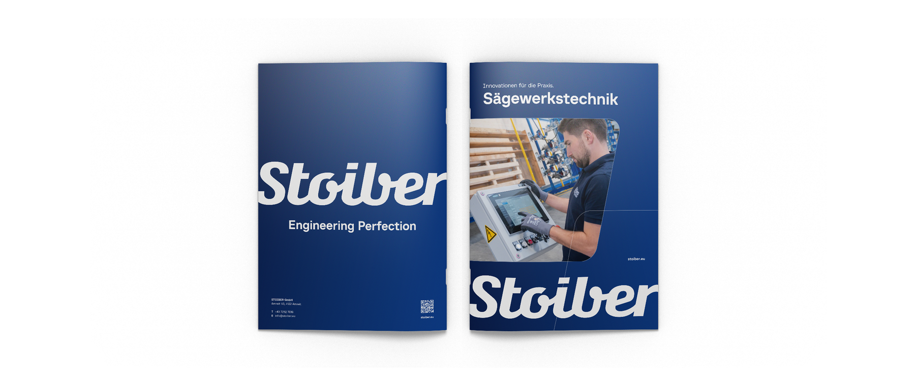
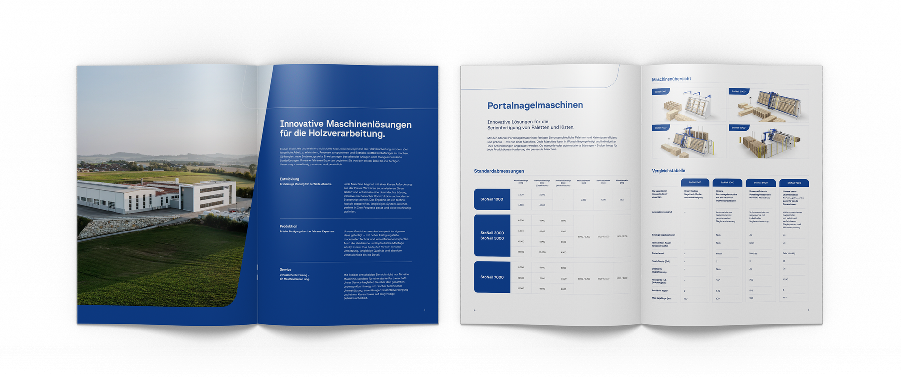
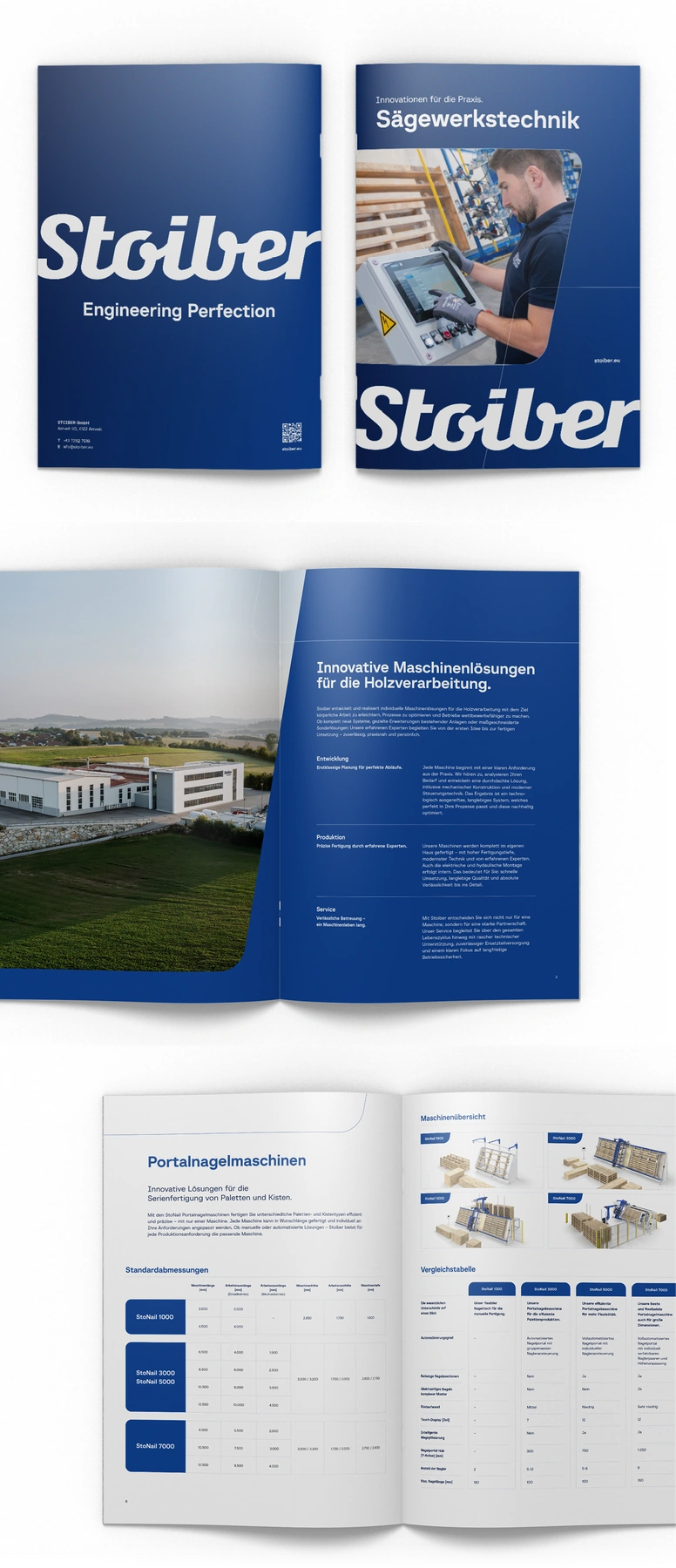
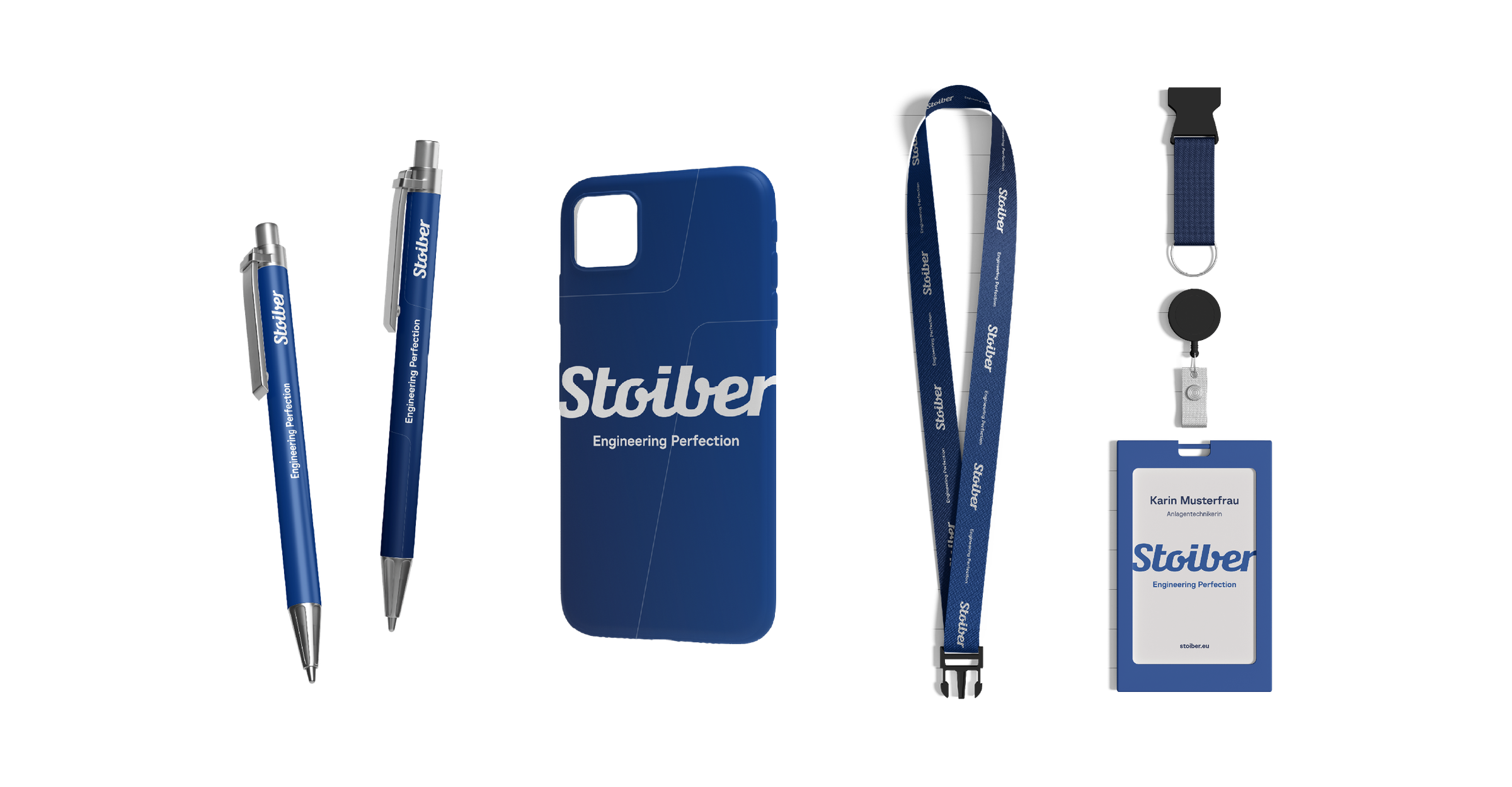
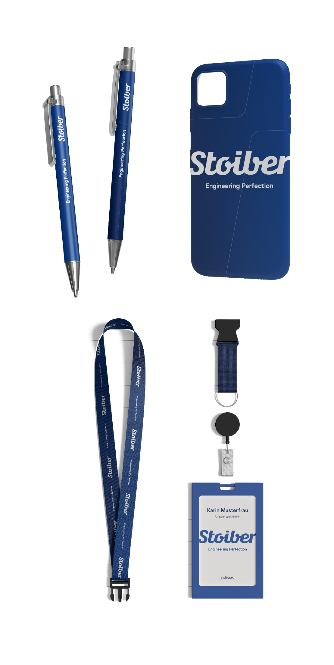
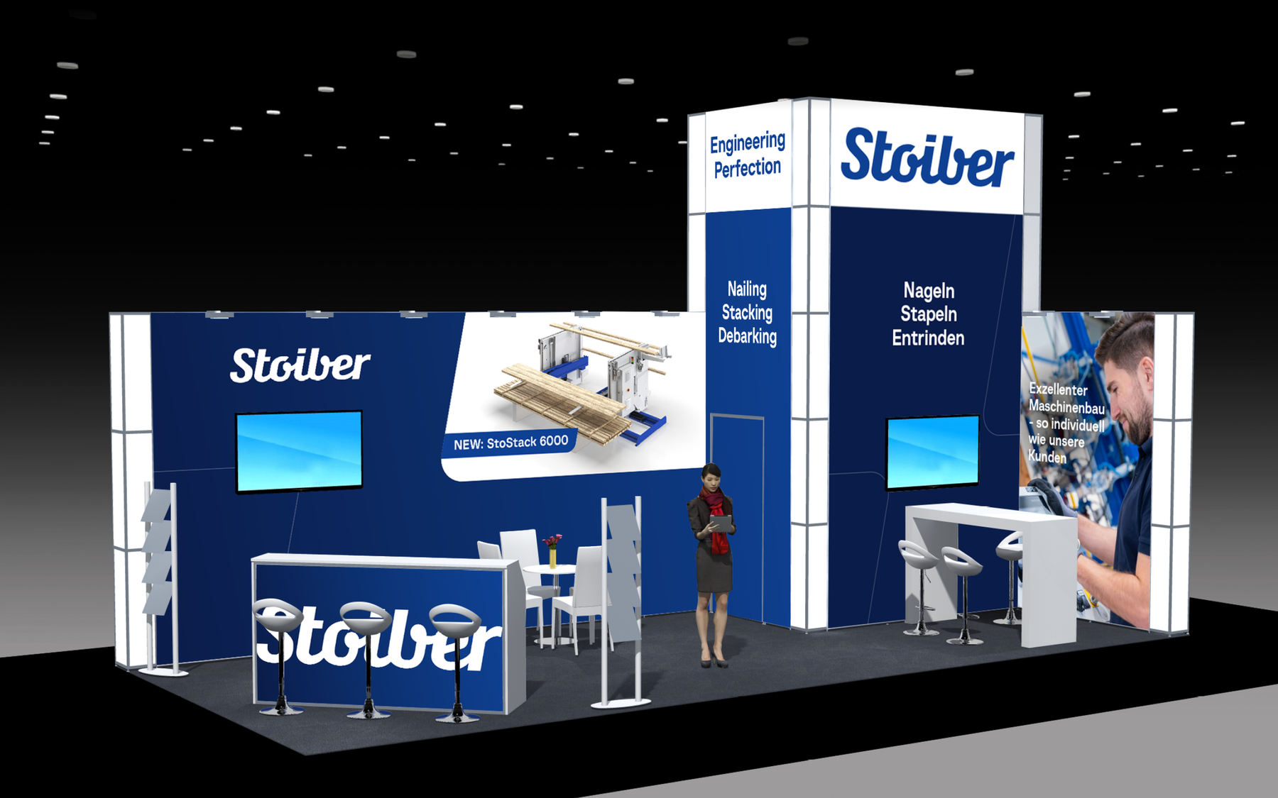
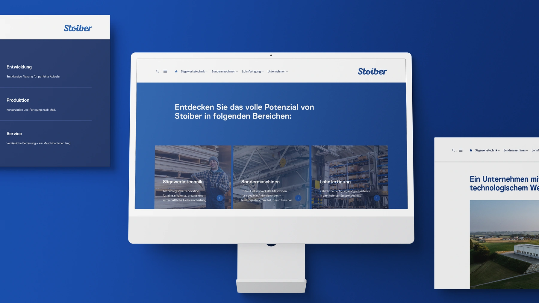
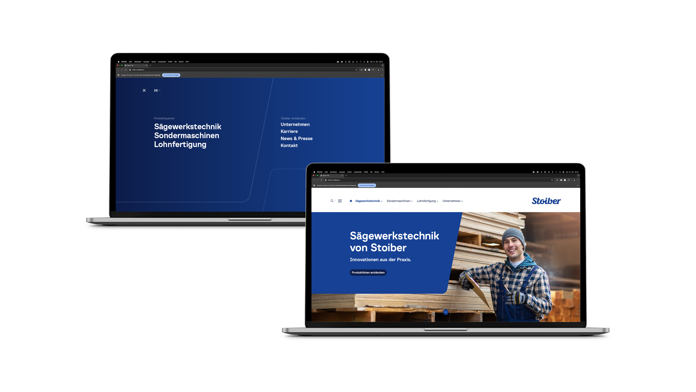
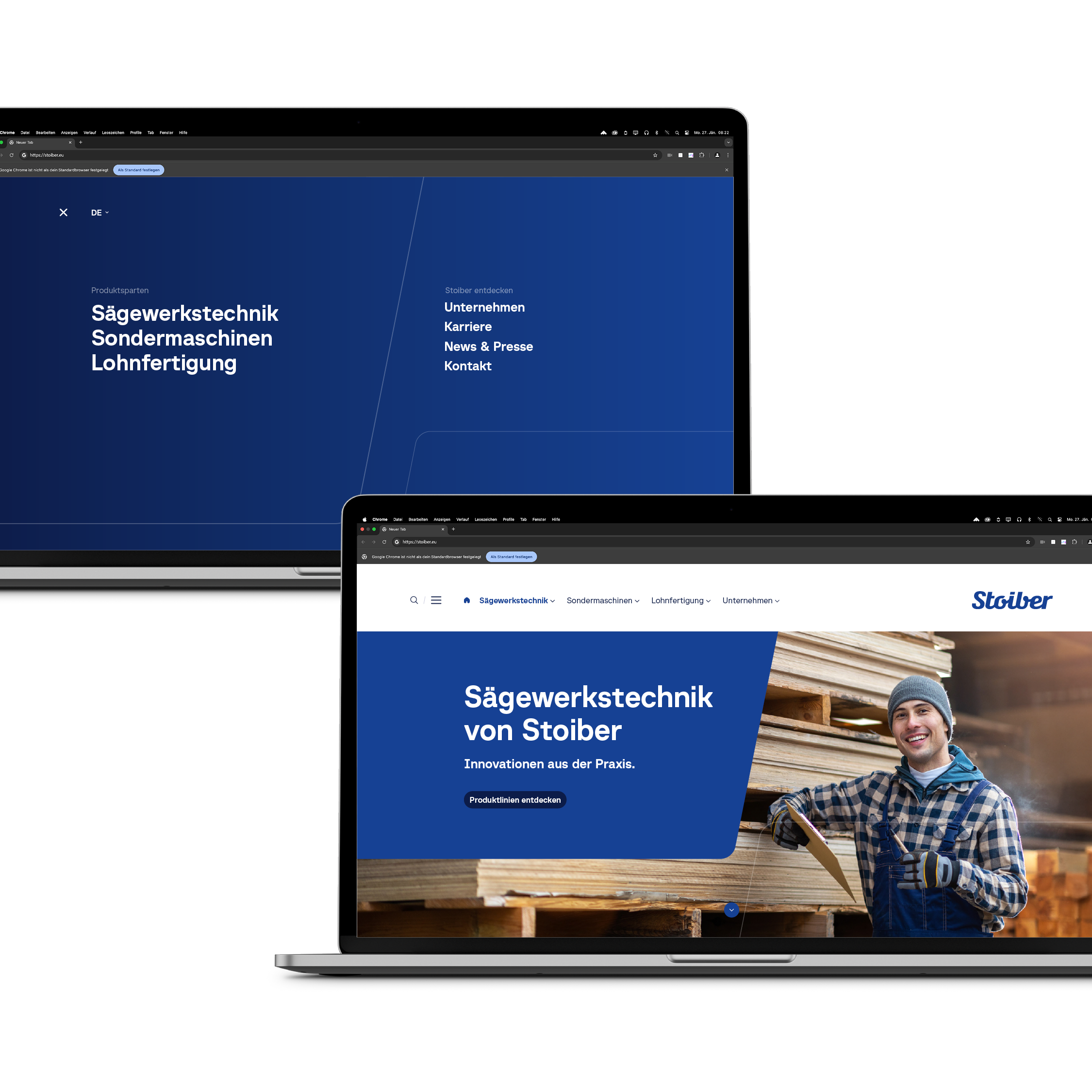
As part of a comprehensive rebranding, MOREMEDIA® created a strong brand foundation for Stoiber Maschinenbau. Building on an in-depth brand workshop, brand development was driven forward in a targeted way: a striking slogan, clear brand values, and a mission and vision were developed. On this basis, a consistent visual identity and a wide range of communication materials were created — including print materials, a folder, a trade fair booth, and a structural and design concept for the digital presence. The new brand image ensures recognition, clarity, and a future-proof positioning.

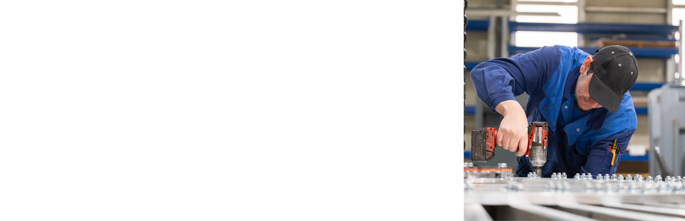
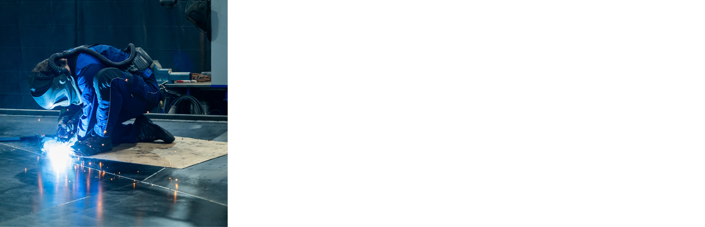
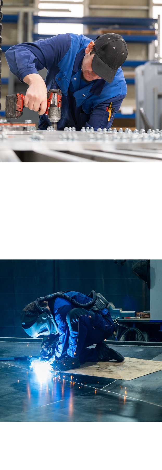
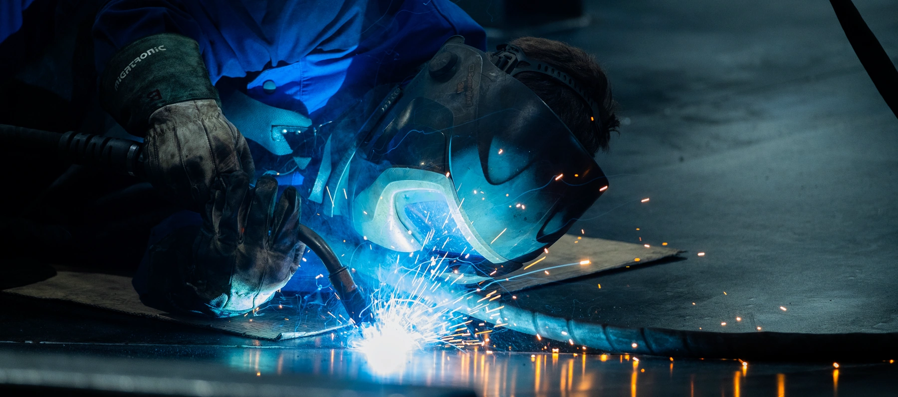
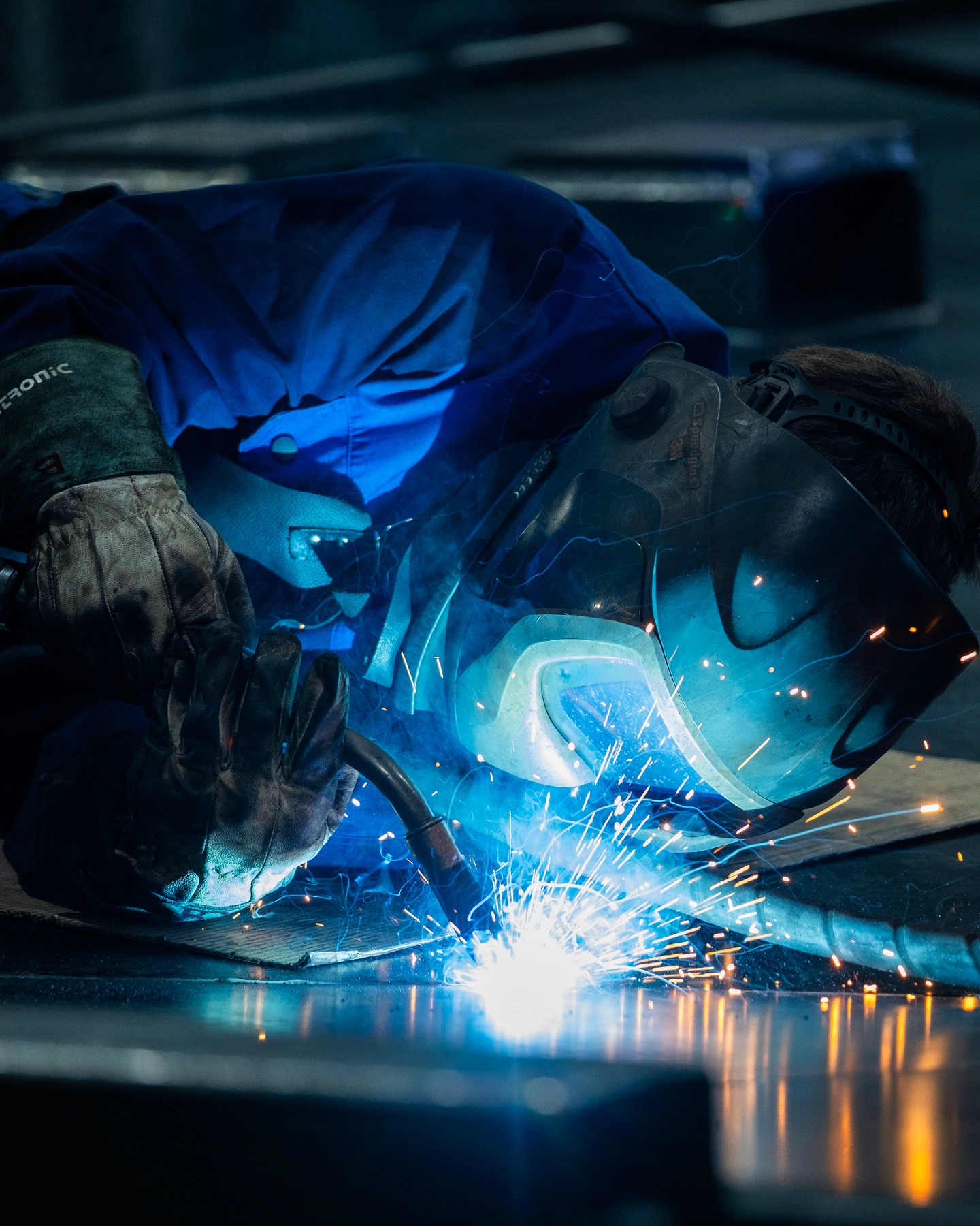
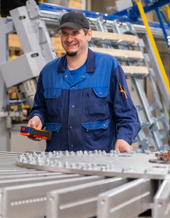
Technical precision communicated visually — on par with international competitors.

stoiber wordmark 2
stoiber brand core 1

Brand core as the basis — values, attitude, and identity distilled to the point.

A strategic rebranding begins with the development of a clearly defined brand core. In an intensive brand workshop, the central values, the company's stance, and its emotional and functional identity were developed together with Stoiber Maschinenbau. The result: a clear, authentic profile that provides orientation – internally and externally – and forms the basis for consistent brand communication.

stoiber brand core mobile

Brand core as the foundation — values, attitude, and identity distilled to the point.

A strategic rebranding naturally includes the definition of a clearly defined brand core. In an intensive brand workshop, the central values, the company's stance, and its emotional and functional identity were developed together with Stoiber Maschinenbau. The result: a clear, authentic profile that provides orientation – internally and externally – and forms the basis for consistent brand communication.

stoiber mission
stoiber vision
stoiber mission vision mobile

A strong mark with history — the logo as a constant with a proud, confident presence and clear visual impact in the new brand identity.

With its clear formal language and balanced typography, the Stoiber Maschinenbau logo already brings a strong visual identity. In the rebranding, it was not redesigned but deliberately staged. In the design manual, we define a striking, space-claiming use: large, present, and consciously positioned. This turns the logo not just into a mark of recognition but into a powerful design instrument across the entire visual presence.

Precision in letterform: typography with Baru Sans.

For the typographic design in the rebranding of Stoiber Maschinenbau, the choice fell on the Baru Sans typeface — a geometric sans serif with high recognition value. Its precise construction, clean lines, and characteristically clipped terminals with 90° angles give the typeface a modern, technical aesthetic that fits the company's positioning perfectly. Baru Sans brings not only visual rigor and structure to the design but also feels approachable and contemporary. Thanks to its neutral yet distinctive character, the typeface is ideally suited for a wide range of applications — from headlines on trade fair stands to body copy in brochures or digital interfaces. In combination with the existing logo and the new design elements, Baru Sans supports a clear, confident brand voice that communicates competence and innovative strength in equal measure.

Technical, precise, distinctive: the newly defined color concept.

The visual identity of Stoiber Maschinenbau is shaped by a clearly defined, technical-looking color concept. At its core are two main tones: Precision Blue and Industrial Navy. While Precision Blue signals competence and innovative strength with its bold, cool character, the deeper Industrial Navy lends the identity stability, professionalism, and depth. A special highlight is the defined Tech Gradient, which connects both tones in a harmonious transition – a design element that makes dynamism and technological precision visually tangible. The gradient is tilted at 11° and creates a subtle yet effective sense of movement in the layout. The color concept is not only functional and versatile but also strengthens recognition of the brand across all channels – digital and analog alike. It creates the visual foundation for a modern, focused brand presence that consistently communicates technical excellence.

stoiber color palette 1 1
stoiber color palette 2 2
stoiber color palette 3 3
stoiber welder
stoiber welder mobile

People, machines, precision – the imagery of Stoiber Maschinenbau.

The imagery of Stoiber Maschinenbau combines technical excellence with approachable authenticity. Clear compositions, natural body language, and professional lighting create a matter-of-fact yet inviting atmosphere. The focus is on the people behind the machines – competent, committed, and concentrated at work. The background remains subtle and often slightly out of focus to direct attention to what matters. The emotional imagery is complemented by photorealistic renderings of the machines. These show technical details from the ideal perspective and in ideal quality, emphasize the high standard of precision, and underscore the core value “Engineering Perfection”. The color world of the imagery is cool and technical – dominated by blue and gray tones – complemented at specific points by bright, friendly accents. The result is a balanced interplay of people, technology, and clarity that builds trust and visually strengthens the positioning of the brand.

The composition is clearly structured: People take center stage, often interacting or focused on their work.

stoiber image 1
stoiber image 2
stoiber image 3

Structure meets flexibility

The design system of Stoiber Maschinenbau is based on a clearly defined, functional grid structure that enables consistent and precise design. At the same time, it offers a high degree of flexibility and transfers easily to the most varied formats and media. The underlying grid logic provides orientation and uniformity – regardless of format or application. A central element is the defined type area, which gives the visual presence structure, recognizability, and a strong design identity. The result is a system that combines efficiency in application with a high degree of creative freedom – clear, well thought out, and versatile.

The corporate design of Stoiber Maschinenbau is defined by two primary design carriers: the distinctive wordmark and the so-called Precision Lines. Both elements are derived directly from the logo and form the visual DNA of the appearance.

stoiber design elements

From concept to impact – the brand presence in action.

The many application examples show how the developed design system proves itself in practice: whether on folders, trade fair stands, or business stationery – the visual identity unfolds its full effect in every situation. The clear design system ensures recognizability, while flexible layout principles allow precise adaptation to different formats. This way, the brand essence of Stoiber Maschinenbau is carried outward consistently and convincingly.

stoiber print materials 1 1
stoiber print materials 3 3
stoiber print materials 2 2
stoiber print materials 4 4
01
01
stoiber print materials 1 mobile
stoiber print materials 3 mobile
stoiber print materials 2 mobile
stoiber print materials 4 mobile
stoiber print materials 5 mobile
01
01
stoiber folder 1
stoiber folder 2 1
stoiber folder mobile 1
stoiber advertising materials
stoiber advertising materials mobile
stoiber trade fair stand 1

Structured. User-oriented. On-brand. The digital design concept as the guiding star for the future web presence.

For the Stoiber Maschinenbau online presence, a well-thought-out structure and design concept was developed that unites brand identity and usability. Clear navigation paths, generous white space, and a flexible grid system form the basis for a contemporary design tailored to the target group. The digital design follows the principles of the corporate design and consistently carries its visual language into the digital space – reduced, functional, and highly recognizable.

stoiber screen design 1
stoiber screen design 2 2
stoiber screen design 2 mobile 2
stoiber screen design 3
stoiber screen design 3 mobile
stoiber screen design 4
stoiber screen design 4 mobile
stoiber navigation 1
stoiber navigation 2
stoiber navigation 3
stoiber navigation mobile 1
stoiber screen design 5
stoiber screen design 5 mobile
stoiber screen design 6 2
stoiber screen design 6 4
stoiber screen design 7
stoiber screen design 7 mobile
stoiber screen design 8
stoiber screen design 9

How we worked

From the first briefing to the result — structured and transparent in clearly defined steps.

01 — Brand Workshop
Jointly defined the values, attitude, and brand core.

02 — Logo Refinement
Deliberately modernized the existing logo instead of reinventing it.

03 — Typography & Color Concept
Set Baru Sans and developed the color concept with Precision Blue and Industrial Navy.

04 — Visual Language & Design System
Built a technical, authentic imagery and a clear design system.

05 — Website
Implemented the brand-compliant, user-oriented web presence.