EBP wanted to be clearly recognizable as an independent construction management office – distinct from construction companies, visible as a partner for project management. The following questions summarize what we paid particular attention to in brand positioning, corporate design, and the website.
What was the brief for the brand relaunch of EBP?
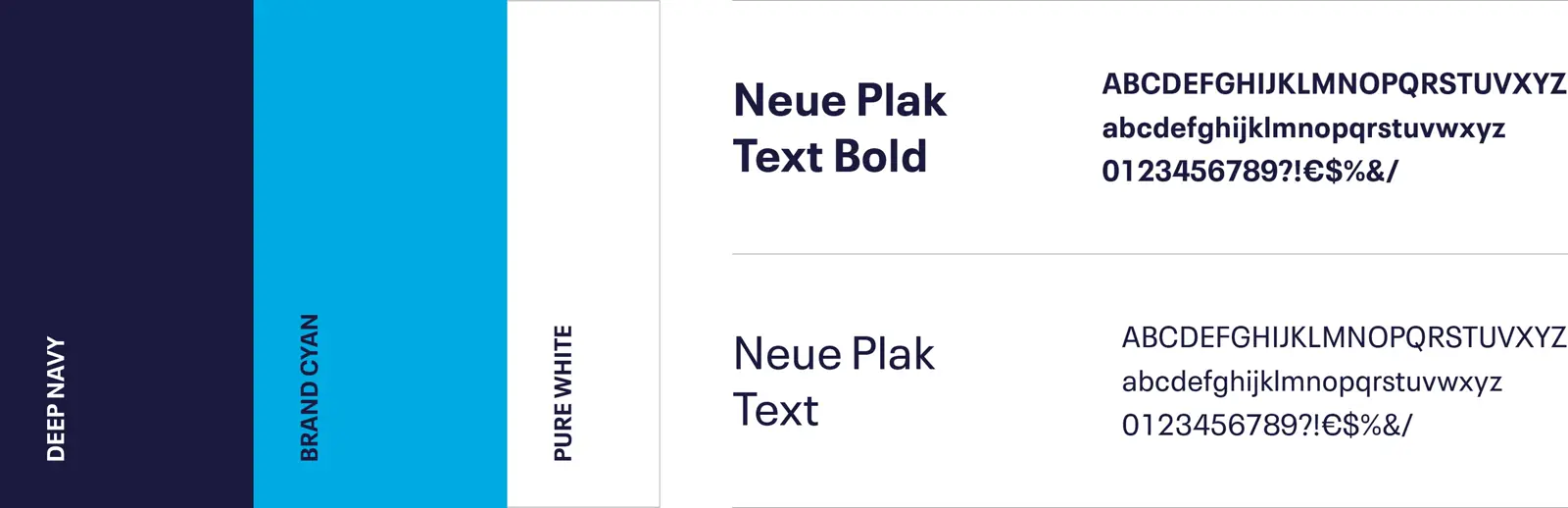
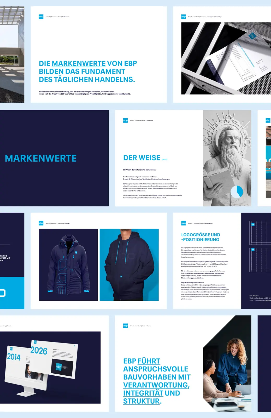
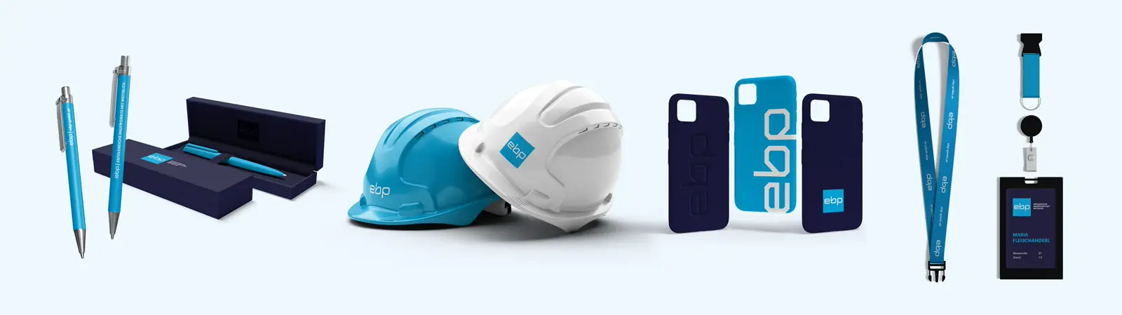
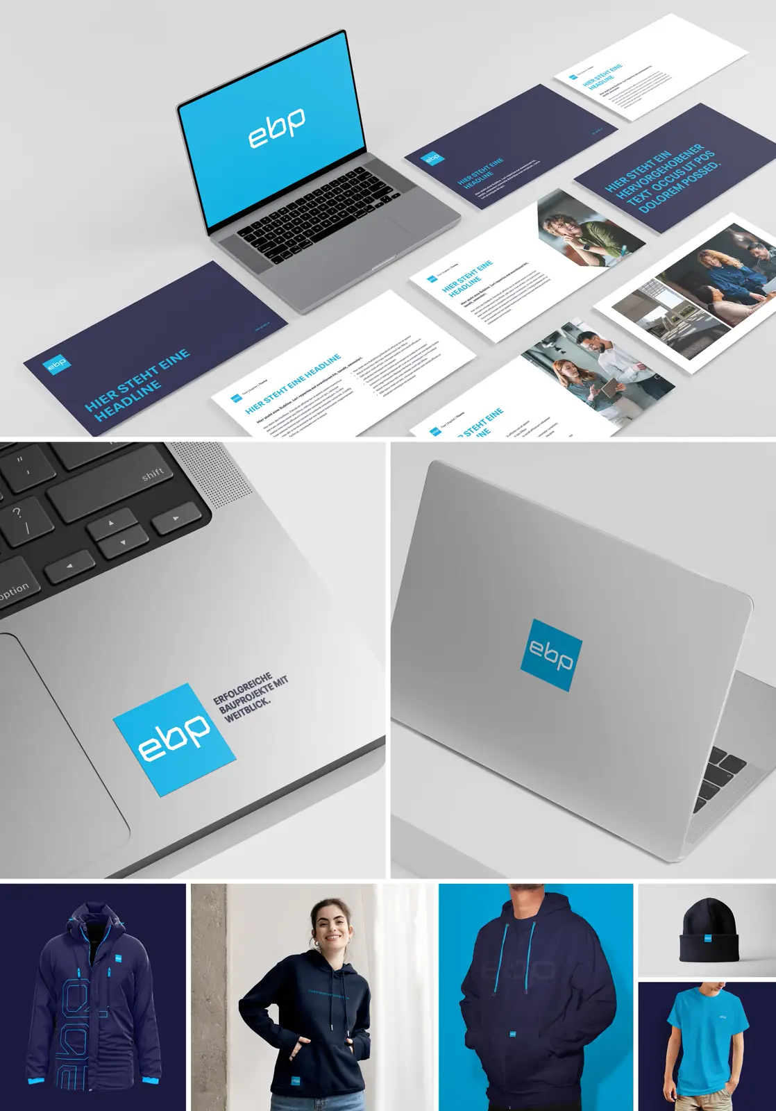
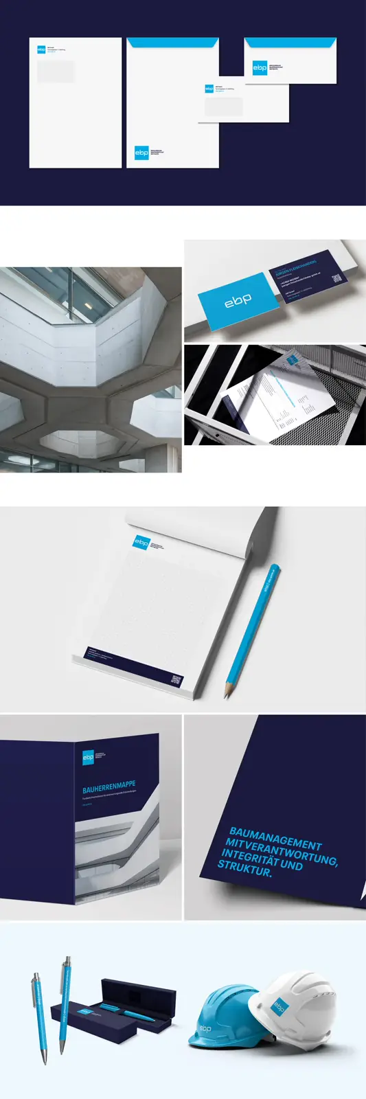
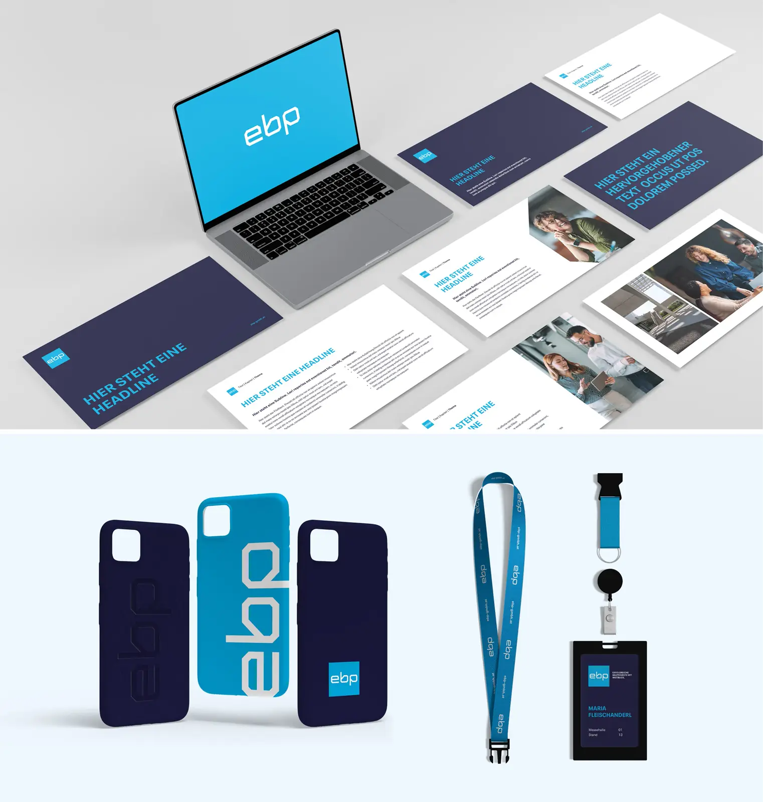
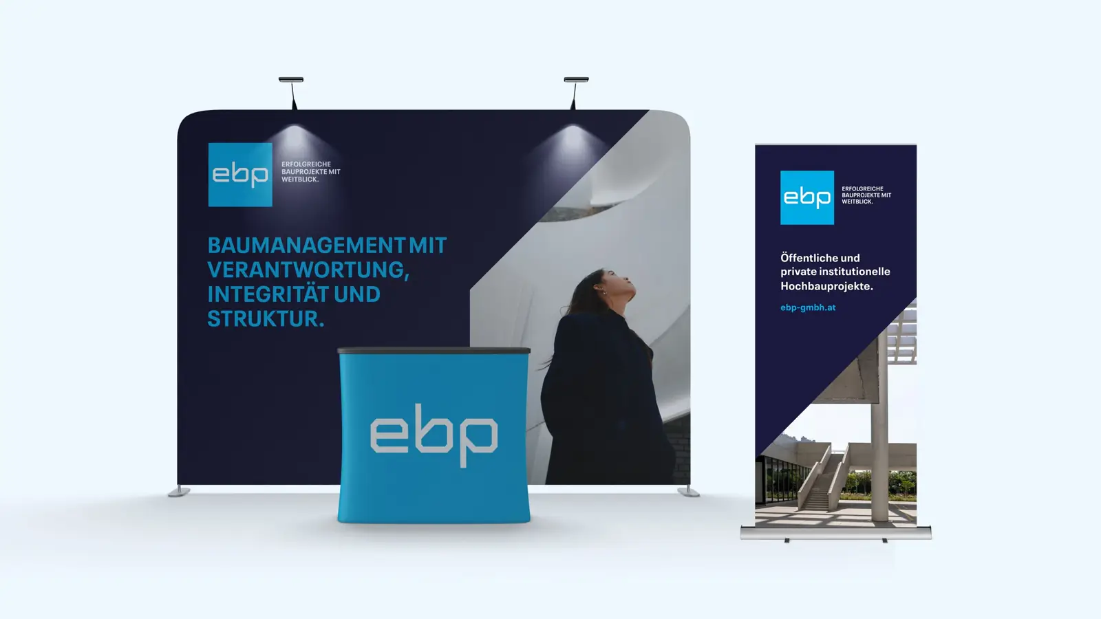
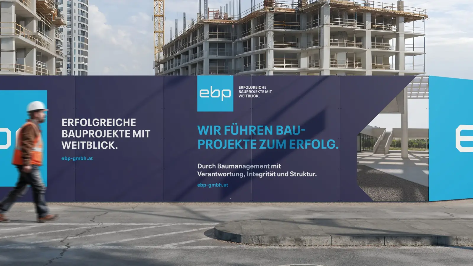
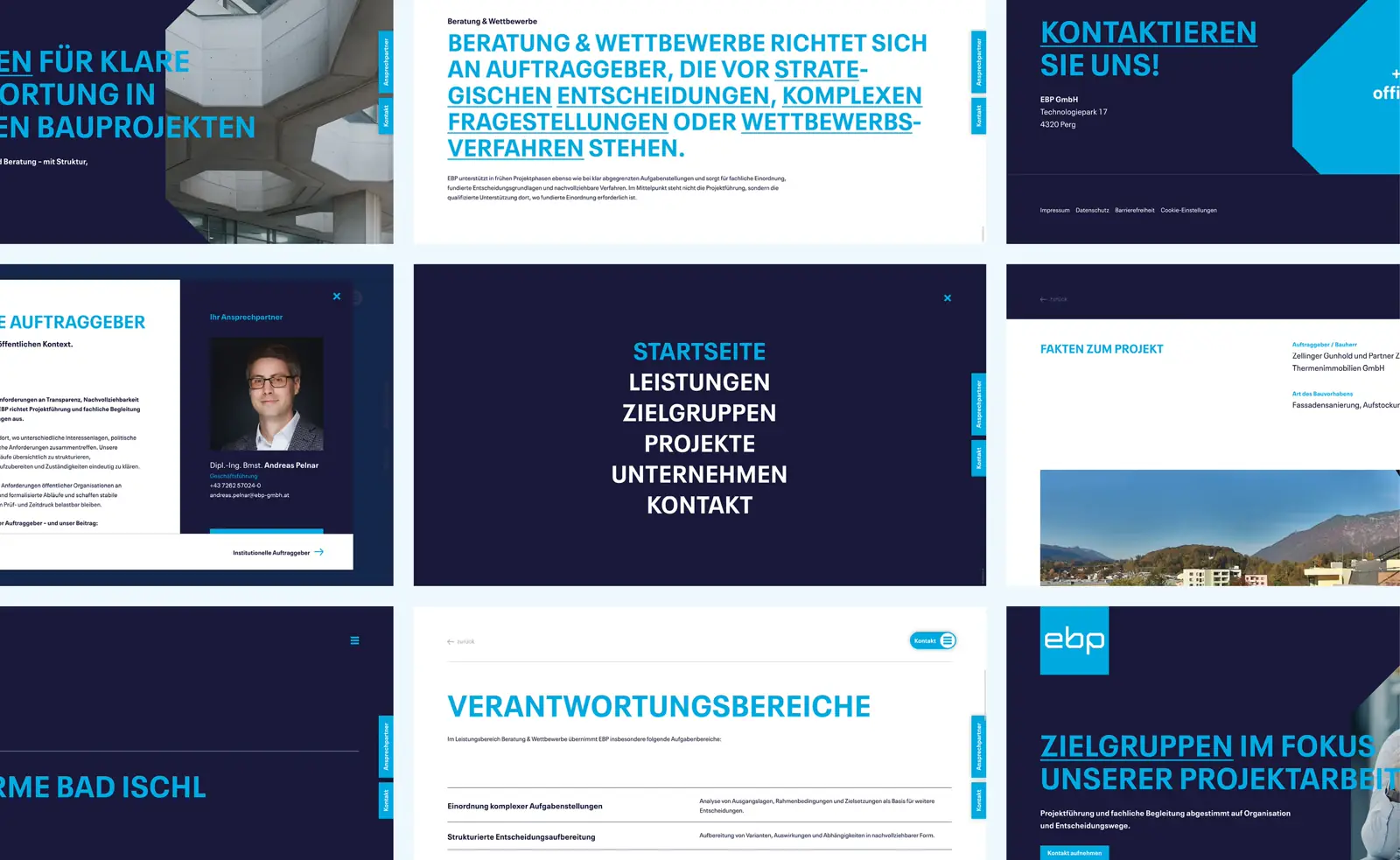
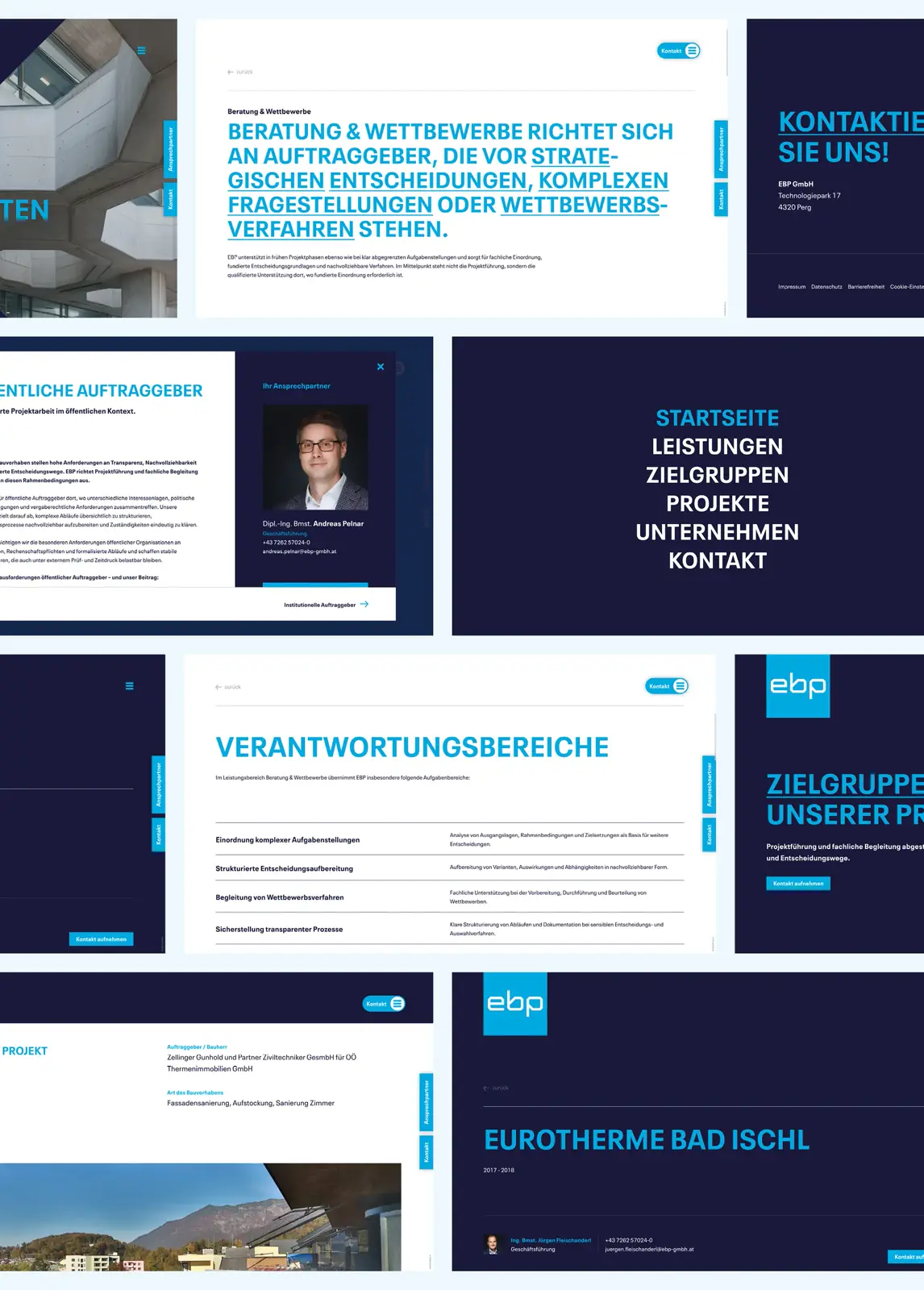
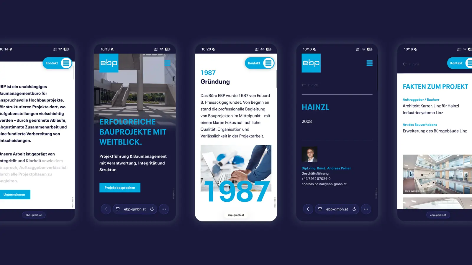
EBP wanted to be clearly recognizable as an independent construction management office – distinct from construction companies, visible as a partner for project management. From this ambition, a new brand identity emerged that translates the values of responsibility, integrity, and structure into a distinctive visual language.
How does the corporate design translate the brand values into something visible?
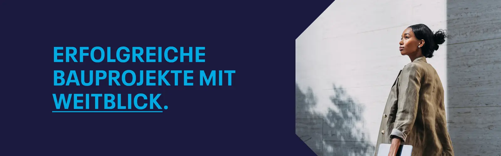
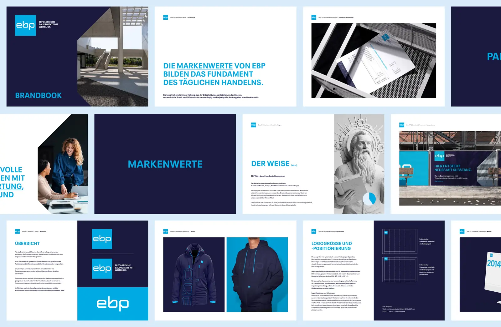
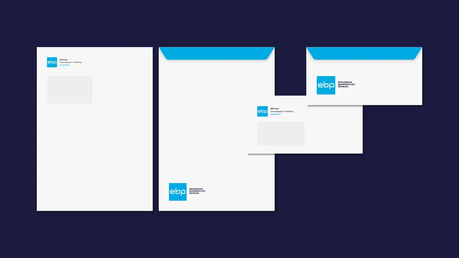
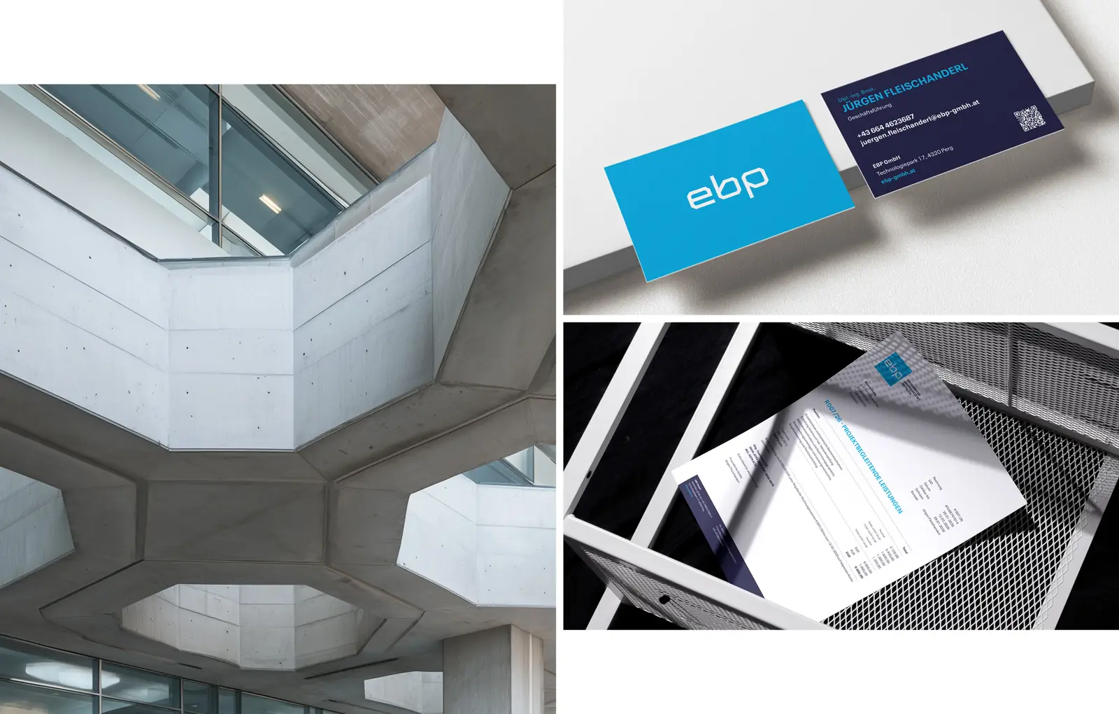
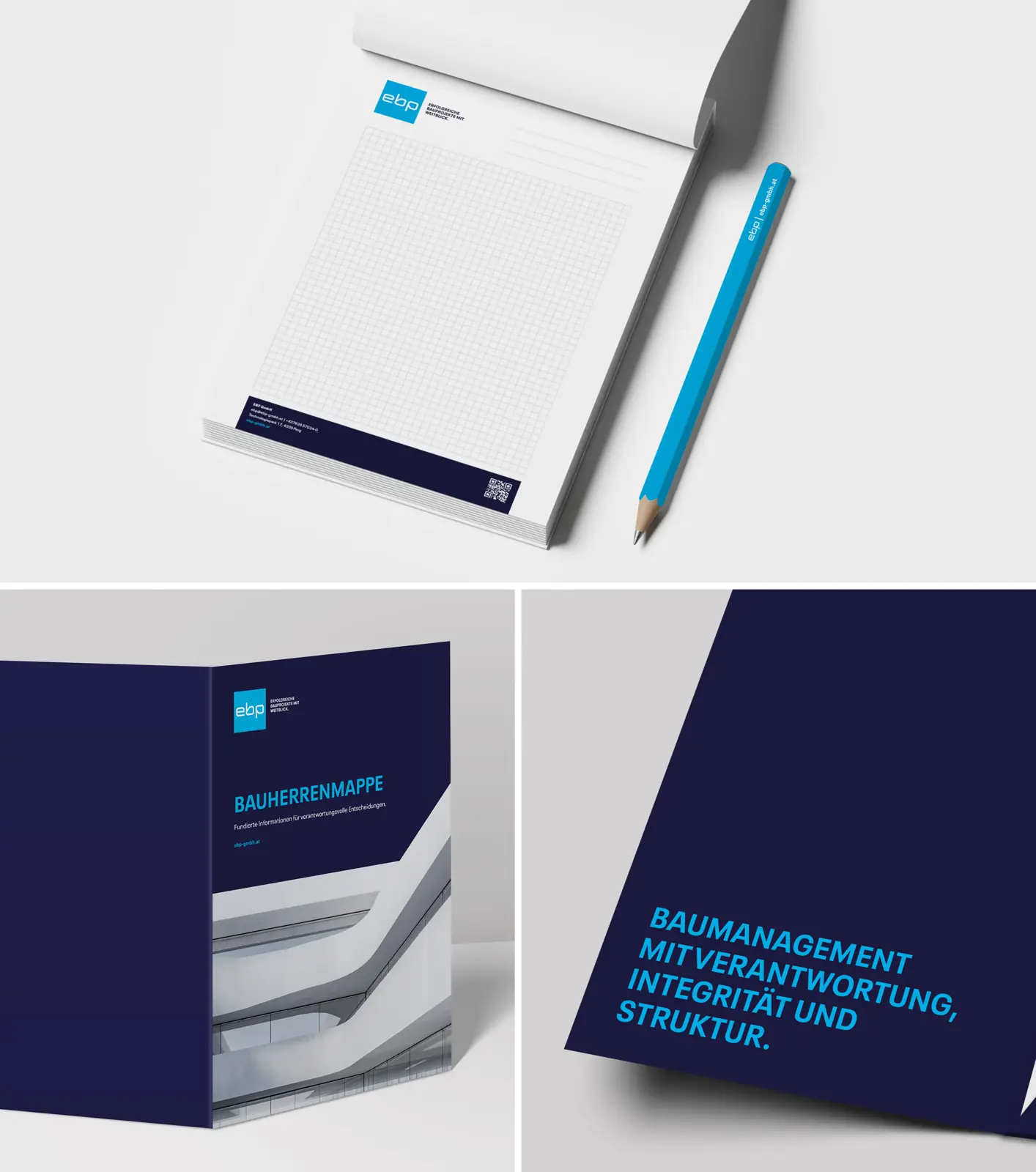
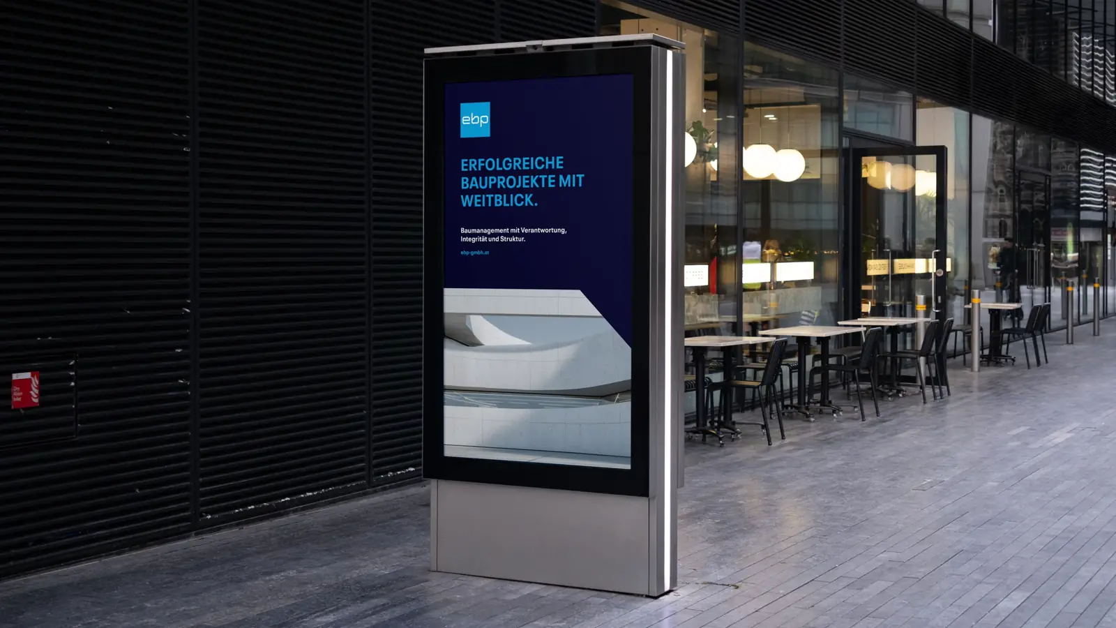
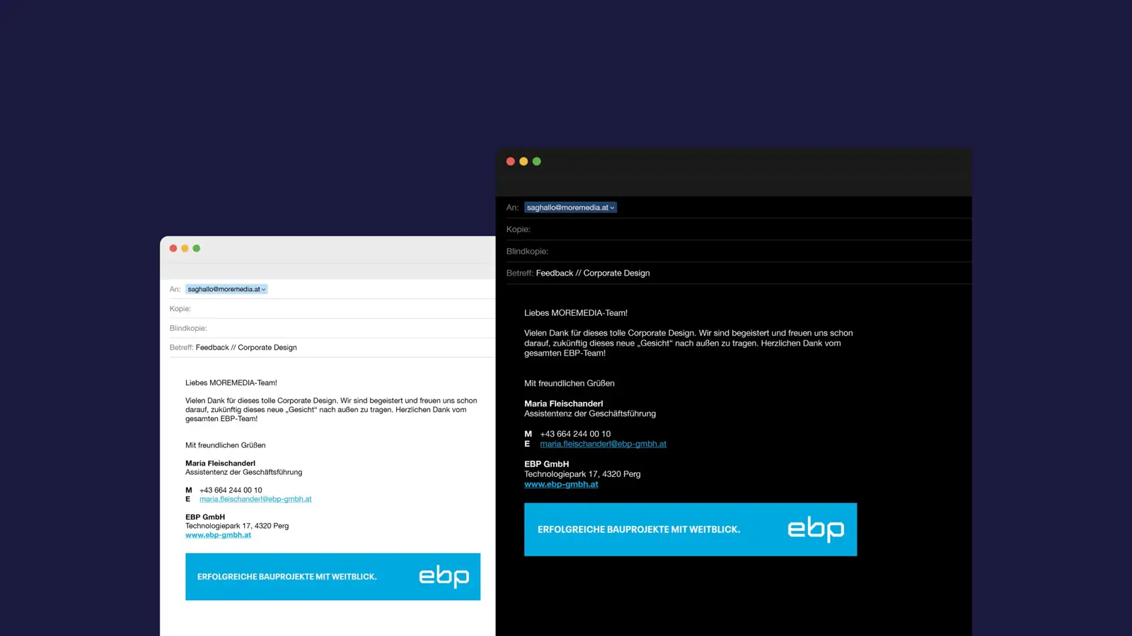
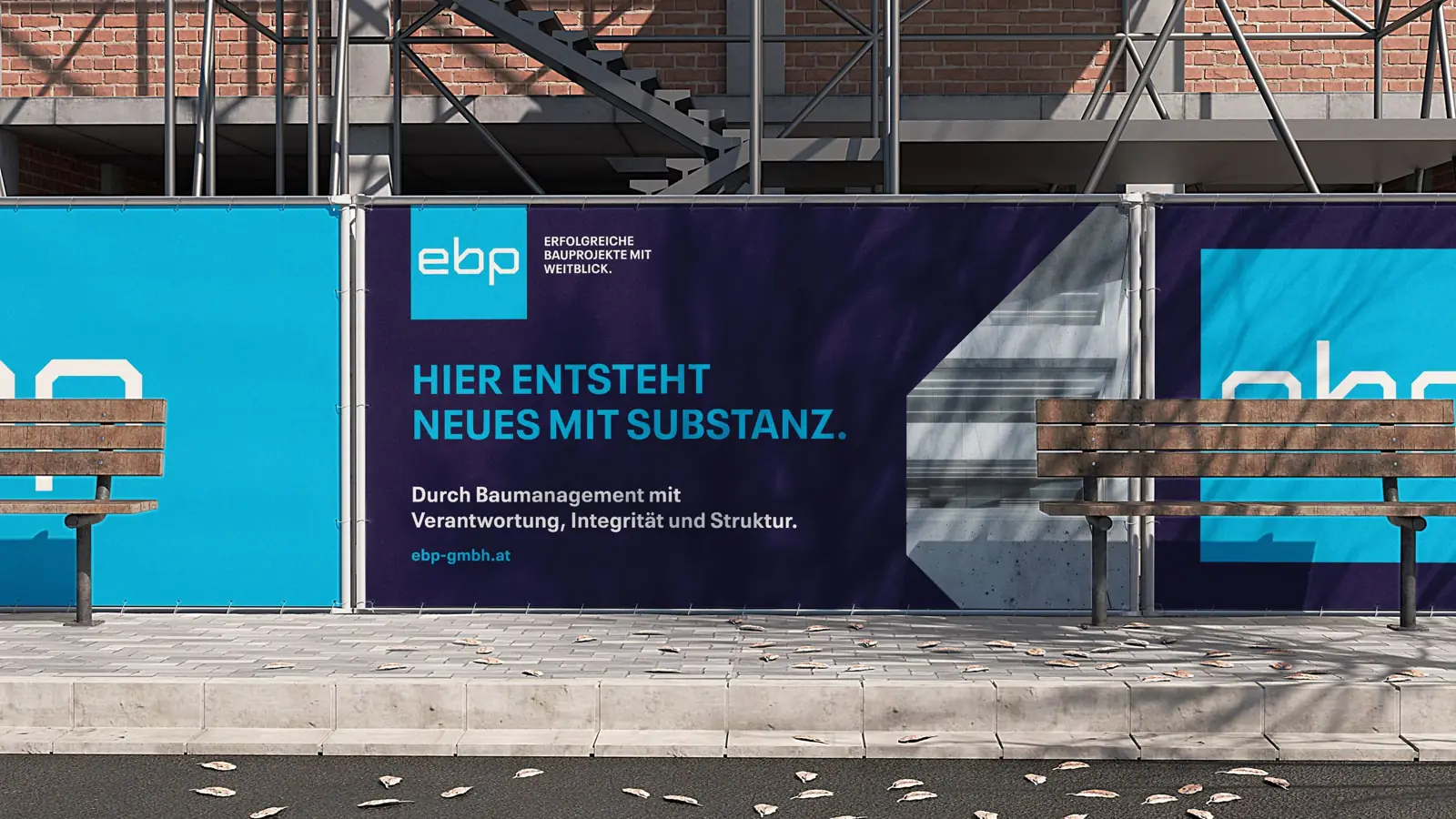
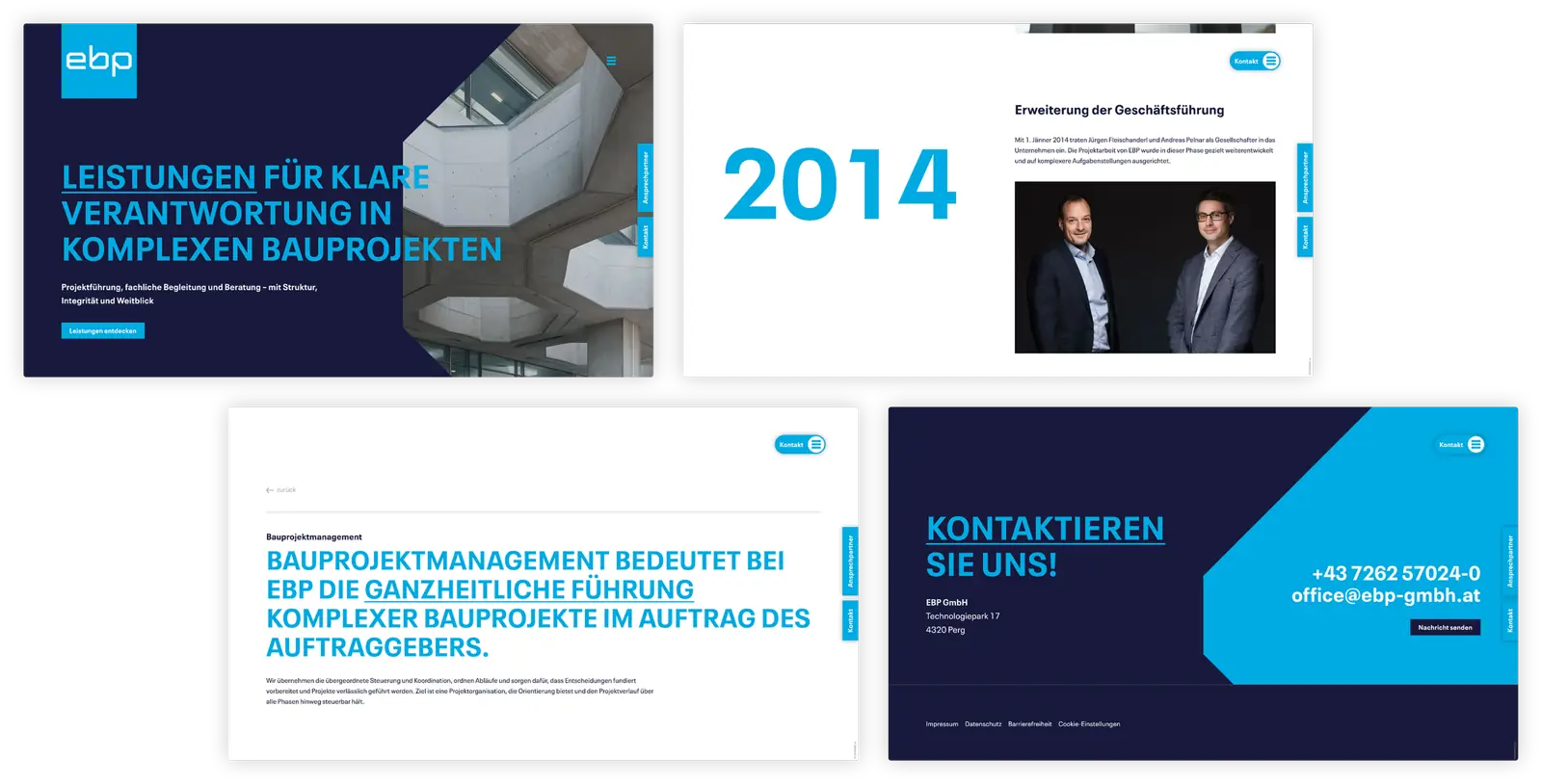
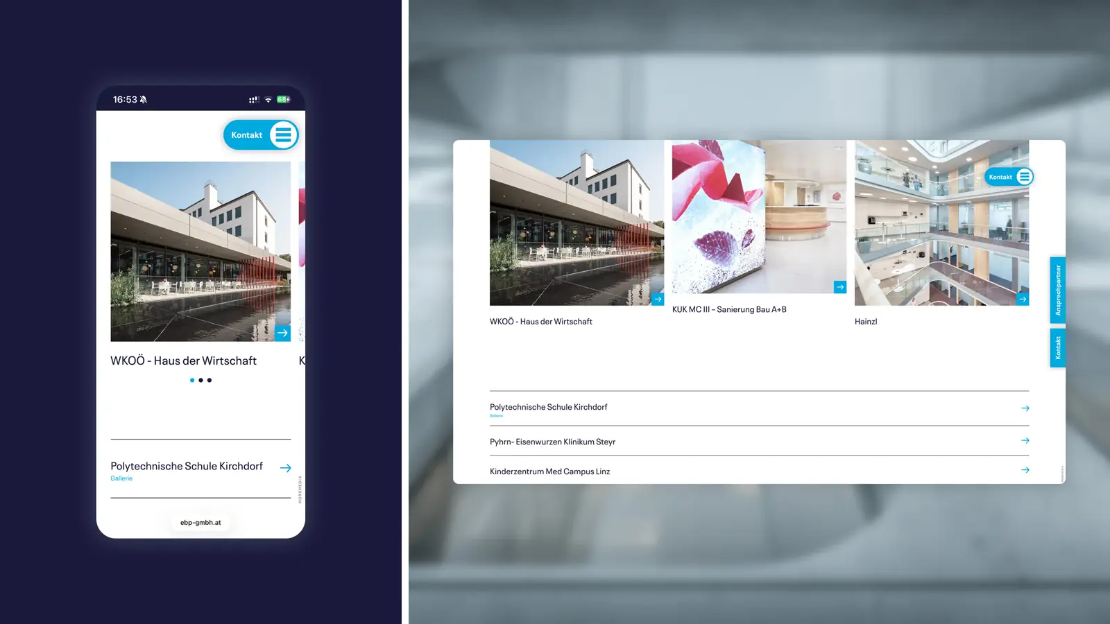
A reduced color palette, matter-of-fact typography, and a rigorously ordered layout system reflect the company's attitude: calm, clear, dependable. Imagery and design details present construction projects as a structured process – sharpening EBP's role in the eyes of clients.
How do corporate design and website interlock?
The design system and the website use the same building blocks – colors, typography, components. This creates a seamless presence from the first visibility on the construction site to the moment of contact. On the website, services are organized by levels of responsibility, guiding clients directly to a project consultation.