Three companies giving one shared brand personality, sharpening strong values, and carrying tradition into the future.
In this project, three established companies within the group were merged into a single shared brand presence. For many years, we have supported the companies of the Reder Group as their agency and were privileged to help shape this significant step strategically. The goal was to preserve established structures, long-standing experience, and existing values while developing a clear, future-proof brand. The result is a consistent presence that provides orientation, strengthens the group's identity, and lays the foundation for a shared path as a strong unit. Three companies of the REDER Group, now one unified, unmistakable brand.
Great stories take time – take a moment and discover in the following video the journey from tradition to the new corporate design.


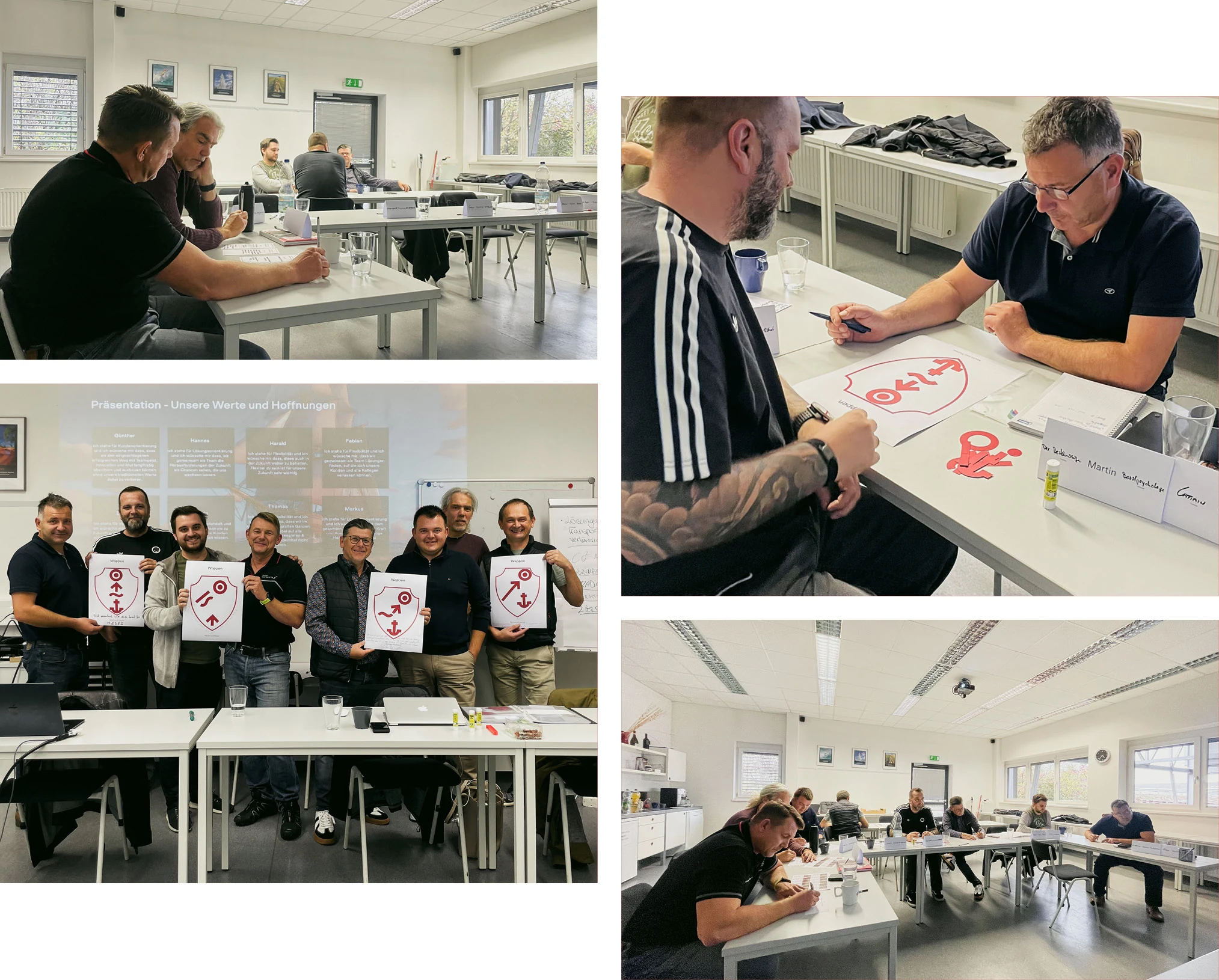
It all began with an exciting workshop to jointly align and develop the new brand
In a joint workshop, the future direction of the brand was developed. In the form of a guided hero's journey — staged as a sea voyage — the participants developed a clear picture of their shared future. The goal was not to merge individual perspectives, but to create a common foundation supported by everyone in charge.
In this structured process, the central elements of the new brand were defined together — from the company name to a strong symbol that will also be used on its own as the brand's emblem in the future. The result was not an imposed brand image, but an identity developed from the strengths of the existing companies and supported by everyone involved.
On this basis, clear strategic decisions could be made that lastingly shape the new brand presence while preserving the connection to the company's long-standing tradition.
Design relaunch with a clear line and modern direction
As part of the brand relaunch, a new visual identity was developed that deliberately takes a clear step toward the future while subtly carrying forward the company's long-standing tradition. The goal was to create a modern, distinctive design that makes strength, reliability, and progress visible.
On this basis, a comprehensive brand design was created with a clearly structured, easy-to-use design system. It enables consistent implementation across all applications, can be used flexibly, and ensures an unmistakable appearance.
The new visual identity thus combines modern clarity with an attitude that keeps the brand's origins tangible.
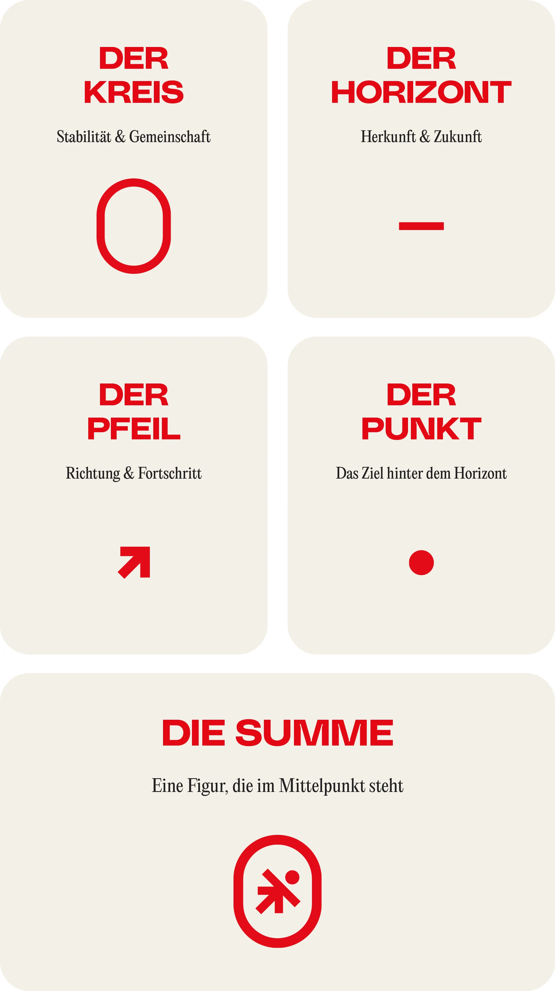
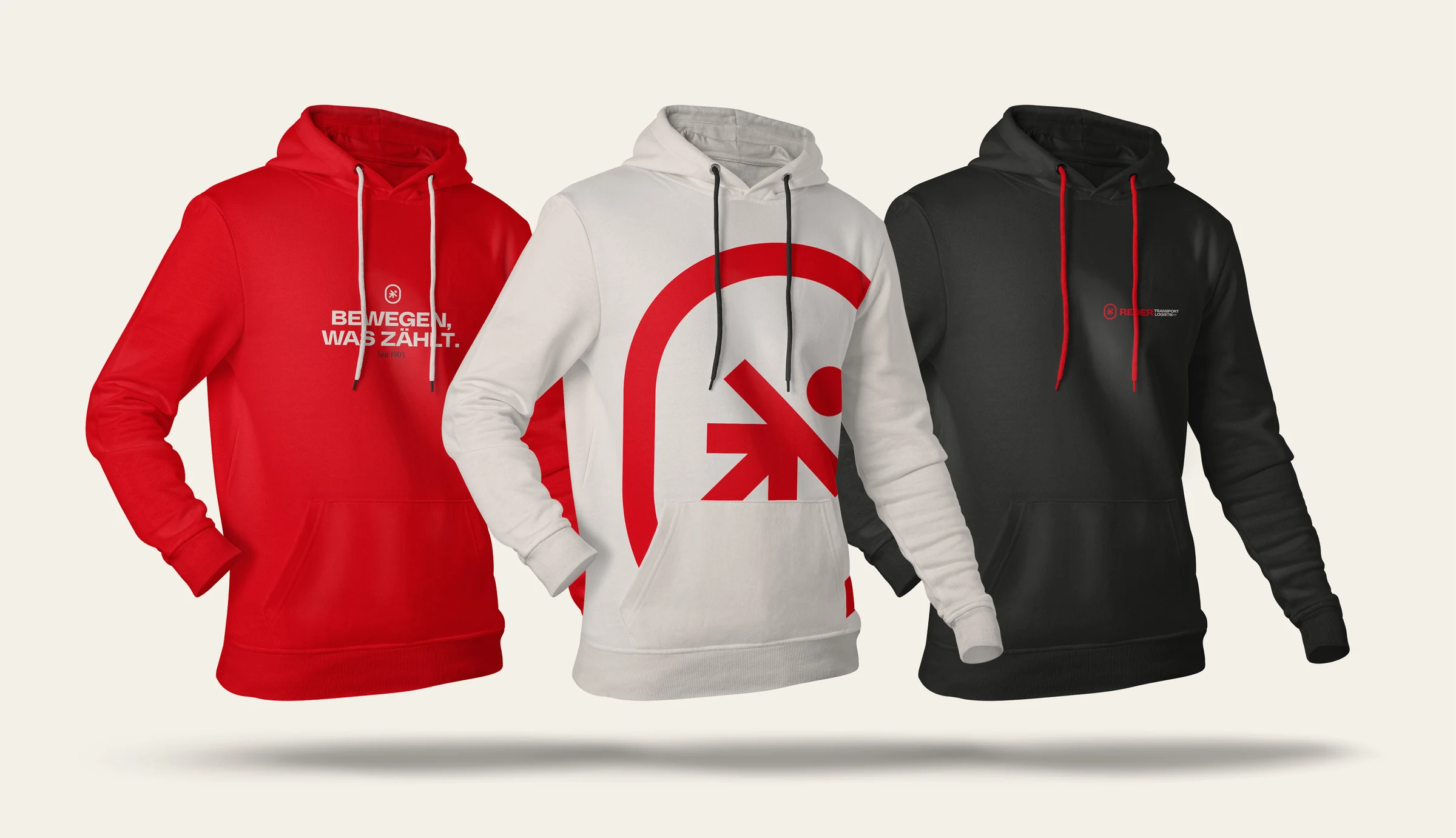
A strong emblem as a visible symbol of the shared brand
At the center of the new visual identity is a distinctive emblem, developed as the core visual symbol of the brand and consistently anchored throughout the entire design. It is both an integral part of the logo and usable on its own as a recognizable design element. The conceptual foundation of the emblem was already laid in the workshop: in a structured, democratic creative process, the participants defined the central elements that shape the identity of the new brand. These derive directly from the companies' core values and symbolize origin, attitude, and a shared sense of identity.
From these defined elements, a mark was developed that makes precisely these values visible – reduced to the essentials and clear in its message. The emblem unites the central aspects of the brand into a distinctive formal language, creating a strong, recognizable symbol. The creative execution and systematic applicability were developed by us as the agency. The substantive DNA and meaning of the mark, however, come directly from the companies themselves – making the emblem an authentic expression of the shared brand.
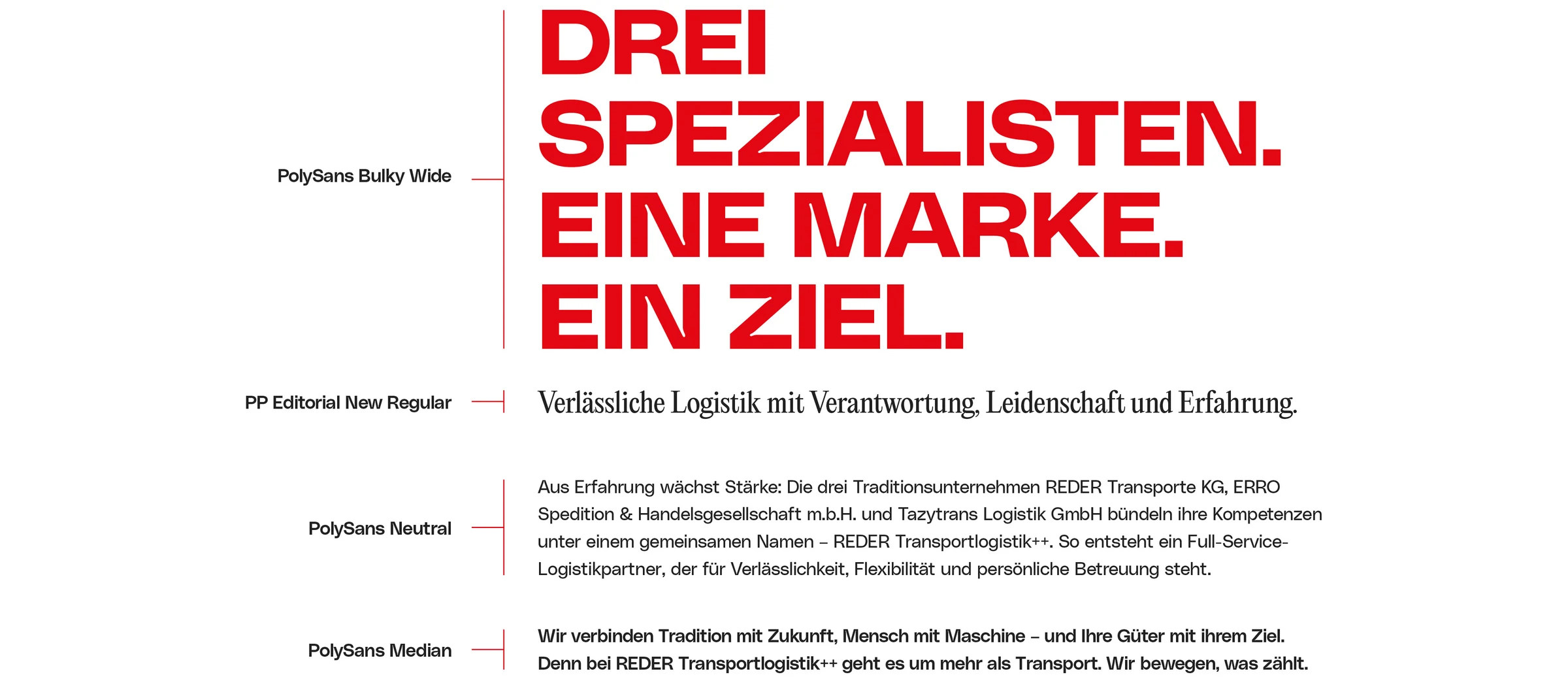
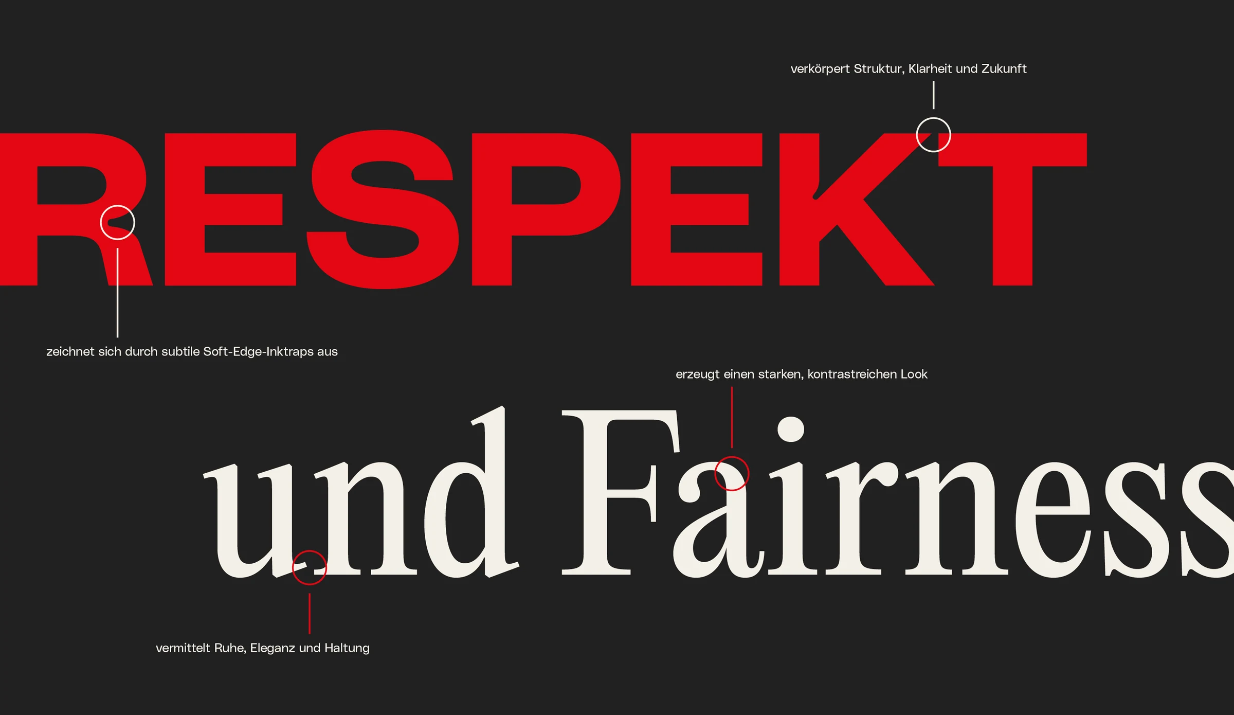
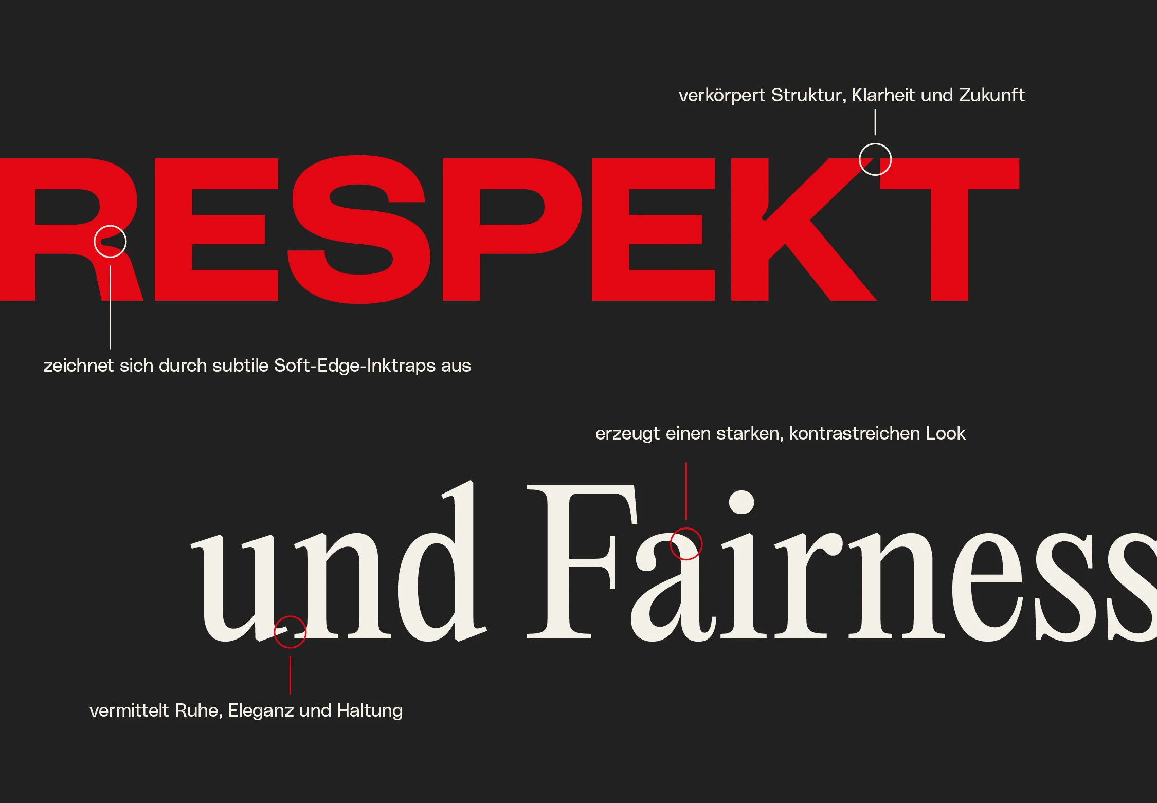
By combining a traditional serif typeface with a modern, precise grotesque, a typography emerges that preserves heritage while consistently looking ahead.
A new slogan that connects attitude and origin
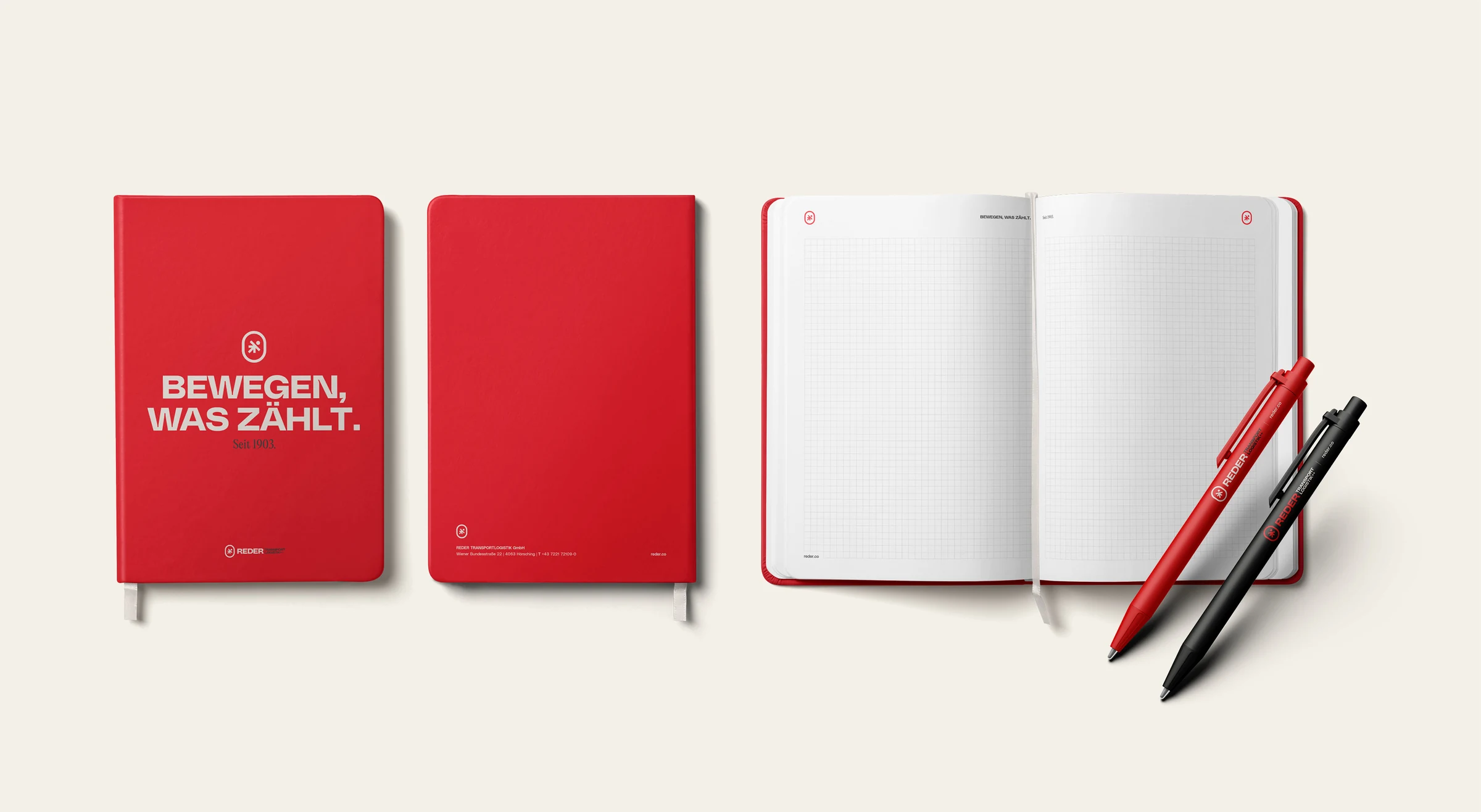
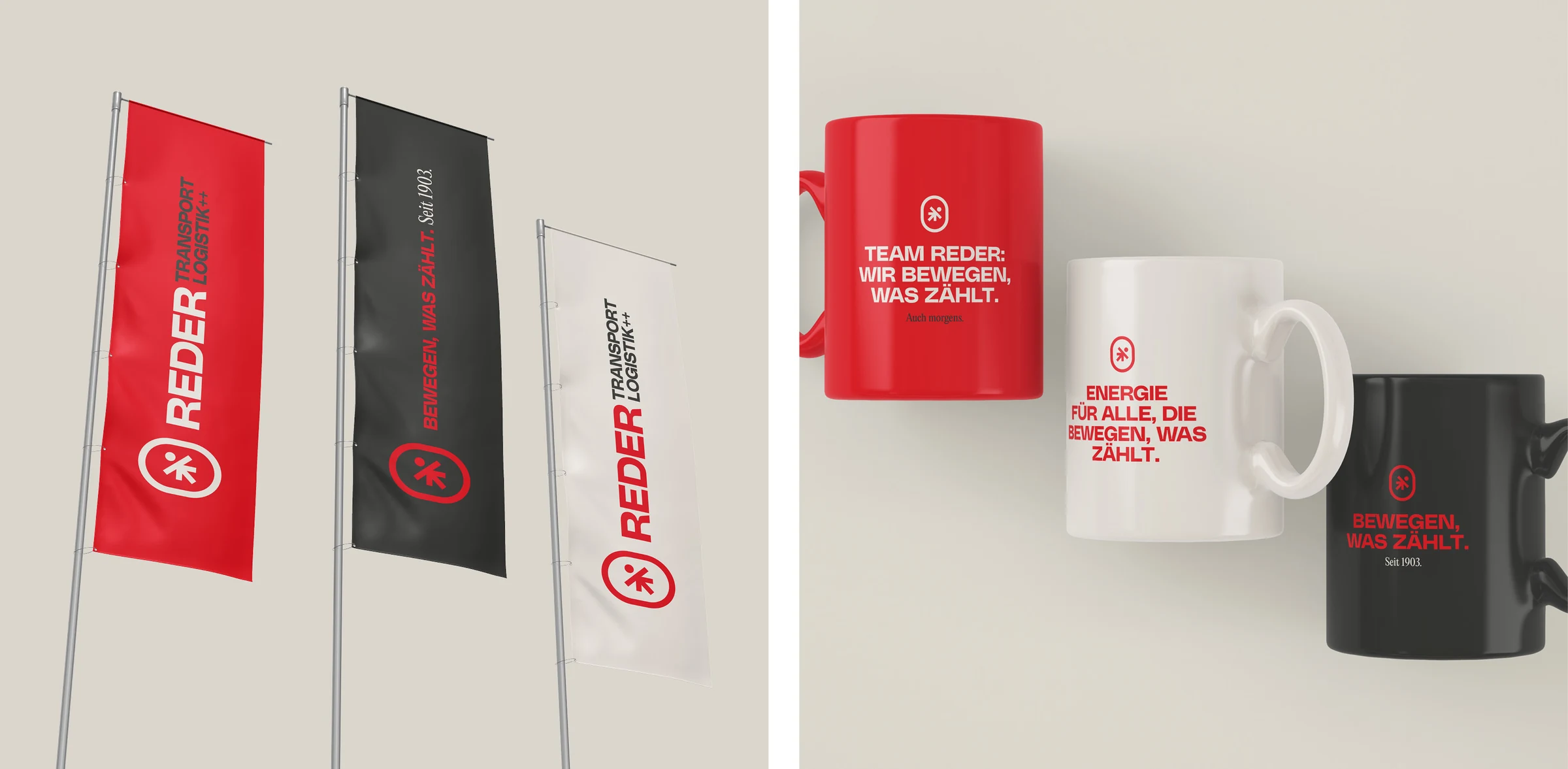
With “Bewegen, was zählt. Seit 1903.” — “Moving what matters. Since 1903.” — a slogan was developed that captures the essence of the brand. “Bewegen” (moving) stands for dynamism, progress, and the ambition to actively drive things forward, while “was zählt” (what matters) emphasizes the significance and responsibility behind every service. The addition “Seit 1903.” (since 1903) visibly anchors the slogan in the company's long history and makes clear that today's strength is built on established values and experience. The result is a clear message that connects present and heritage, giving the brand a distinctive, recognizable voice.
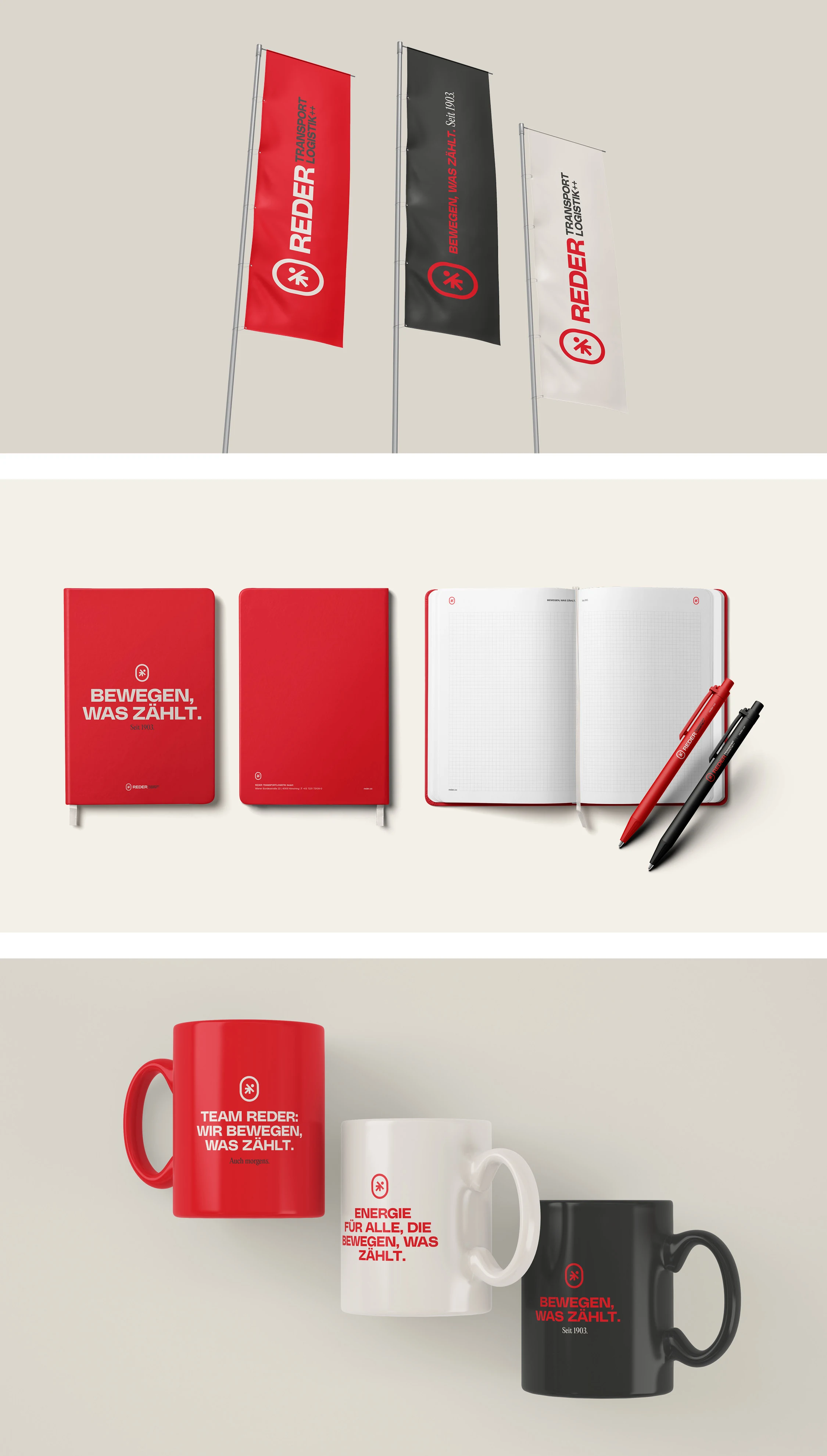
Design elements with a strong brand signature
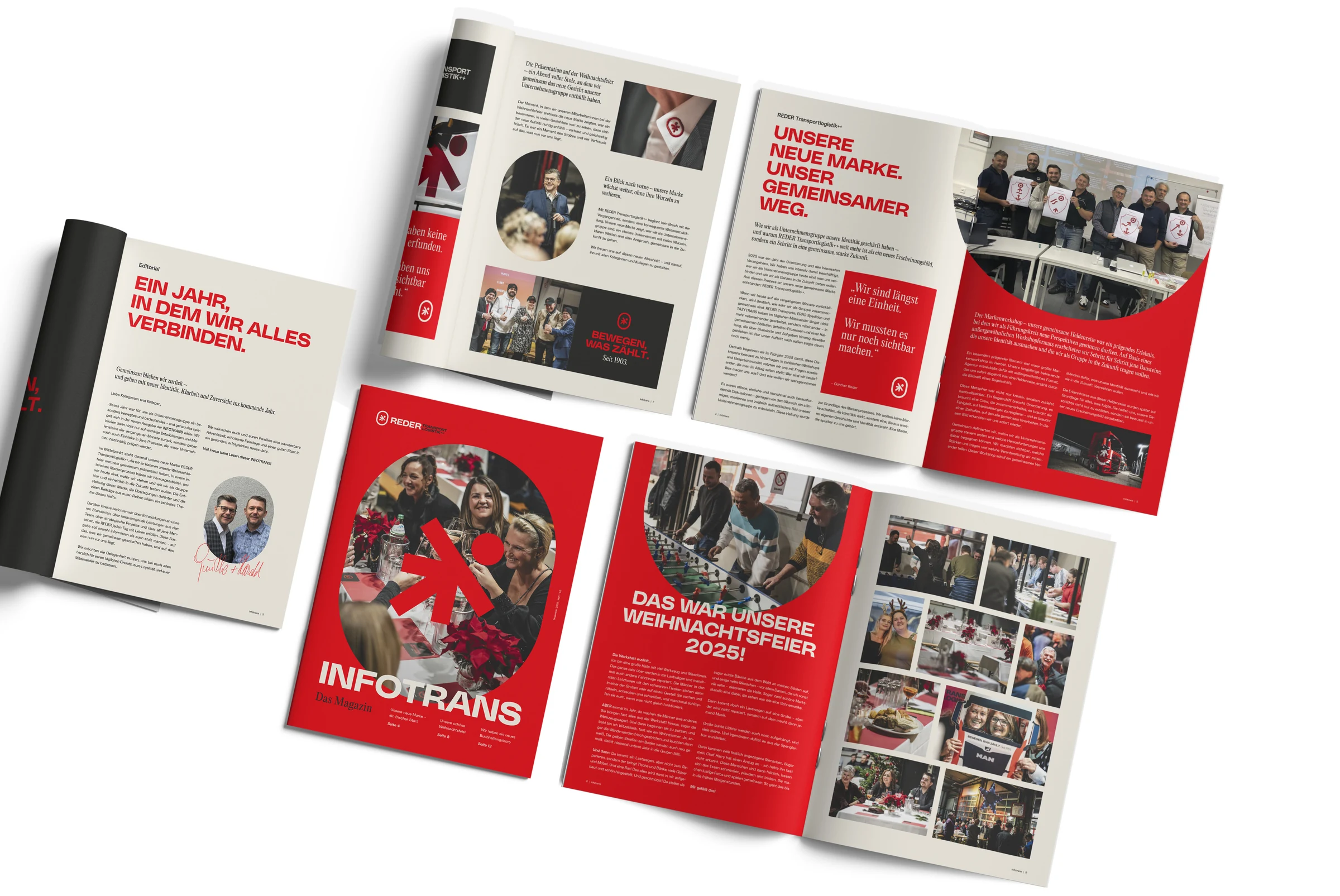
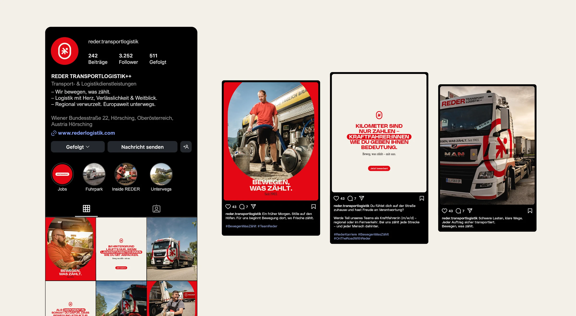
The signet forms the basis for central design elements in the new visual identity and extends the brand with a striking, flexibly usable formal language. It is used not only in the logo but deliberately as a standalone design element, creating a clear visual identity across all applications. The slogan, too, is consciously used as a distinctive design element and contributes to the brand's recognizability. Applied in clearly defined variants, it creates a consistent interplay of symbol, typography, and message. The foundation is a clearly structured set of rules that enables simple and reliable application – including in day-to-day use within the company. Because only when design is comprehensible and practical does the consistency emerge that lets a brand appear strong and unified in the long term.
A corporate design only works if it is simple and clear to apply in everyday use. That is exactly why the brand book defines understandable rules that provide orientation without overcomplicating. This ensures that the brand is not just designed correctly once, but used consistently and uniformly over the long term.
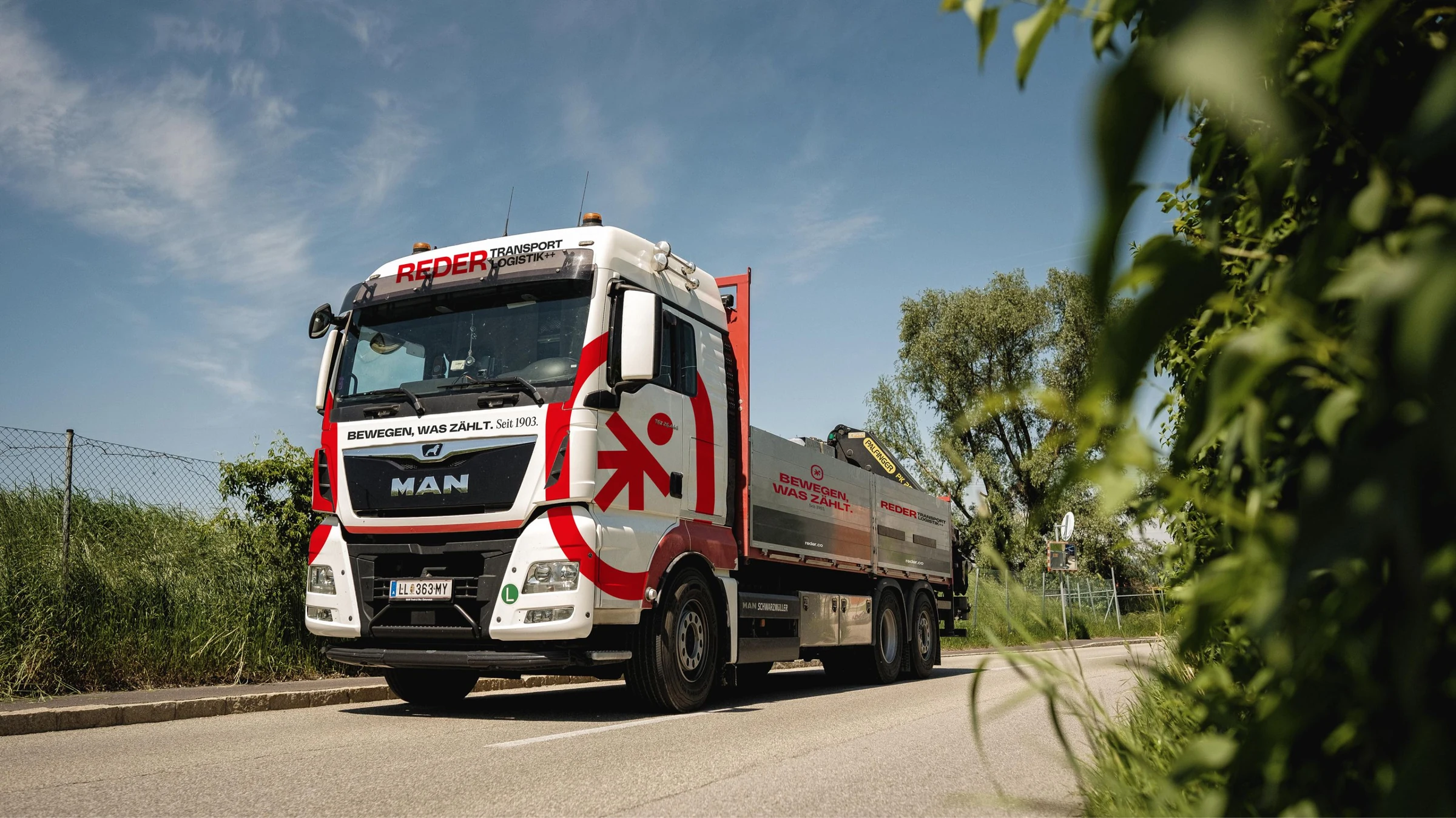
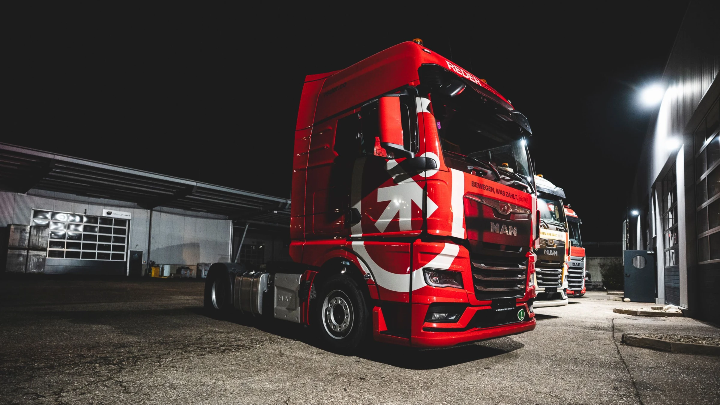
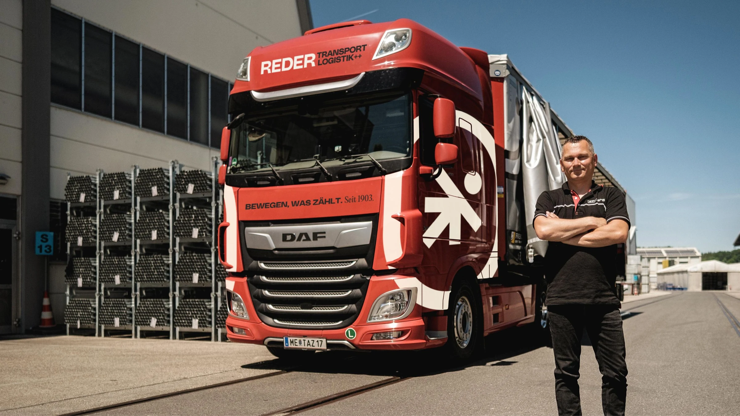
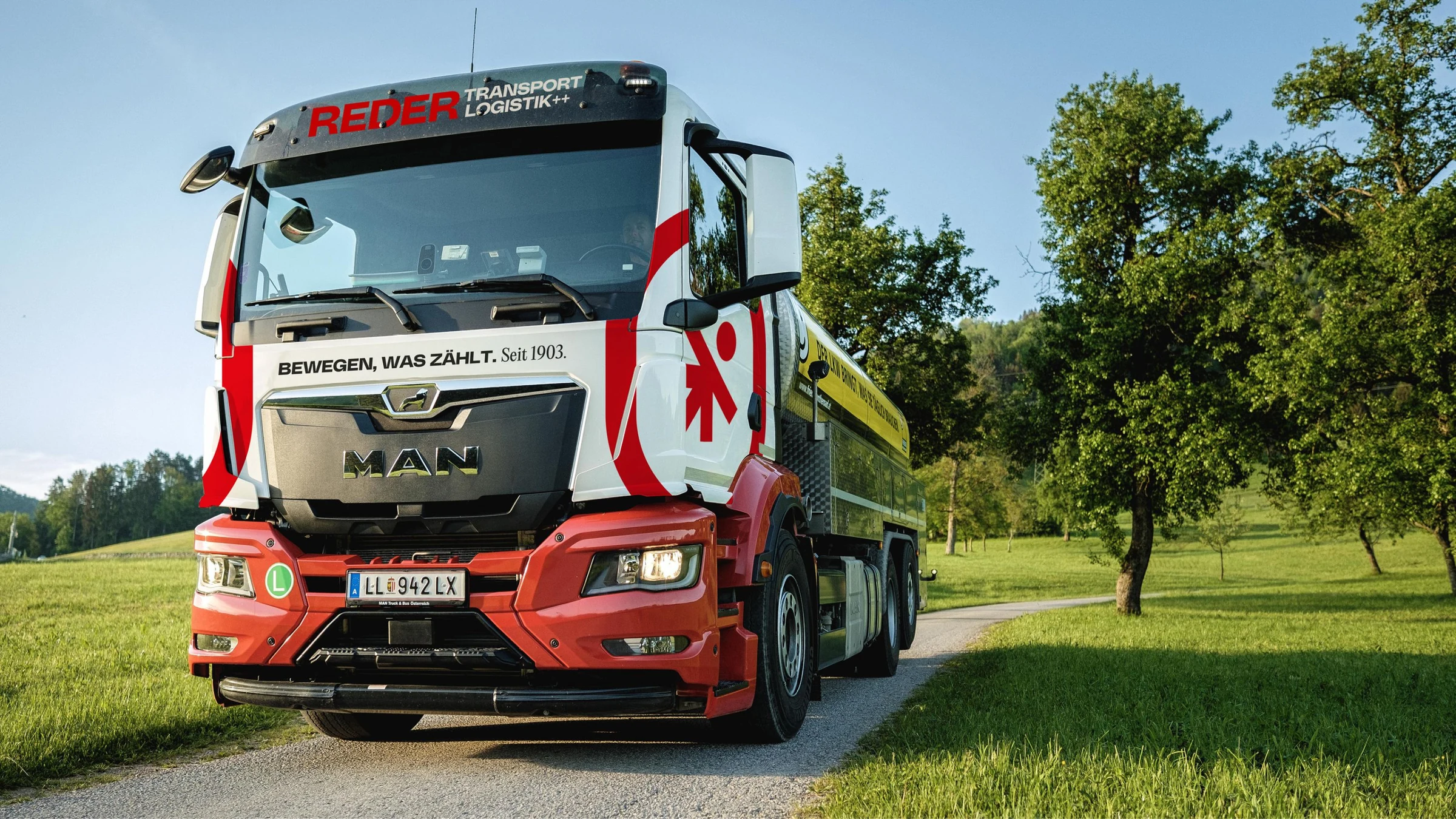
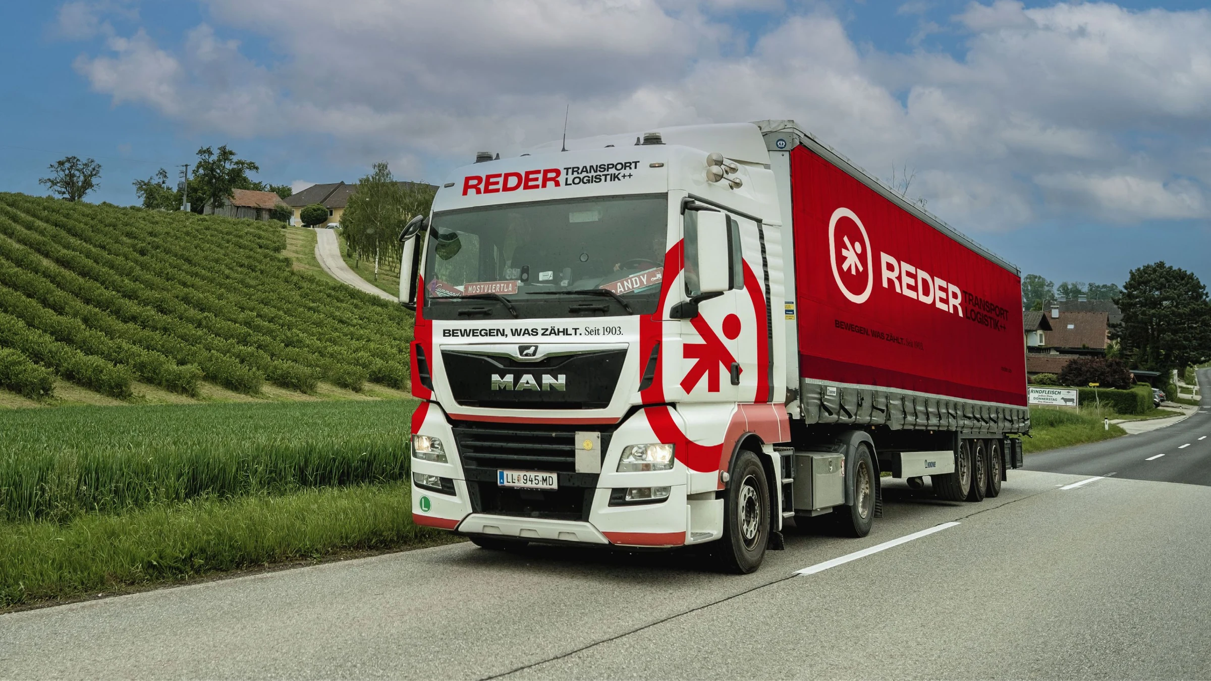
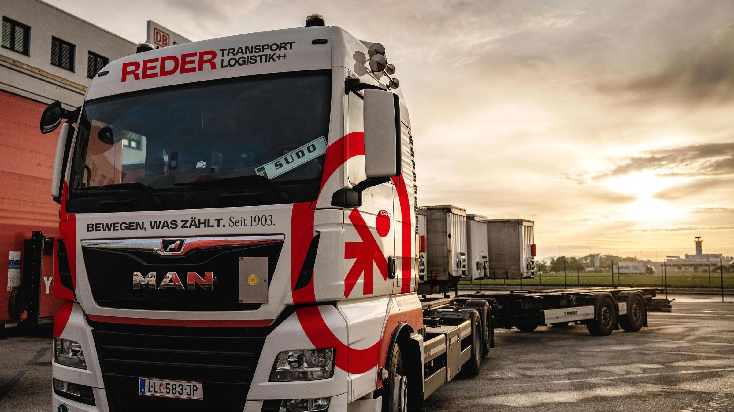
A vehicle design that grows – and always stays coherent
The vehicle design was conceived from the start so that the transition is an integral part of the solution. Existing vehicles and new vehicles were not treated separately, but deliberately brought into a shared system. This creates a harmonious, consistent overall picture on the road even during the transition phase.
The agate-gray cab is introduced step by step with each new acquisition. It picks up a defining element from the company's history and brings this tradition into a modern, striking form. This combination is exactly where the strength of the new appearance lies. The fleet thus evolves not abruptly but organically – toward a clearly defined brand presence that gains expression, recognizability, and strength with every vehicle.
Source: Google
Questions and answers about this reference project
REDER Transportlogistik stands for reliable logistics and transport solutions in Austria and across Europe. MOREMEDIA® developed a powerful new brand presence for REDER – from logo development to a complete visual identity that radiates strength, reliability, and professionalism.
What's special about branding for logistics companies?
Logistics companies communicate across very different touchpoints – from truck lettering and workwear to websites and business stationery. Good logistics branding has to work equally well on all of these surfaces – in bright sunlight, on small screens, and on large-format vehicle wraps.
How does MOREMEDIA® design its positioning workshop?
Our positioning workshop is not a standardized format — it is consistently tailored to the client, the topic, and the participants. The goal is not only to gather relevant facts but to offer everyone involved an exciting and engaging experience in which they can actively contribute to the brand. Every opinion is heard and flows into the result — creating a brand foundation the entire team stands behind.
How long does a professional brand presence stay future-proof?
A well-developed corporate design still looks timelessly modern after 8 to 12 years – it doesn't lose its impact when it's strategically conceived. Beyond that, we continuously evolve the corporate designs of our clients and enrich them with new elements to ensure a consistent, modern appearance over a much longer period.
What does a professional corporate design cost?
Entry-level offers for a lean basic corporate design start at EUR 3.000 at MOREMEDIA®. A solid, fully developed corporate design for SMEs and mid-sized companies typically ranges between EUR 7.000 and EUR 15.000. For larger projects, the finished brandbook typically comprises 80 to 120 pages – a comprehensive set of rules that leaves nothing to be desired and documents the brand bindingly for every use case.
How we worked
From the first briefing to the result — structured and transparent in clearly defined steps.
01 — Analysis
Brand audit of the existing identity, target audience survey, and positioning check.
02 — Strategy & Concept
Positioning workshop, rebranding concept with a new brand promise.
03 — Corporate Design
New corporate design including vehicle lettering, workwear, and digital templates for all channels.
04 — Digital & Rollout
Website relaunch, SEO optimization, social media rollout.
