Client

Landstrom

Brand building, brand design, and website

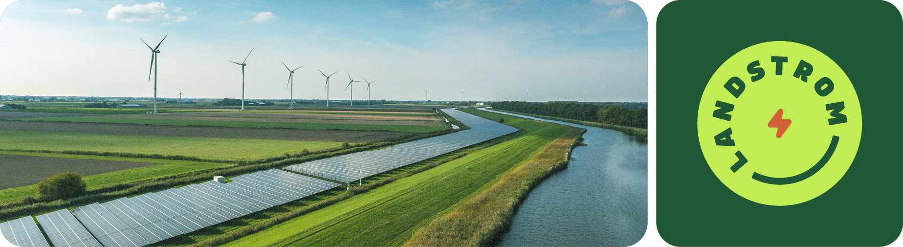
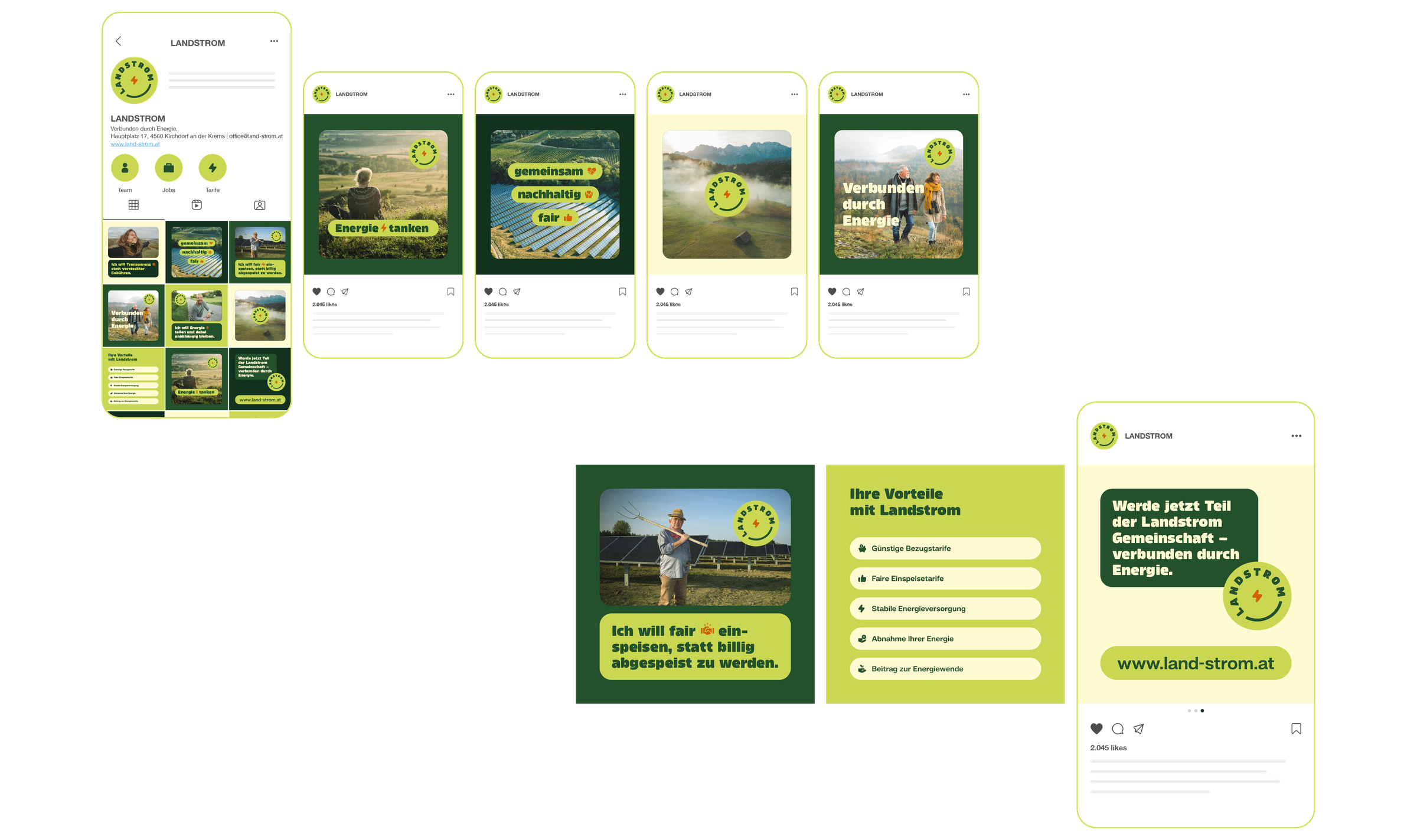
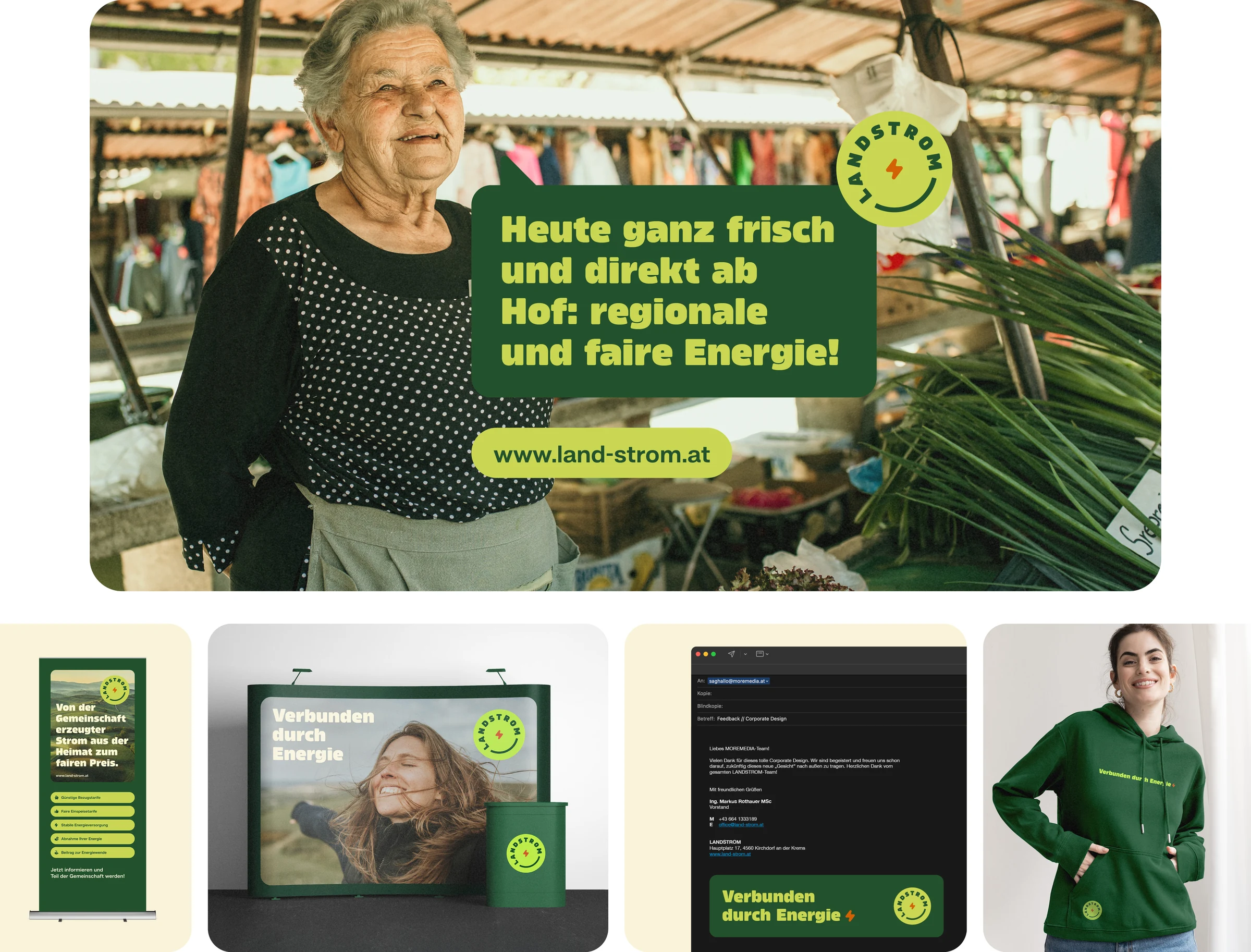
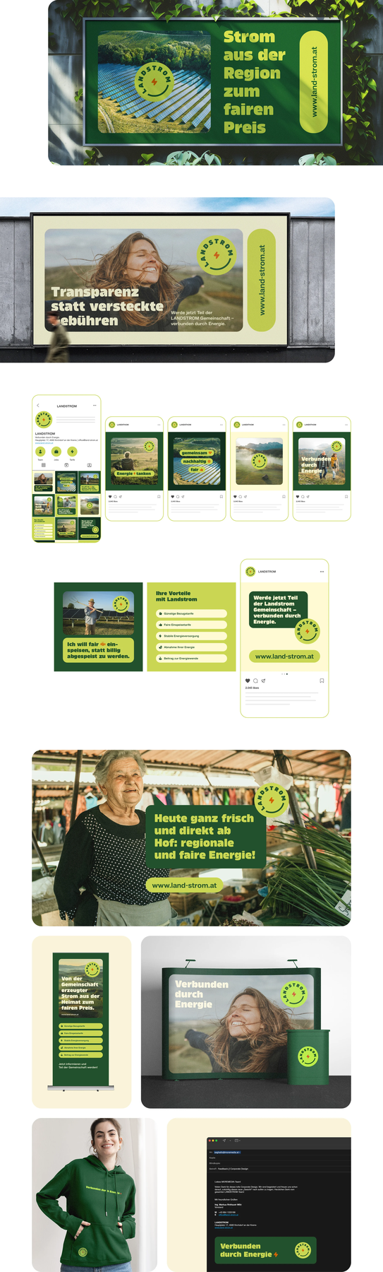
Connected by energy. How a bold brand design turns Landstrom into the leading brand for regional energy communities.

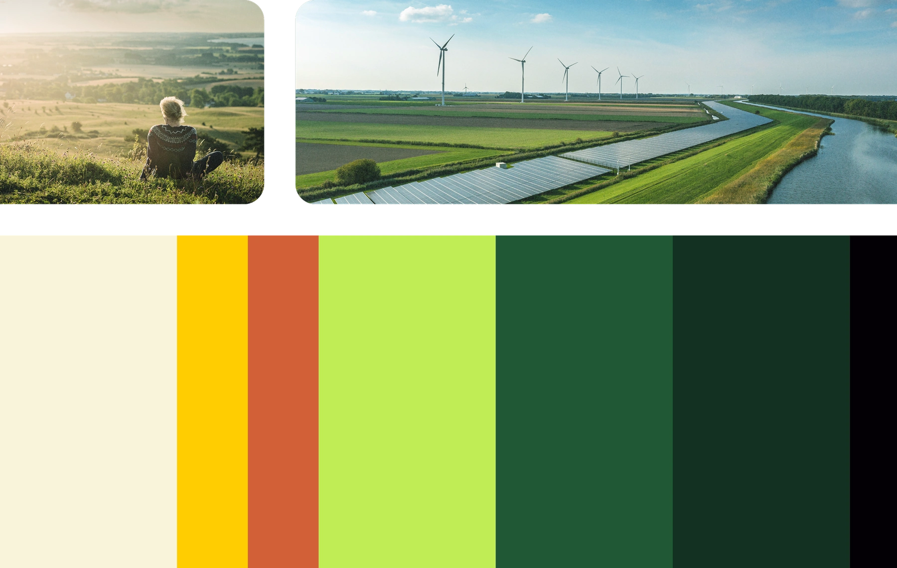
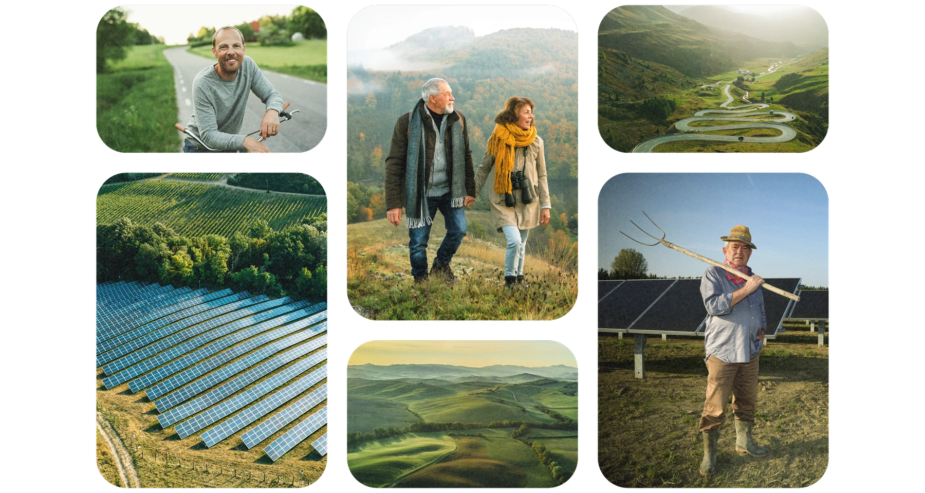
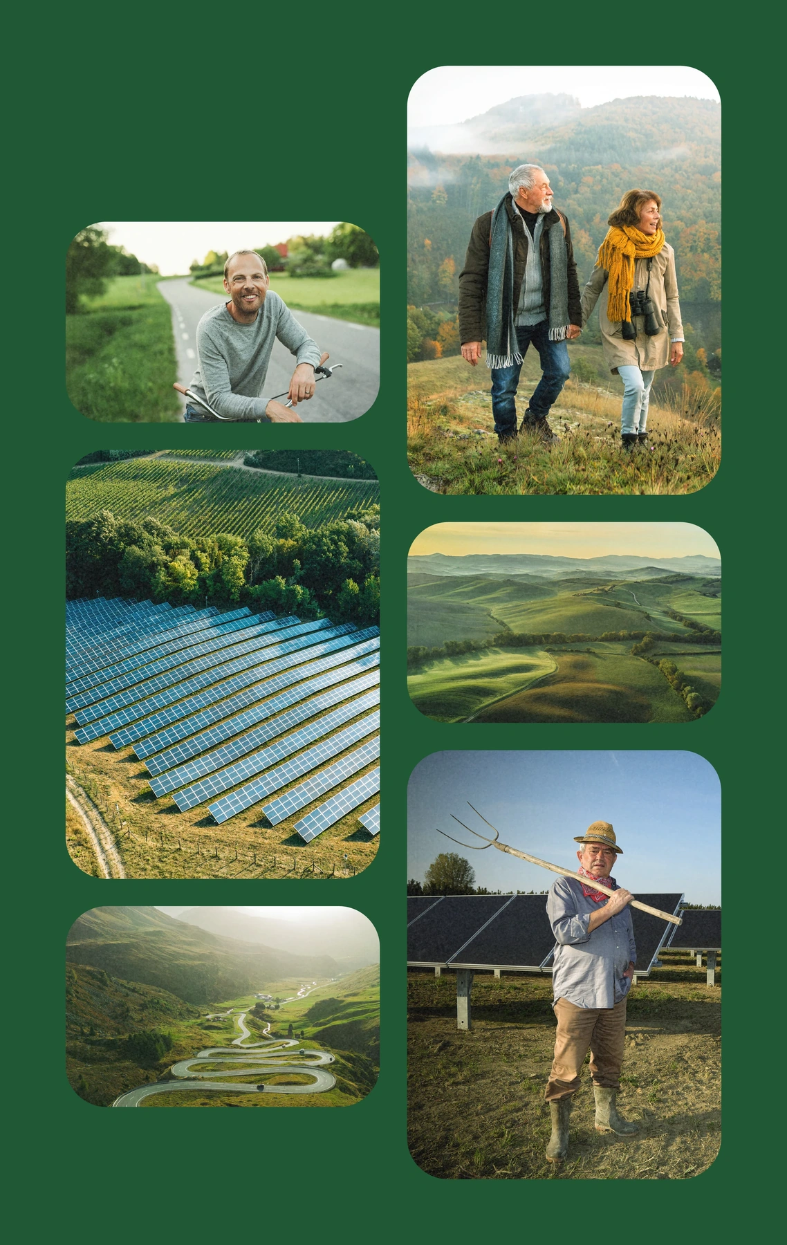
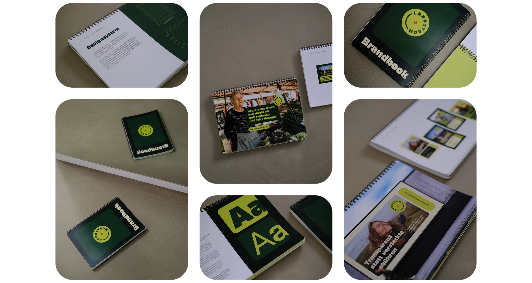
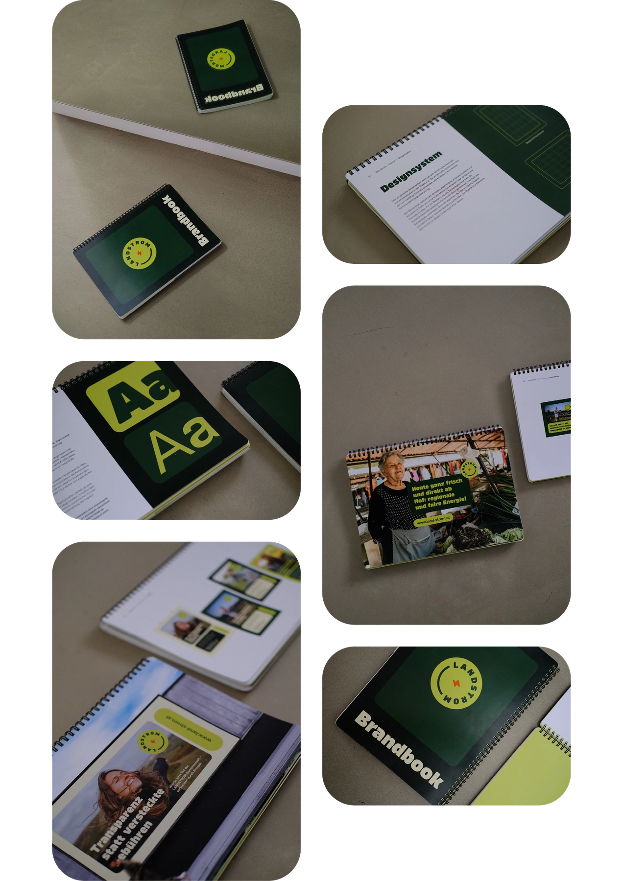
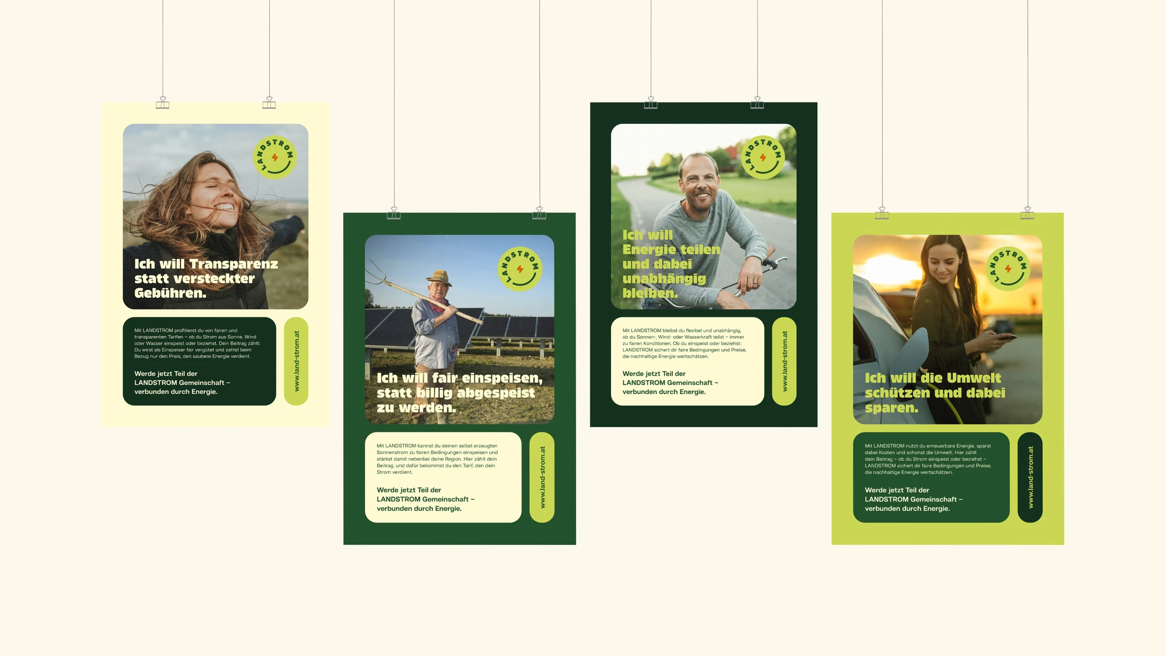
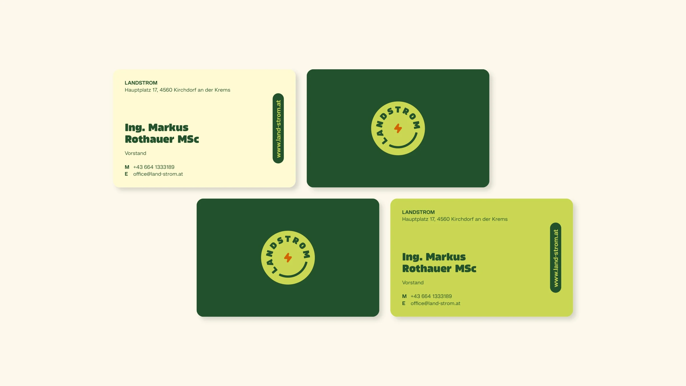
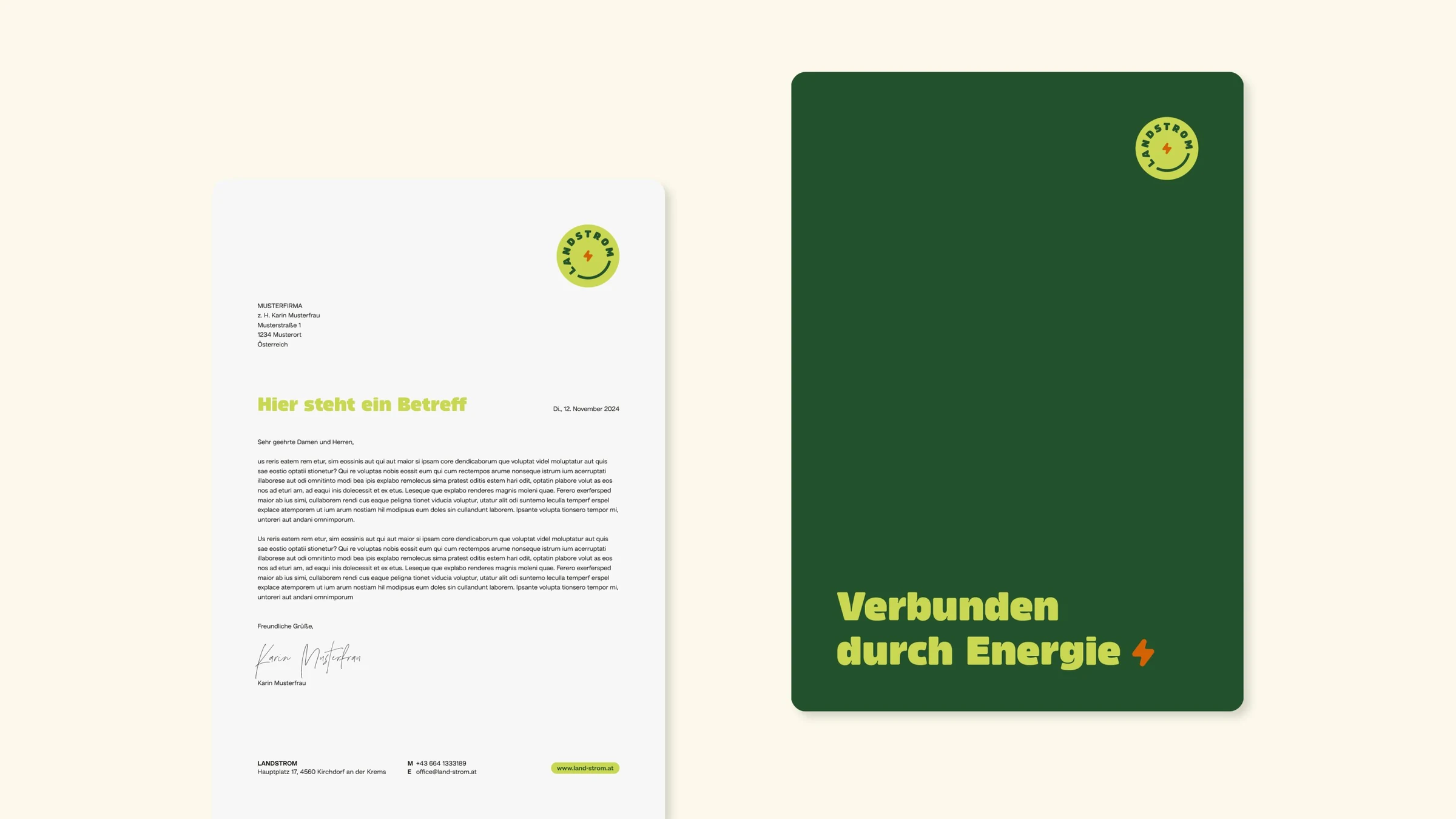
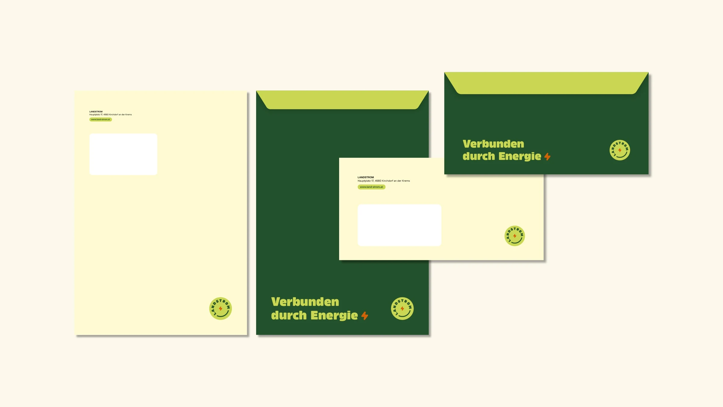
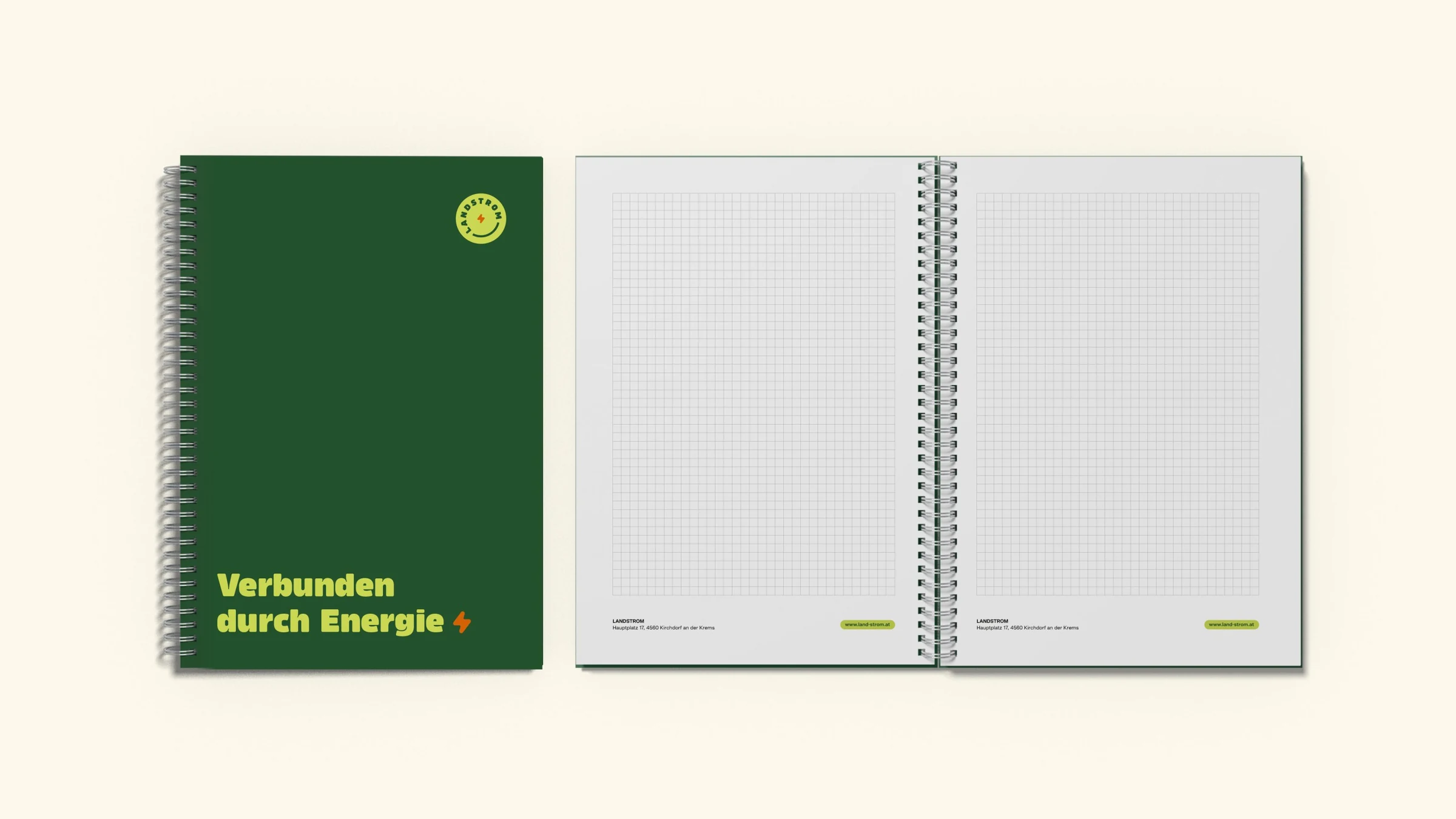
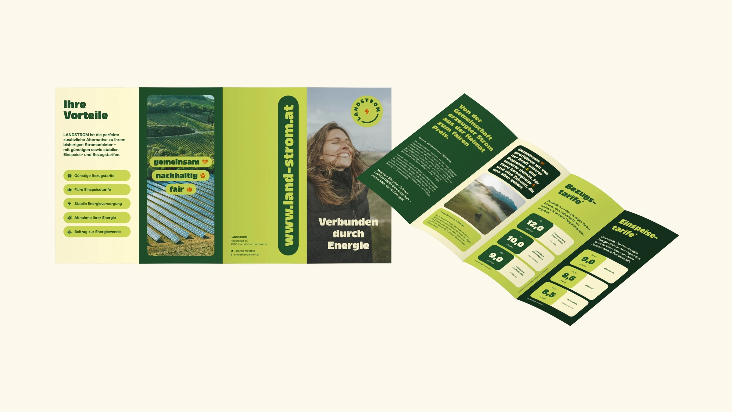
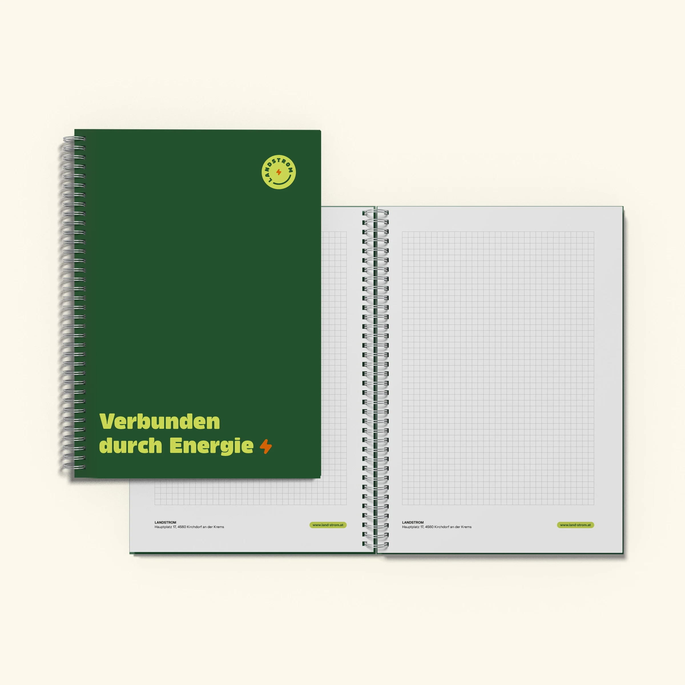
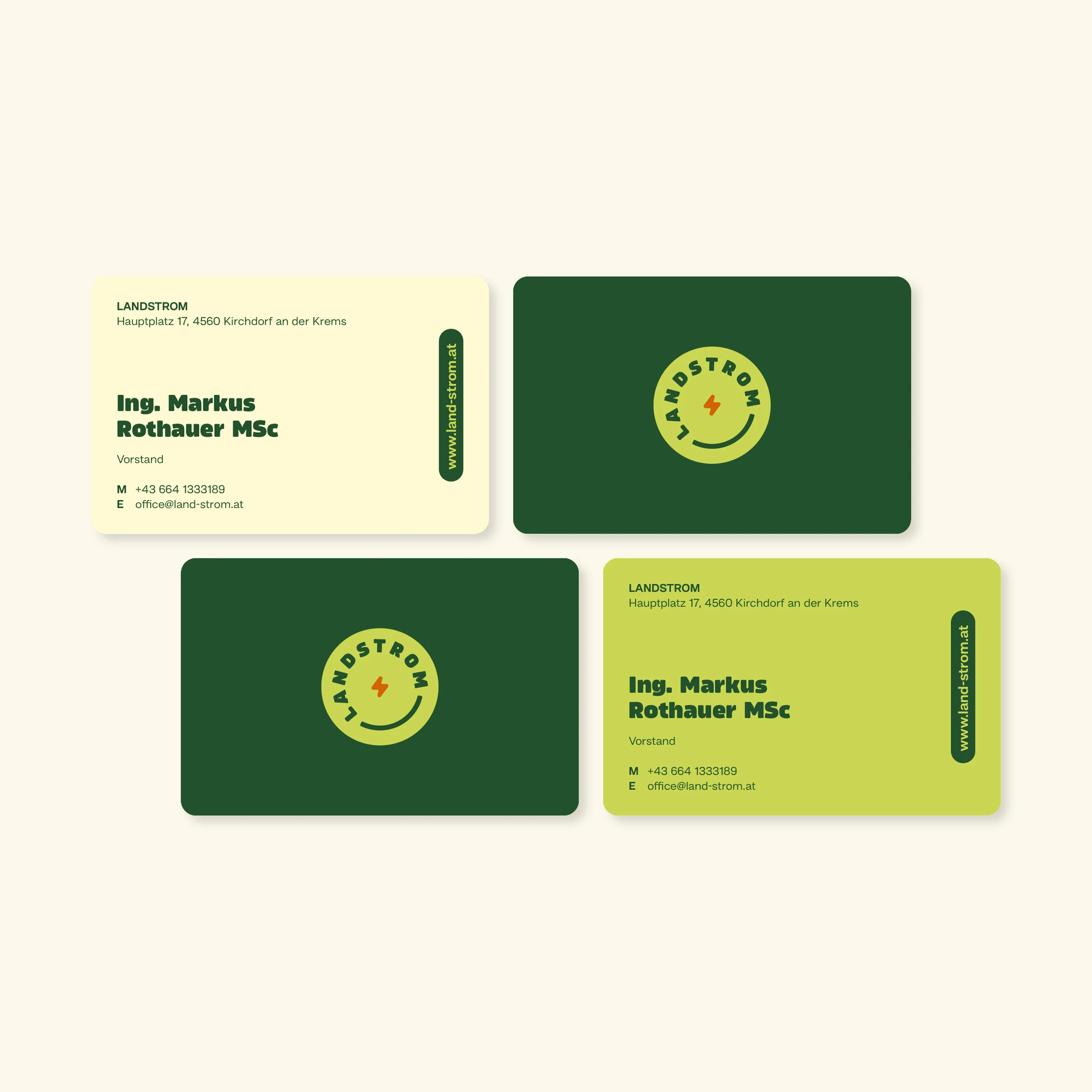
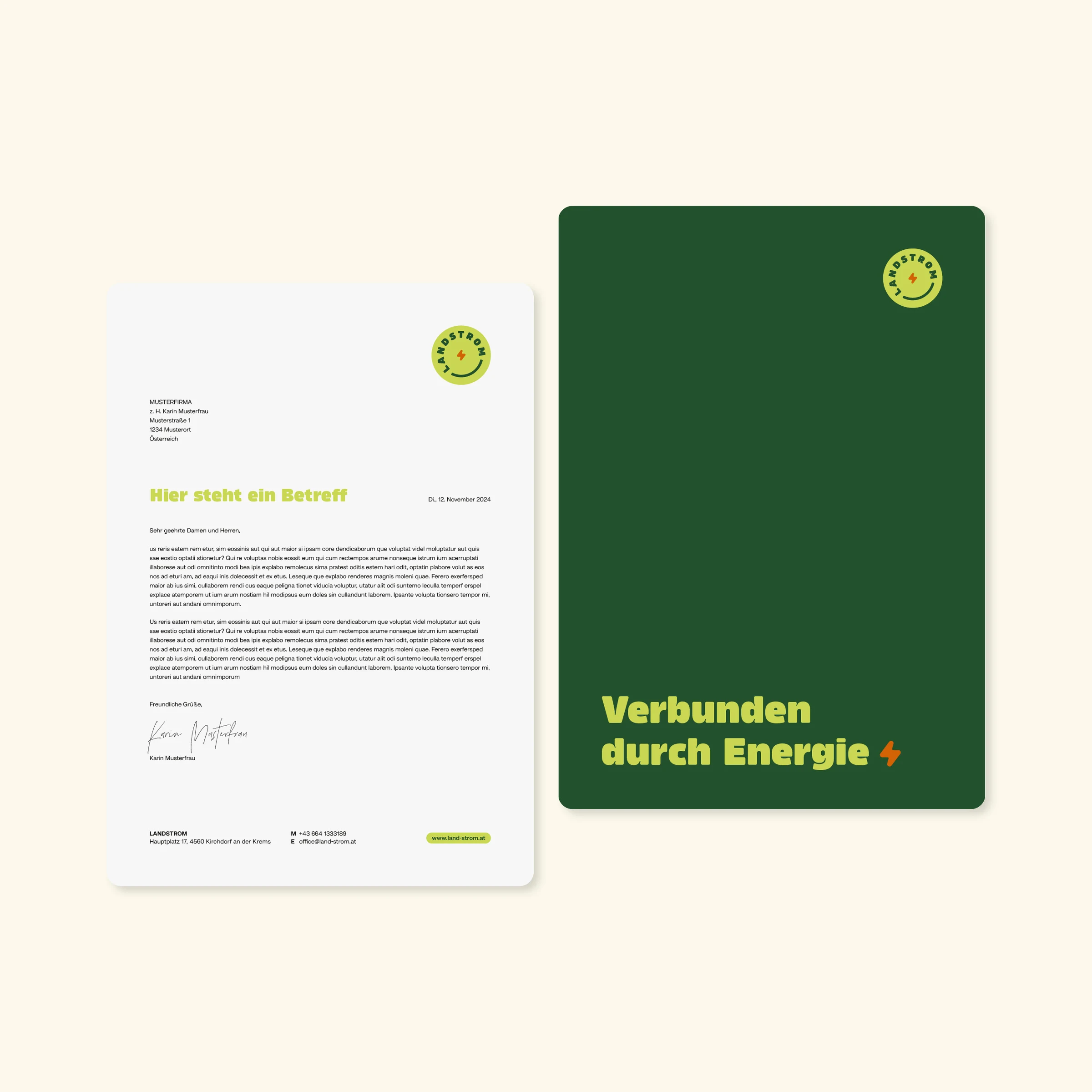
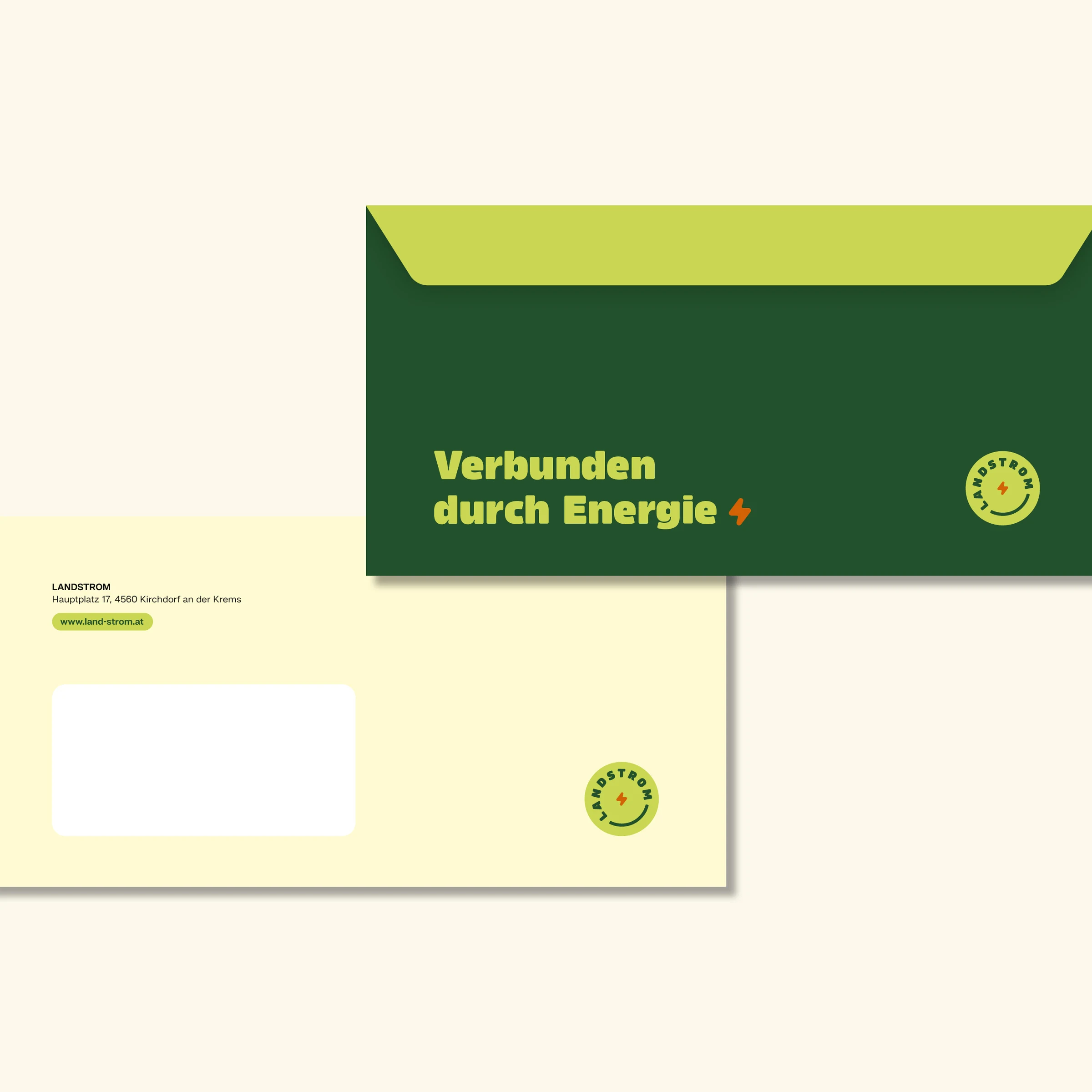
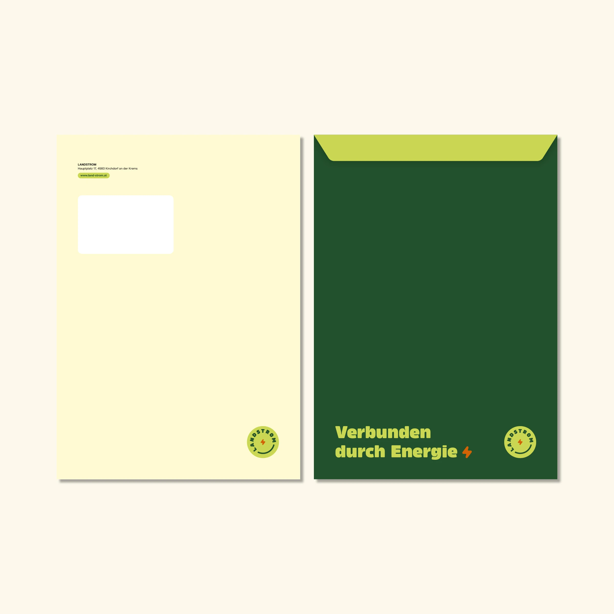
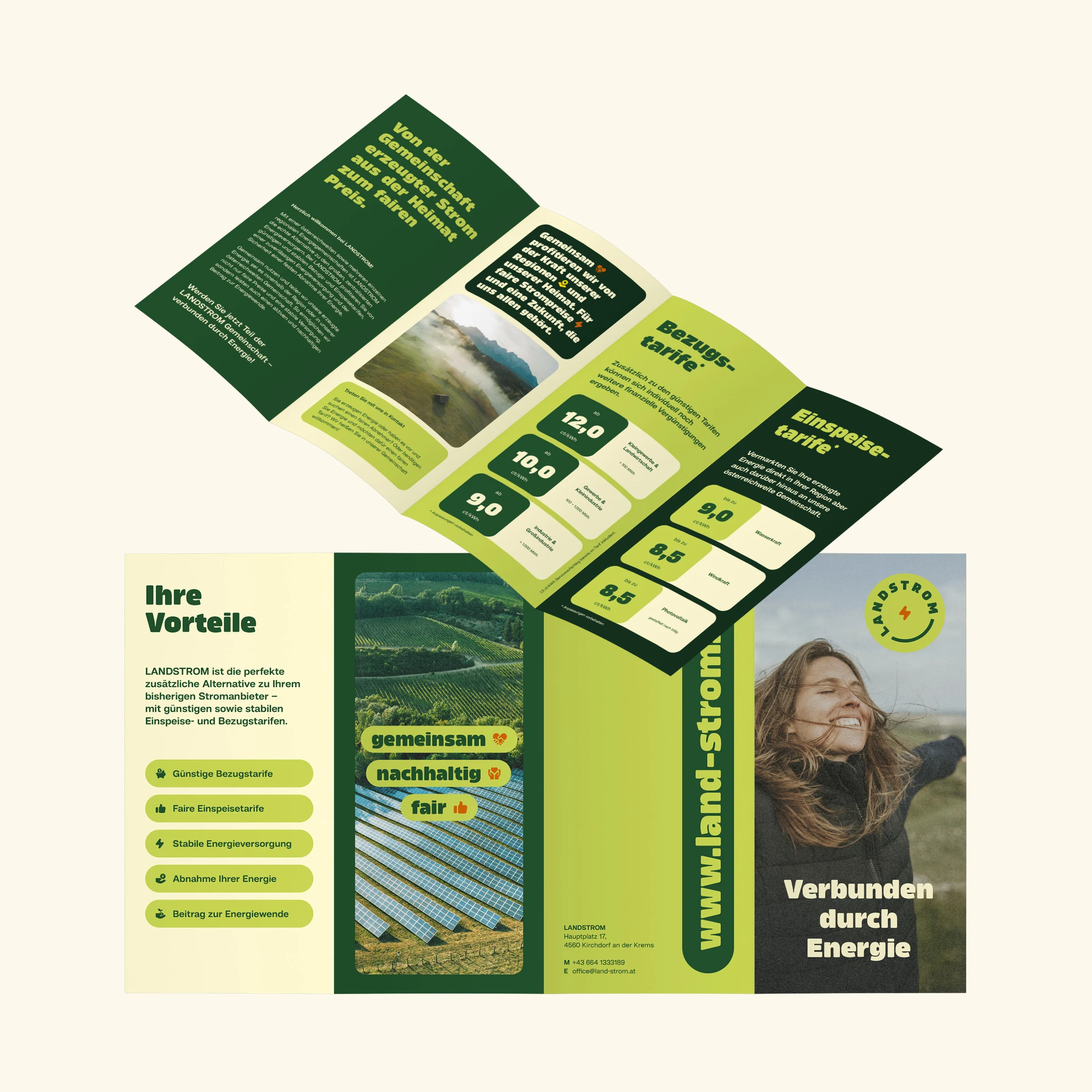
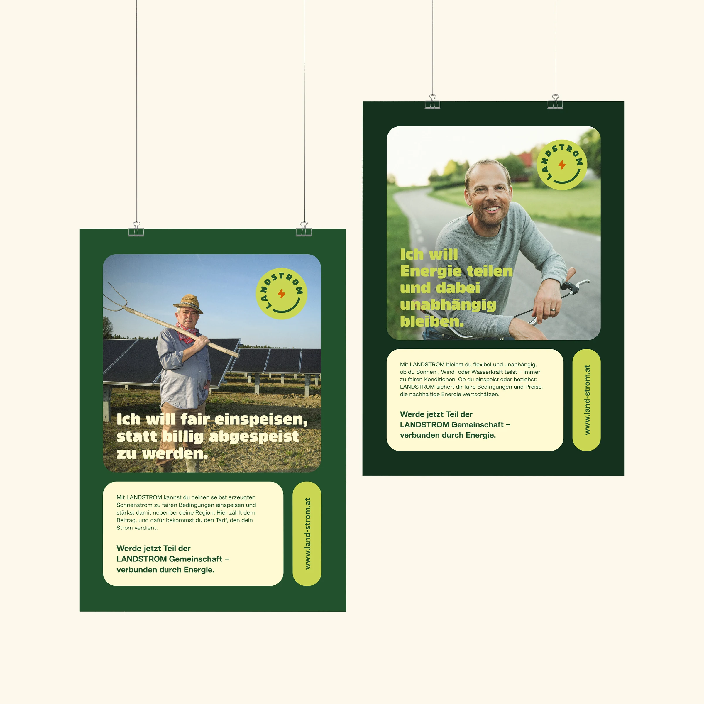
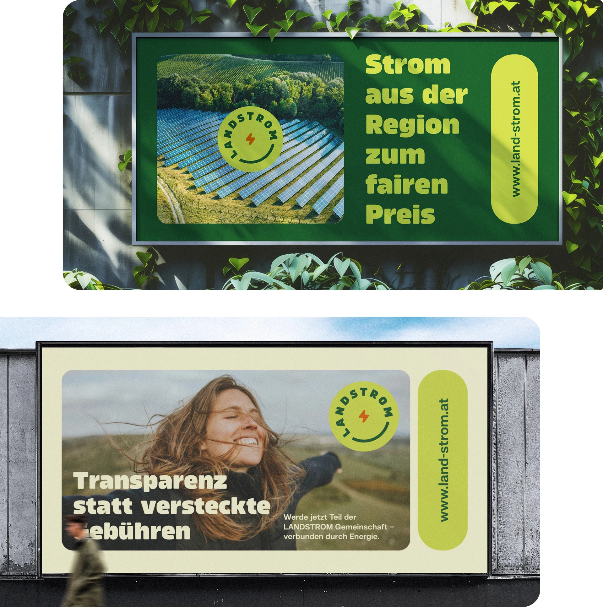
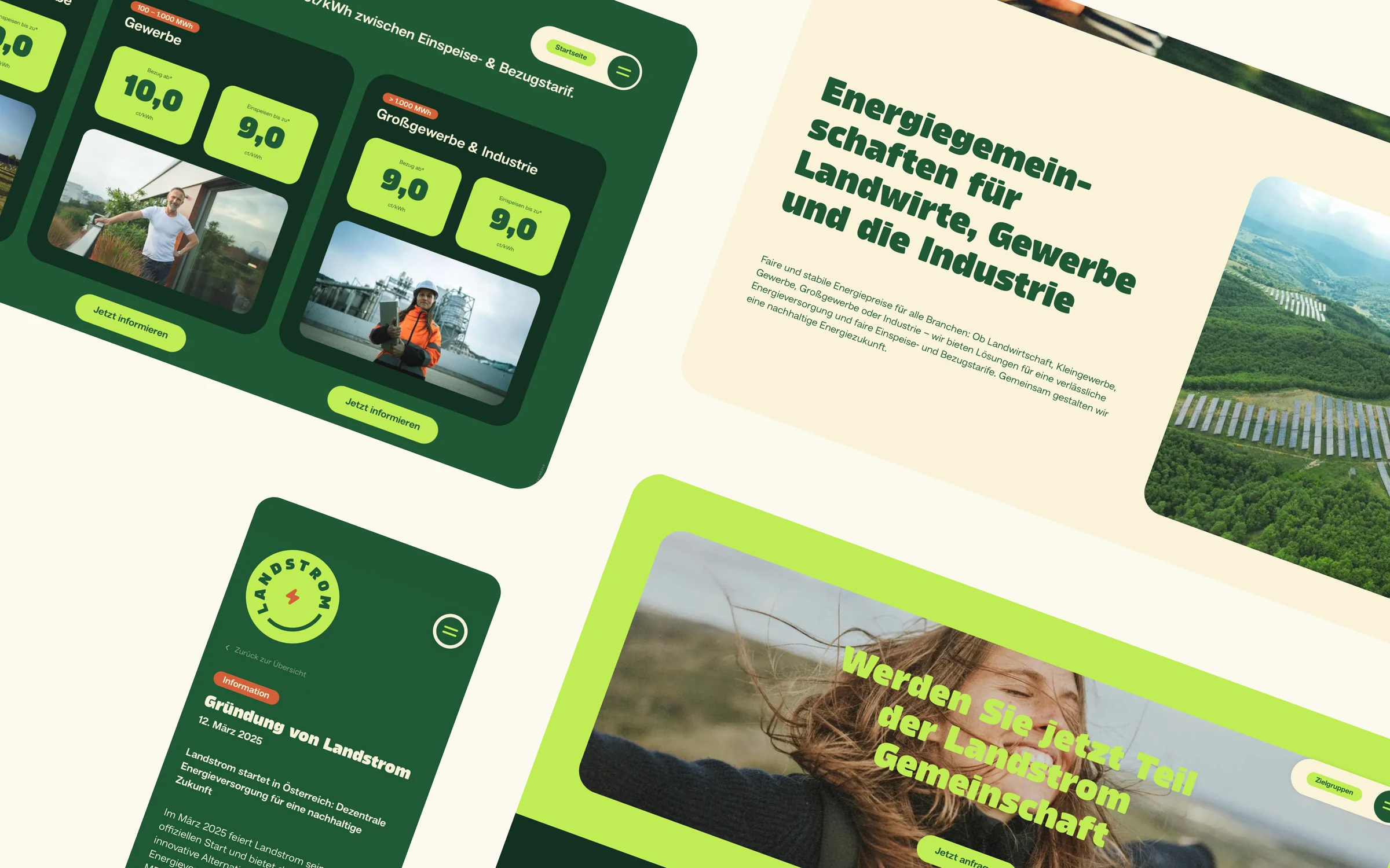
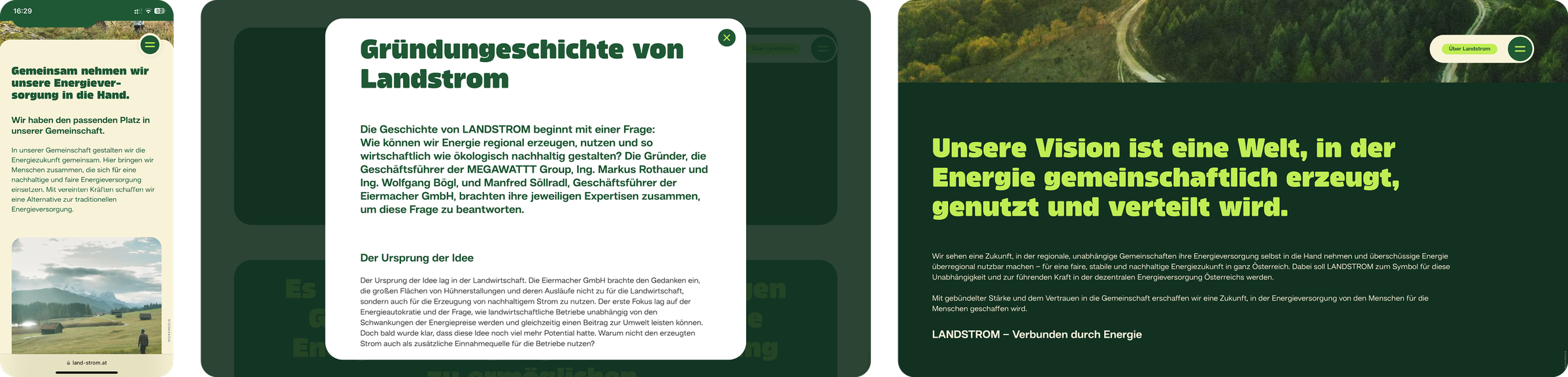
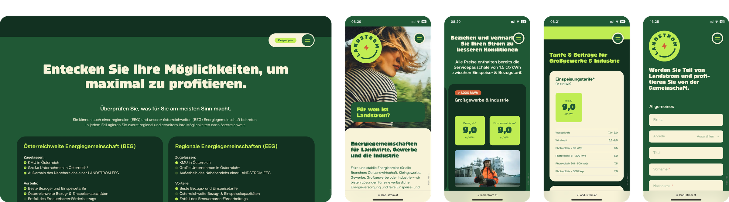
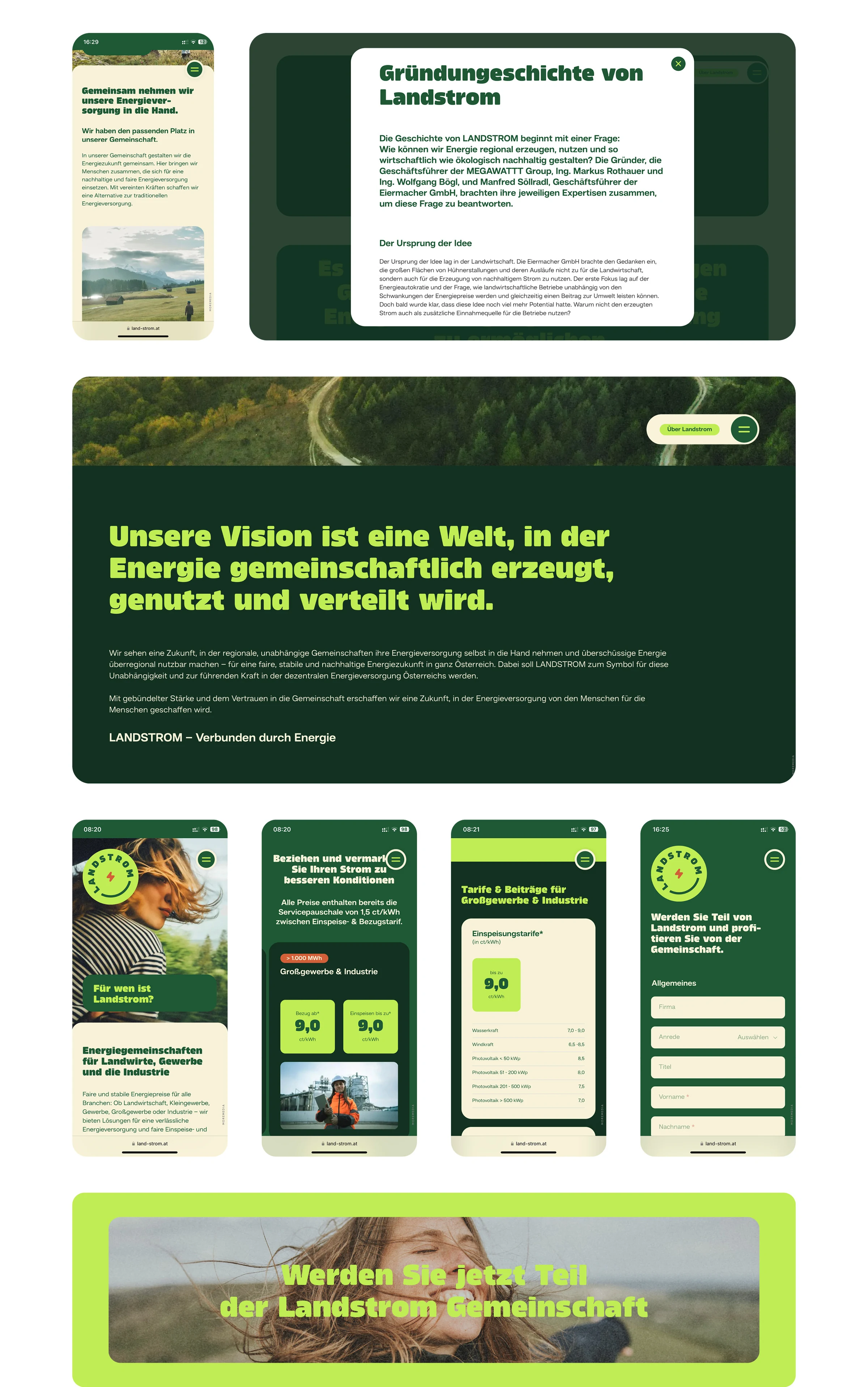
The joint brand workshop resulted in a clear mandate for holistic brand building: a new brand that credibly embodies independence, community, and future security. Based on the defined values of expertise, foresight, security, and holism, we developed a visual concept with soft curves, harmonious typography, and a natural green palette that radiates closeness and trustworthiness. The resulting brand design – including a detailed set of rules, a design system, and application examples – forms the foundation for all touchpoints: from the logo and marketing materials to the high-performance website. Every component carries the Landstrom mission of “enabling independent communities to access sustainable energy supply and distribution” to the outside world and brings the slogan “Verbunden durch Energie” (Connected by Energy) to life. The result is a fresh, confident brand presence that clearly sets Landstrom apart from the competition and underscores its role as a driving force of the decentralized energy transition.

A brand identity that clearly differentiates itself in the growing energy community market.

Visit website

From mark to brand: Landstrom’s iconic visual language with natural forms and an approachable charm.

With its soft curves and organic design language, the logo instantly conveys what Landstrom stands for: regional roots, collective strength, and renewable energy. The flowing silhouette evokes associations with natural cycles, while the powerful capitalization of “Landstrom” lends the combined word-and-image brand presence and reliability. The overall geometric shape also subtly recalls a smiley, giving the brand a friendly, familiar appeal that evokes positive emotions and comes across as likeable. A firmly defined clear space protects the brand in every application and guarantees a clear, confident appearance — from smartphone icon to trade fair booth. This makes the logo a constant point of orientation across the entire design system, anchoring Landstrom's mission of making clean energy a shared experience.

moremedia advertising agency linz landstrom 2
moremedia advertising agency linz landstrom 5
moremedia advertising agency linz landstrom 6
landstrom colors

Typography with clear expression and strong presence: Amfibia & Hando shape the visual voice of Landstrom.

Landstrom's typographic language combines distinctiveness with clear structure. Amfibia Black is used for the headlines – an expressive geometric grotesque with soft, flat-sided letterforms that conveys confidence and quality. It gives the brand a high recognition value and conveys its attitude: striking, but not loud.

In body copy, the geometric Hando ensures calm readability and a modern aesthetic. It is matter-of-fact, approachable, and ideal for both digital and print applications. Together, the two typefaces form a duo full of character that underscores Landstrom's commitment to clarity, quality, and authenticity.

moremedia advertising agency linz landstrom 10
landstrom mobile 7

When everyone understands how the brand works, the result is a presence that always feels familiar yet never gets boring.

The Landstrom brand book lays the foundation for exactly this ambition: a unified appearance with room for creative execution. It provides clear guidance through the entire visual identity – from logo, colors, and typography to concrete applications. This ensures that every design – whether produced internally or externally – contributes to the identity of the brand. Clearly structured, illustrated with practical examples, and thought through down to the last detail: this brand book makes consistent brand communication easier than ever.

landstrom cd 1
landstrom mobile 18
landstrom slogan

From rulebook to reality: design that proves itself in everyday use.

A good brand design proves its quality only in application. That's why Landstrom's visual identity was tested and sharpened on numerous concrete implementations during the development phase – from folders to the website, from posters to infographics. The result was not just a theoretical rulebook but a living, practice-ready system that adapts flexibly to different formats and media. Every application was used to further refine the design and ensure the brand works everywhere: clear, distinctive, and recognizable.

landstrom posters
landstrom business cards
landstrom letterhead
landstrom envelopes
landstrom notepad
landstrom flyer
01
01
landstrom mobile notepad
landstrom mobile business cards
landstrom mobile letterhead
landstrom mobile envelope 2
landstrom mobile envelope 1
landstrom mobile flyer
landstrom mobile posters
01
01
landstrom banners 1
landstrom social media
landstrom various visuals 2
landstrom mobile 11

We didn't just want to build a website, but a digital brand experience that builds trust and sparks enthusiasm.

For Landstrom, we developed a website that makes the brand values – regionality, sustainability, and community – tangible. From conception and information architecture to UX design, every element was designed to guide users intuitively and introduce them to the world of Landstrom. The design follows the brand's signature design system, ensures recognition, and at the same time creates room for information, interaction, and participation. This turns a website into a strategic touchpoint with a clear function – and attitude.

landstrom web screens

A navigation that thinks along with you: subtly reduced when it matters, present in the central field of view when it's needed.

The navigation of the Landstrom website was designed to support the user flow rather than interrupt it. A central navigation element remains visible at all times, yet automatically reduces to the essentials as you scroll. This keeps the focus on the content – without sacrificing orientation. In addition, a burger button menu is available at all times, permanently accessible and offering direct access to all subpages, even when the primary navigation is minimized to serve as a position indicator. This dynamic solution combines functional clarity with maximum user-friendliness and reflects our ambition to bring design and usability into perfect harmony.

landstrom web 1
landstrom web 4
landstrom cta
landstrom mobile 16

How we worked

From the first briefing to the result — structured and transparent in clearly defined steps.

01 — Brand Discovery
Conducted workshops on the brand identity, analyzed target audiences, developed the competitive positioning.

02 — Brand Design
Developed the brand name, formulated the slogan, defined the visual concept and color palette.

03 — Corporate Design
Worked out the logo, typography, visual language, and design system for print & digital.

04 — Website & Video
Developed the website, created the image film concept, supported the social media kickoff.