Client

Geosolar

A strong presence for Geosolar

Website relaunch and corporate design refresh for the specialist in photovoltaics, heat pumps, and storage systems

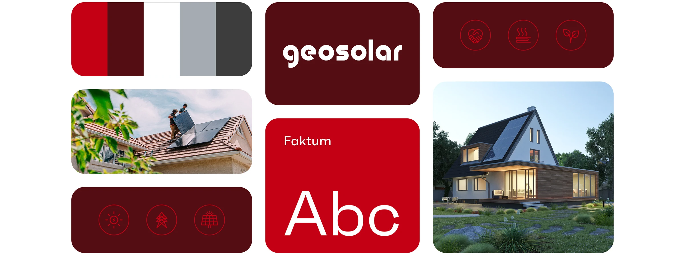
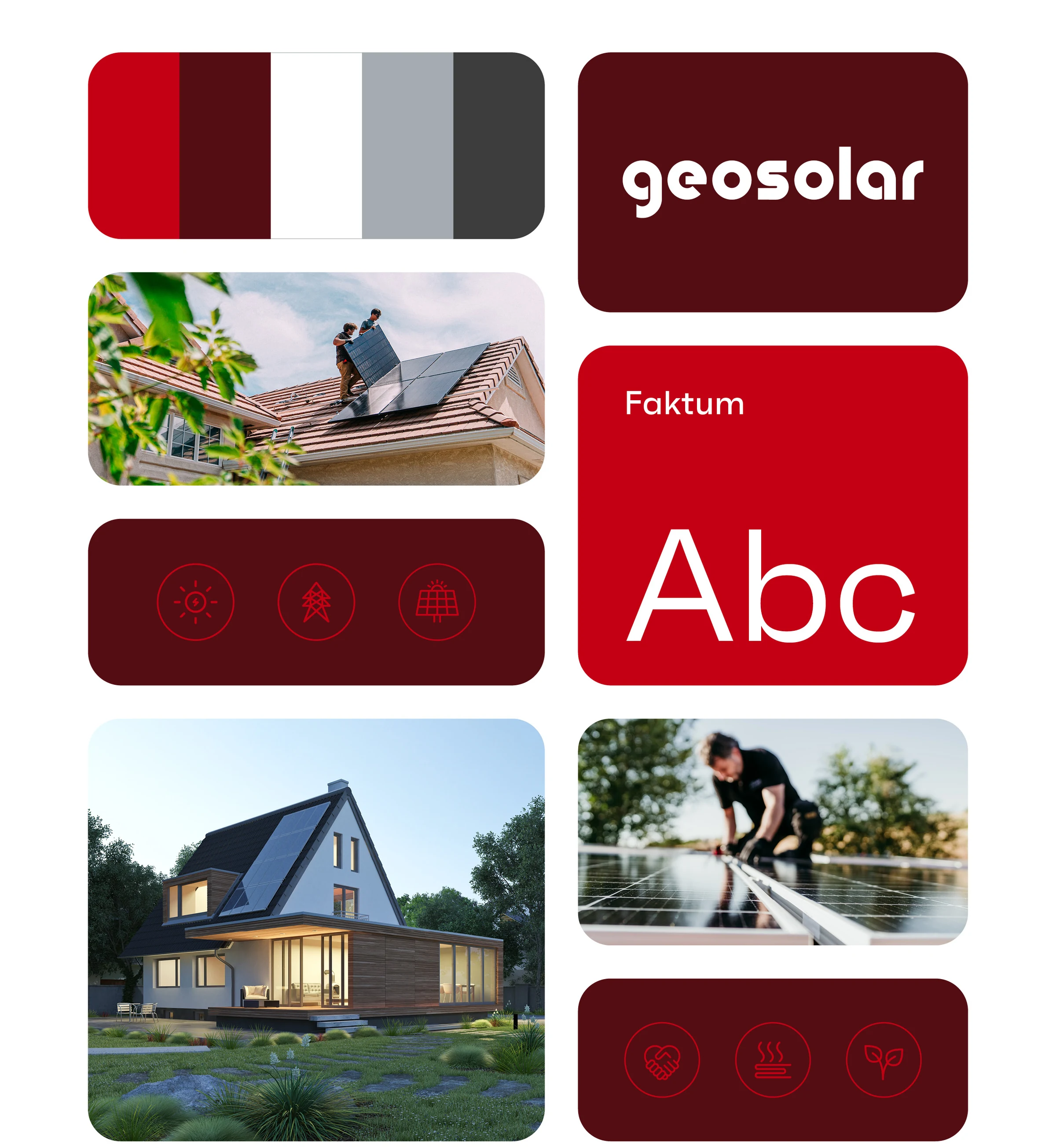
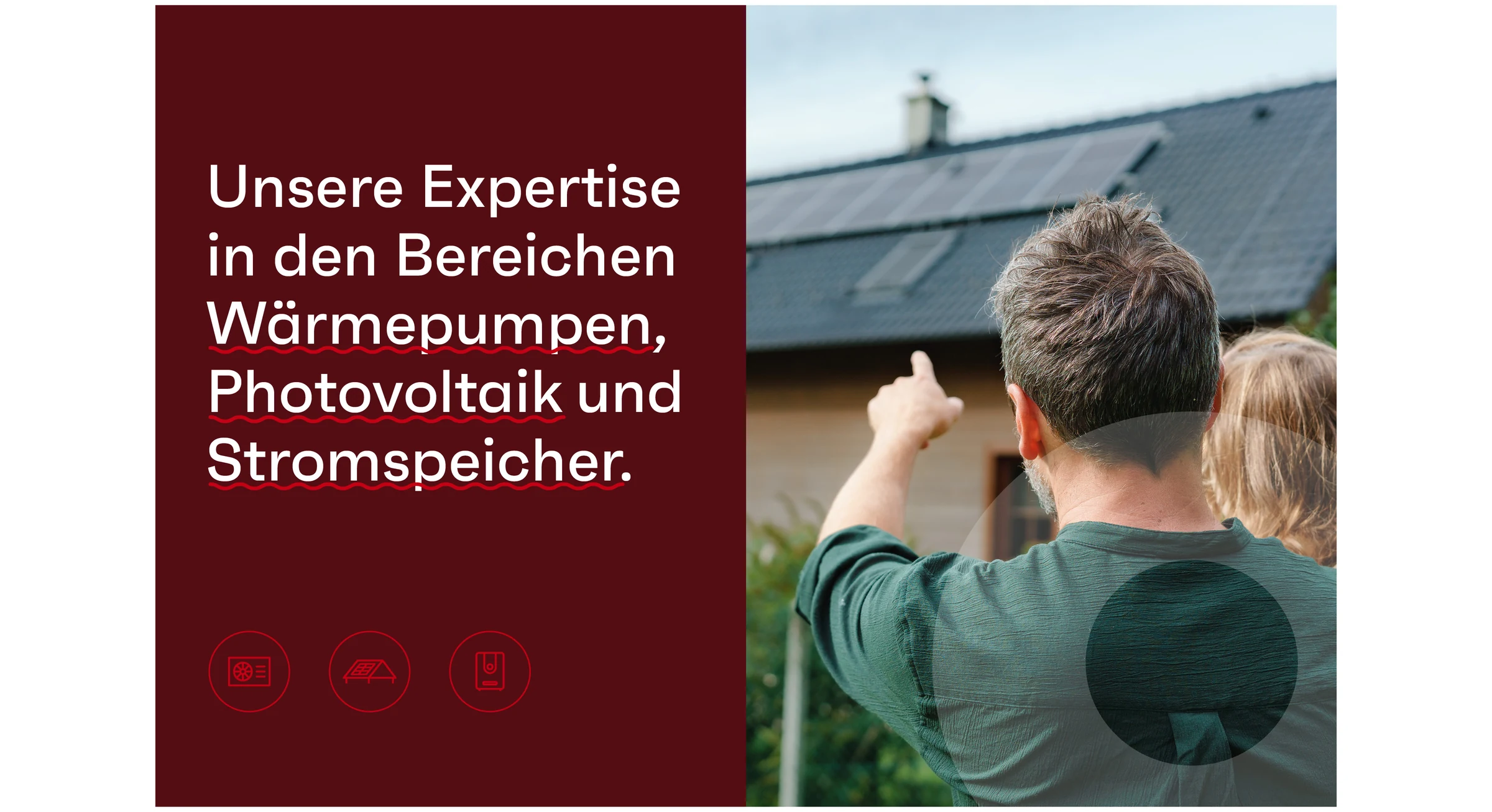
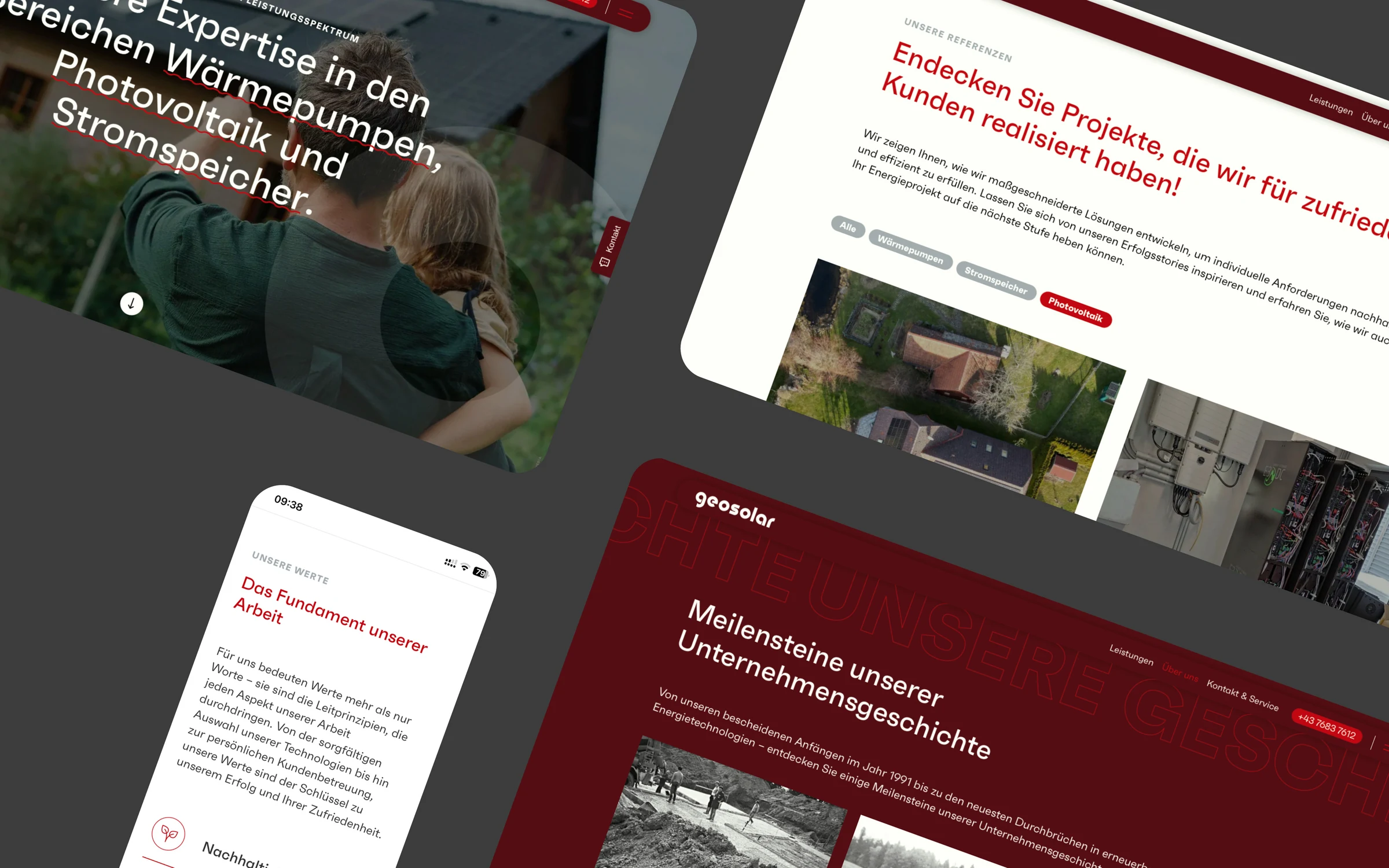
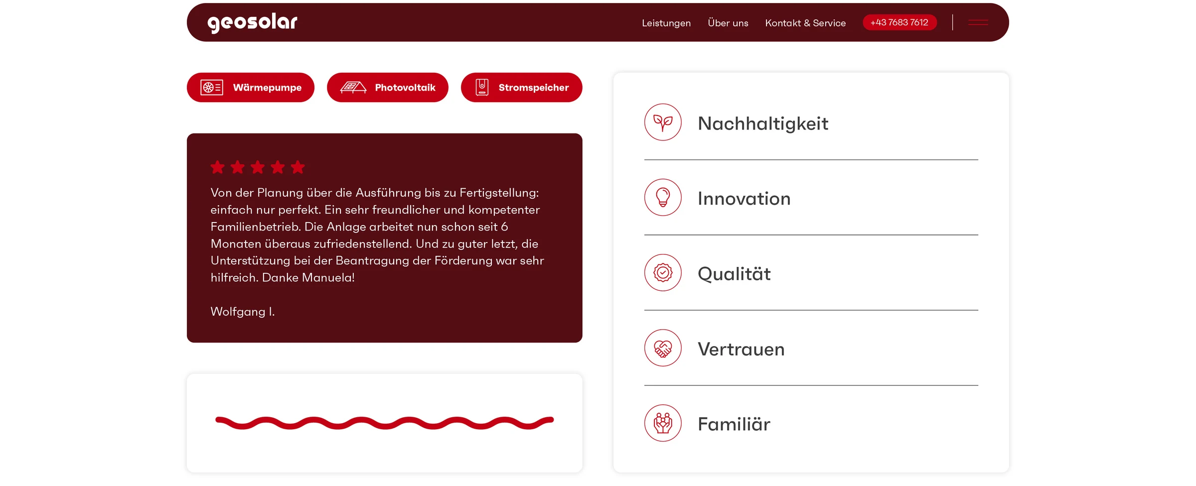
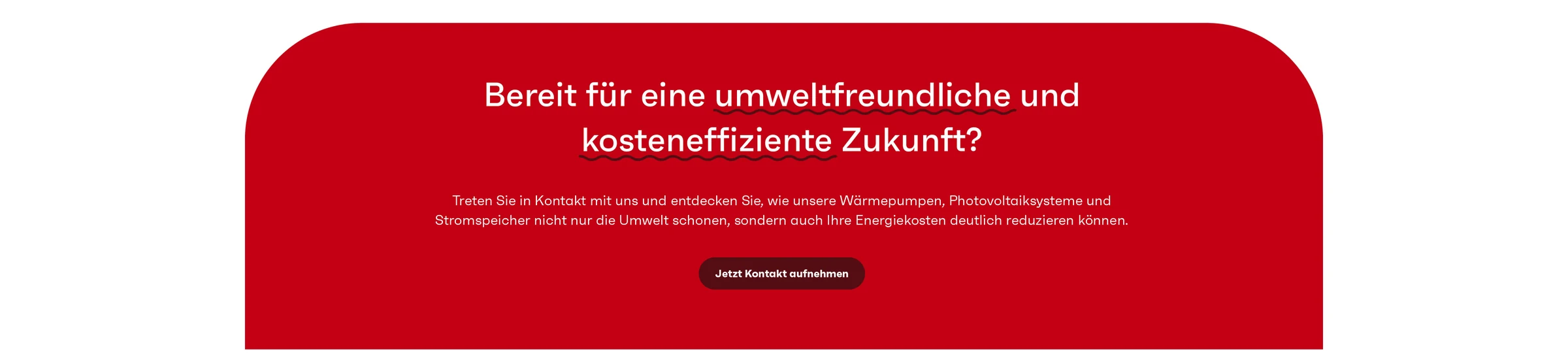
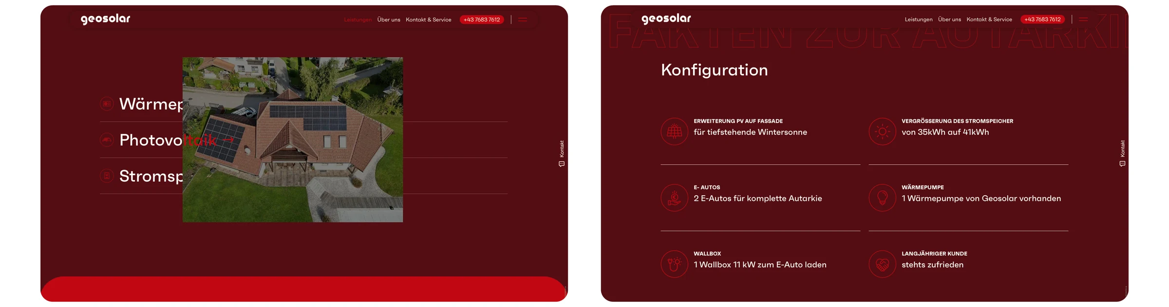
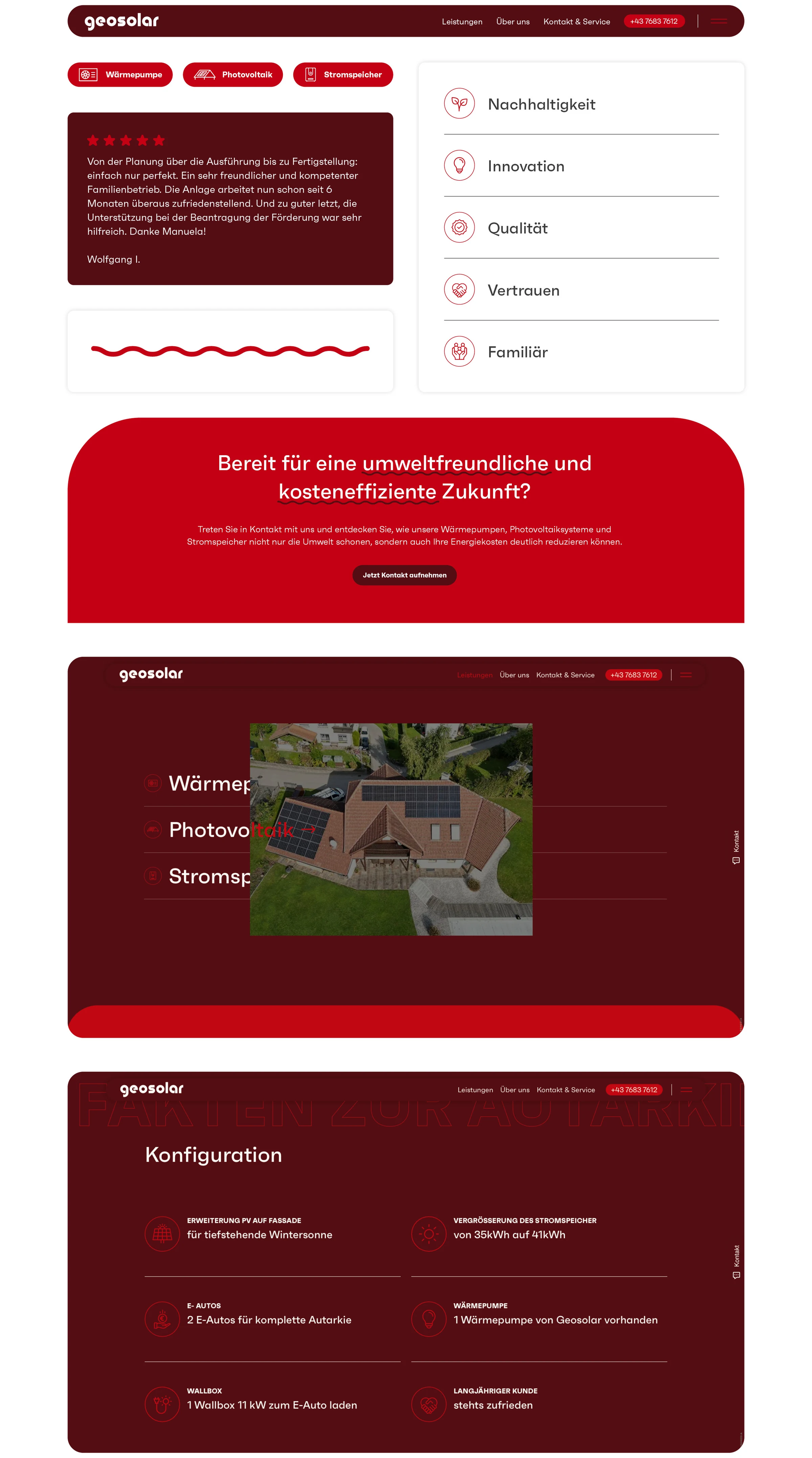
Geosolar stands for future-oriented energy solutions in photovoltaics, heat pumps, and storage systems. To make this expertise visible in the digital presence as well, we comprehensively evolved the brand. The corporate design received a fresh, modern look — including a new logo, clearly defined color worlds, and matching typography. Building on this, a completely newly developed website was created that combines technical precision with a user-friendly structure. It was implemented on the basis of Drupal — the low-maintenance, easy-to-use open-source CMS regarded worldwide as the first choice for long-lasting business websites. Today, Geosolar presents itself as a strong partner for sustainable energy concepts — visually and digitally.

A presence that clearly positions Geosolar against the competition — confident and to the point.

Visit website

geosolar cd 3
geosolar mobile cd 1

Preserving tradition, shaping modernity

The logo relaunch for Geosolar was deliberately gentle: the familiar look was preserved but translated into a contemporary design language. Finely tuned adjustments to typography, proportions, and colors created a modern logo that respects Geosolar's established identity while underscoring its commitment to future readiness and innovation.

logo redesign 1
geosolar mobile logo 1

The new website combines clean design with technical precision and makes visible what Geosolar stands for: sustainable energy solutions at the highest level.

geosolar visual 1
mobile screens visual 1

Design with system and clarity

For the new Geosolar website, no detail was left to chance. Every design element emerged from a clear creative concept built on clarity, consistency, and recognition. Colors, typography, spacing, and imagery mesh seamlessly, creating a continuous style that conveys trust and provides orientation. At the same time, the design is flexible enough to work perfectly on the most diverse devices and in various usage scenarios. The result is a coherent user experience that presents Geosolar as a modern, reliable brand.

geosolar element 1
geosolar element 2
geosolar screens 5
geosolar mobile
Moremedia implemented our website geosolar-punkt-at professionally and exactly according to our wishes. From the very first contact, we felt we were in the best hands — the team was always friendly, competent, and available. The proposal was transparent and detailed, so we had a clear overview of the costs at all times. The value for money was absolutely convincing, too. The collaboration went smoothly, and change requests were implemented quickly and flexibly. Our new website is modern, clear, and functional — exactly what we wanted. We can recommend Moremedia without reservation!
Dipl. Ing. (FH) Gösselsberger Gregor |

Source: Google

How we worked

From the first briefing to the result — structured and transparent in clearly defined steps.

01 — Analysis
Captured the energy pioneer's existing brand and recognition assets.

02 — Logo & Corporate Design Refresh
Carefully translated the familiar logo into a contemporary visual language.

03 — Design System
Defined design elements for clarity, consistency, and recognition.

04 — Website Relaunch
Implemented a clear, technically precise web presence.