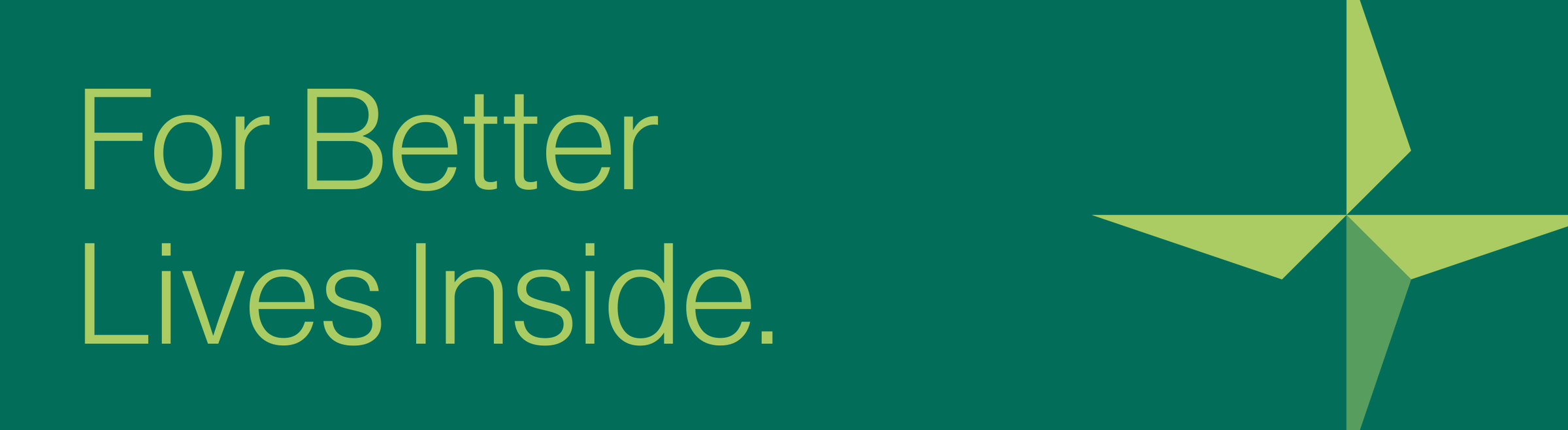
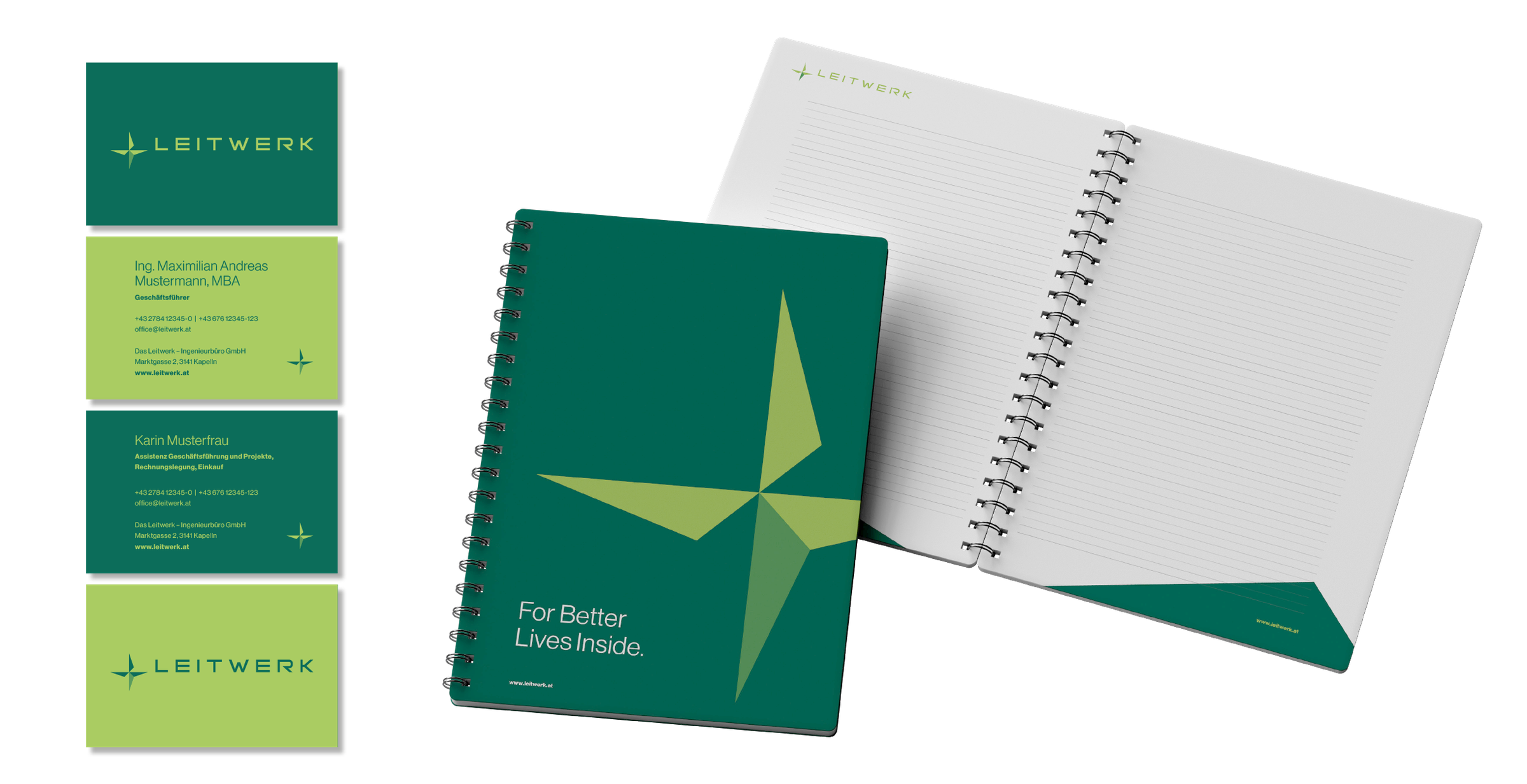
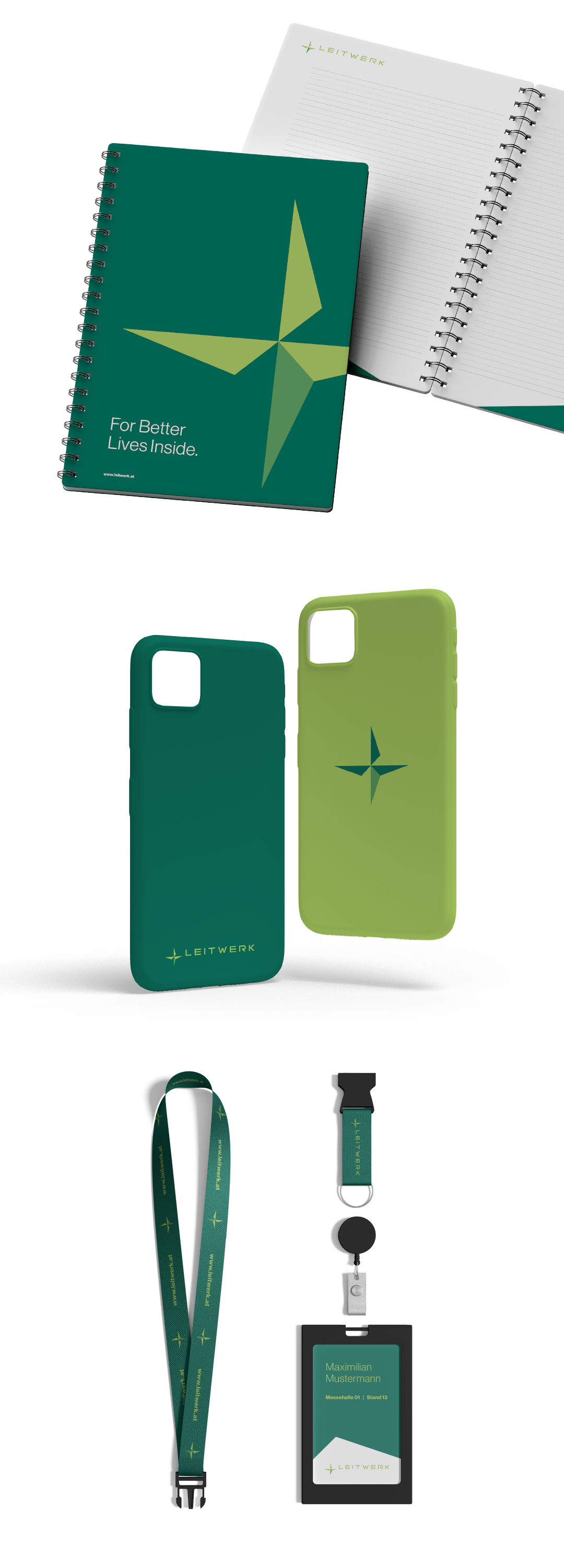
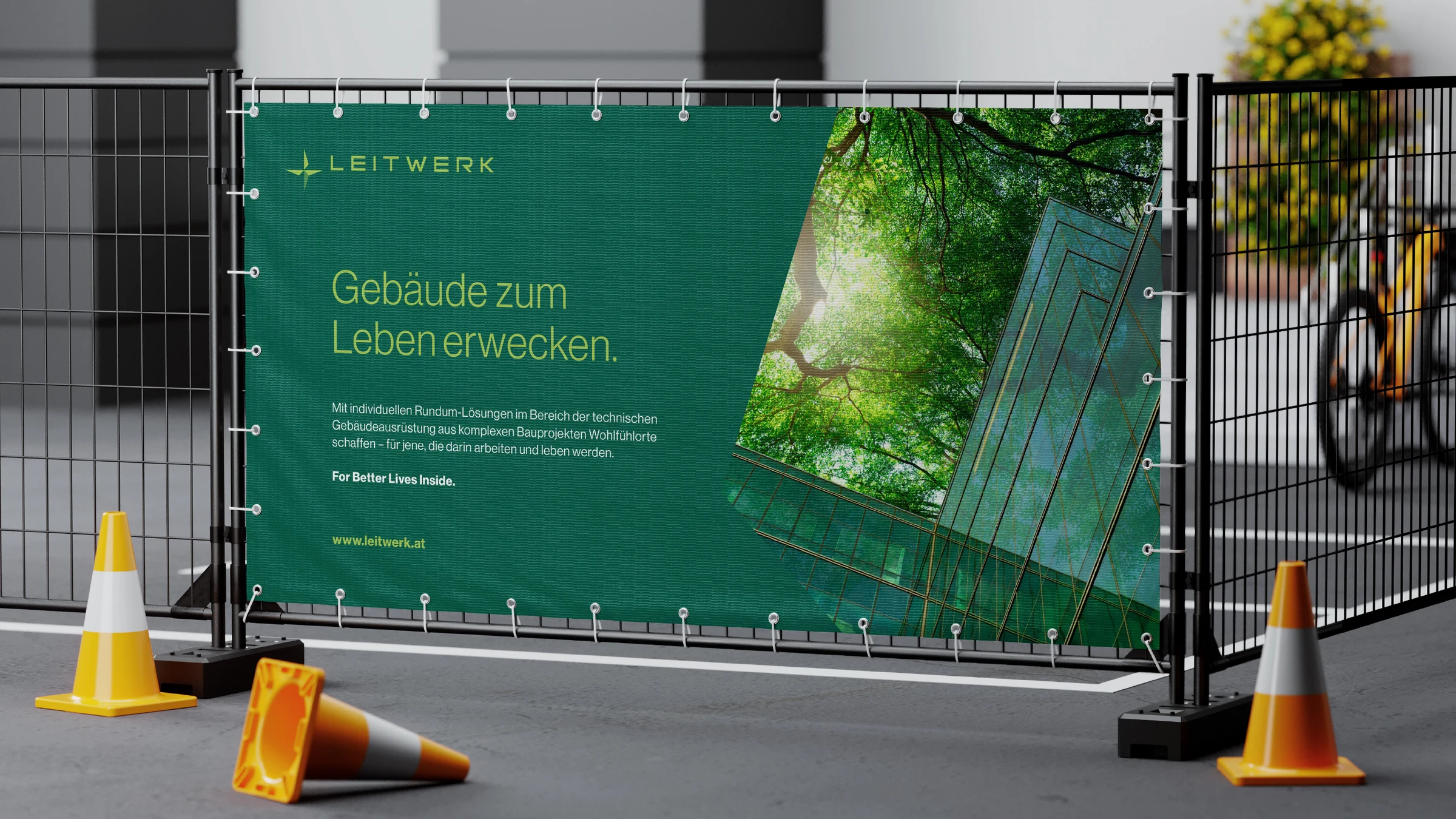
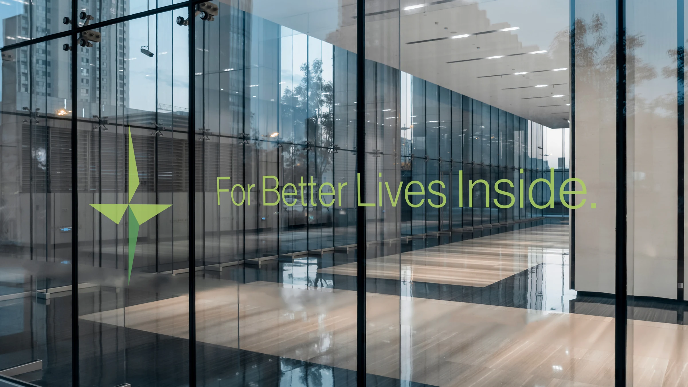
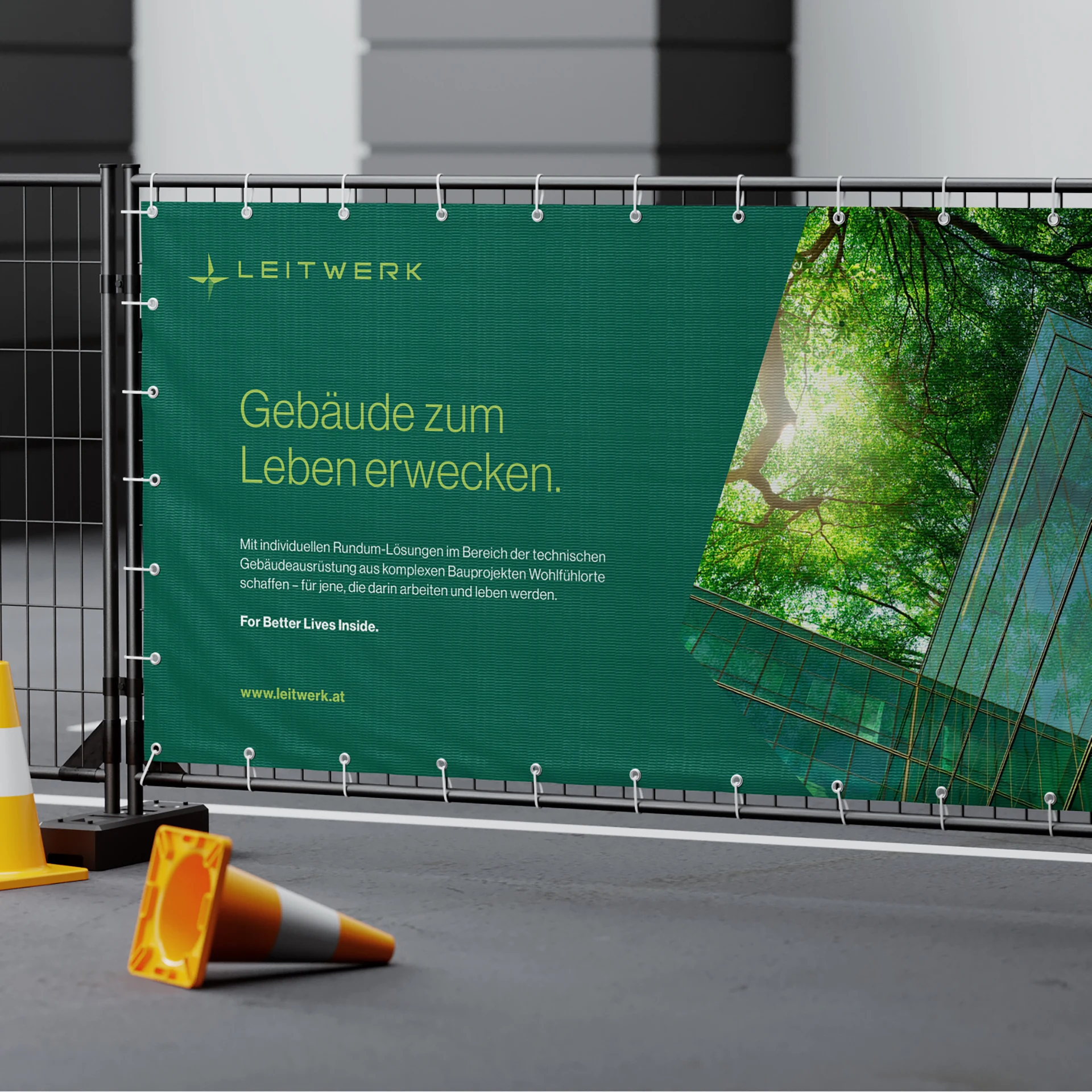
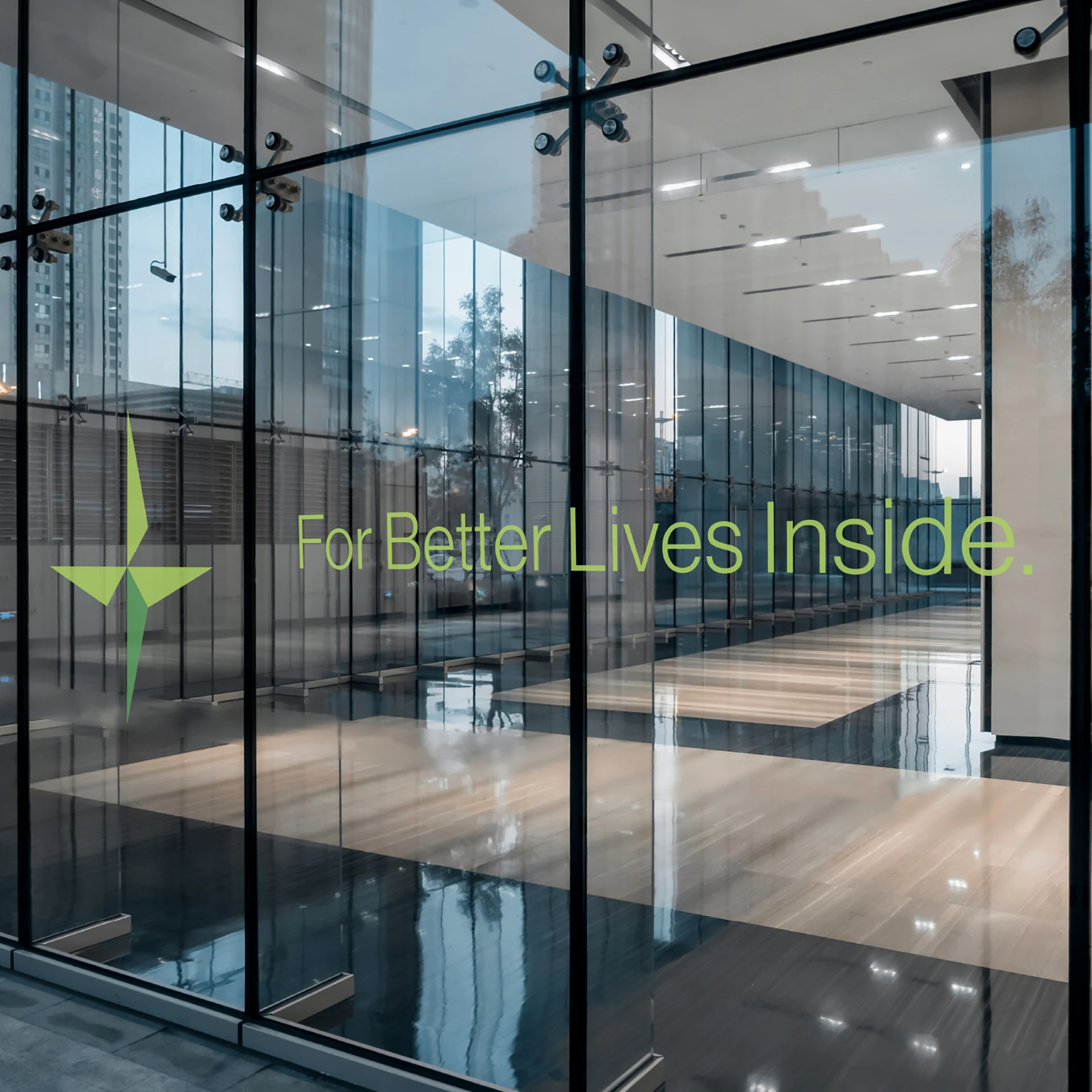
For Better Lives Inside – Bringing spaces to life.
In this project, intensive brand building and targeted brand positioning together with the client resulted in a comprehensive corporate design that clearly positions the brand and makes its values and vision visually tangible. As a corporate design agency, we defined the central brand values in a workshop, which served as the foundation for the visual and strategic direction. Through the deliberate use of colors, typography, and design elements, the design projects the company's expertise in conception, consulting, and planning in the field of building technology. The close collaboration enabled us to create a brand identity that resonates emotionally while remaining functional — ideal for the demands and ambitions of the modern construction industry.
Technical competence and human warmth — united in one visual identity.
Visit website


Brand values in focus: A workshop for clear visions.
In an intensive workshop, we developed the fundamental values that shape the identity of the brand together with the client. The focus was above all on the aspects that shape the company's vision and ensure clear differentiation. The creative exchange produced well-founded guidelines that serve as the basis for the corporate design, the brand positioning, and the brand strategy. The result is a powerful and coherent brand positioning that authentically reflects both the professional expertise and the human side of the company.
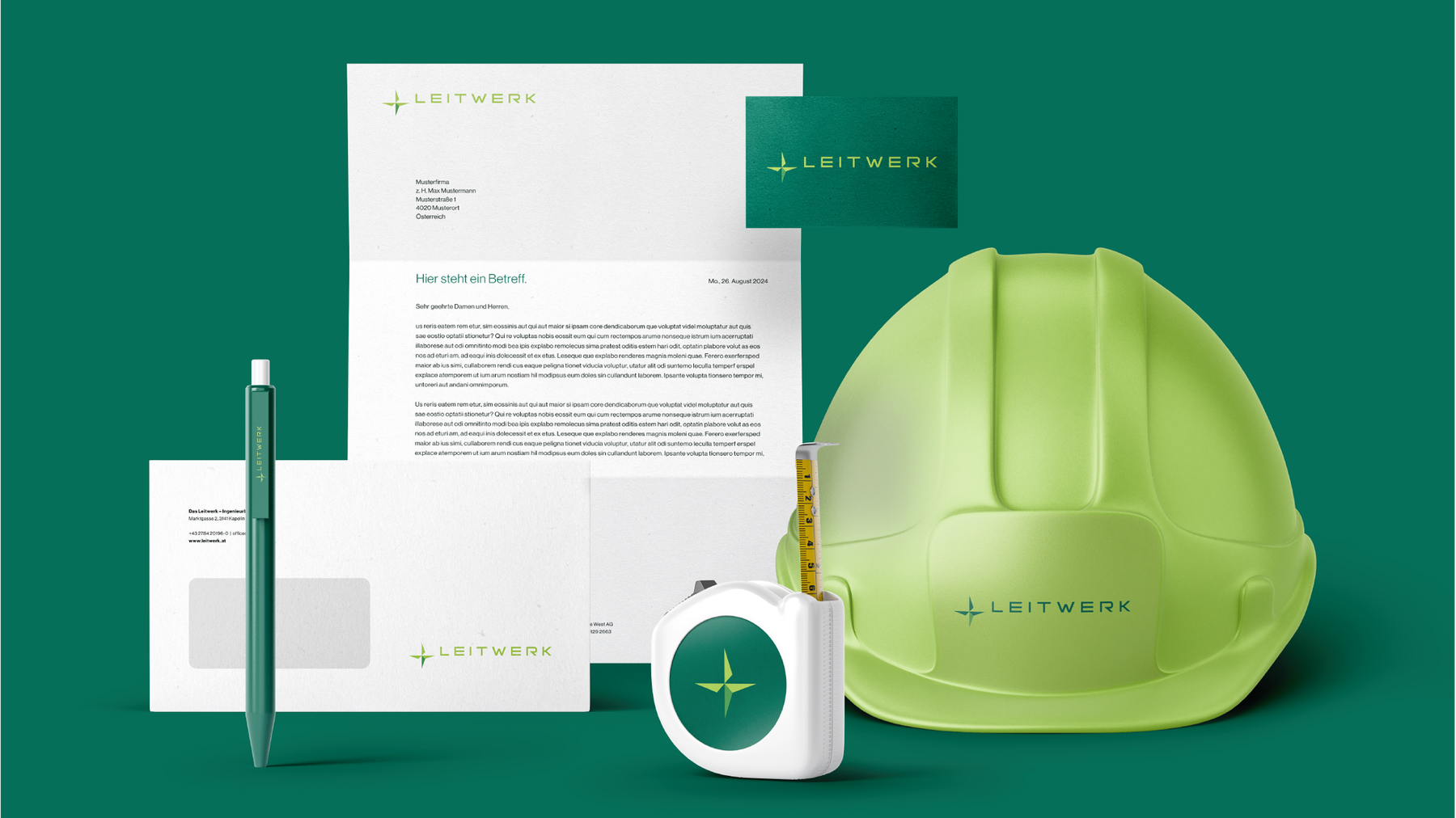
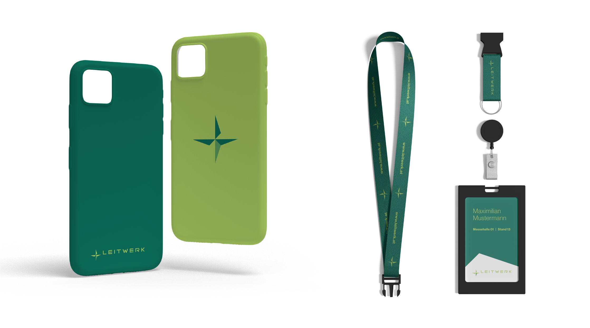
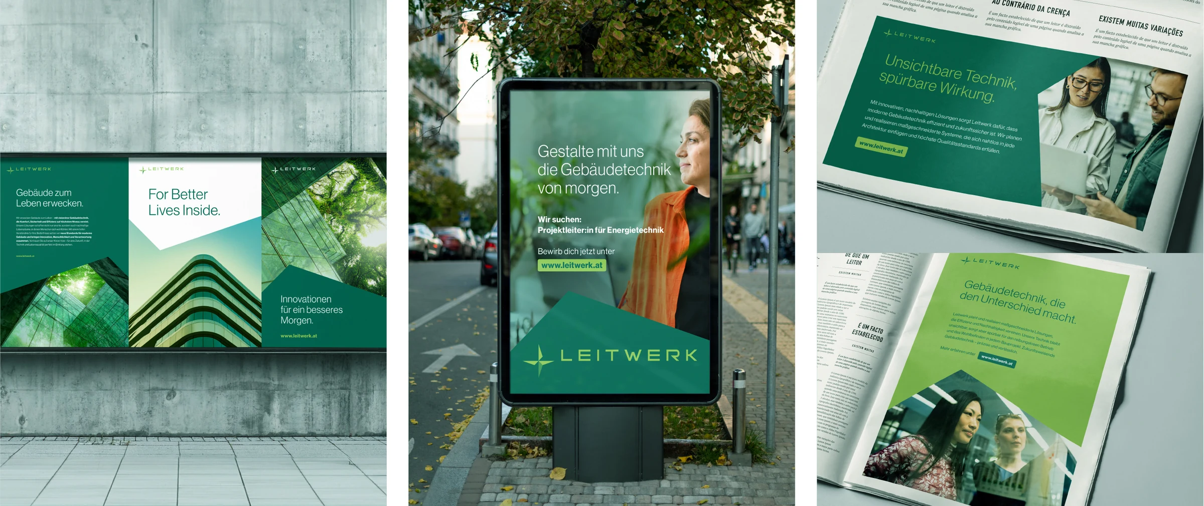
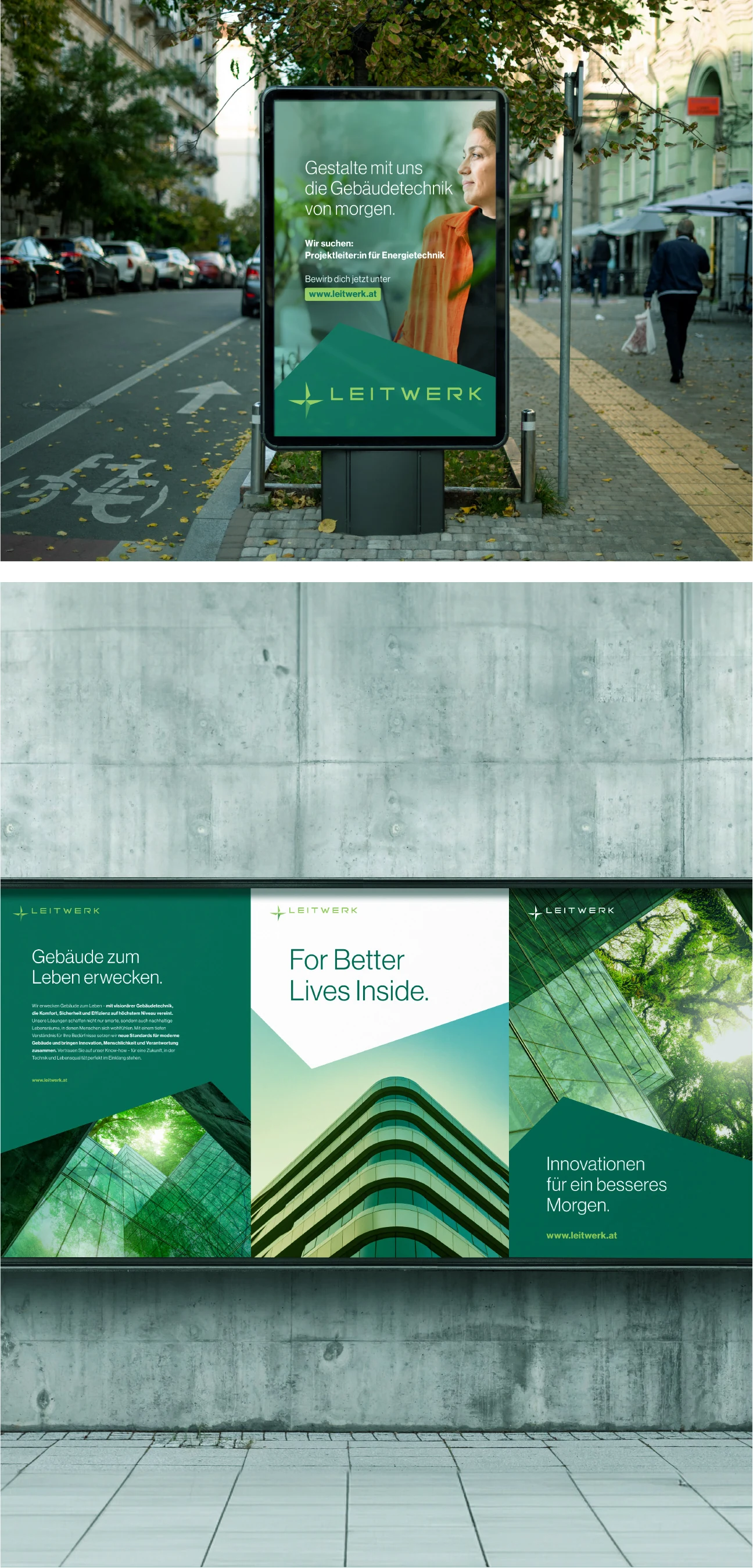
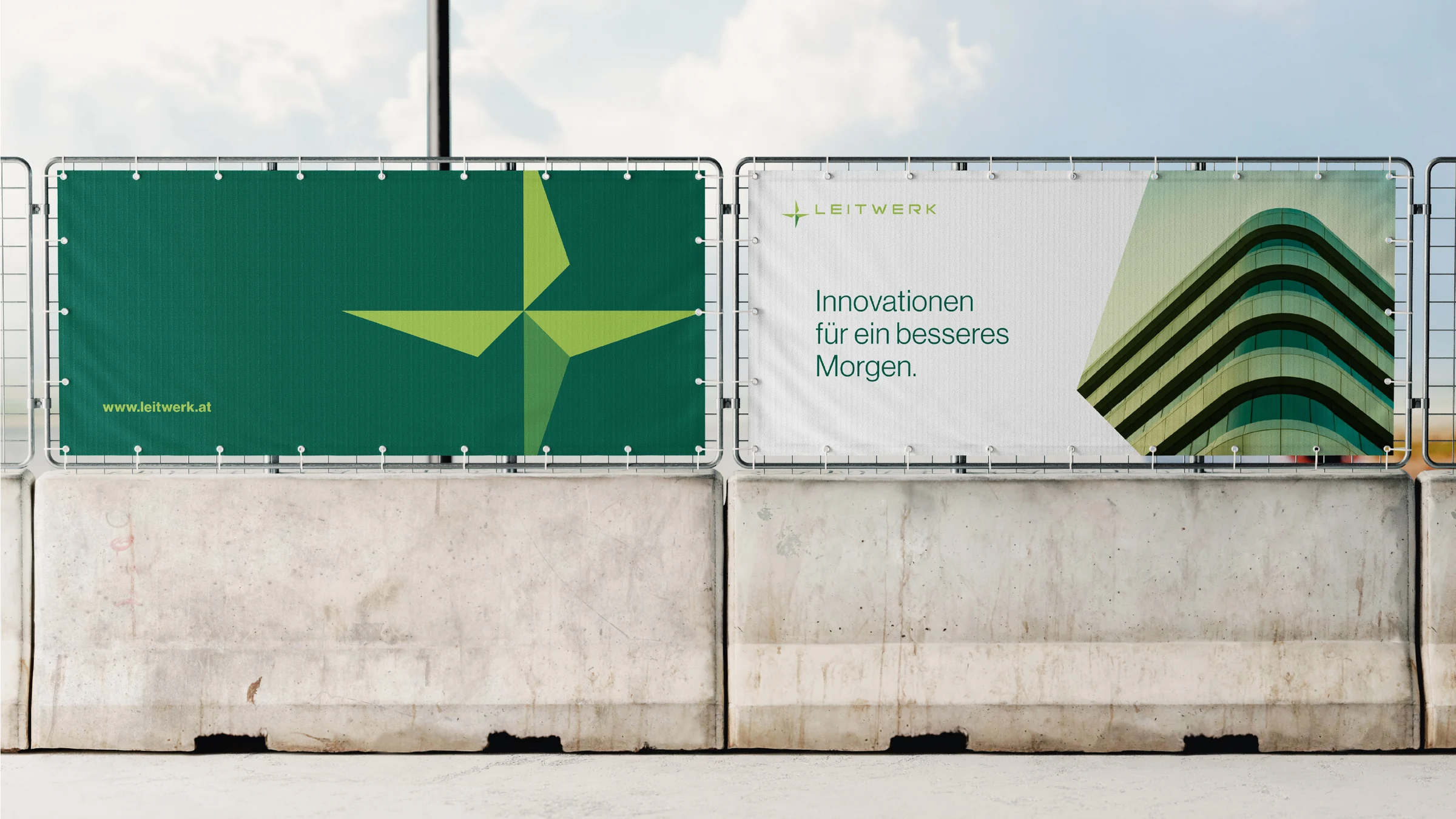
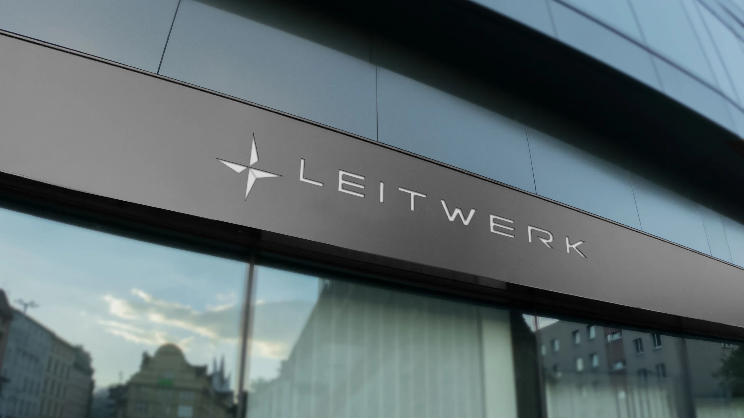
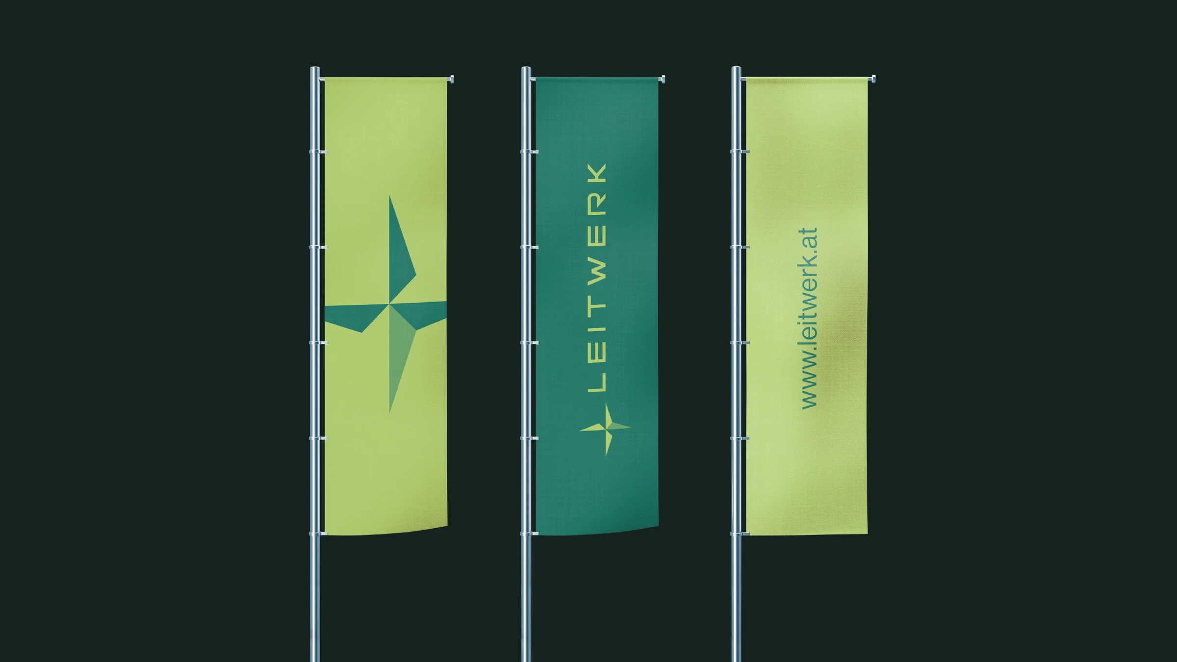
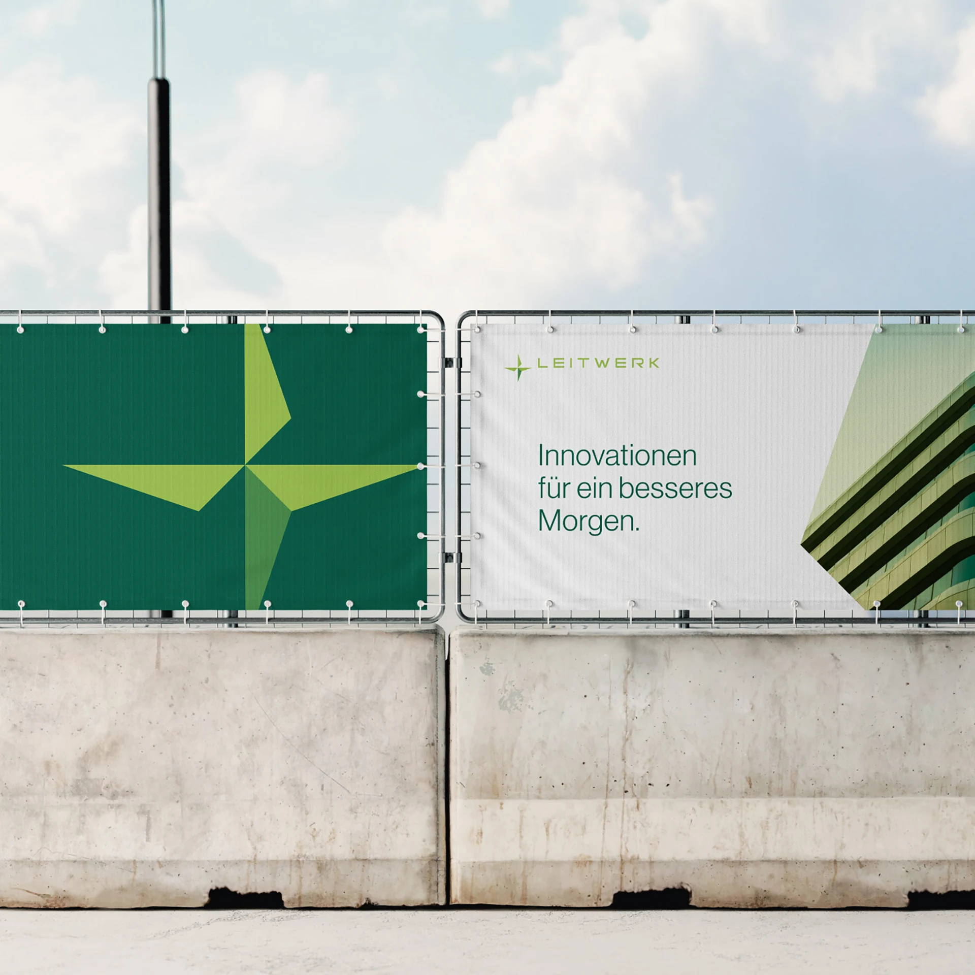
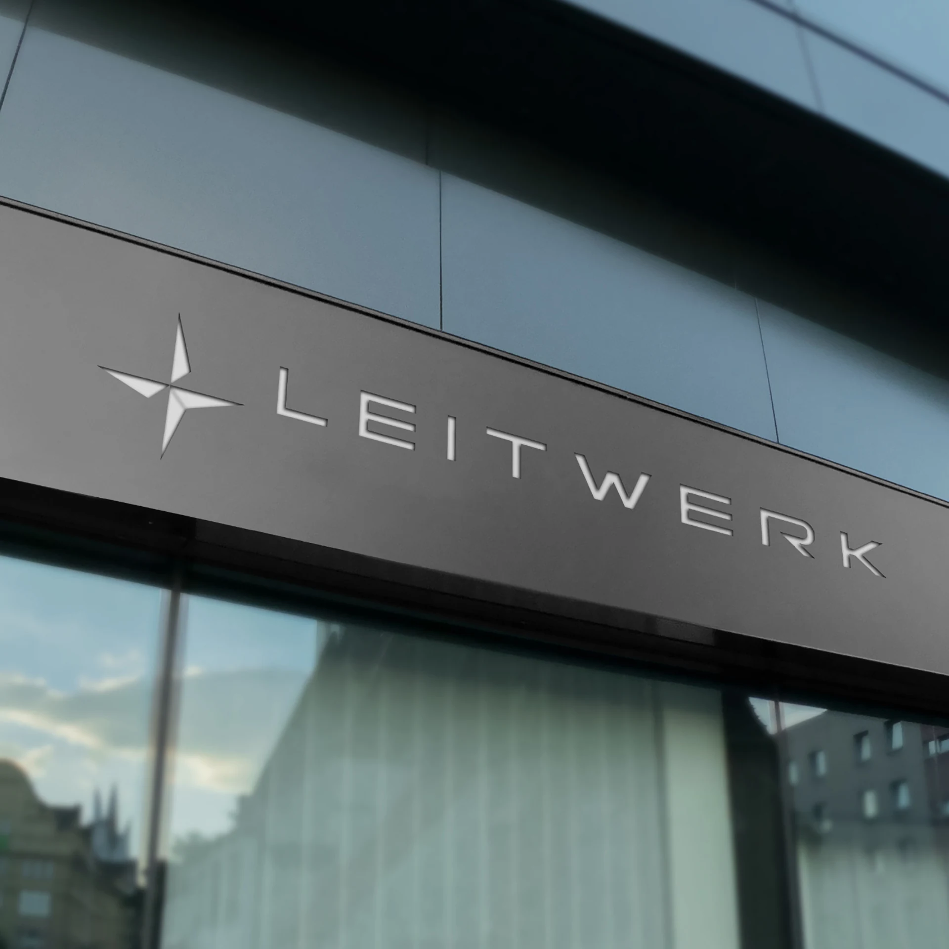
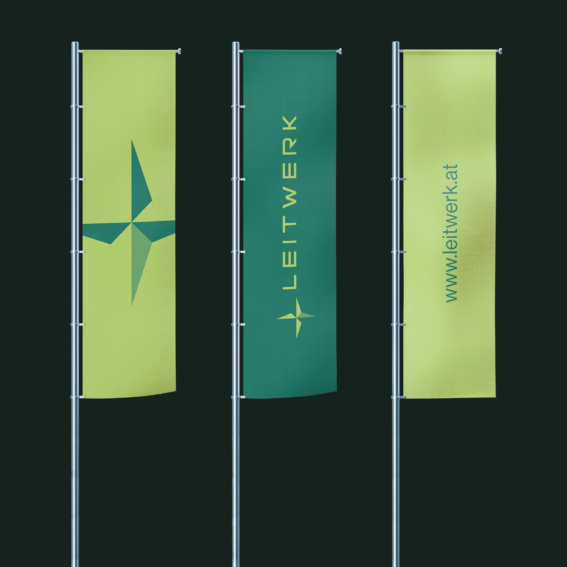
The new logo: a symbol of orientation and innovation.
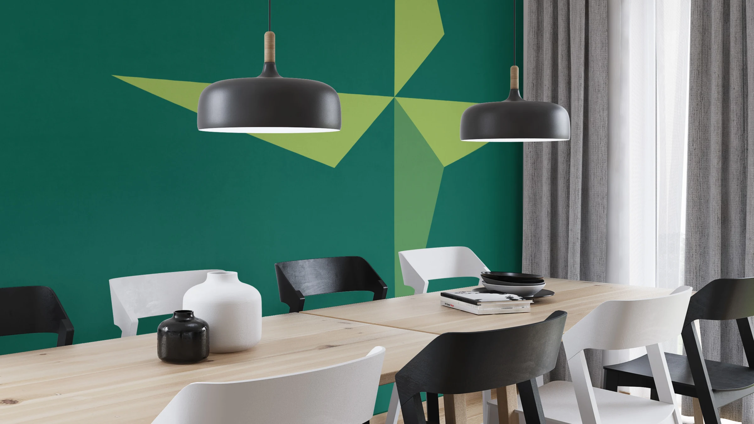
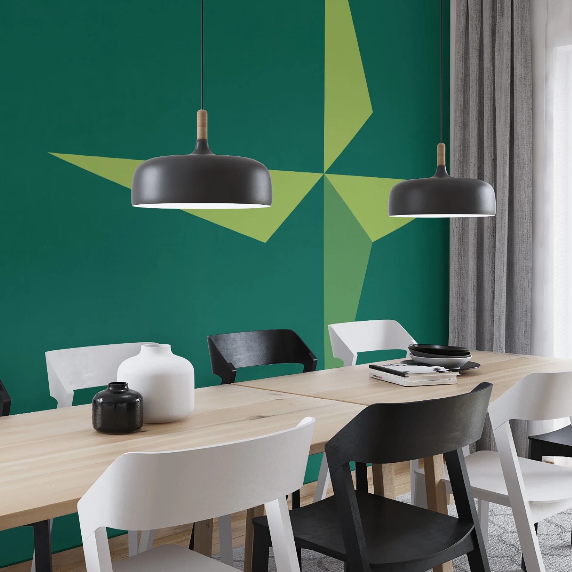
The new logo combines clean lines and striking shapes to visually represent the company's values. A central element is the guiding star, which stands for leadership and reliability. Inspired by the North Star, which has served as a navigation aid for centuries, this design element symbolizes the company's role as a reliable partner in building technology. The star embodies not only the ability to navigate complex projects but also the stability and innovative strength that define the company. This makes the logo a powerful symbol for the future.
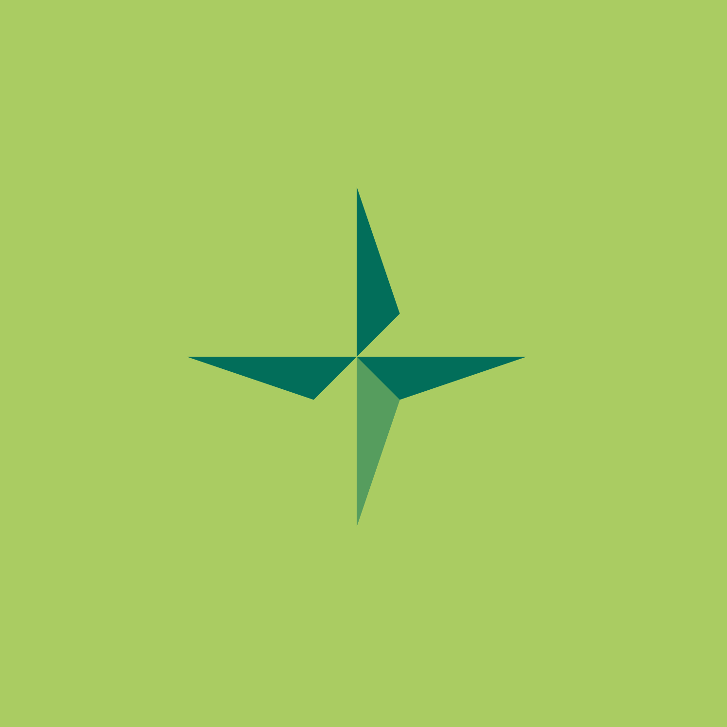
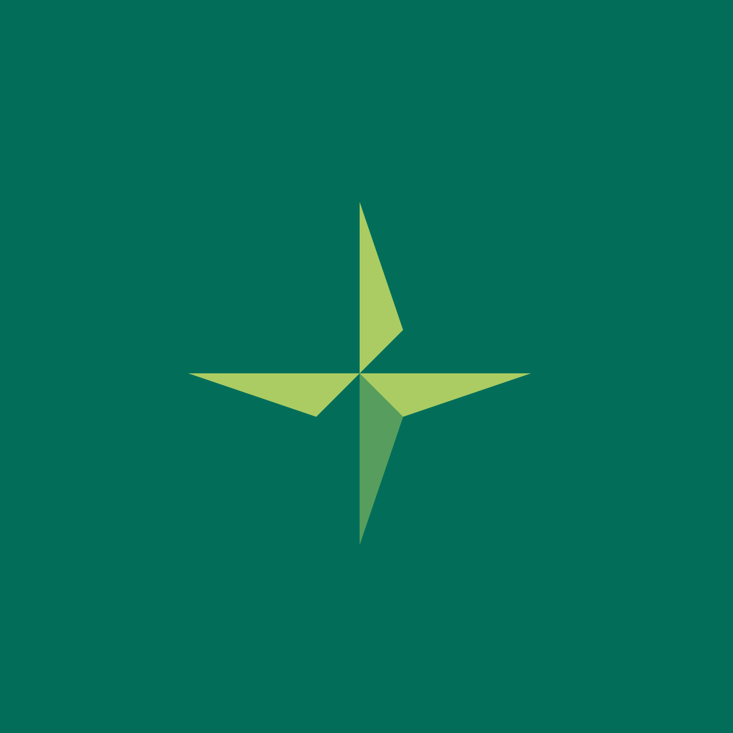
The guiding star: a defining design element for clear orientation.
The guiding star serves as the central design element and runs consistently through the entire brand world. Inspired by the navigation star, it symbolizes precise guidance through the complex challenges of building technology. As a visual anchor, it gives the design structure and constancy, while its striking points convey dynamism and direction. Whether subtle in the background or dominant in the foreground – the guiding star is more than just a graphic element: it expresses the company's role of providing unifying orientation and security at every stage of a project.


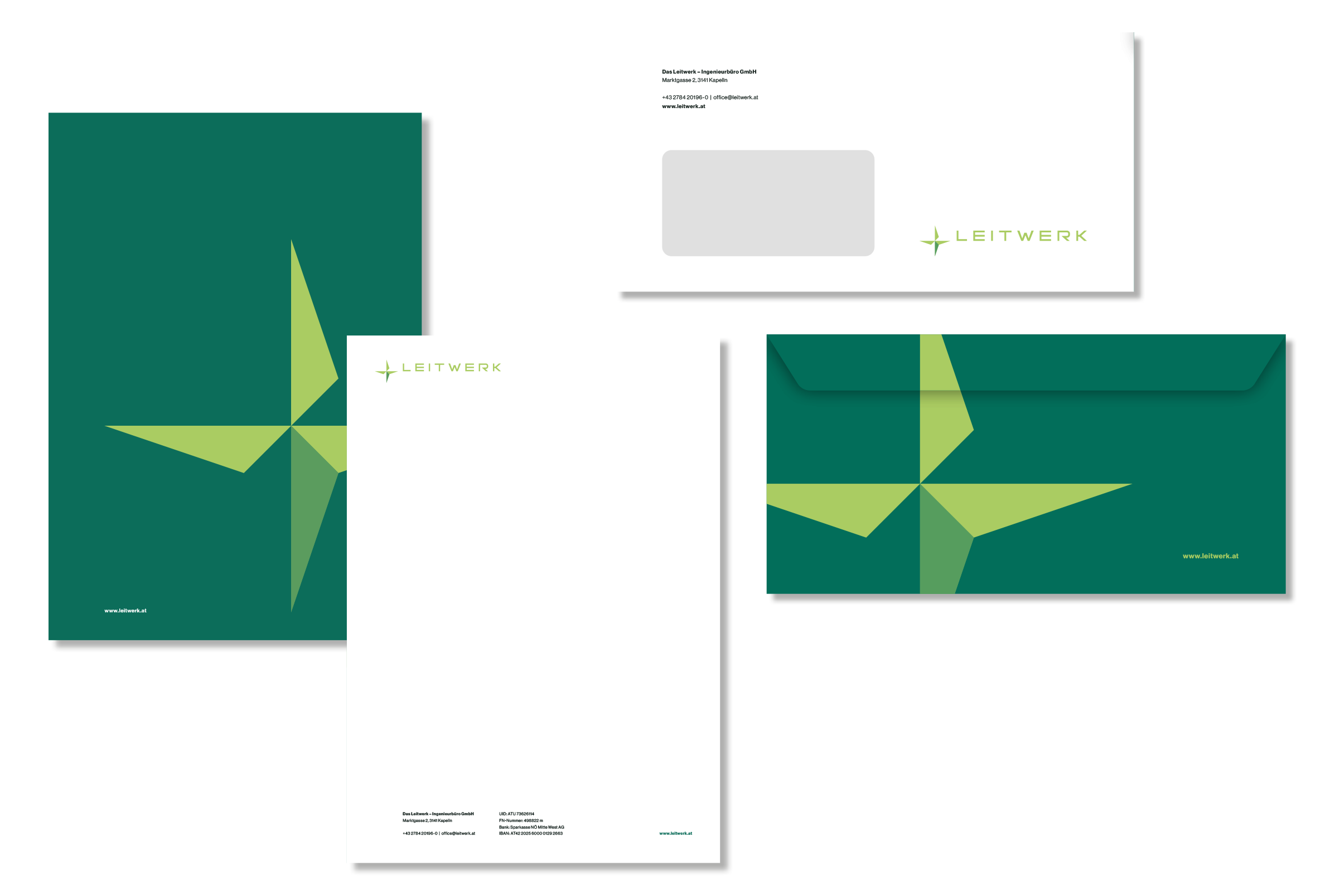
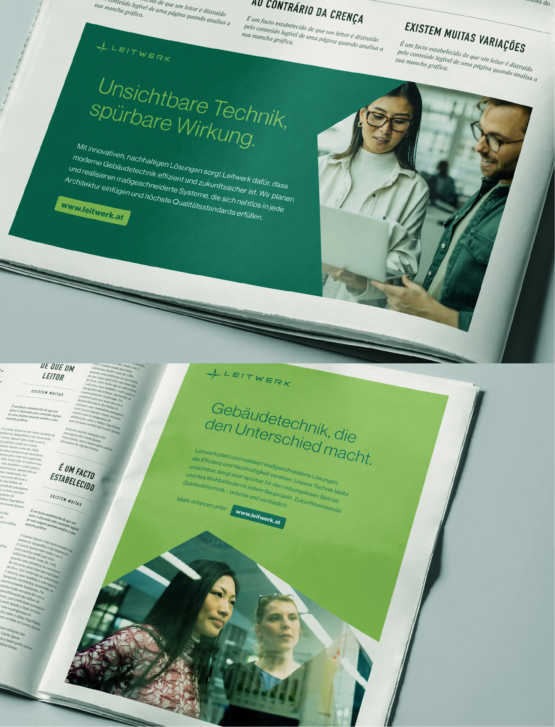
The color concept unites timeless elegance and functional clarity. The primary colors in various shades of green reflect the connection to nature and symbolize sustainability and innovation. Supported by high-contrast white and deep graphite, they create a harmonious balance that radiates both professionalism and modernity. This color palette not only creates visual unity but conveys the brand values in a subtle yet powerful way.
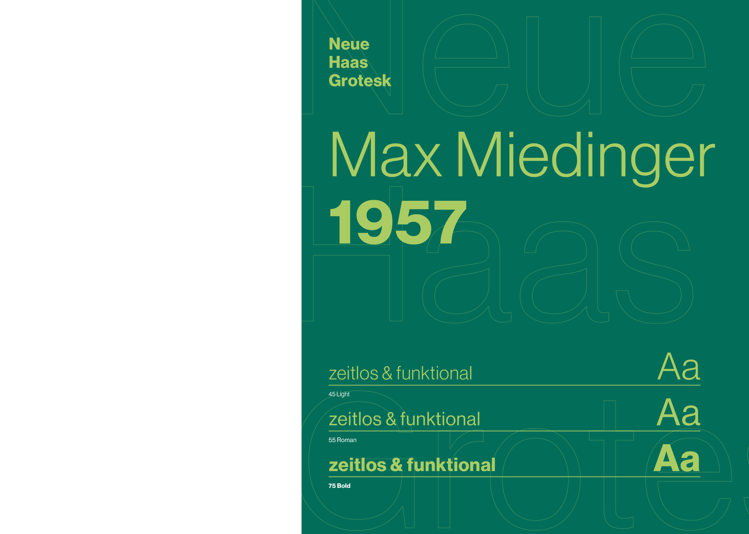
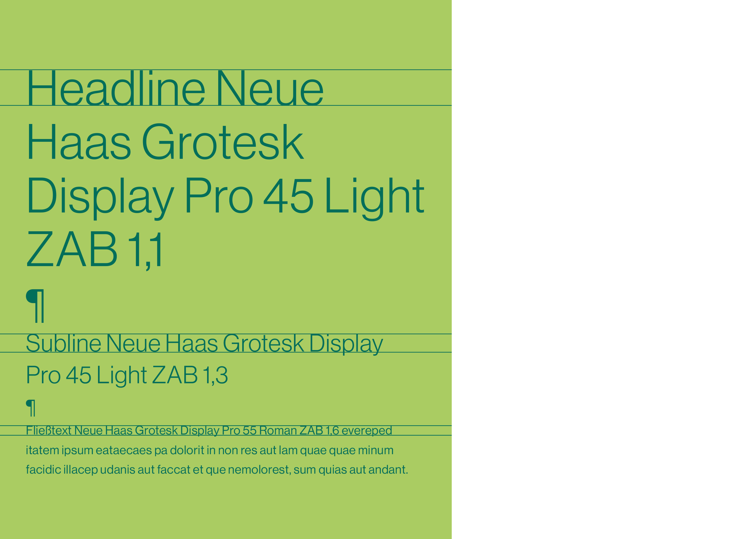
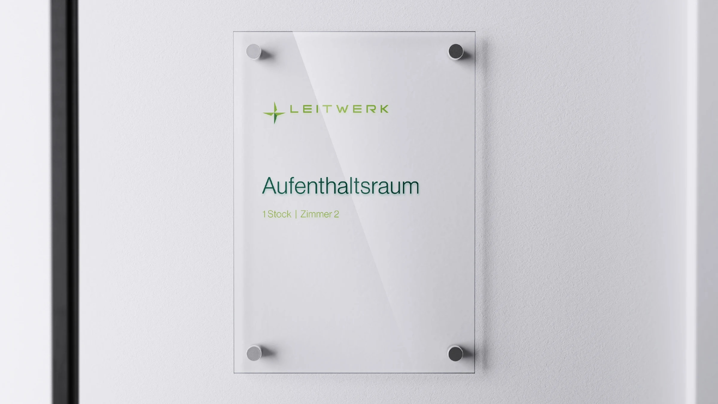
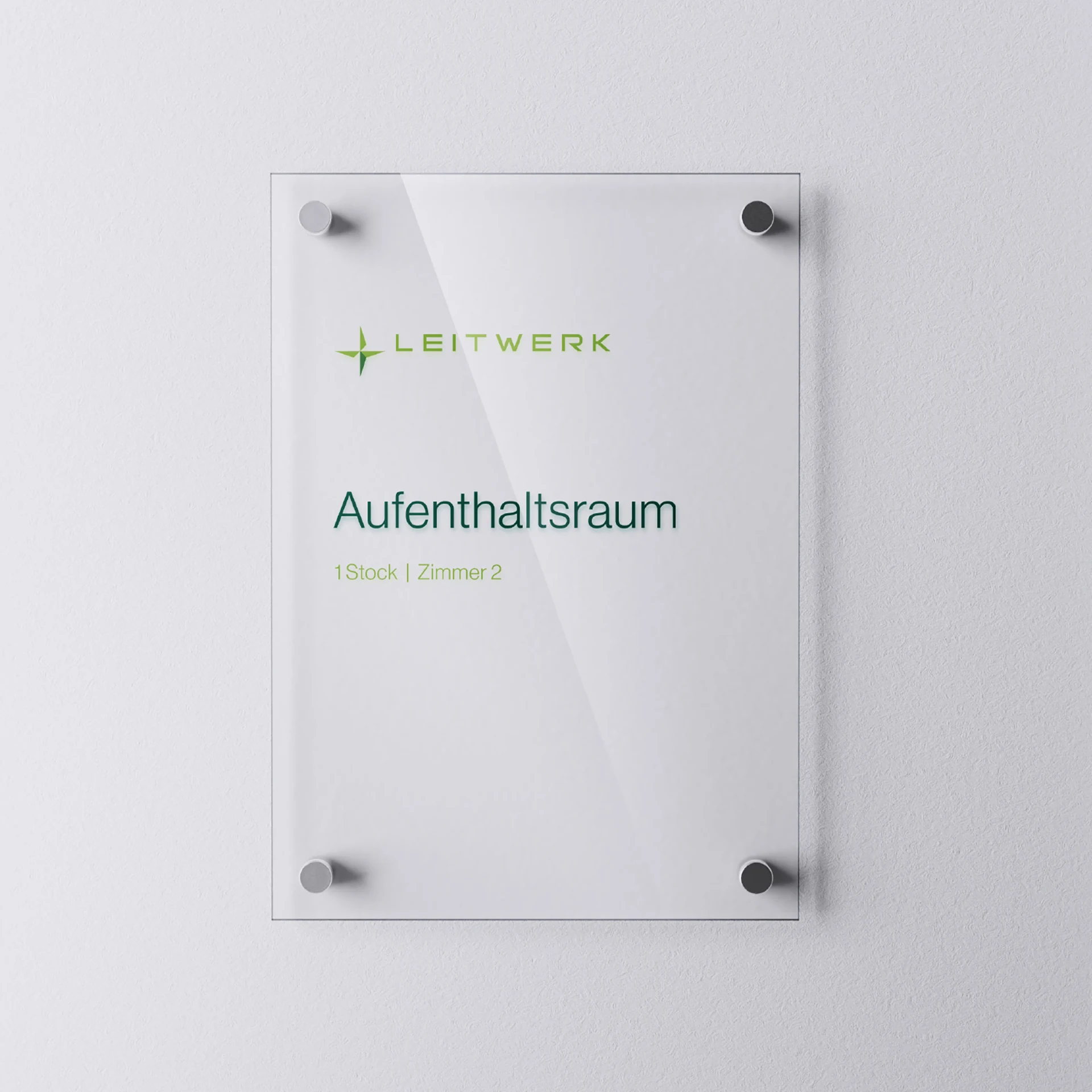
Typography that unites clarity and modernity.
The choice of typography reflects the essence of the brand positioning: timeless, precise, and functional. The sans-serif typeface “Neue Haas Grotesk” stands for modern elegance and matter-of-fact clarity. Its clean lines and harmonious proportions ensure optimal readability and give the brand presence a professional yet fresh character. Whether in headlines or body copy, the typography supports the brand message with its understated but distinctive presence and always keeps the content center stage.
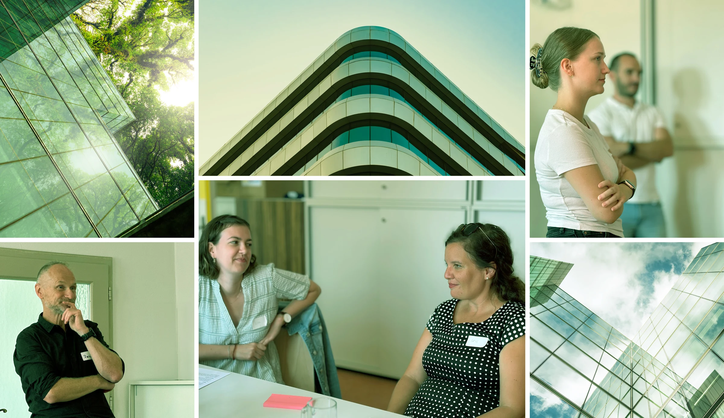
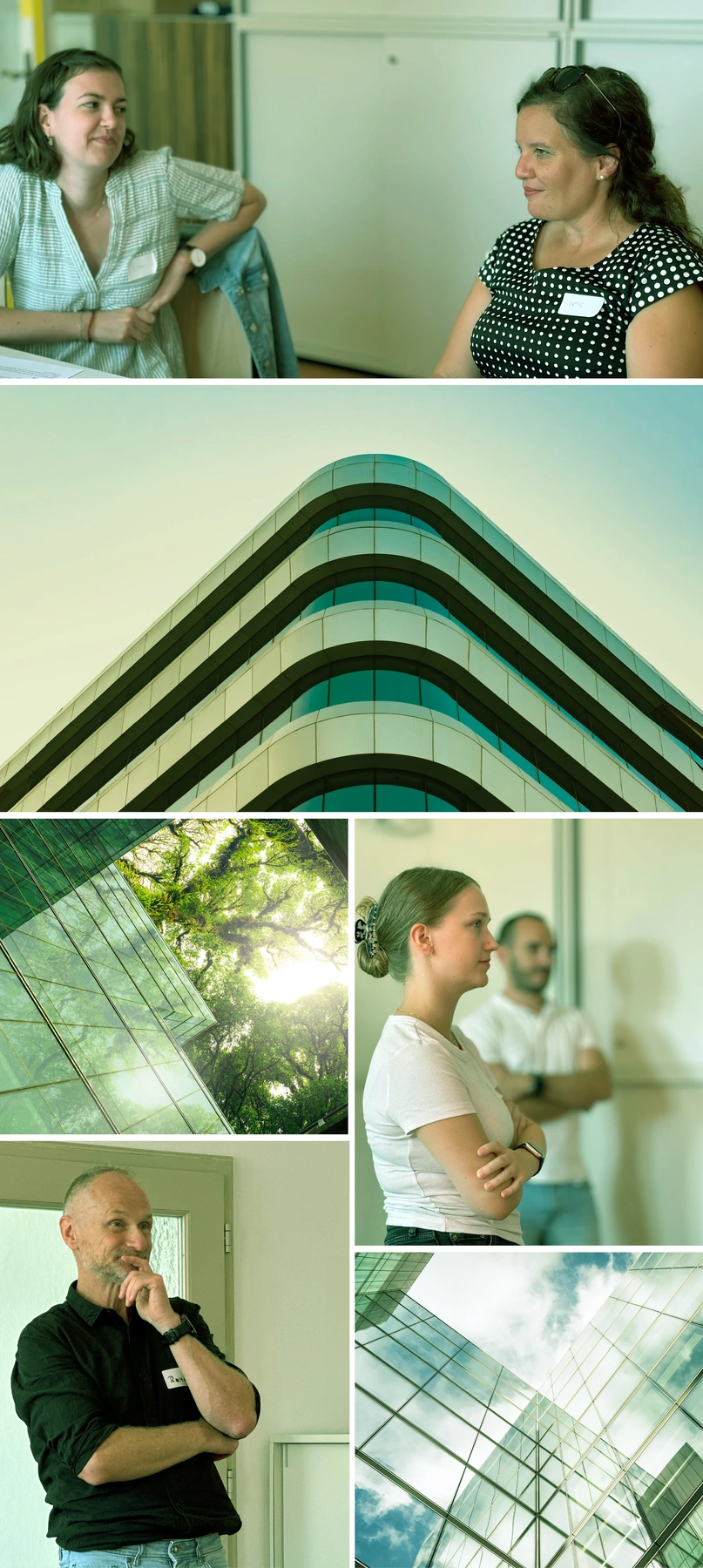
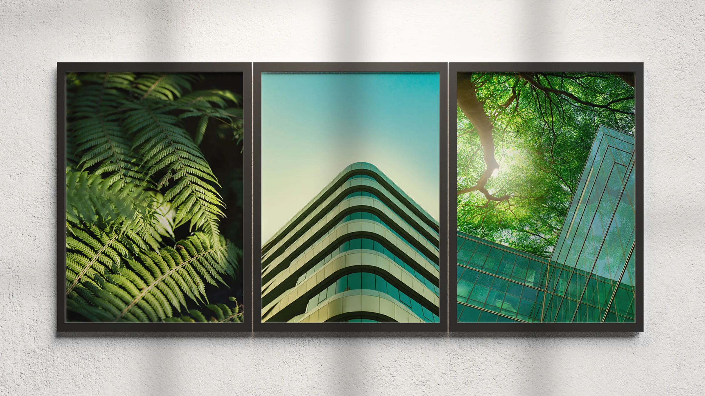
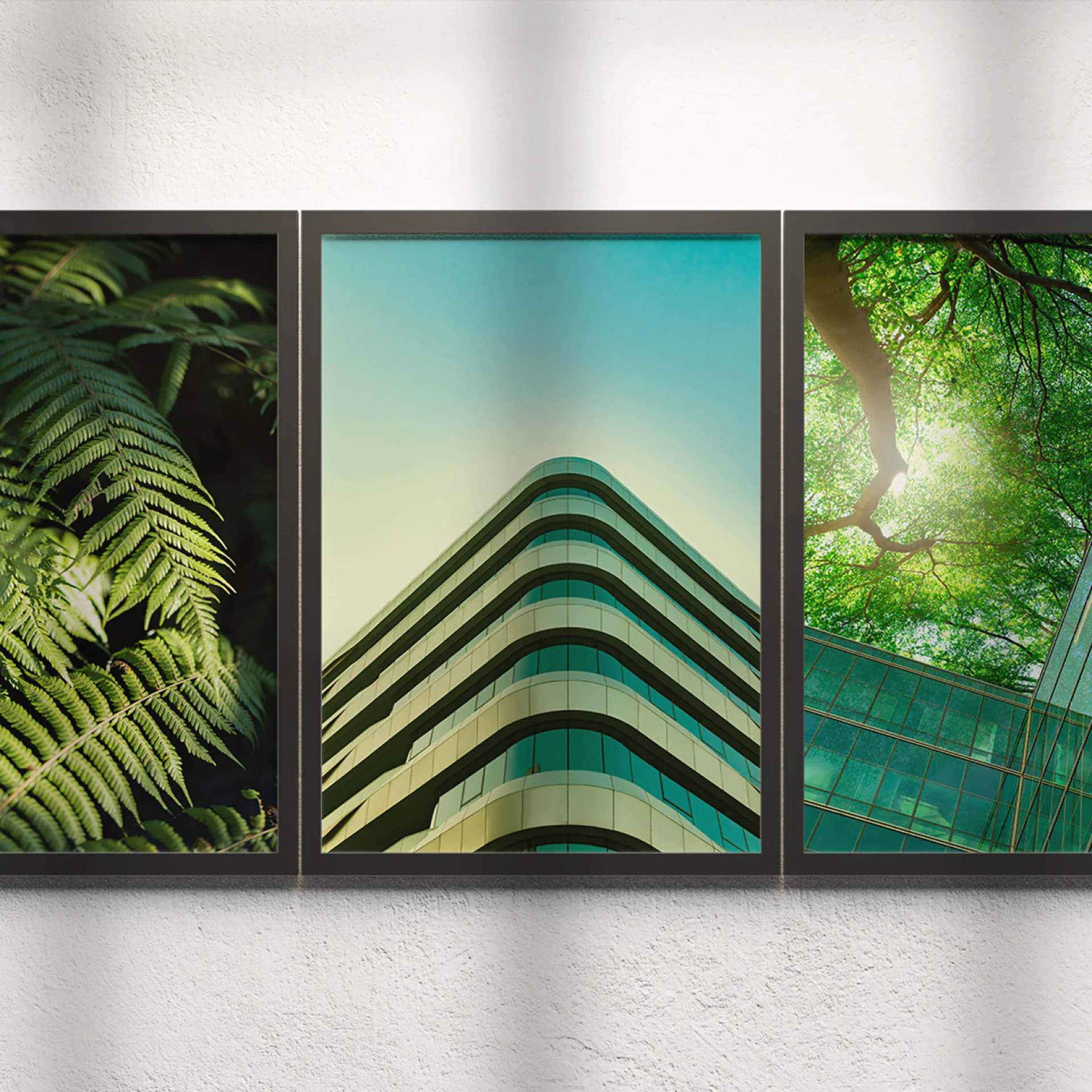
An imagery style that evokes emotion and builds trust.
The imagery deliberately relies on authentic, emotional motifs that put the people behind the projects center stage. Natural lighting moods and harmonious color worlds underscore the connection to architecture and building technology. Every image tells a story that strengthens trust in the company's competence, brand positioning, and commitment to quality. The subtle green tint creates visual unity and reinforces the sense of constancy and innovation. The result is a visual world that conveys both closeness and professionalism.


The design system unites flexibility and consistency. Clear grids, precise proportions, and the use of white space create a structured, unified aesthetic. Elements like the guiding star add dynamism, while the system allows adaptation to different formats without losing the brand's visual coherence.
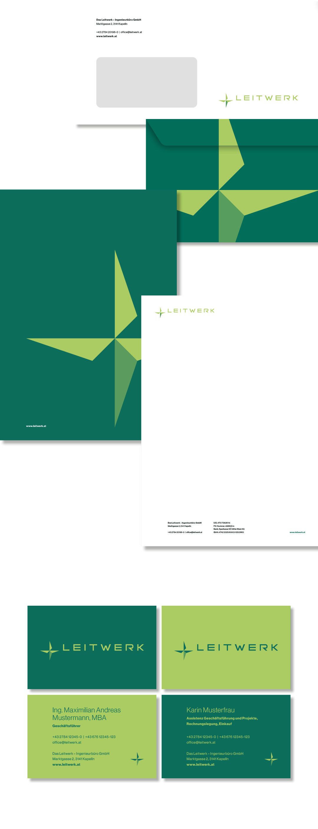
The design principles, defined in line with the brand positioning, are based on contrast, clarity, and dynamism. They create a visual hierarchy, emphasize central elements, and provide structure while bringing movement and energy into the design. The result is a harmonious balance between comprehensibility and expressiveness.

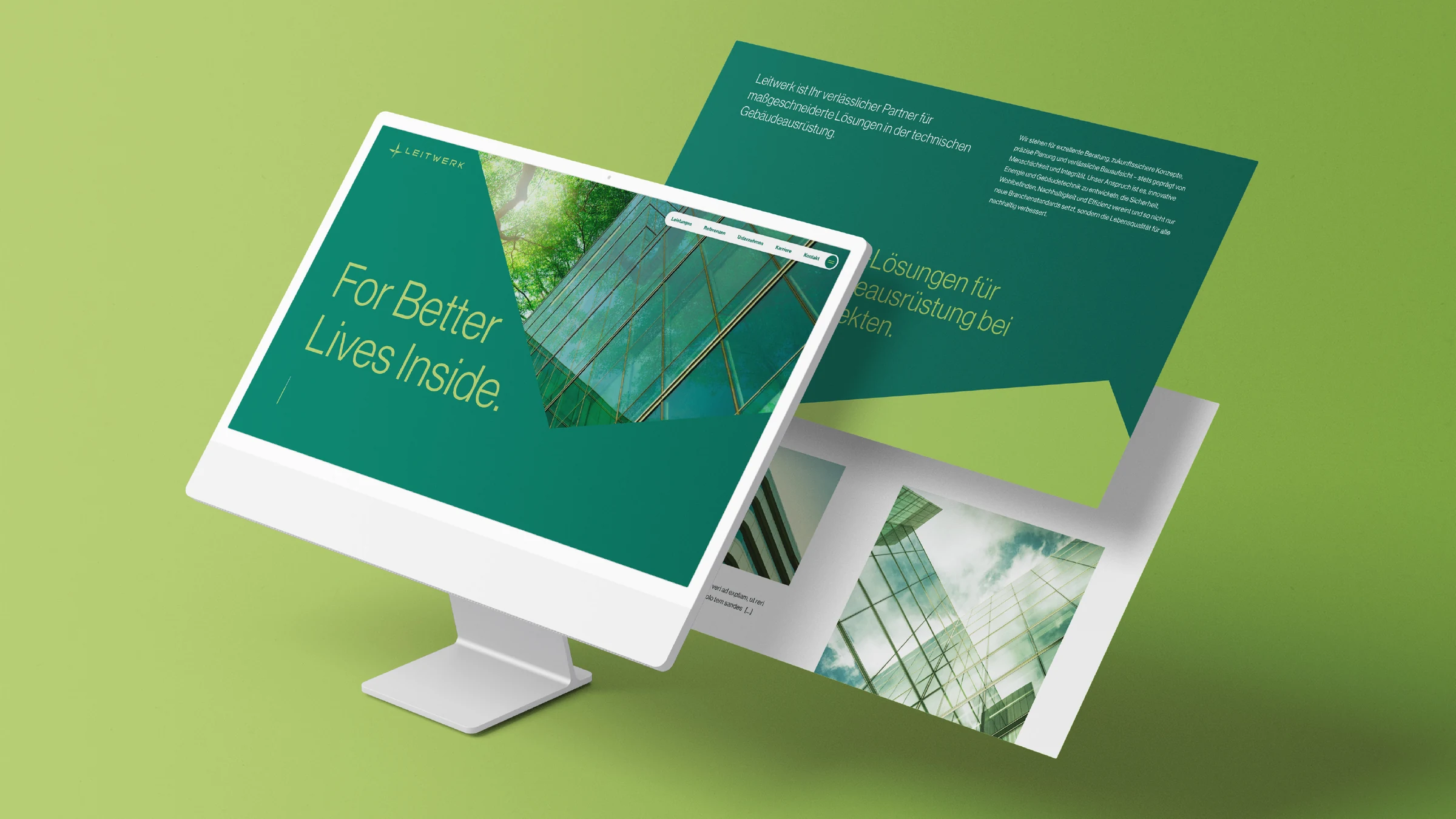
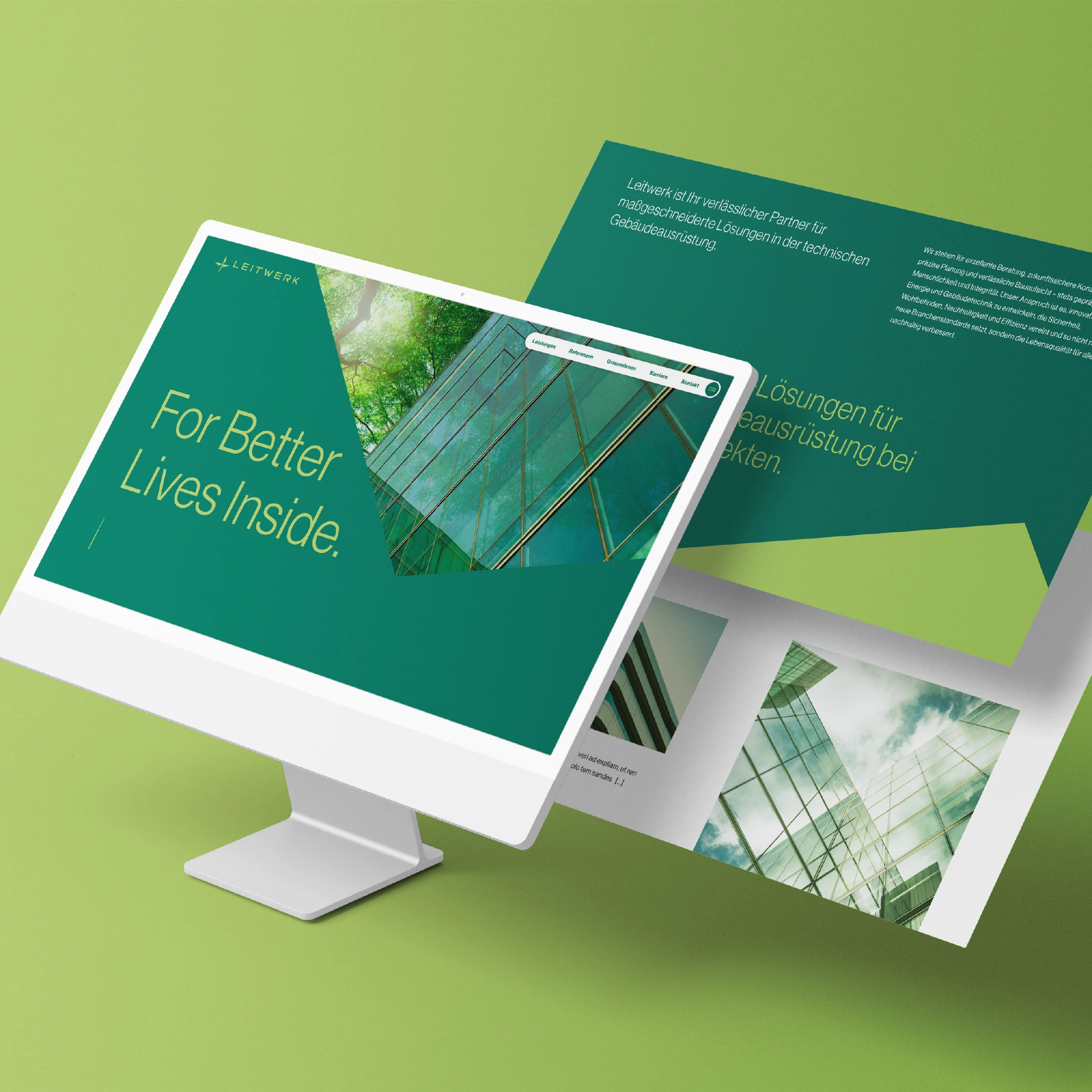
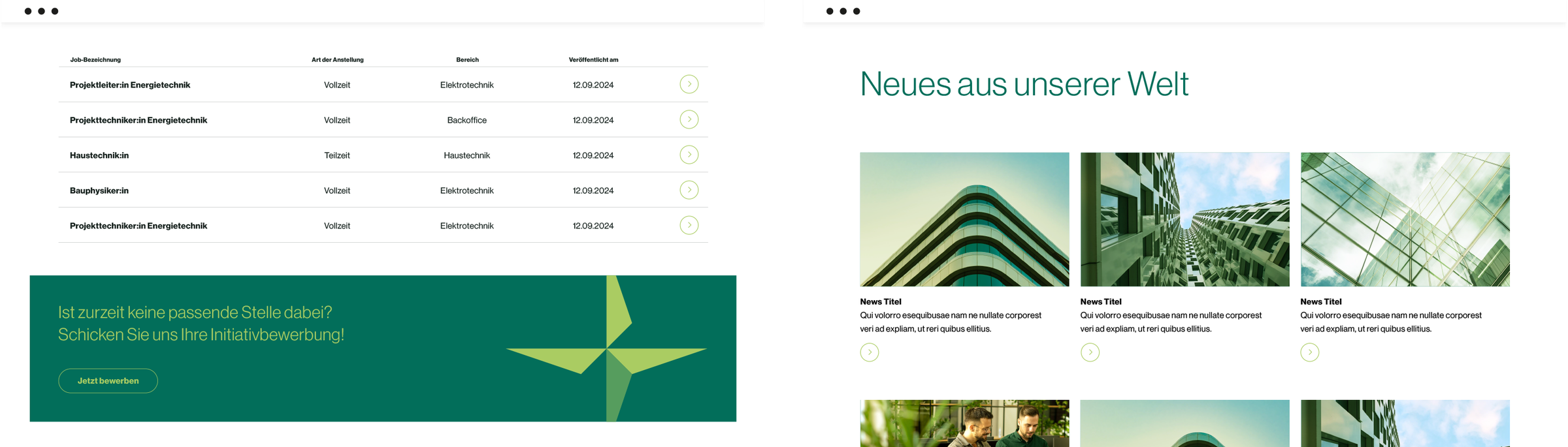
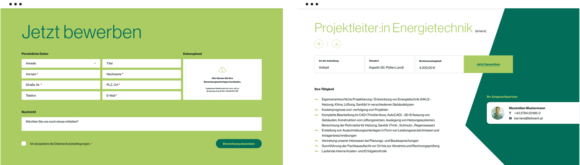
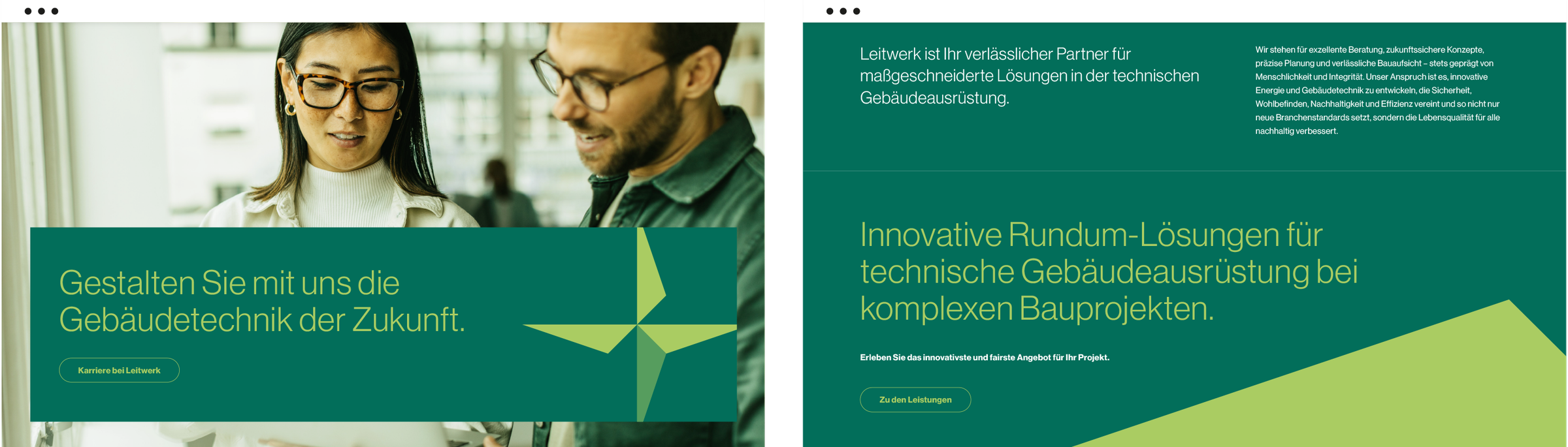
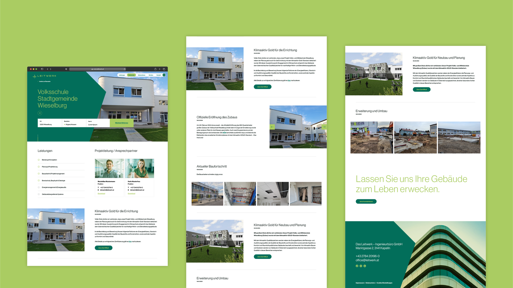
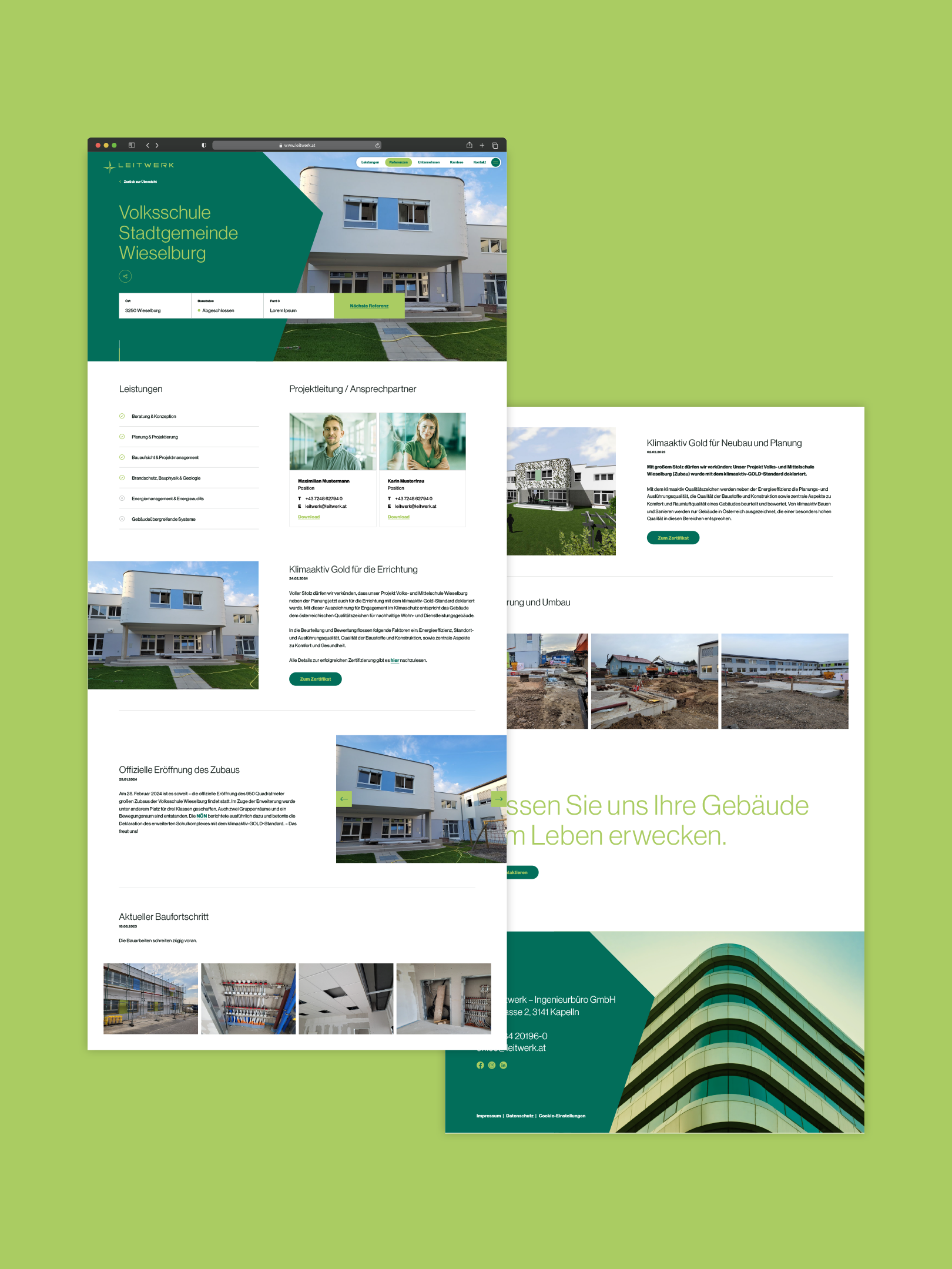
The new website combines modern functionality with a clear, structured design that reflects the company's values and services. Through intuitive navigation, appealing visual elements, and a user-friendly structure, it offers visitors comprehensive insight into the expertise and range of services in the field of building technology.

Design principles in action: A brand that becomes tangible.
As part of the corporate design, the design rules we developed were applied across a wide range of designs and tested for ease of implementation. This process ensured that every element, from colors to typography, works together harmoniously. The result is a coherent overall picture that not only looks convincing but also clearly conveys how the new brand will feel — approachable, modern, and precise in its impact.
The project resulted in a holistic brand positioning that not only created a visually strong identity but also clearly carries the company's core values to the outside world. From the corporate design to the individual design elements, every aspect of the brand was carefully coordinated and reviewed. The result is a flexible yet consistent appearance that reflects the company's professionalism and innovative strength.
Questions and answers about this reference project
Leitwerk is a technical planning office specializing in building services engineering — with the ambition to bring spaces to life: “For Better Lives Inside”. Through intensive brand work and a joint workshop, MOREMEDIA® created a powerful new brand identity — from positioning and corporate design to the finished website.
How does a corporate design convey the expertise of a technical engineering firm?
In building technology, expertise, reliability, and innovative strength are decisive. Exactly these values must be tangible in the corporate design. For Leitwerk, we created an identity through the deliberate use of shades of green, clear typography, and the guiding star as the central design element — one that radiates technical competence and human warmth in equal measure.
What is behind the guiding star as the central element in the Leitwerk logo?
The guiding star is inspired by the North Star – humanity's most reliable point of orientation for centuries. As the central design element, it symbolizes Leitwerk's role: a reliable partner that navigates safely even through complex planning challenges. The star runs through the entire brand world as a defining element – subtle but unmistakable.
How does MOREMEDIA® develop the foundations for a corporate design together with clients?
Every corporate design project begins with an intensive workshop in which we jointly develop the company's central brand values, positioning, and vision. This strategic foundation is crucial – without it, you get beautiful designs that fail to create real brand impact. For Leitwerk, the workshop results formed the core of all subsequent design decisions.
What role does a professional brand presence play in customer acquisition for a technical engineering firm?
Potential clients today almost always check a company's online presence first. A professional corporate design and a well-thought-out website signal competence and quality awareness — qualities that are decisive when planning services are awarded. A weak presence can cost valuable contracts even with excellent technical competence.
Can MOREMEDIA® also help with presentation and proposal templates?
Yes. We develop professional PowerPoint and Keynote templates as well as proposal templates that consistently translate your corporate design into everyday business communication. For technical engineering firms that regularly create presentations and proposals, high-quality presentation design is an important instrument of brand communication.
How we worked
From the first briefing to the result — structured and transparent in clearly defined steps.
01 — Workshop & Analysis
Brand value sprint, positioning, and competitive analysis with the Leitwerk team.
02 — Concept Development
Brand narrative, design principles, derivation of a stylescape.
03 — Design & Design System
Logo, colors, typography, icons, and a complete design system — including a guiding-star element for all media.
04 — Website & Launch
Implemented the new website based on the design system, created content, technical handover.
More interesting
references

