Client

Sentient Expanse

Digital Positioning & Corporate Website

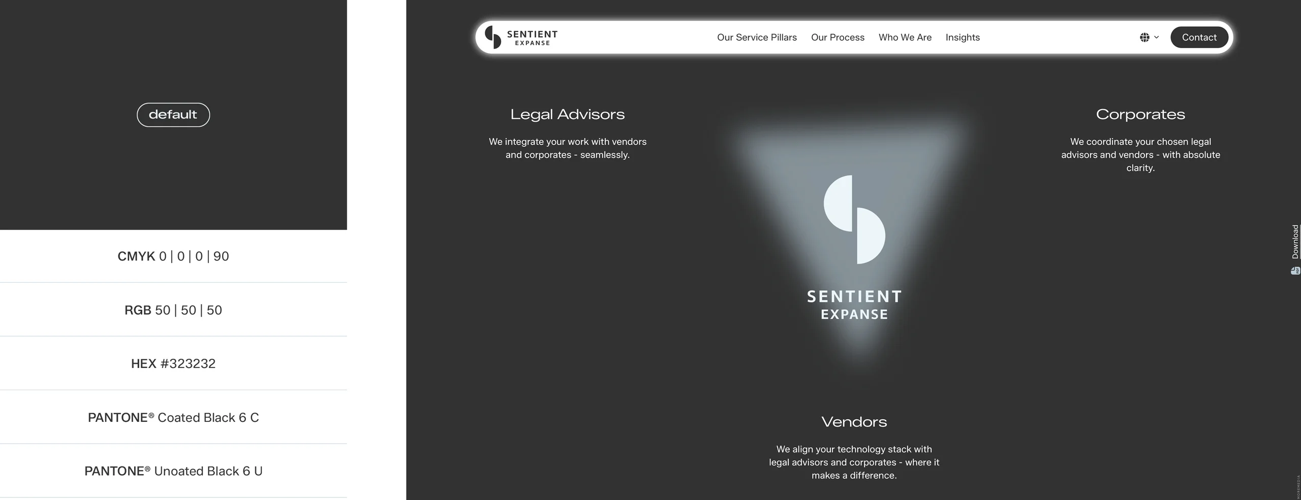
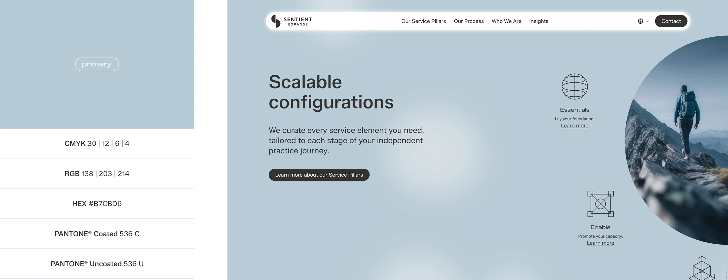
A complex business model. Clearly communicated.

Four founders with decades of international experience in world-leading law firms, regulated markets, technology companies, and cybersecurity – united by a clear conviction: independent top-tier lawyers should have access to the operational, technological, and strategic infrastructure previously reserved mostly for large law firms. At the same time, complex mandates need a high-value partner who confidently brings together legal advisors, international corporates, and technology providers and orchestrates them through demanding projects. From this experience, Sentient Expanse was born – built as the company the founders would have wished for themselves back then: strategically strong, operationally reliable, and technologically at the highest level. A company that rethinks entrepreneurship in the legal industry. Sentient Expanse stands where law, technology, strategy, and execution come together.

It was exactly this depth that made the project especially exciting. Co-developing a brand that convinces experienced lawyers as well as international corporates and technology partners. Creating a website that radiates competence, builds trust, and instantly shows what the company stands for — executed with high design standards and technological excellence. We accompanied the founding team not as a classic service provider but as a strategic sparring partner — thinking along, questioning, and with the ambition to treat the project as if it were our own company.

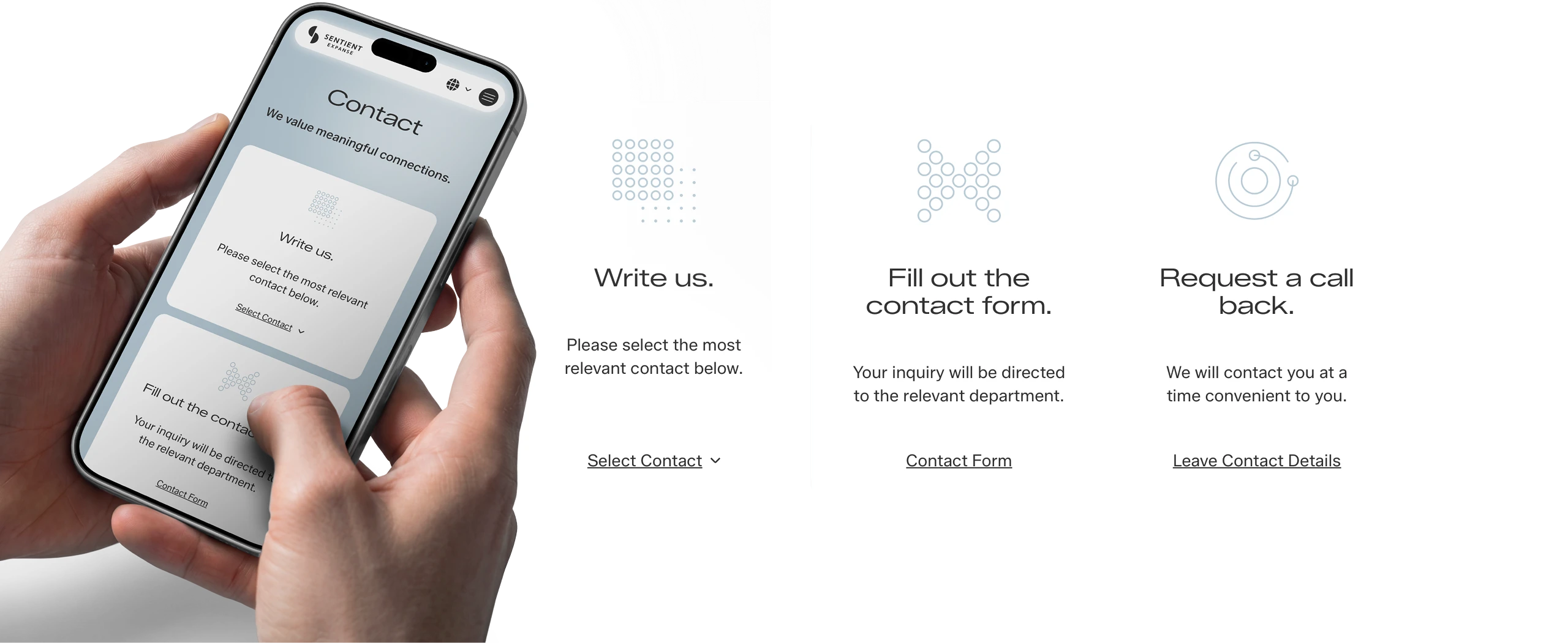
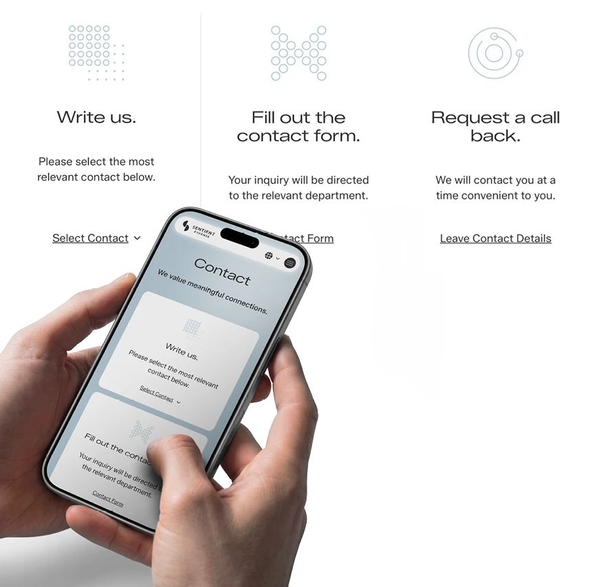
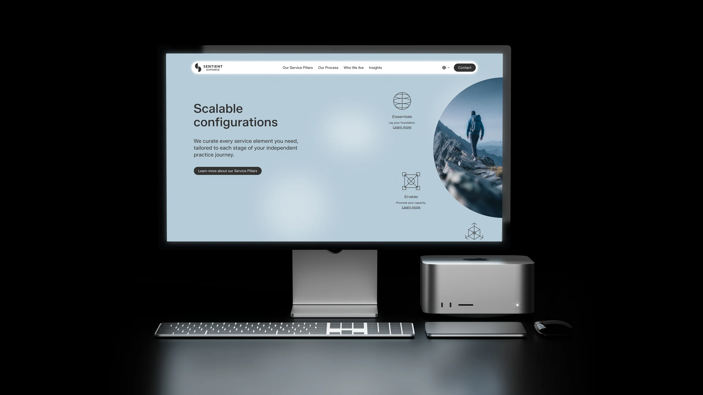
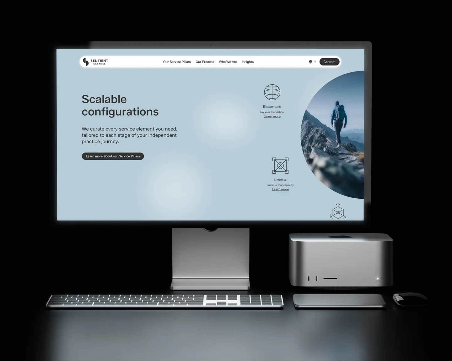
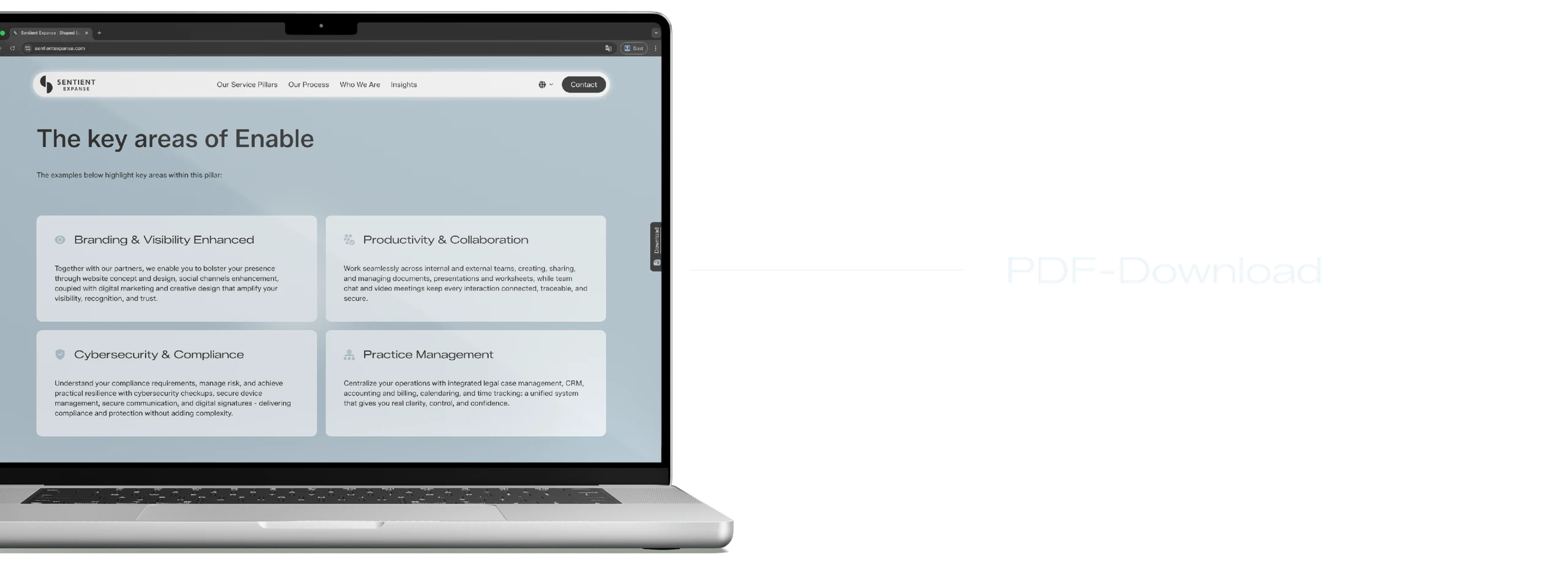
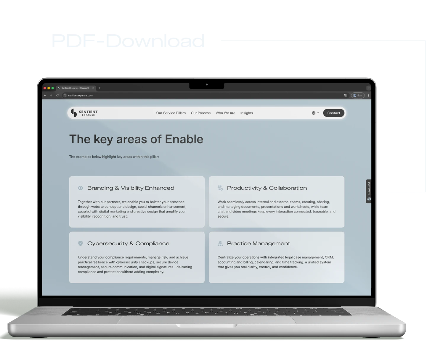
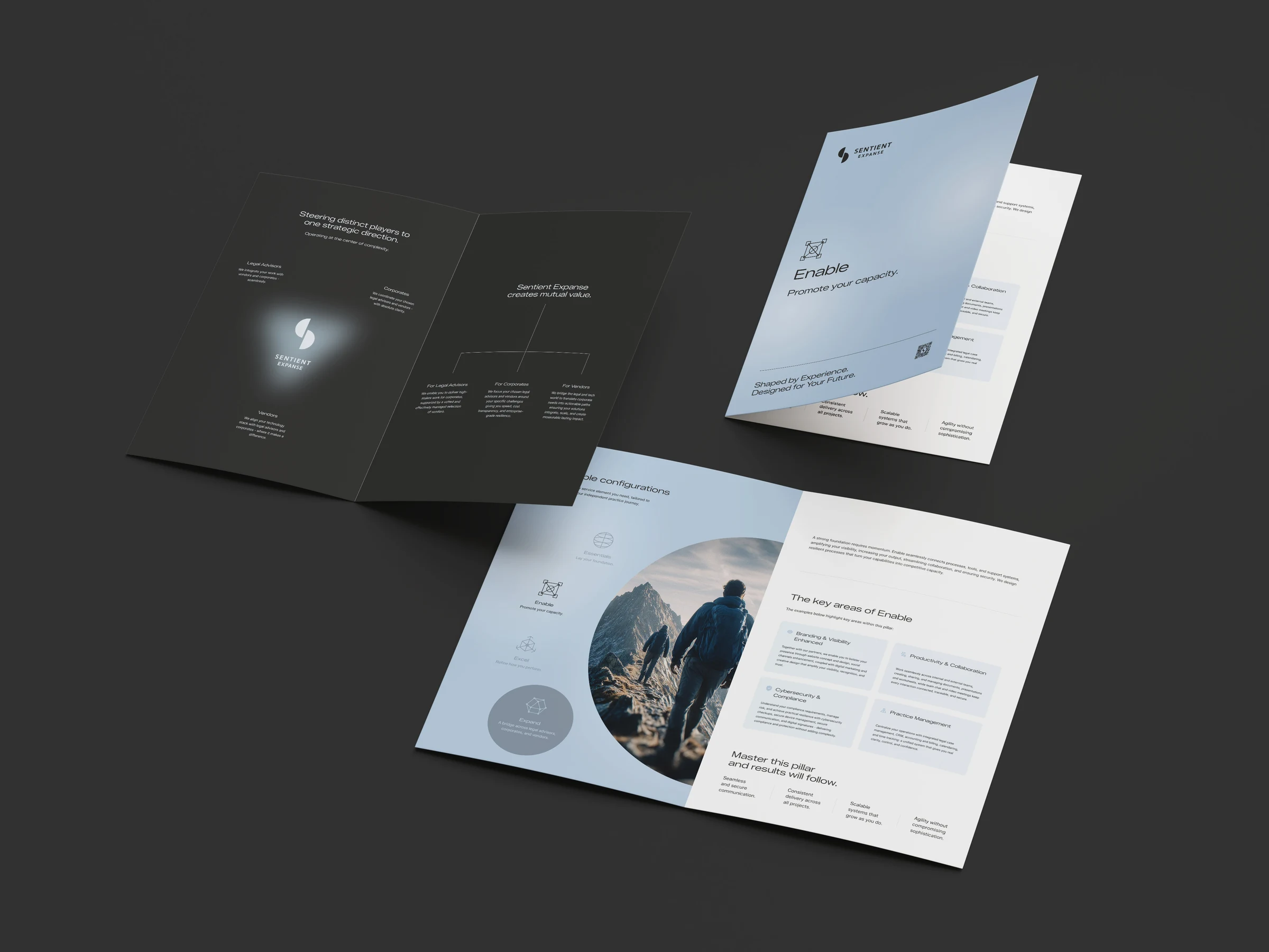
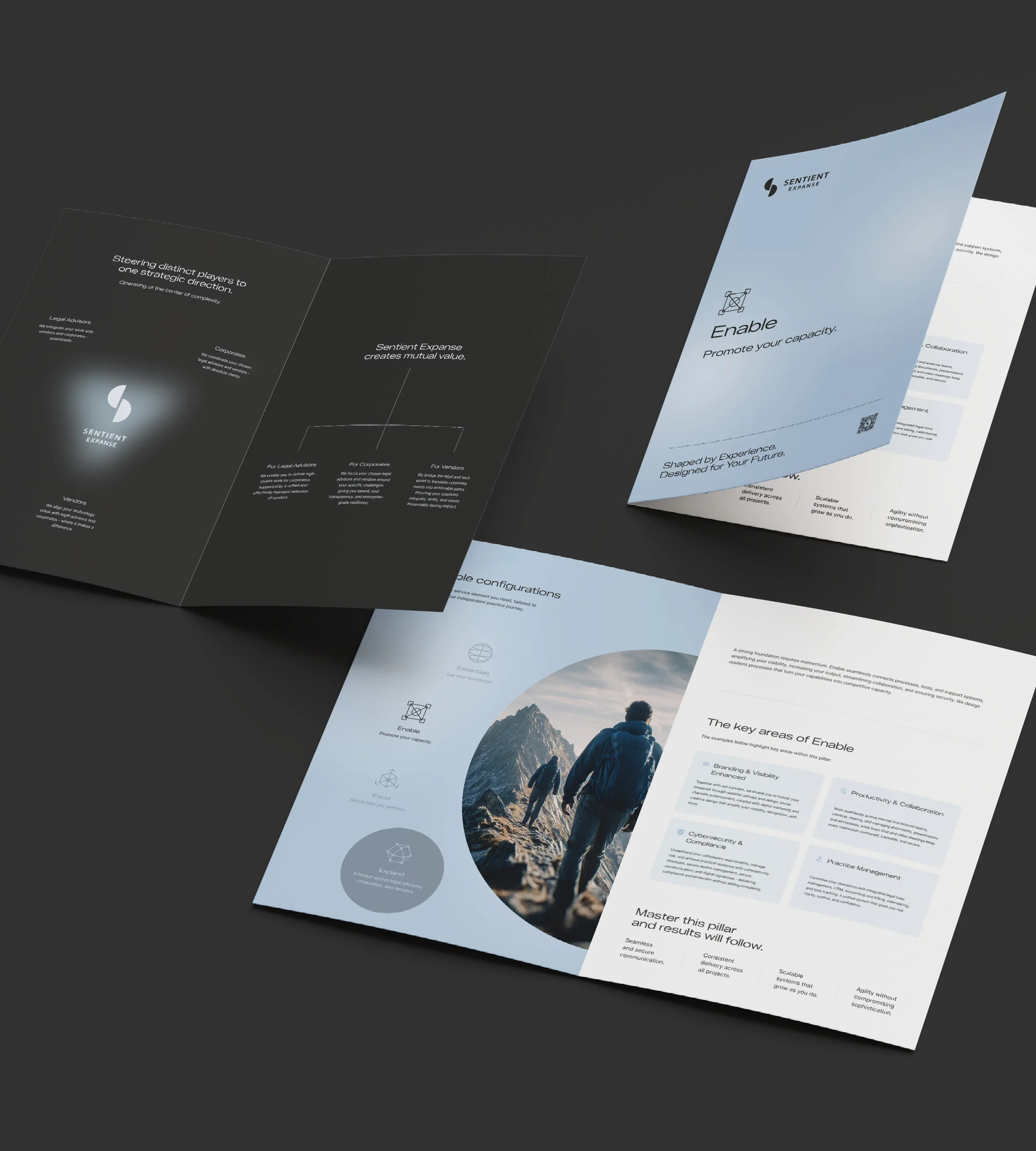
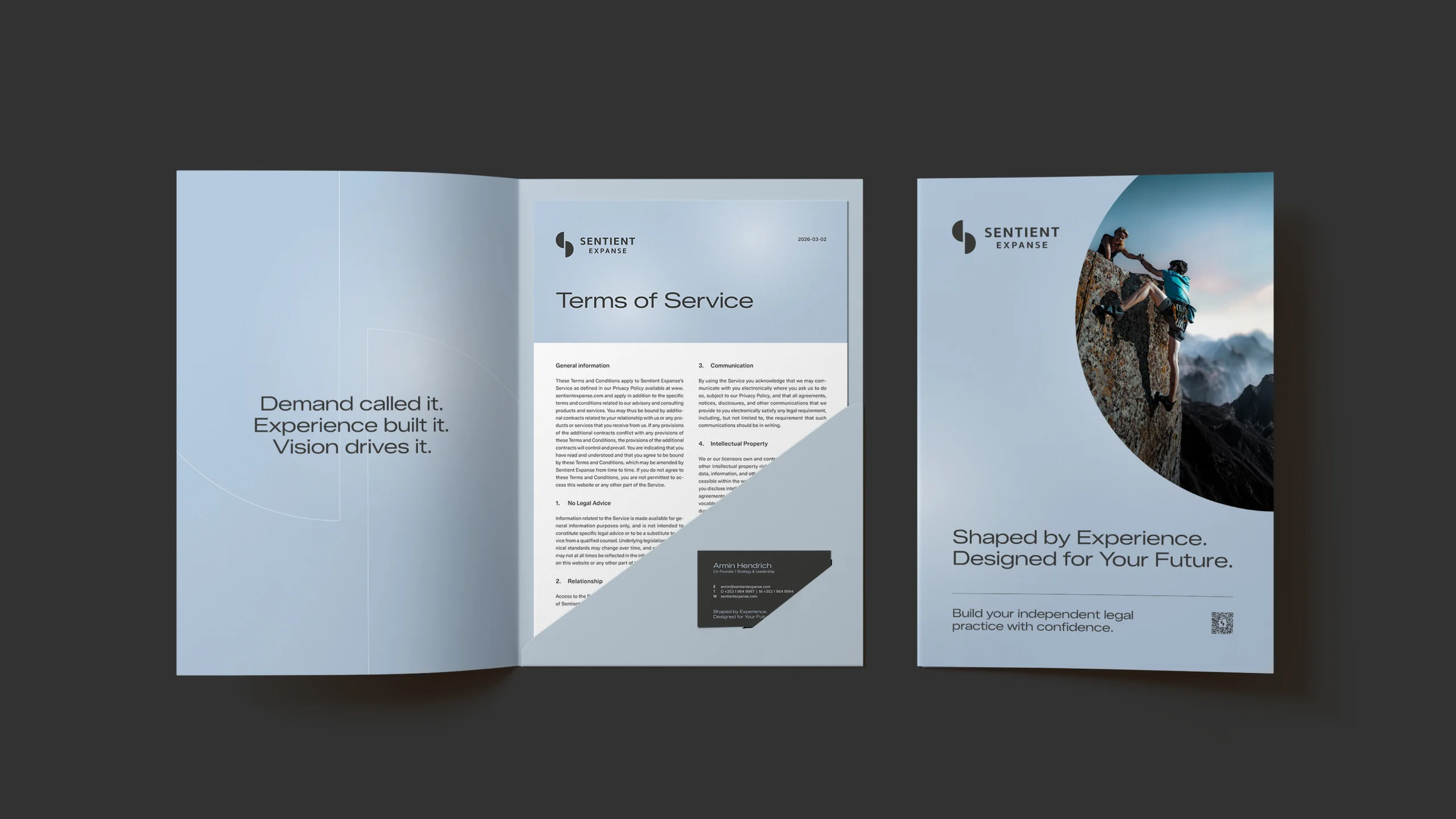
The result is a website that conveys the core of Sentient Expanse: Shaped by Experience. Designed for the Future.

Visit website

Color palette

The color world was developed in collaboration with Sentient Expanse: it is meant to build trust, radiate international class, and deliberately break away from the often interchangeable aesthetics of classic law firm brands. Carbon Grey anchors the presence with calm, authority, and substance. Steel Blue brings technological precision, modernity, and recognizability. Frost Blue opens up the surfaces, creates airiness, and lends elegance to content-dense pages. The result is a look that exudes confidence – high-quality, intelligent, and timeless.

moremedia sentient color
moremedia sentient color mobile
moremedia sentient color 1
moremedia sentient color 2
moremedia sentient color 3
moremedia sentient color 1 mobile
moremedia sentient color 2 mobile
moremedia sentient color 3 mobile
moremedia sentient typography 1
moremedia sentient typography 1 mobile

Typography

Typography does more here than ensure pure readability — it conveys attitude. With Zalando Sans, the choice fell on a type family that works in a modern, clear, and international way. Punchy headlines create presence. Structured medium weights guide readers through complex content. Calm text weights ensure high reading comfort even with demanding topics. Especially in bilingual use, the system convinces through consistency, precision, and stylistic calm.

moremedia sentient typography 2
moremedia sentient typography 2 mobile
moremedia sentient typography 3
moremedia sentient typography 3 mobile

UI elements (icons, buttons, navigation)

The user interface was consistently designed for quality, orientation, and dynamism. Navigation elements feel clear, bold, and high-end – with strong presence without being intrusive. Menus guide visitors intuitively through the service portfolio and set deliberate visual accents. For the four service pillars, individual, geometrically reduced icons with a distinctive formal language were created. High-quality micro-animations, fluid transitions, and purposefully deployed motion give the presence additional depth and modernity. The result is a digital experience that conveys competence and makes quality tangible with every click.

moremedia sentient icons 1
moremedia sentient icons 1 mobile
moremedia sentient icons 2
moremedia sentient icons 2 mobile
moremedia sentient buttons
moremedia sentient buttons mobile
moremedia sentient navigation 1
moremedia sentient navigation 1 mobile
moremedia sentient navigation 2
moremedia sentient navigation 2 mobile
moremedia sentient contact 1
moremedia sentient contact 1 mobile
moremedia sentient web mockup 1
moremedia sentient web mockup 1 mobile

PDF download

For each service pillar, standalone PDF documents were developed that meaningfully extend the digital presence. They allow prospects to share services internally, prepare decision-making processes, or explore content in depth offline — a relevant factor in an international B2B environment with multiple stakeholders. In design and tone, the PDFs consistently follow the brand identity: high-quality, clearly structured, and prepared at management level. The result is a consistent sales ecosystem that works far beyond the website.

moremedia sentient pdf 1
moremedia sentient pdf 1 mobile
moremedia sentient pdf 4
moremedia sentient pdf 4 mobile
moremedia sentient folder

Strategic copywriting in the original language with idiomatic adaptation

A key success factor of the project was the linguistic positioning. Sentient Expanse addresses experienced lawyers, international corporates, and technology partners at the same time – three target groups with different expectations and decision patterns. The content foundation was developed and strategically built in English. The German version was then not translated, but independently rethought – with an adapted feel for the language, a clear tonality, and culturally fitting messaging.

The result is messaging that comes across as precise, credible, and premium. Complex services become understandable, experience becomes tangible, and future readiness is clearly communicated.

Questions and answers about this reference project

Sentient Expanse addresses independent top-tier legal professionals worldwide – a market environment with traditionally restrained visual conventions. Building a distinctive, internationally viable brand presence within this tension was the core of the project.

What does the Sentient Expanse brand presence comprise?

Sentient Expanse is positioned as an international infrastructure platform for independent top-tier legal professionals. Together with Sentient Expanse, we developed the brand architecture and the corporate design as well as the corporate website – from the visual system to the English-language main site and the German version.

How is the website's language strategy set up?

The main version is English because the target audience operates internationally; a German version complements it for the DACH region. Both versions are created editorially and visually as one, so the brand appears with the same clarity in every language region.

How does the design system support the brand character?

Reduced, calm imagery, clear typography, and a restrained color system give Sentient Expanse the feel of an international infrastructure provider rather than a traditional law firm. The design system is built to extend coherently from the website to additional brand media.

How is the brand managed consistently across digital and accompanying media?

We define a central design system – typography, color, imagery, component logic – that works the same on the website and in accompanying brand media. This keeps the presence recognizable, whether someone discovers Sentient Expanse online or gets in contact through other channels.

How we worked

From the first briefing to the result — structured and transparent in clearly defined steps.

01 — Brand Strategy & Color Palette
Jointly developed a trust-building color palette with international appeal.

02 — Typography
Chose Zalando Sans — a modern, clear typeface with attitude.

03 — UI Design
Designed navigation, buttons, and icons for quality, orientation, and dynamism.

04 — Copywriting
Strategically positioned content in the original language with idiomatic adaptation.

05 — PDF & Service Pillars
Developed standalone PDF documents for each service pillar.