Brand positioning, brand design, and corporate website
As a competence center for network technology, NTIT offers individual, holistic, and sustainably effective solutions – Connected by Solutions. With highly specialized consulting, vendor-independent procurement, and decades of experience, the brand has built a strong range of services. In a positioning workshop, we defined the company's core values and initiated the brand relaunch. A purist, value-driven corporate design and a modern, functional website form the basis of the new public image. The comprehensive design system sets the rules for all future creative work and ensures a consistent, contemporary appearance.
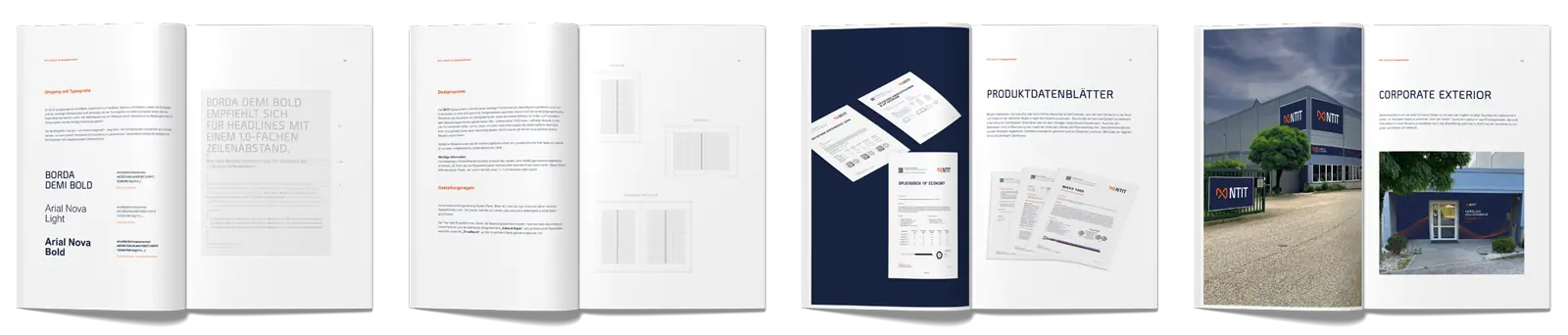
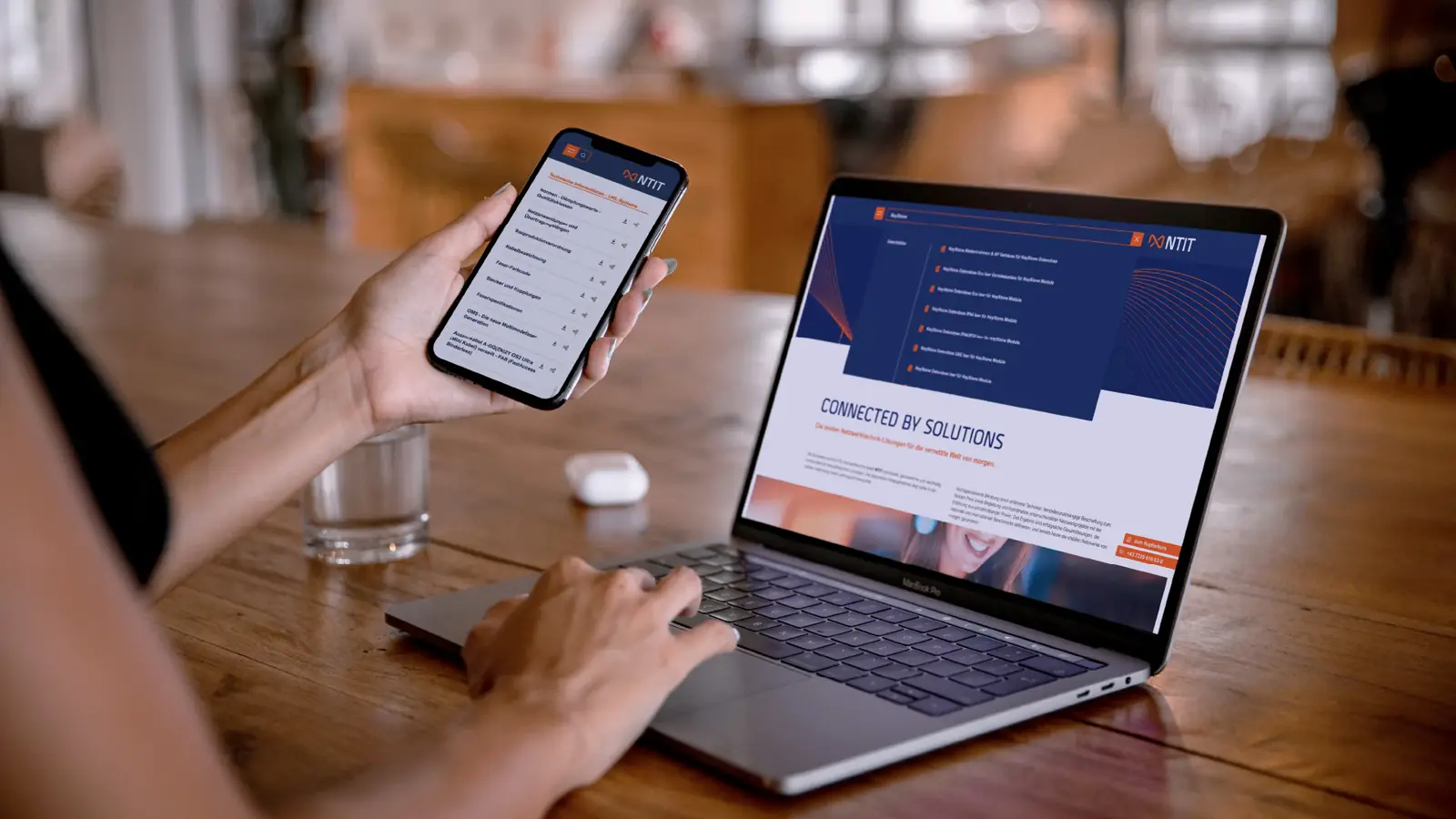
Hundreds of product data sheets automated in real time — a technical presence on a new level.
Visit website
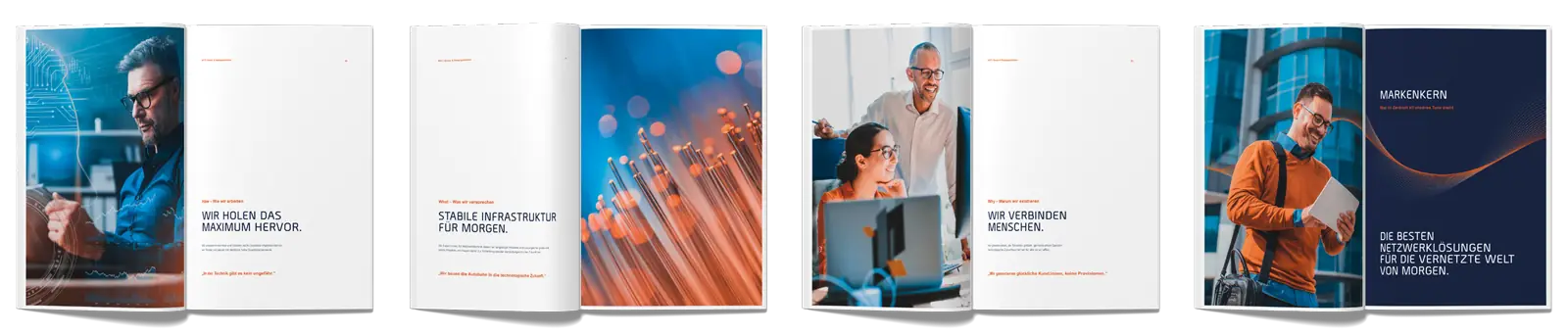
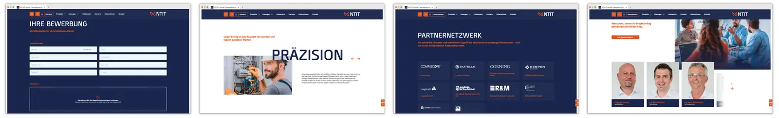
Precision, flexibility, and loyalty – those who know their values can pursue the path to the future with consistency.
A two-day workshop formulated an authentic picture of the values lived within the company and defined the guiding principle for developing the new visual identity. In a relaxed atmosphere, we worked with NTIT's decision-makers to capture what defines the company and the people who work in it, and shaped it into a clear vision.
The insights gained and the infectious enthusiasm from the workshop flowed seamlessly into the visual communication concept to create a universally applicable design system that serves as a solid basis for future designs. The emotional components were skillfully united with the facts to ensure a consistent and effective appearance that sticks in the memory and, above all, remains easy to apply over time.
Our approach is based on active listening, creative design, and comprehensive presentation to make brands truly tangible.
We listen closely to our clients to truly understand their needs and goals. When designing, we are only satisfied once we are thrilled with the results ourselves. And when it comes to presenting our work, we take an unconventional path. We show our clients the complete, finished corporate design, including well-thought-out rulebooks and application examples, instead of releasing individual fragments – to make the big picture clearly visible.
Of course, this also means that we as an agency may have to rework things more than once. But the real effect the brand will later unfold — and which we can let our clients experience in its entirety — matters more to us than the supposed security of fragments approved in isolation. We firmly believe that our approach delivers the best result for our clients, and we guarantee this approach to every client we accompany through the entire brand process.
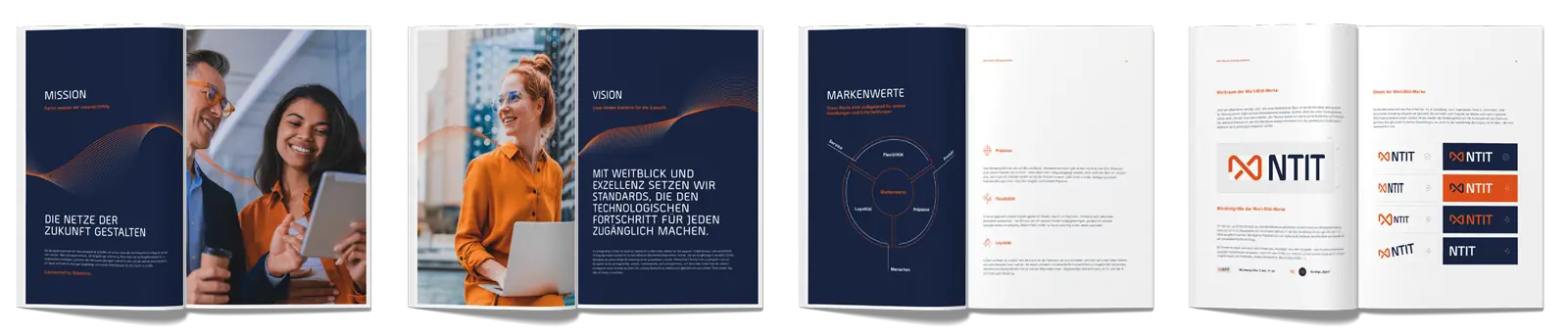
New meaning for familiar elements. The logo.
Whenever we modernize the design of our clients, we try to retain elements and reinterpret them in a modern way – continuing the company's DNA on the one hand and making it fit for the years ahead on the other. At NTIT, it turned out over the years that the "&" (and) was in fact no longer used in everyday language. We took this into account and, in redesigning the logo, turned this element into a distinctive stylistic device with multiple meanings, which now appears in the new logo in the form of a stylized cable with a touch of the infinity symbol.
Typography and color concept
A particularly demanding task in this project was selecting typography that fit both aesthetically and functionally. On the one hand, the typography was meant to emphasize the company's values and set the design apart from competitors; on the other hand, numerous frequently used special characters placed special demands on the new corporate font that only a few typefaces could meet. After careful consideration, we chose a combination of the bold, distinctive typeface "Borda" and a reinterpretation of a classic – "Arial Nova". This combination comprehensively covers all functional criteria for body text and data sheets while still not being a widely used standard font. With it, we successfully achieved the desired balance between company values and functional requirements.
The color concept picks up the orange from the previous design and carries it into the new corporate design in a slightly adjusted shade. It is complemented in the new brand design by a deep dark blue that forms a calm counterpoint.
An exact design system for effective designs in the style of the corporate design
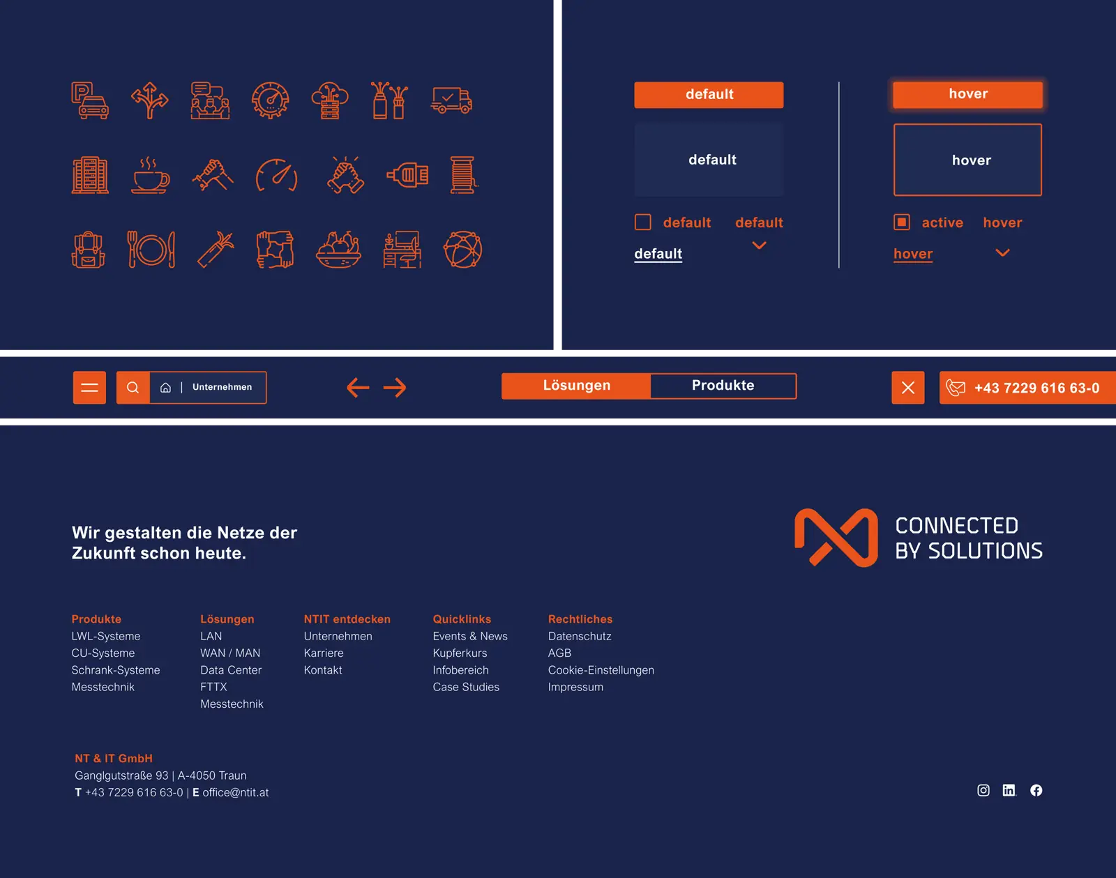
The design process developed for NTIT is universal and easy to apply. A precise set of rules defines all designs regardless of format. With this system, it will be possible in the future to design consistently in NTIT's unified style, independent of individual tastes. This increases efficiency, reduces stress, and ensures the consistent application of the design fundamentals according to the guidelines.
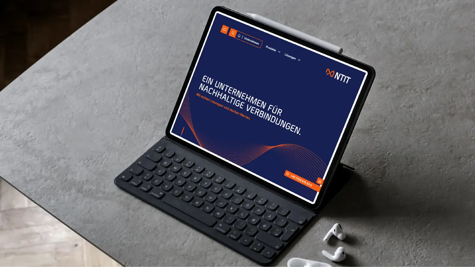
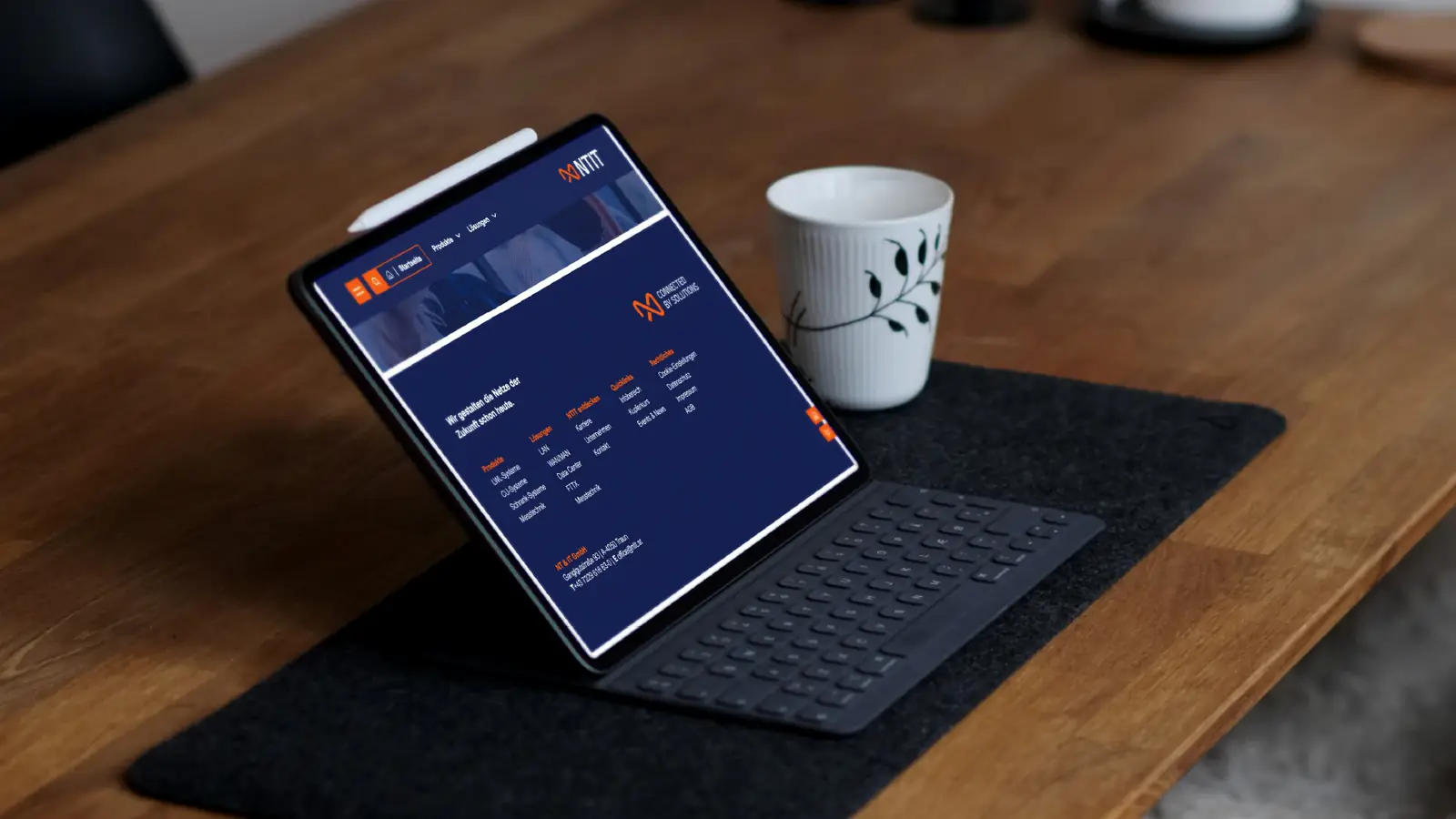
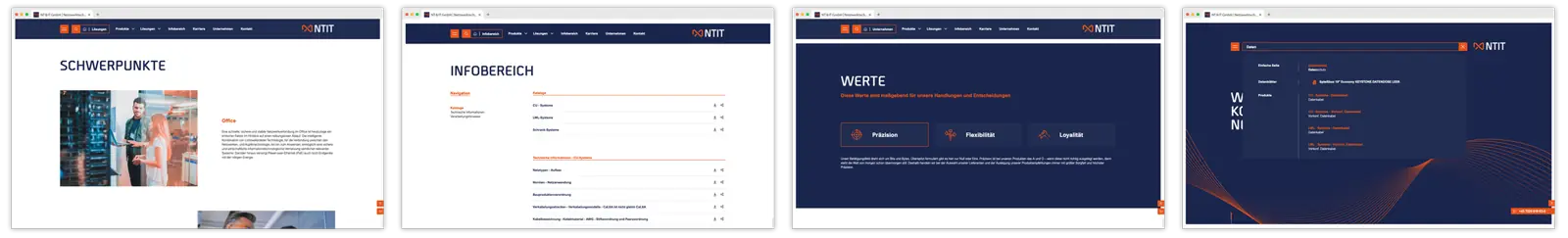
The new corporate website with an integrated system for generating hundreds of PDF data sheets
At the heart of the new website is a fully digitized product presentation. With the help of a custom-developed data sheet generator, hundreds of frequently changing data sheets are generated in real time. Previously, these data sheets were created in software and inserted into the website as exported PDFs. This process not only demanded significant staff resources but was also error-prone.
With the new data sheet generator, the data basis is now updated in one central place and a new version is created. This version contains a version code and QR code that enables customers to reliably identify even already-printed versions and, if needed, download the current one. As an additional feature, a catalog generator was developed that compiles a selection of data sheets with a personalized cover page and a predefined back page into a printable PDF – it even ensures that the page count is divisible for brochure printing: depending on the amount of content, predefined pages styled like graph paper are added automatically, providing space for notes.
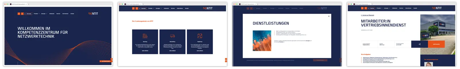
Care was also taken to present a large volume of content on the website in a visually reduced way. A well-thought-out page structure guides visitors to the relevant information on the very first screen and quickly leads them to the deeper content that interests them.

The proof of concept: the new brand design in practice
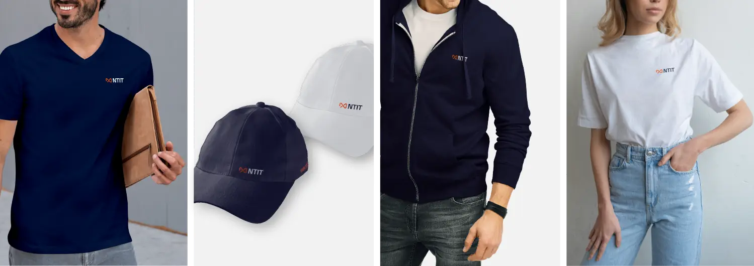
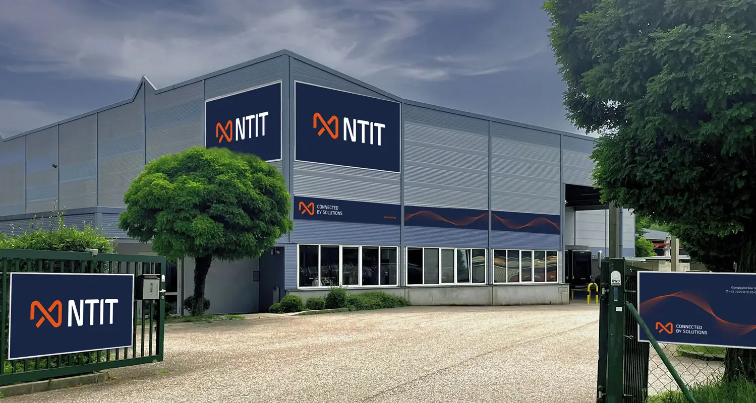
The newly developed brand design has already been extensively tested on numerous print materials and advertising media and has proven itself. The designs created according to the rules of the system add up to a clearly defined look with high recognition value. Whether on textiles, brochures, or exterior design – everything bears the signature of the NTIT brand, makes employees proud of their company, and clearly shows who it is about.
Source: Google
How we worked
From the first briefing to the result — structured and transparent in clearly defined steps.
01 — Values Workshop
Defined the lived values and the guideline for the visual identity in two days.
02 — Logo Rebranding
Preserved familiar elements and reinterpreted them in a modern way.
03 — Typography & Design System
Chose fitting typography and built a precise, format-independent set of rules.
04 — Website & PDF System
Implemented a digitalized product presentation with a system for hundreds of PDF data sheets.
05 — Proof of Concept
Put the new brand design to the test in practice.
More interesting
references

