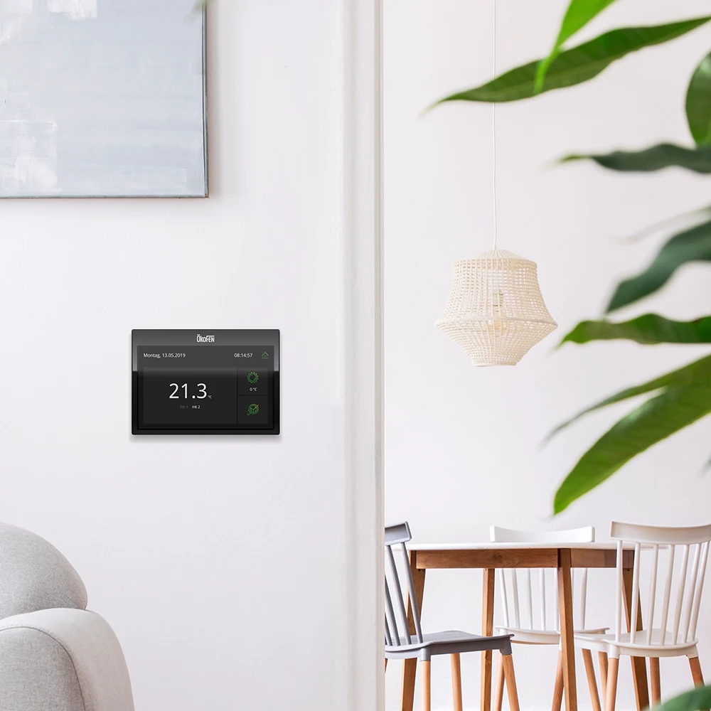
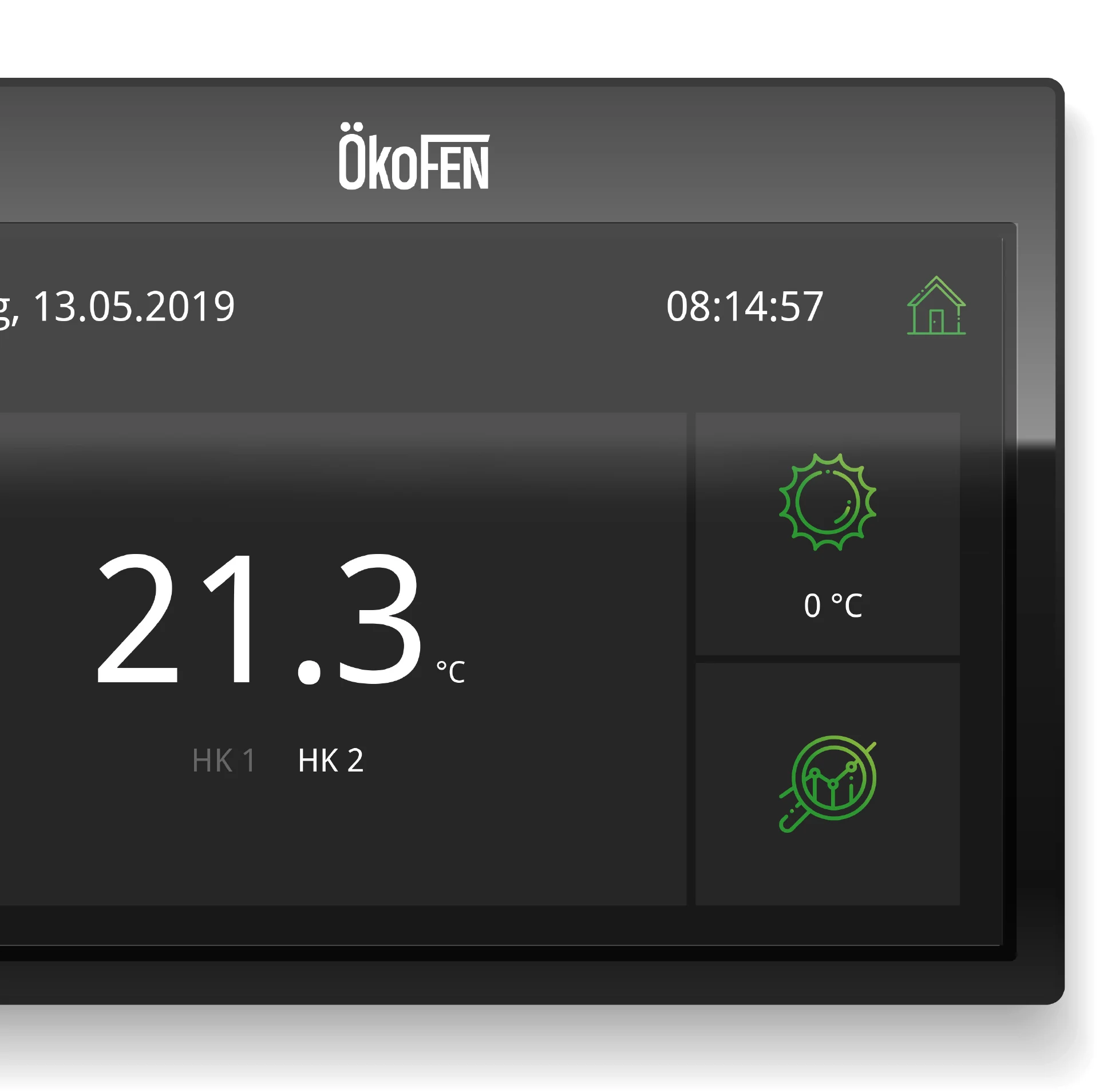
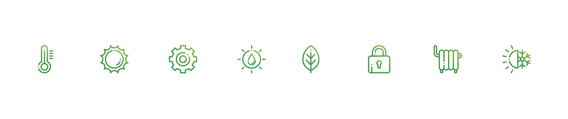
ÖkoFEN is the global pioneer in pellet heating systems. For the touch panels of their heating controllers, we developed the user interface design as well as the icon design.
The UI challenge with rarely used devices
Nowhere is a well-thought-out, clearly structured, and intuitively operable user interface as decisive as with devices that are rarely actively used in everyday life — and that applies to heating controllers in particular. Unlike smartphones or home assistants, heating controls are often consciously operated only once or twice a year, usually at the change of seasons or for extra comfort.
Instantly understandable — no explanations needed
Precisely because handling the device is not part of daily routine, operation must succeed immediately even without regular use. An interface must not require explanation or lengthy searching, and must give users a sense of control back with just a few actions. Poor usability quickly leads to frustration — or to settings not being made at all.
Our solution: reduction to the essentials
For the touch panels of a renowned manufacturer, we developed a user interface designed from the outset for maximum clarity, reduction, and logical workflows. The focus was not on effects but on the question: How does the user feel the moment they touch the device — and how can we help them intuitively?
Design principles and interface elements
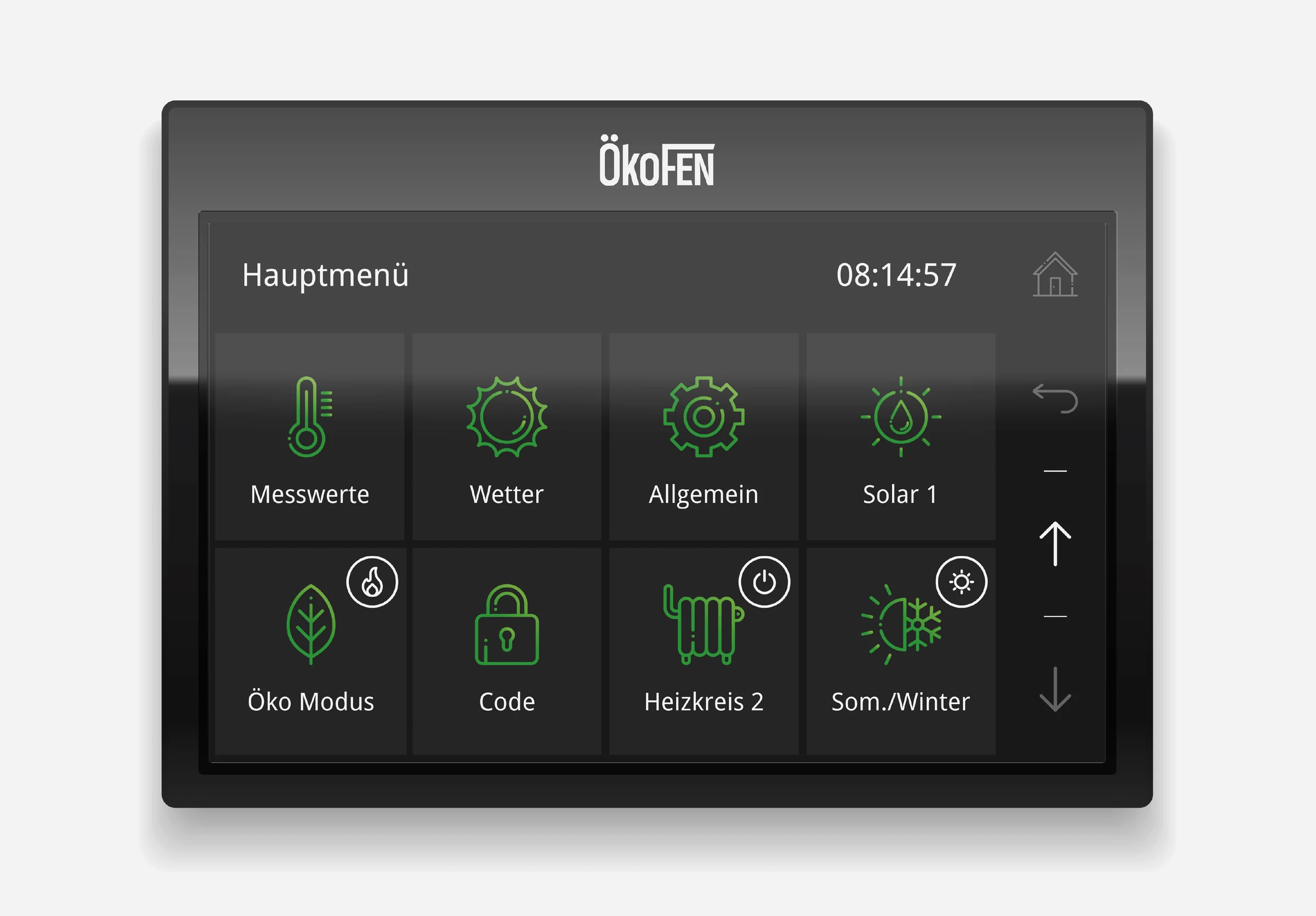
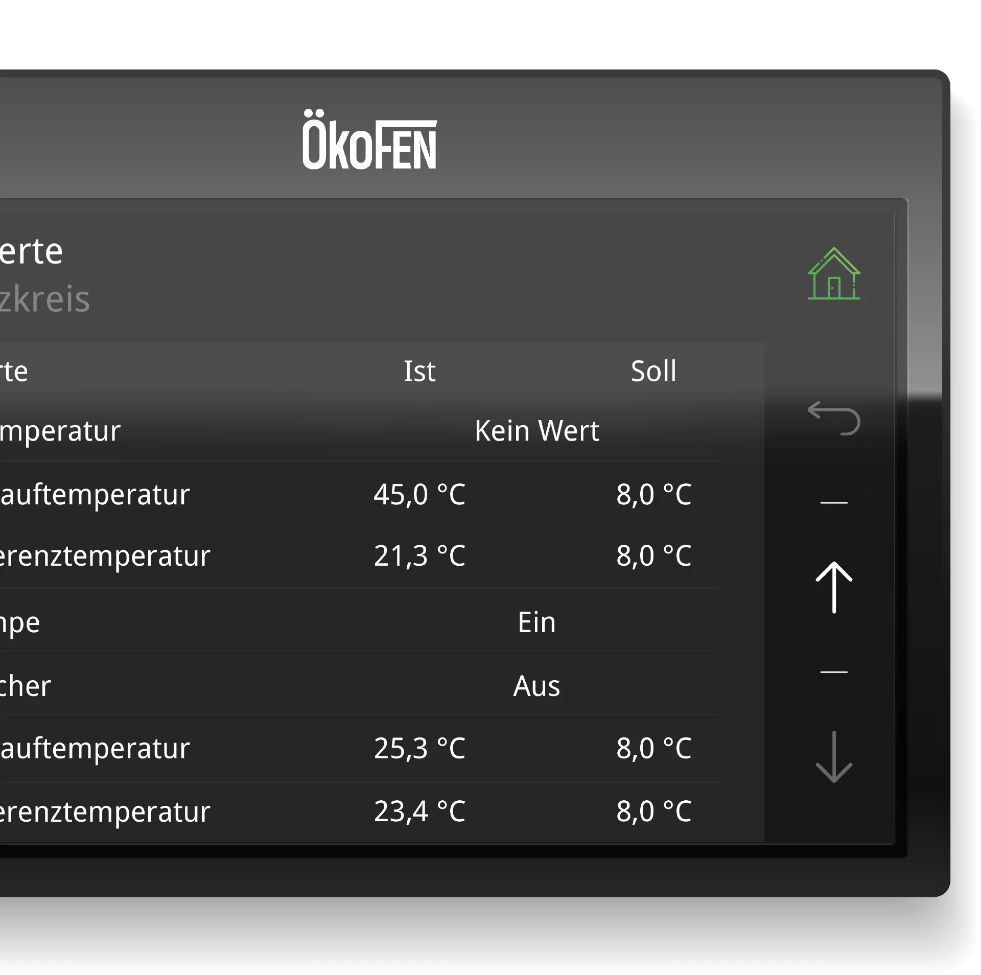
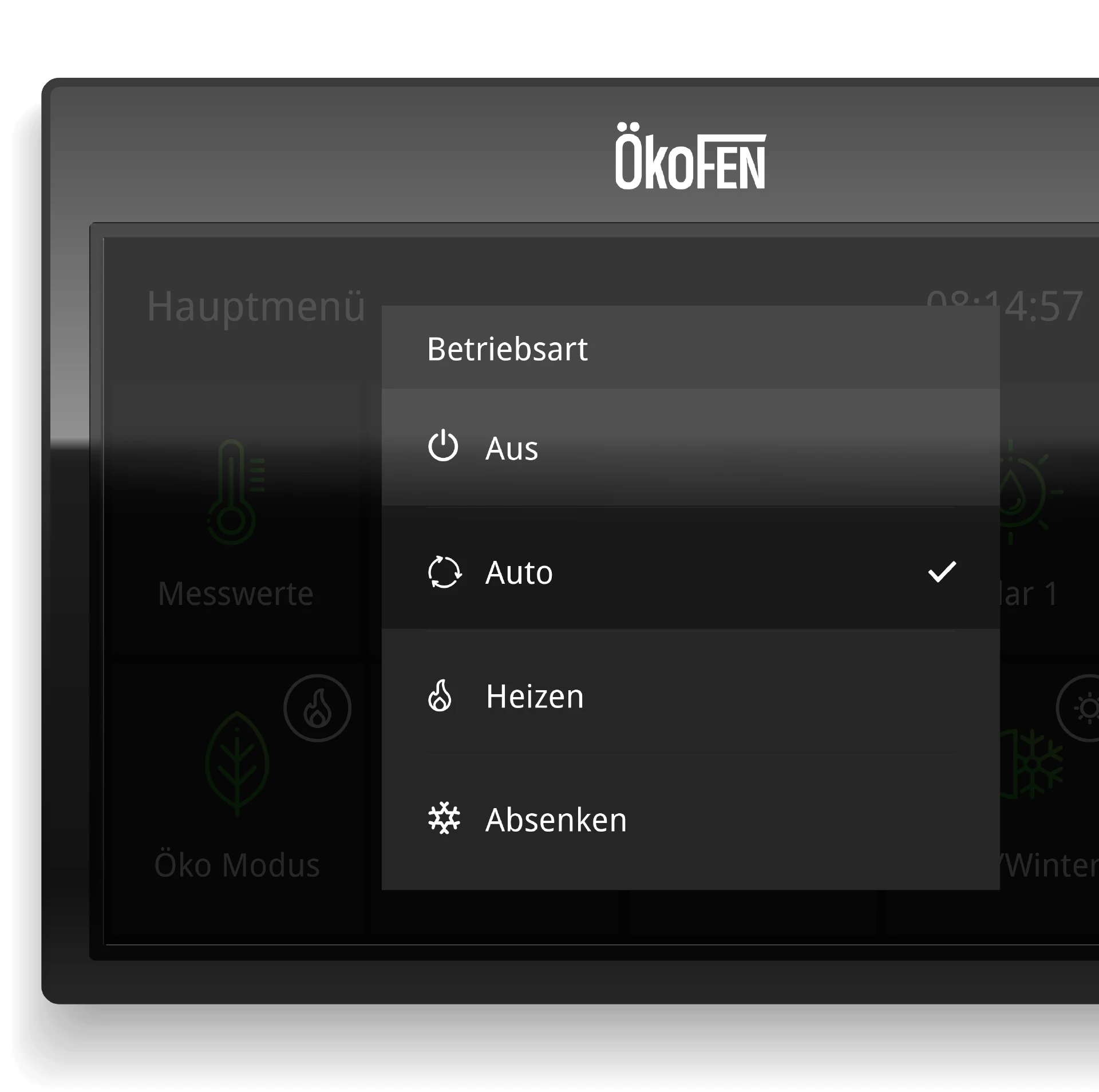
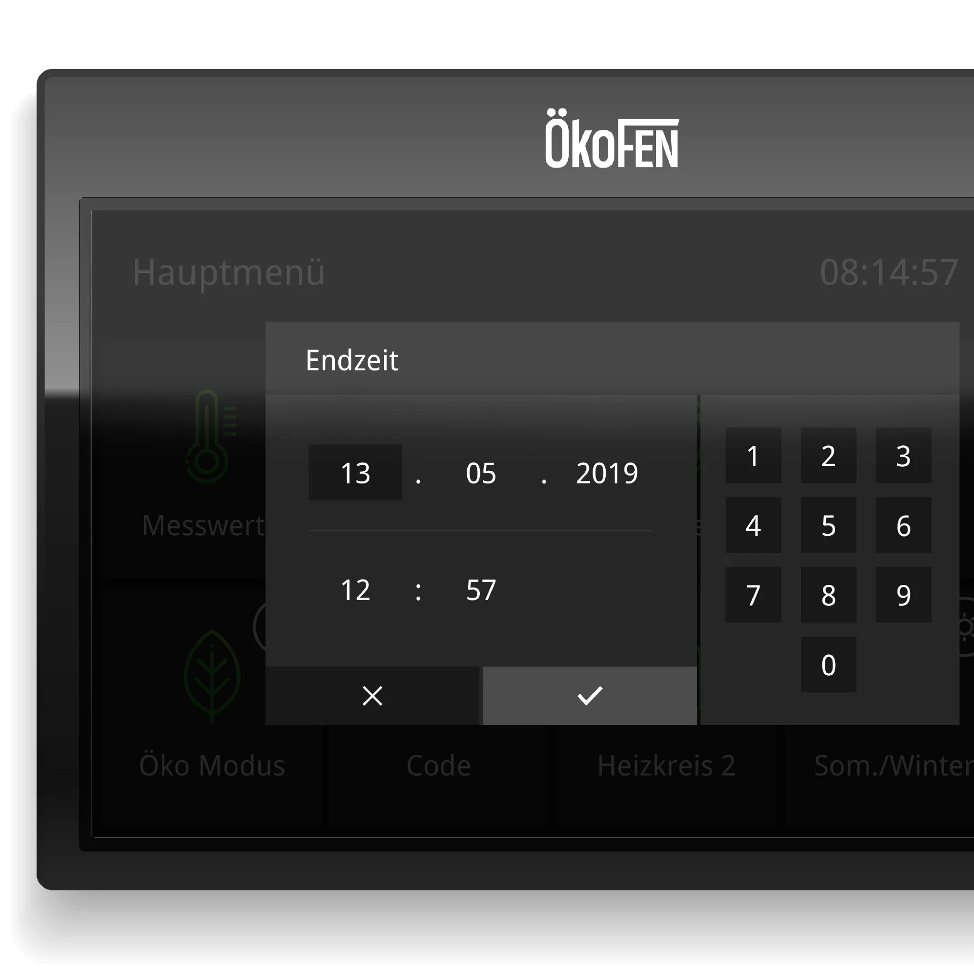
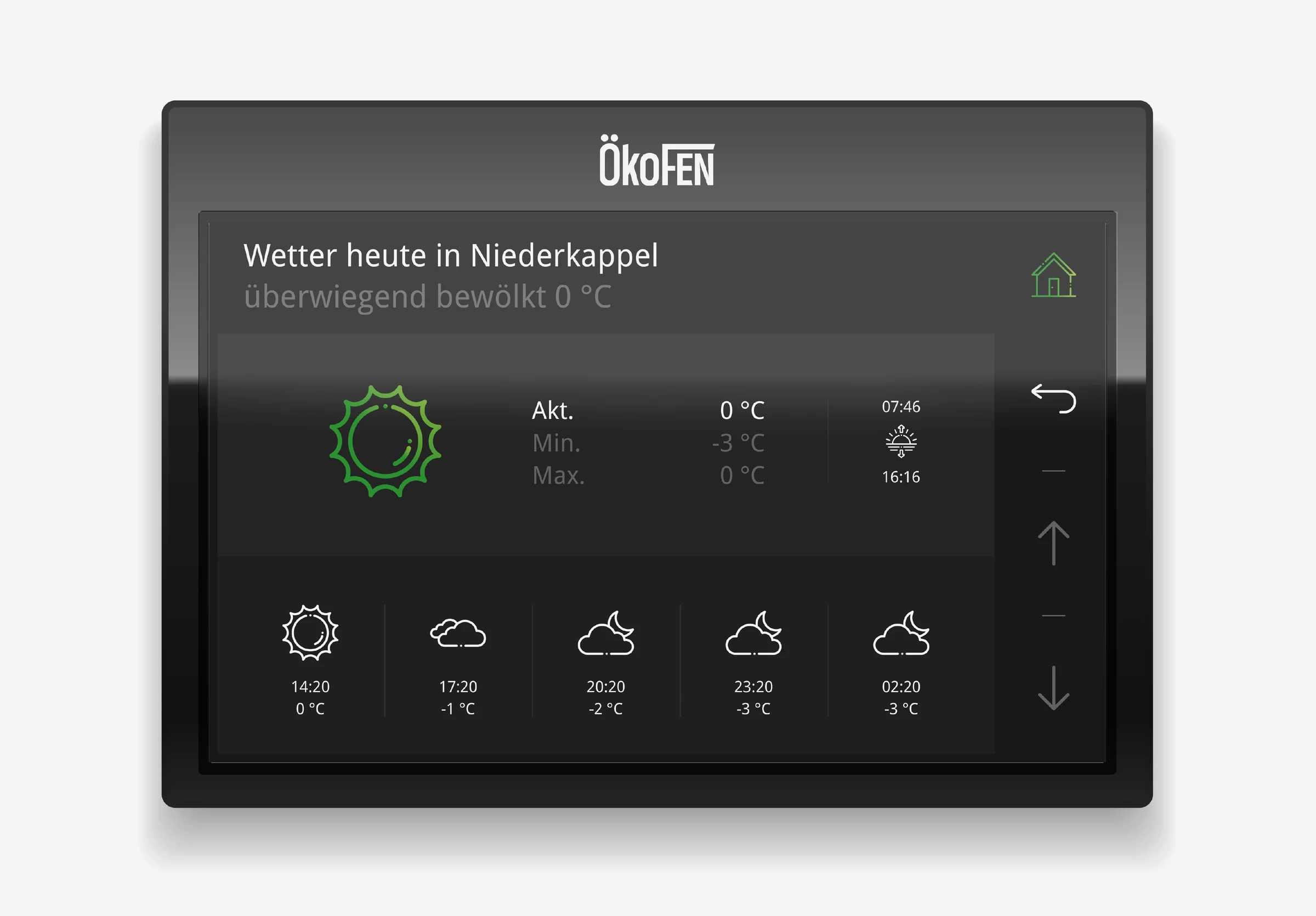
The result is a deliberately reduced visual interface that avoids any unnecessary complexity and instead relies on self-explanatory icons, clear hierarchies, and stringent user guidance. Every control was designed to be immediately understandable and unambiguous – regardless of users' technical affinity.
Dark mode as a functional design element
A modern dark mode was used as a visual stylistic device. It looks refined and contemporary, is easy on the eyes in low light, and enables a high-contrast display – even from unfavorable angles or under changing lighting conditions.
No learning curve – instant service
Our goal was a user interface so reduced and logically structured that it requires no relearning — even if months pass between uses. Every button, every animation, and every visual decision serves usability, clarity, and trust.
Conclusion: make technology invisible
The simple, understated aesthetic emphasizes function and underscores the product's ambition: technically sophisticated, yet invisible in everyday life. The result is an interactive experience that doesn't just deliver modern heating control, but redefines it: complex technology becomes tangible, controllable, and pleasant to use. Good UI design makes technology understandable without oversimplifying it, offers solutions without overwhelming, and leaves an impression – even when used only once a year.
Translated complex control logic into an intuitive UI/UX — understandable for every user.
FAQ
Frequently asked questions
UX (user experience) deals with the entire usage experience — logic, structure, and user guidance. UI (user interface) focuses on the visual design of the surface: colors, typefaces, icons, buttons, and layout. At MOREMEDIA®, both disciplines work hand in hand so that an interface not only looks good but is also intuitive to use.
Technical interfaces must present complex information clearly and serve different user groups — from professional installers to end consumers. For ÖkoFEN, we developed a clear, reduced design that focuses on the essentials and minimizes input errors through intuitive guidance.
We conduct usability tests with real users, analyze click paths and heatmaps, and use A/B tests for specific design decisions. In addition, we use heuristic evaluations based on Nielsen standards to identify weaknesses early.
The handover takes place via professional design tools like Figma, which make developer-friendly specifications, spacing, colors, and assets directly exportable. We deliver a complete design system with a component library for efficient, low-error implementation.