Client
OUTFITMACHER

Corporate design & web development

A brand that dresses others needs a profile of its own.

OUTFITMACHER develops custom corporate fashion for companies of every size. For its market launch, MOREMEDIA® gave the brand a distinctive presence: an unusual imagery style and a corporate design that holds together from the business card to the website. At the centre is the same idea as with clothing itself: a presence should show who stands behind it.
Visit website

A furry rhino as a brand mark

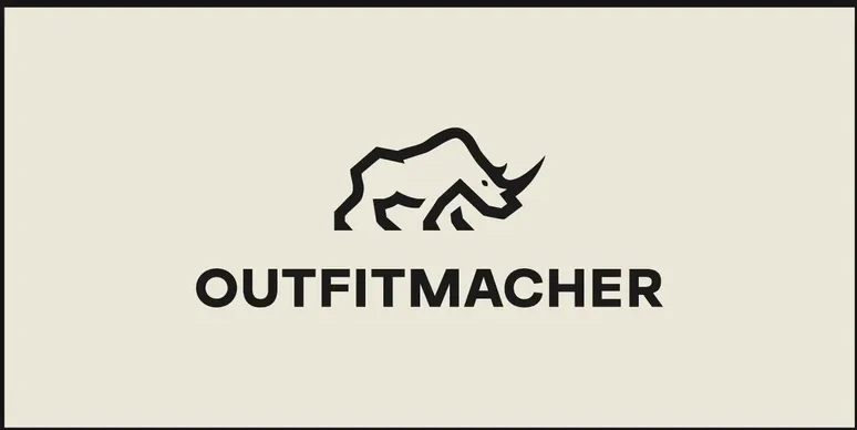
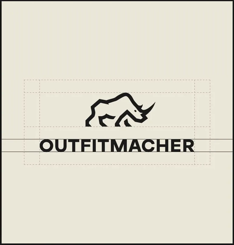
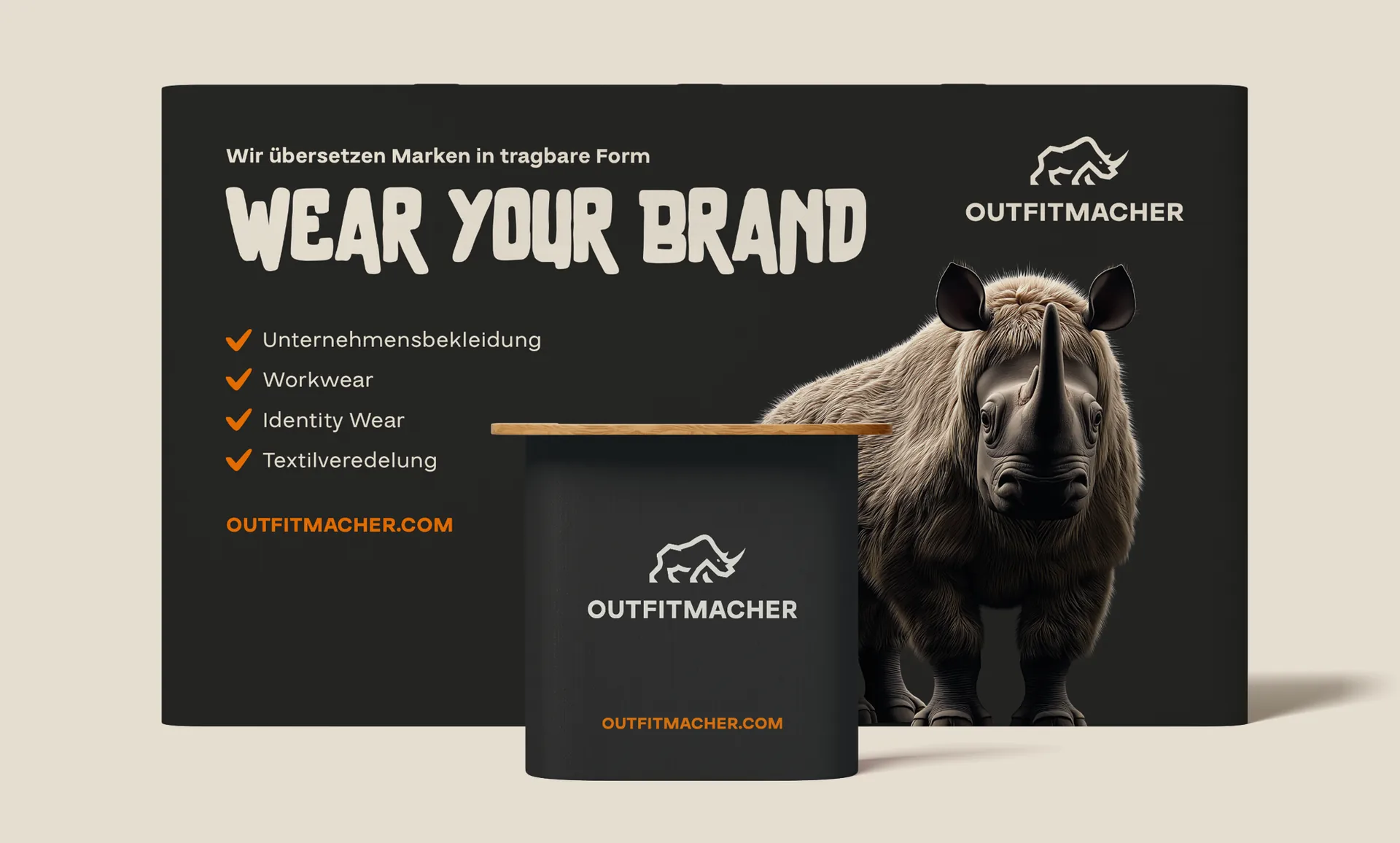
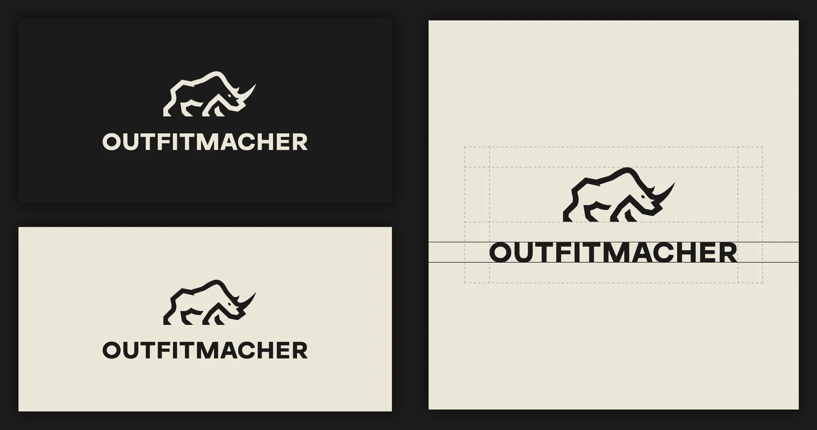
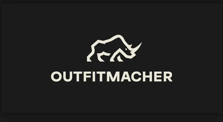
The reduced head of the furry rhino gives OUTFITMACHER a confident face. Its angular contour stands for strength, its fur for the unexpected – together a mark that breaks with convention. As a standalone icon it works independently of the logotype and stays instantly legible even at small sizes. Combined with the clear wordmark, it becomes a recognition feature that runs through every application: from the smallest print format to large-scale signage.

OUTFITMACHER logo
OUTFITMACHER – Corporate design & web development | MOREMEDIA®

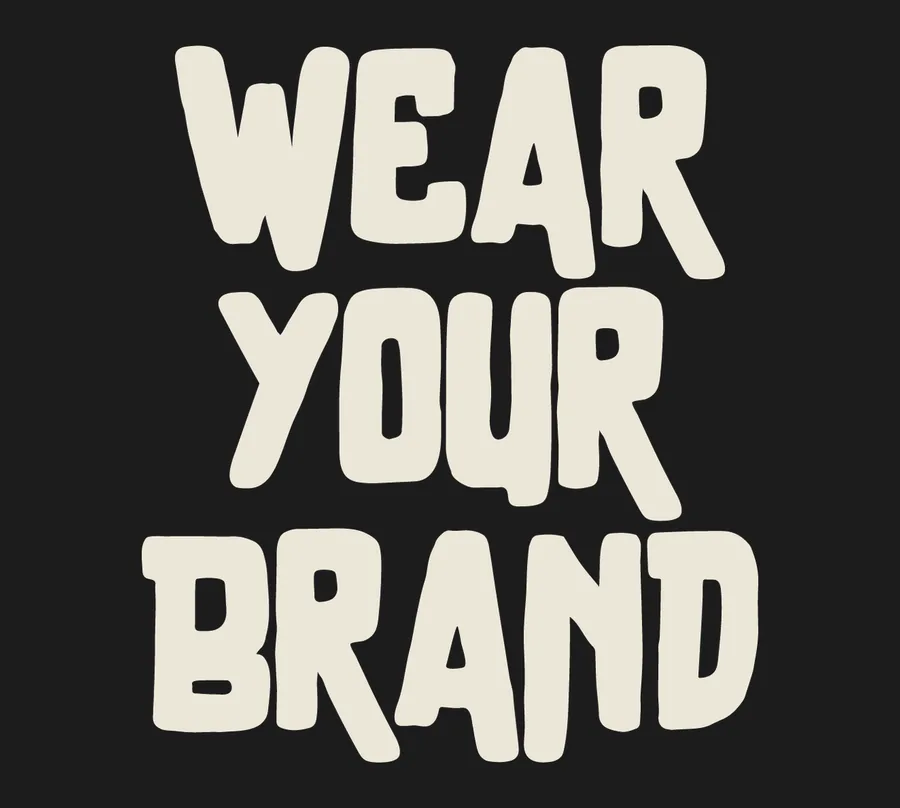
“Wear your Brand” sums up what OUTFITMACHER stands for: clothing makes corporate identity visible. The claim links the product to its purpose and gives the brand a short, direct message. Anyone who works for a company also carries its identity into the world.
Dark base. Warm contrast. Orange accents.

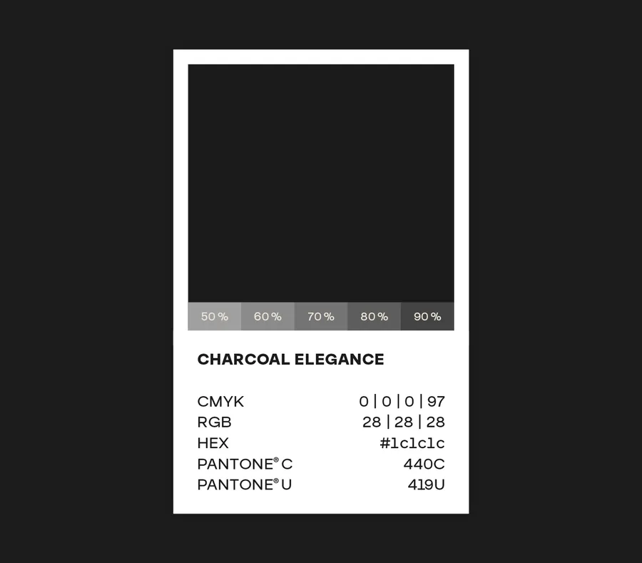
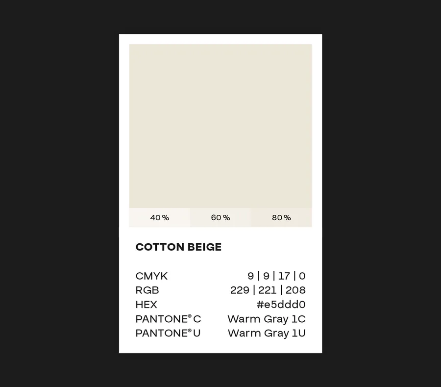
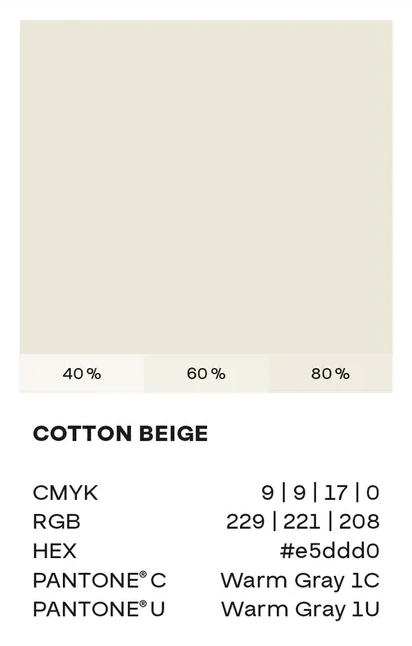
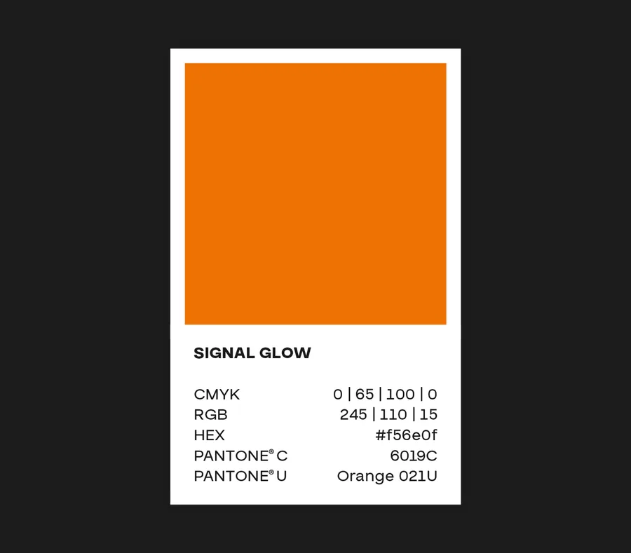
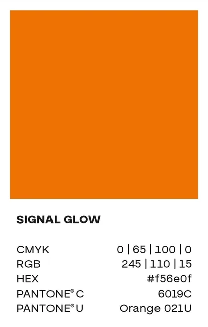
Three colours carry the identity: Charcoal Elegance as the dark base, Cotton Beige as a calm counterpoint, and Signal Glow as a bold accent for buttons and key details. Together they form a colour world that is instantly recognisable across every application – from business collateral to the website.

OUTFITMACHER – Corporate design & web development | MOREMEDIA®
Colour card Charcoal Elegance

Charcoal Elegance
The deep grey forms the base of the identity. Against the dark surfaces, light type, imagery and orange accents stand out clearly.
OUTFITMACHER – Corporate design & web development | MOREMEDIA®
Colour card Cotton Beige

Cotton Beige
The warm beige complements the dark surfaces and brings calm to the design. The interplay of light and dark structures the applications.
OUTFITMACHER – Corporate design & web development | MOREMEDIA®
Colour card Signal Glow

Signal Glow
The bold orange draws the eye to selected details. On the website, it sets buttons and key elements apart from the dark background.
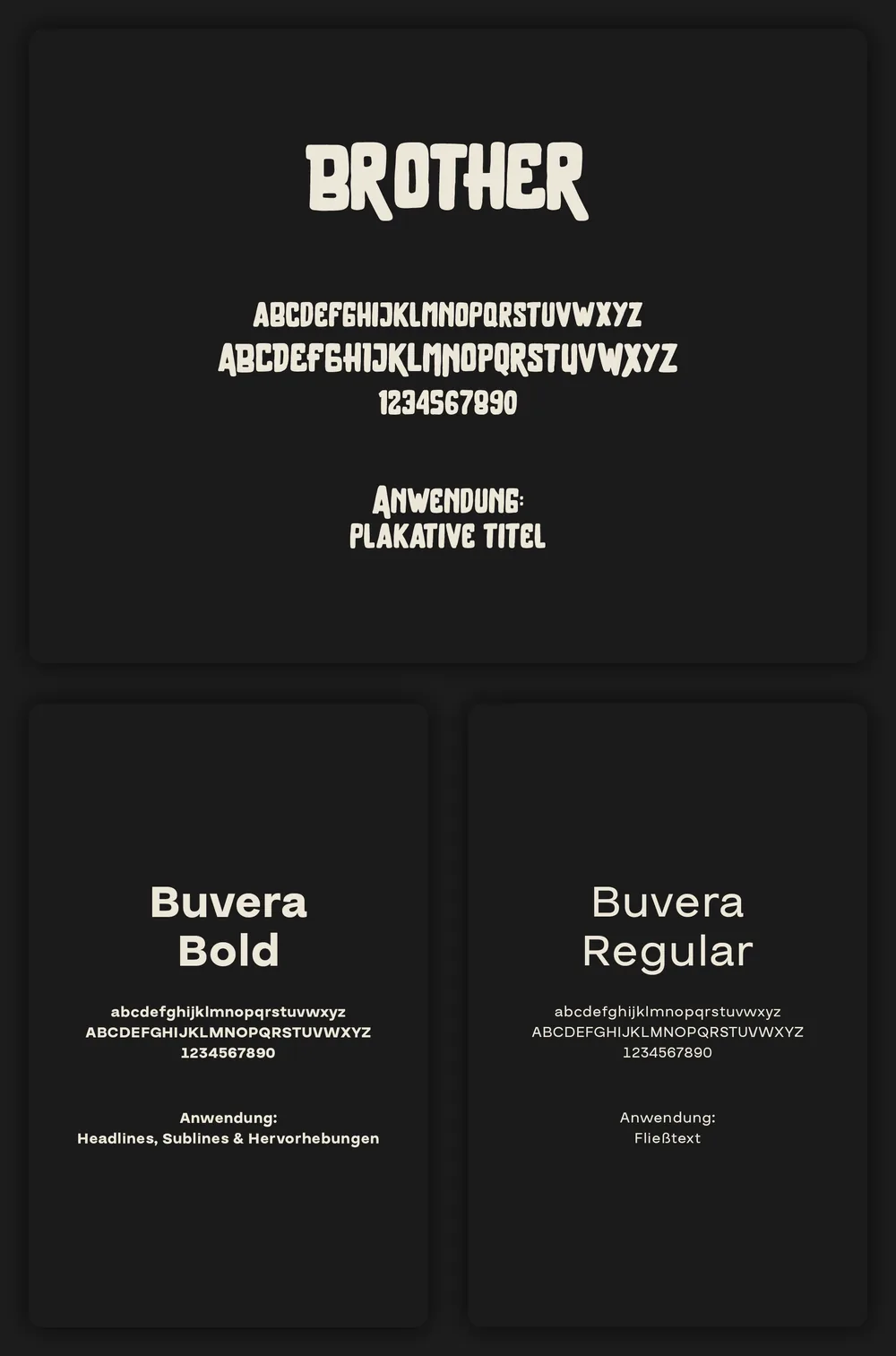
Two typefaces with clearly defined roles

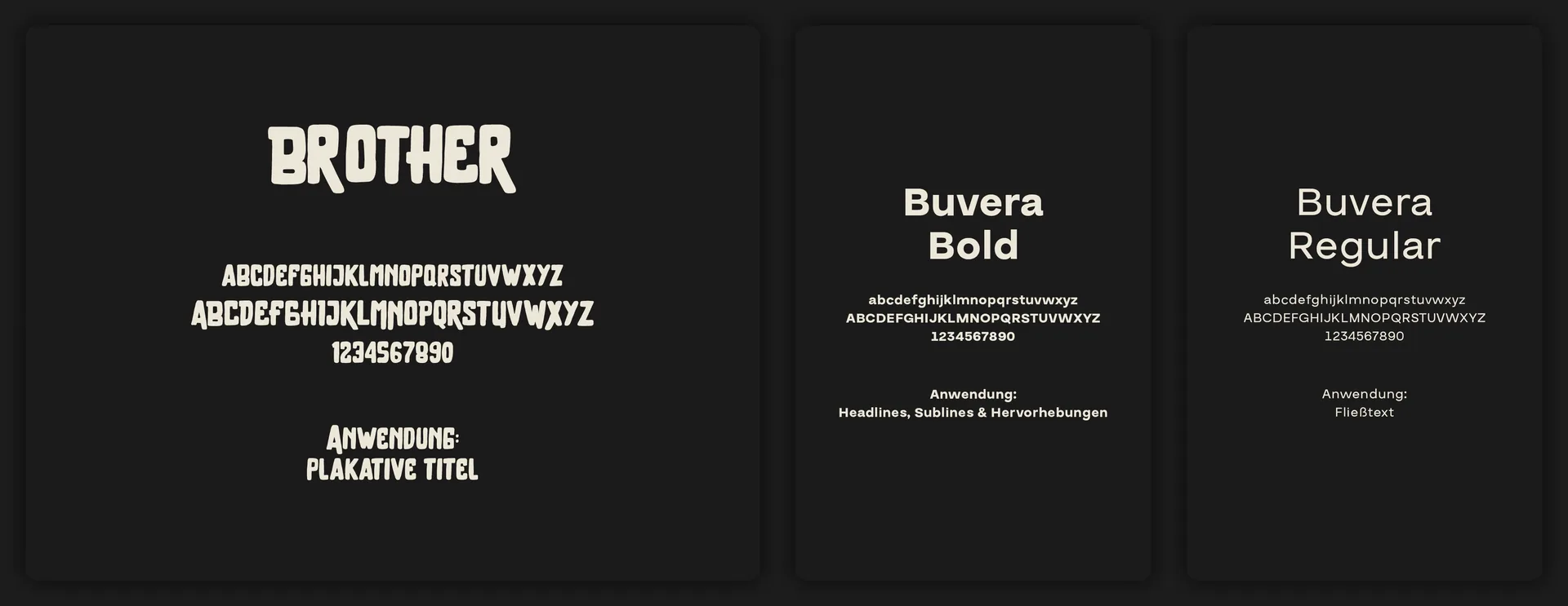
Buvera Regular & Bold
Buvera takes on the legible base: Regular for body copy, Bold for headlines and emphasis. Its calm forms organise the content and leave room for the brand’s more striking elements.

Brother
Brother sets the bold accents. Its strong, irregular letterforms give short messages a distinct character. Together with Buvera, it creates the interplay between factual information and striking statement.

Typography: Brother, Buvera Bold, Buvera Regular

Reduced. Functional. Instantly recognisable.

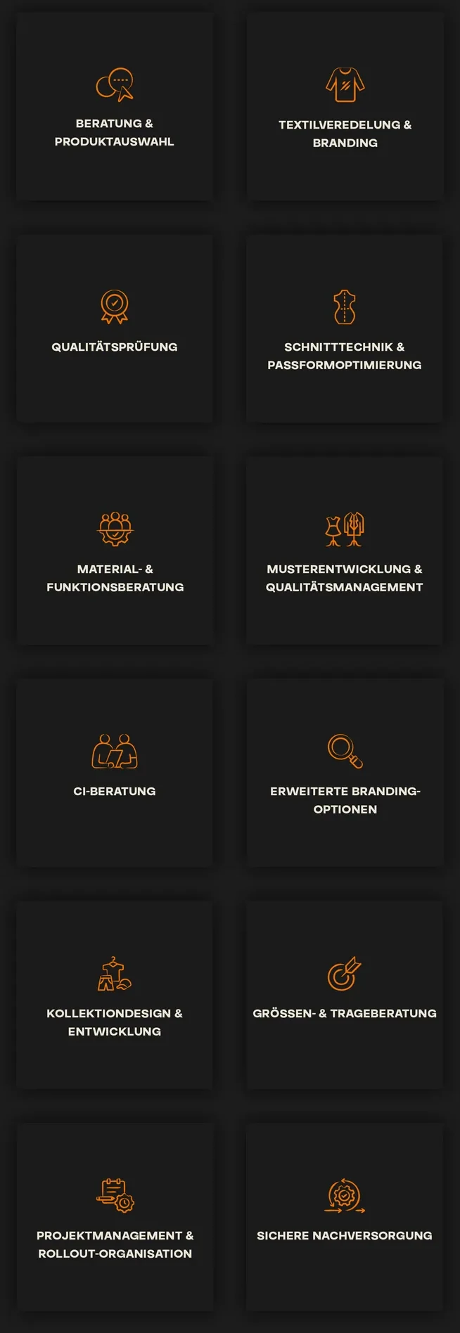
Consulting, finishing, fit: the icons make individual services distinguishable at a glance. Their drawn style picks up the distinctive character of the typography and complements the imagery. Unlike the photorealistic animal hybrids, they remain deliberately reduced and purely functional. This gives even the smallest, everyday elements a form that belongs to OUTFITMACHER and is recognisable in every application.

Icons
Icons

Unusual combinations. A visual world of its own.

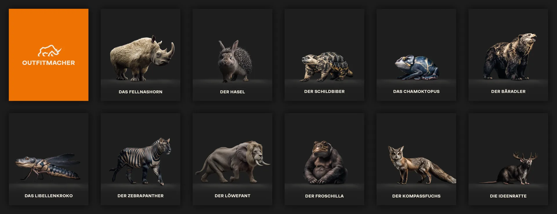
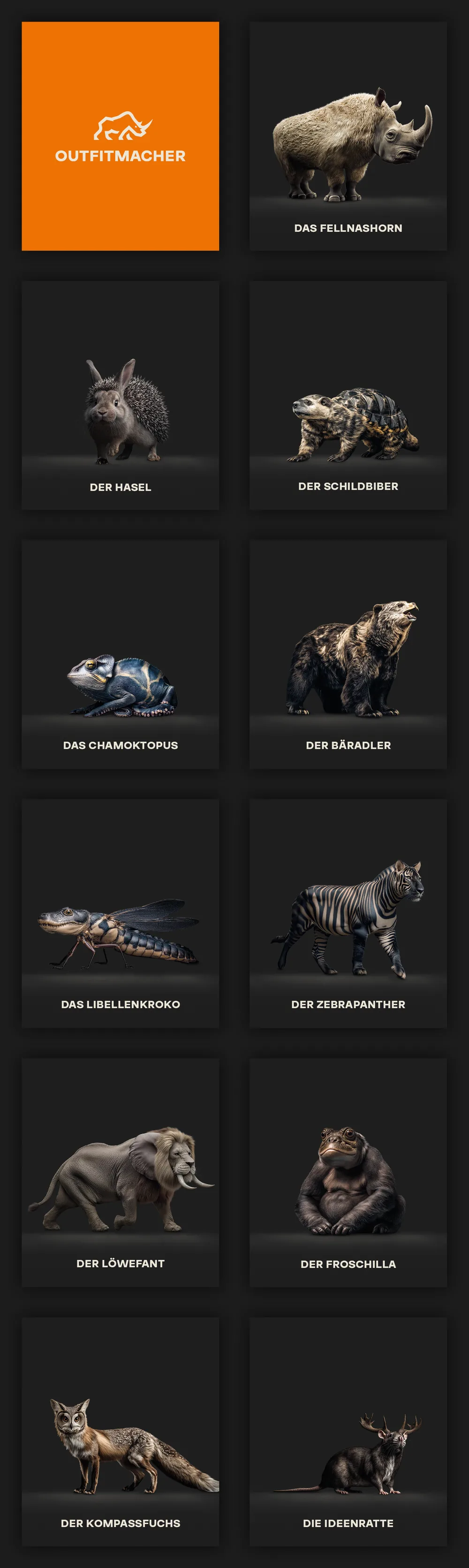
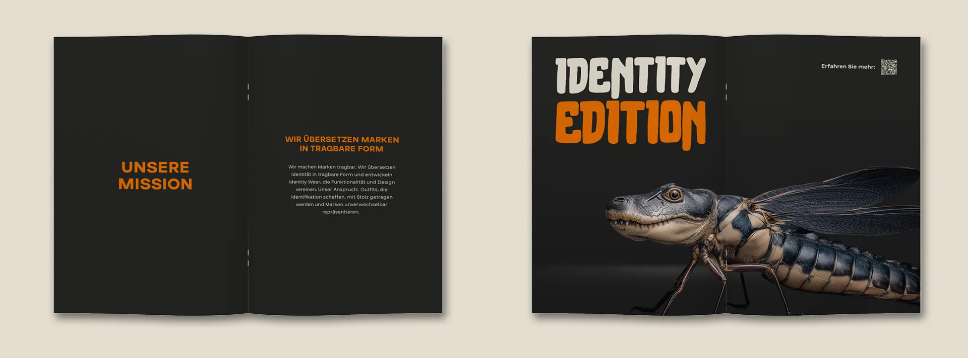
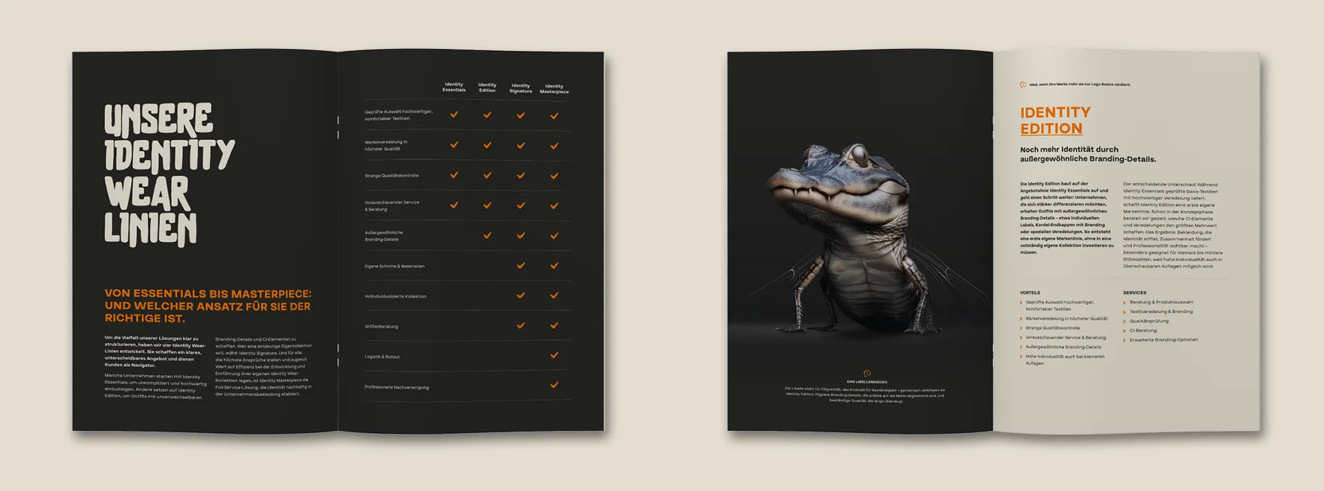
Each animal hybrid combines two qualities into a visual language of its own – from the furry rhino, born of strength and the unexpected, as the brand mark, to the animals of the individual product lines, each standing for its own promise of quality, such as gentleness and durability, or elegance and uniqueness. None of the unusual creatures feels arbitrary: every combination is deliberately chosen and makes the brand recognisable through the motif alone. The photorealistic execution reinforces this effect further, lending the creatures credibility despite their unusual nature.

Animal hybrids
Animal hybrids

A consistent brand presence at every touchpoint

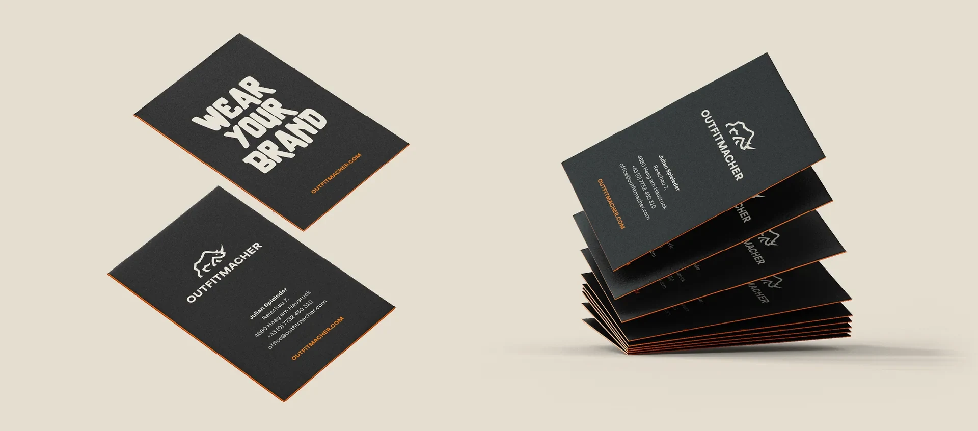
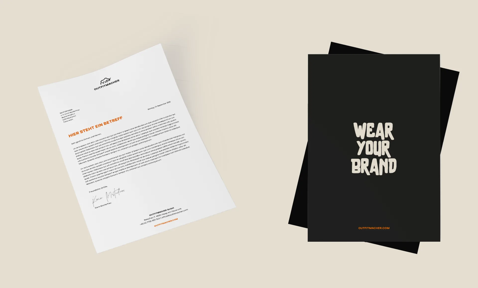
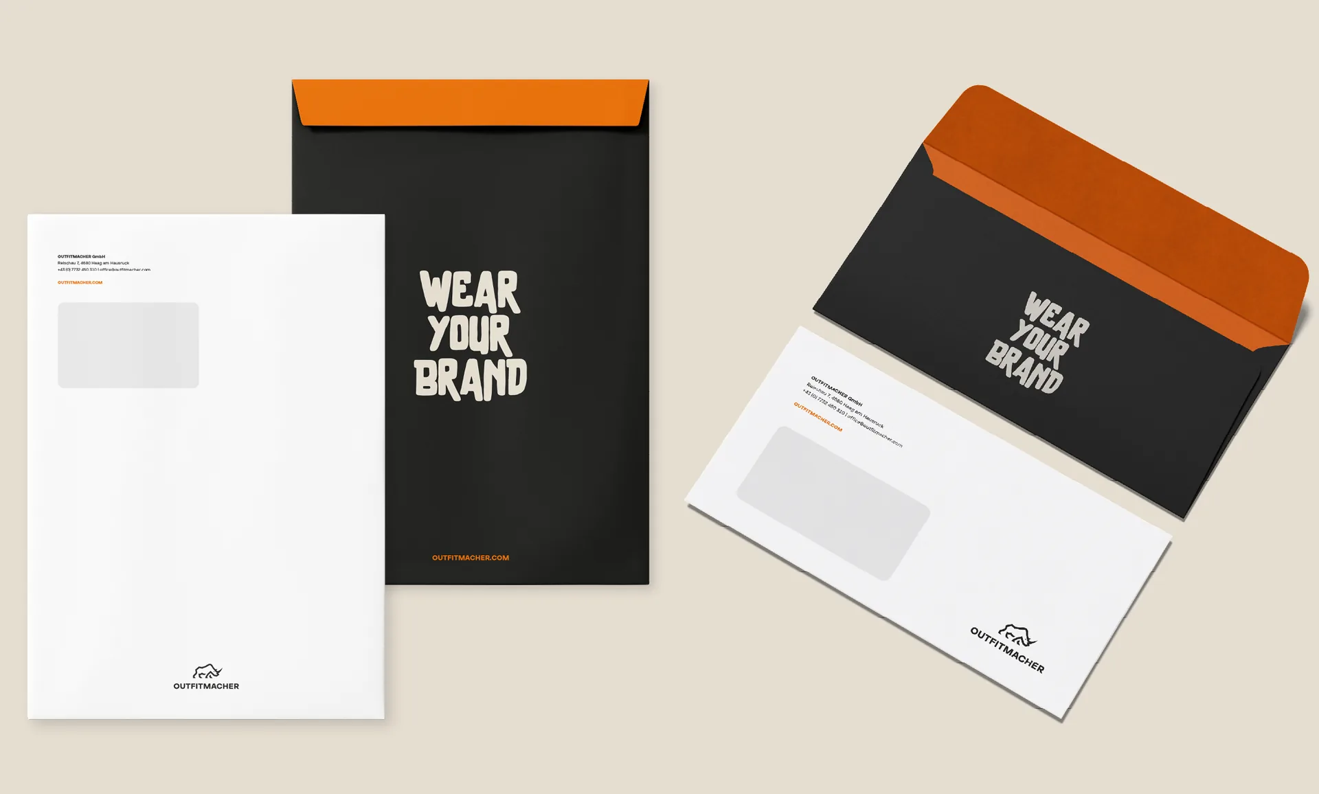
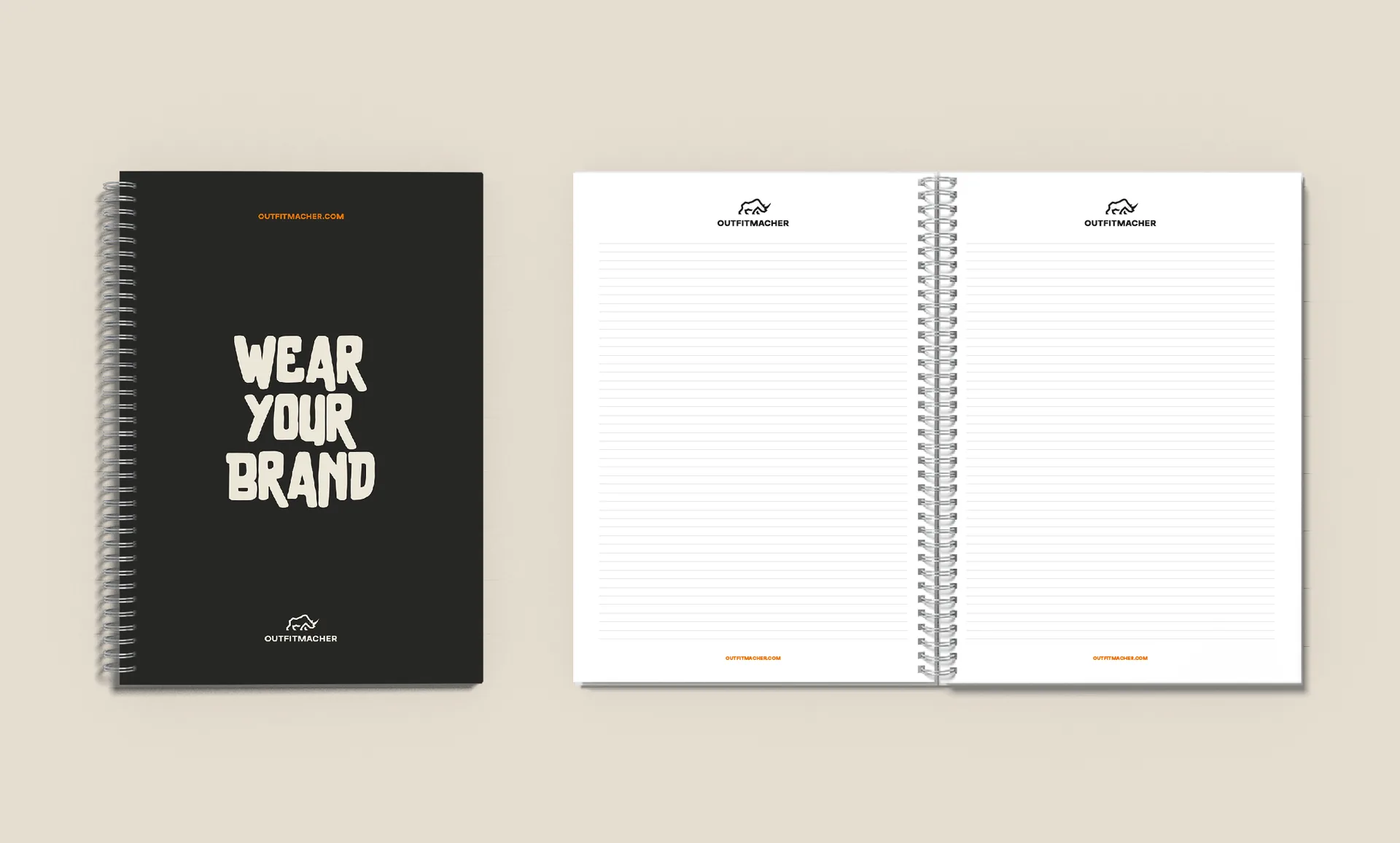
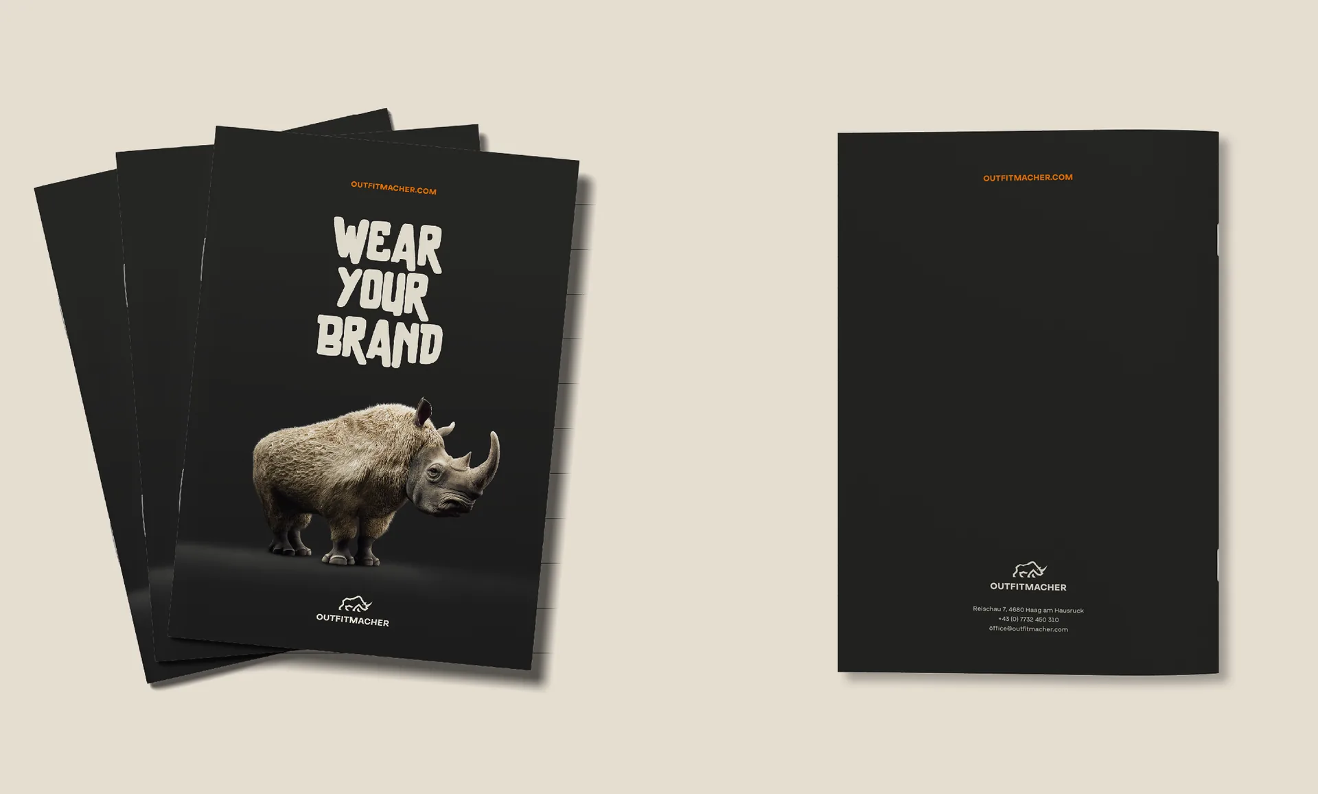
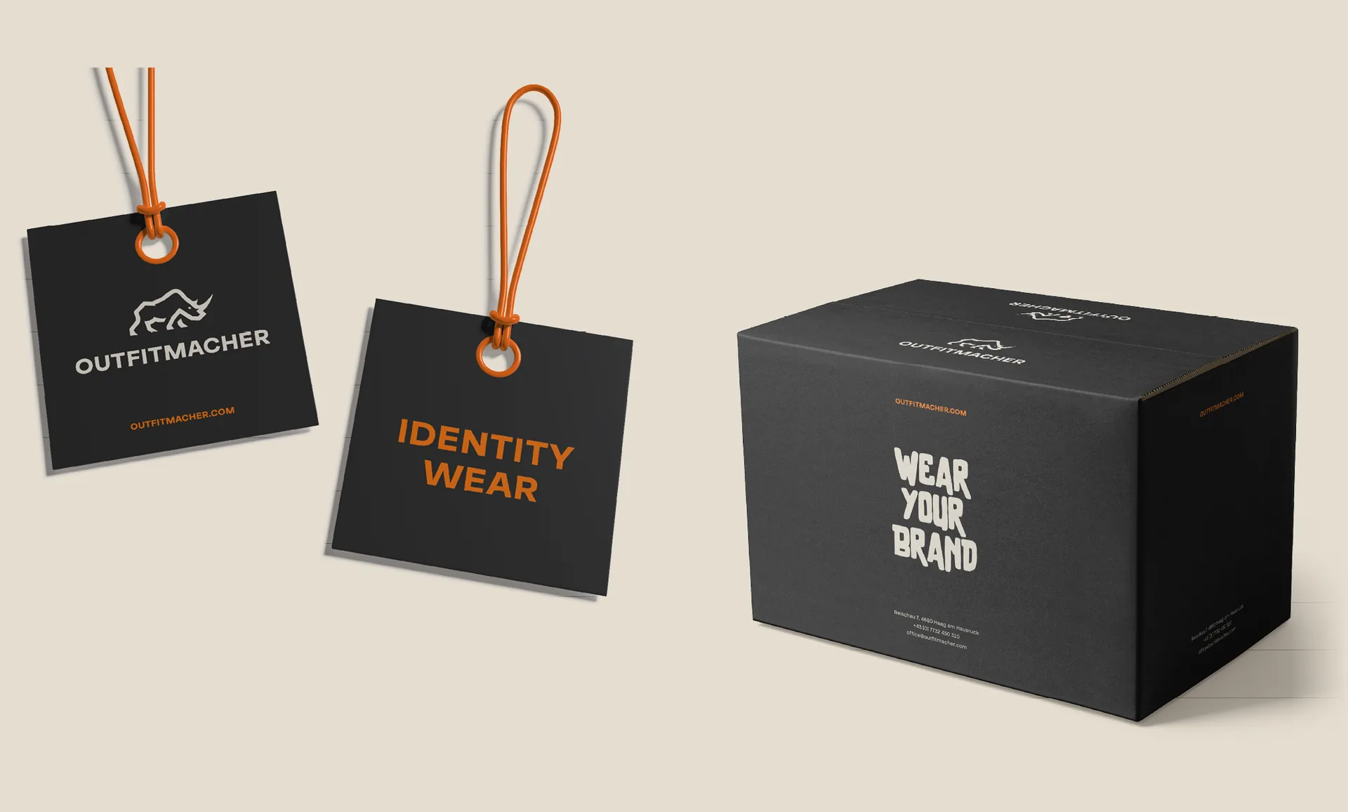
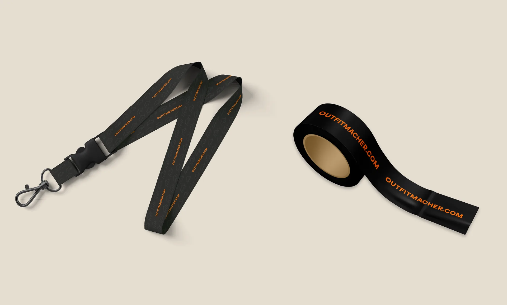
Business cards, folders, brochures and packaging carry the corporate design into everyday use. Colours, type and imagery come together on notebooks, lanyards and packing tape too. Even at the smallest scale, the furry rhino, the colour world and the typography remain instantly recognisable. Together, the individual applications form a coherent presence – from first contact through to shipping.

Business collateral
Business collateral
Business collateral
Business collateral
Business collateral
Business collateral
Business collateral
Business collateral
Business collateral
Business collateral

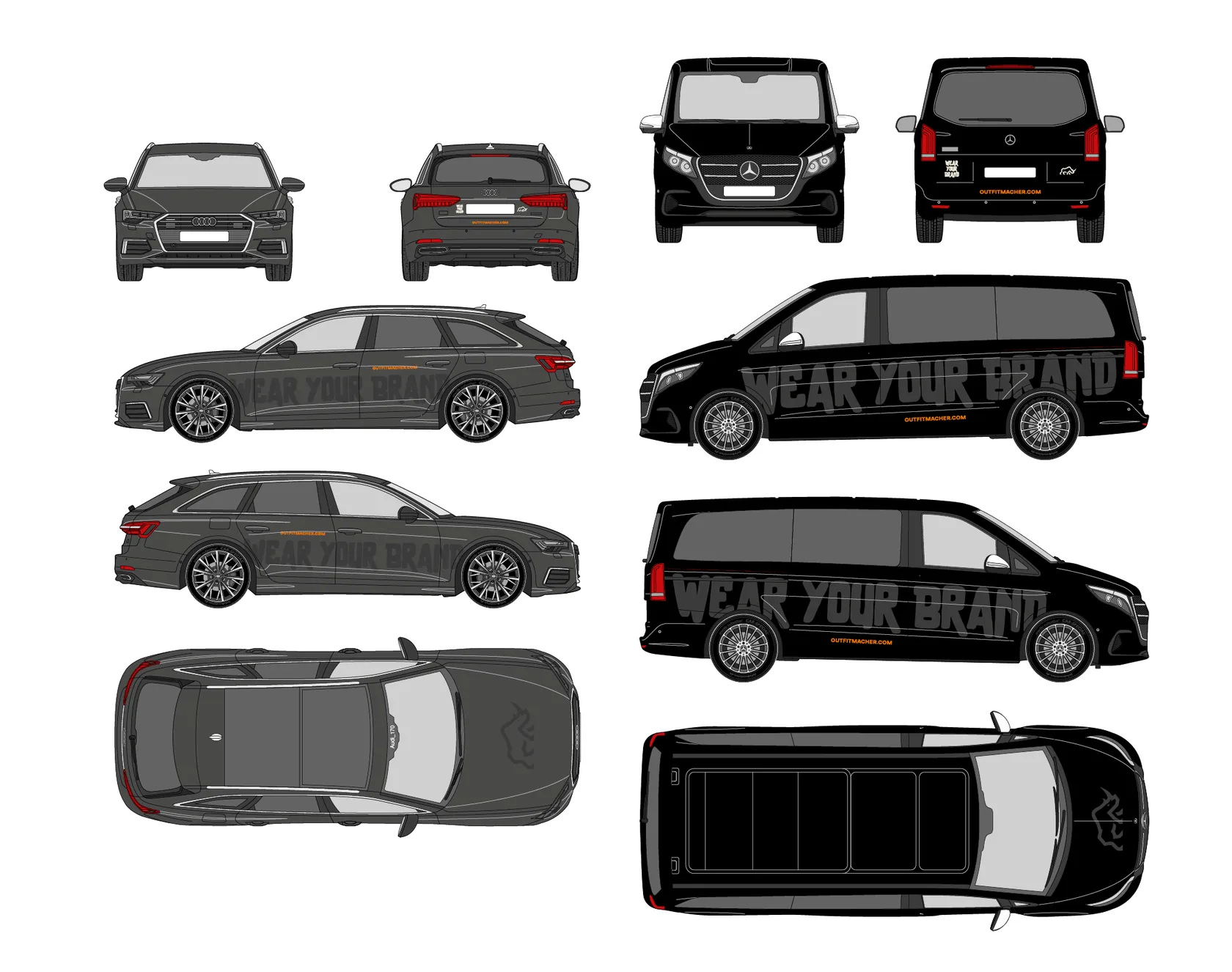
Visible on site. Recognisable on the road.

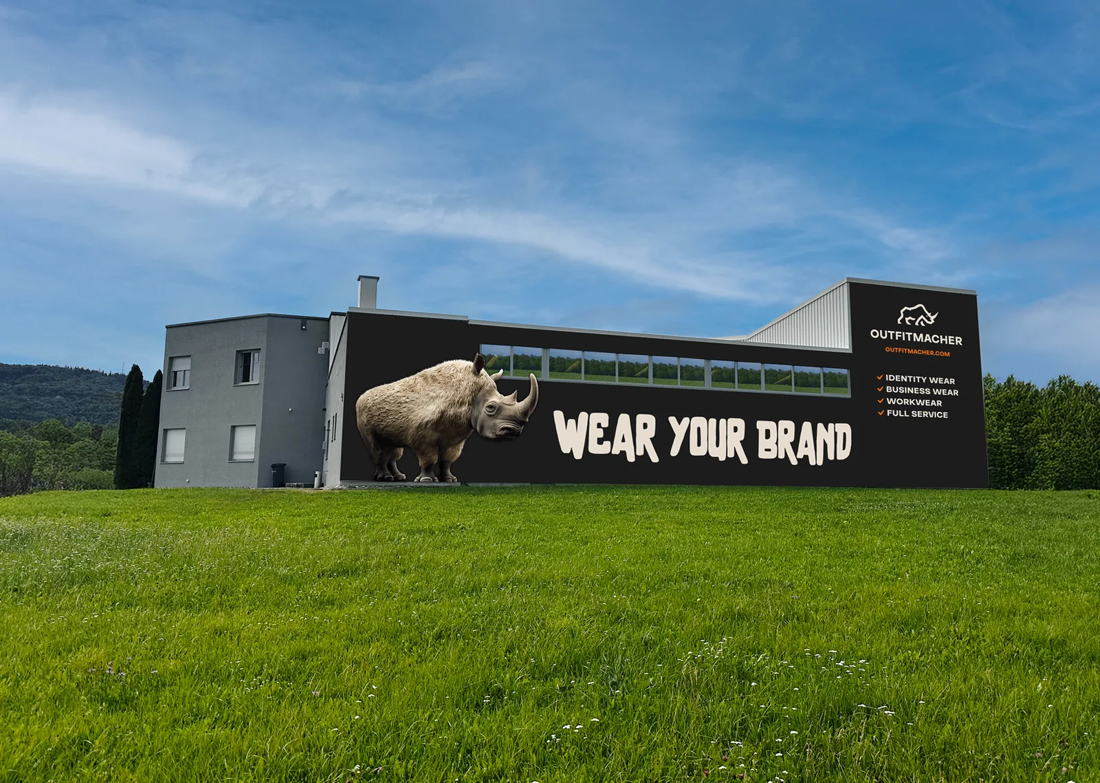
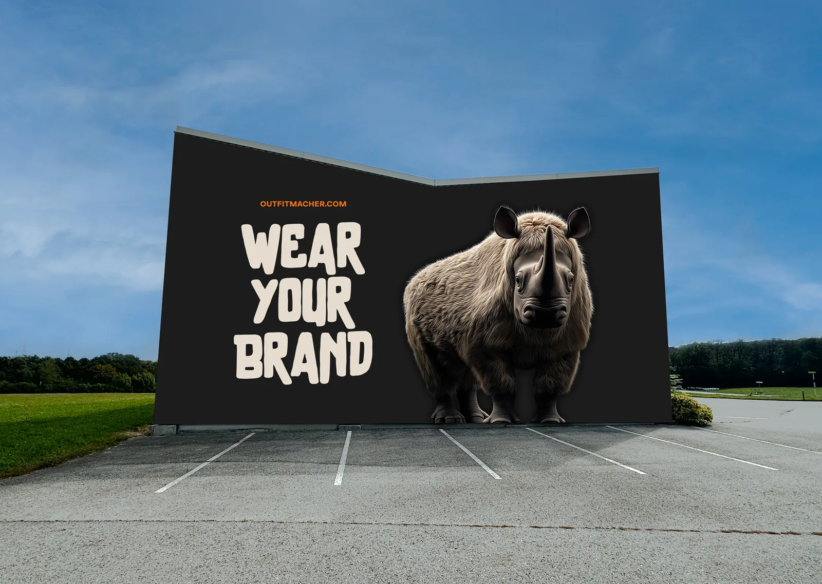
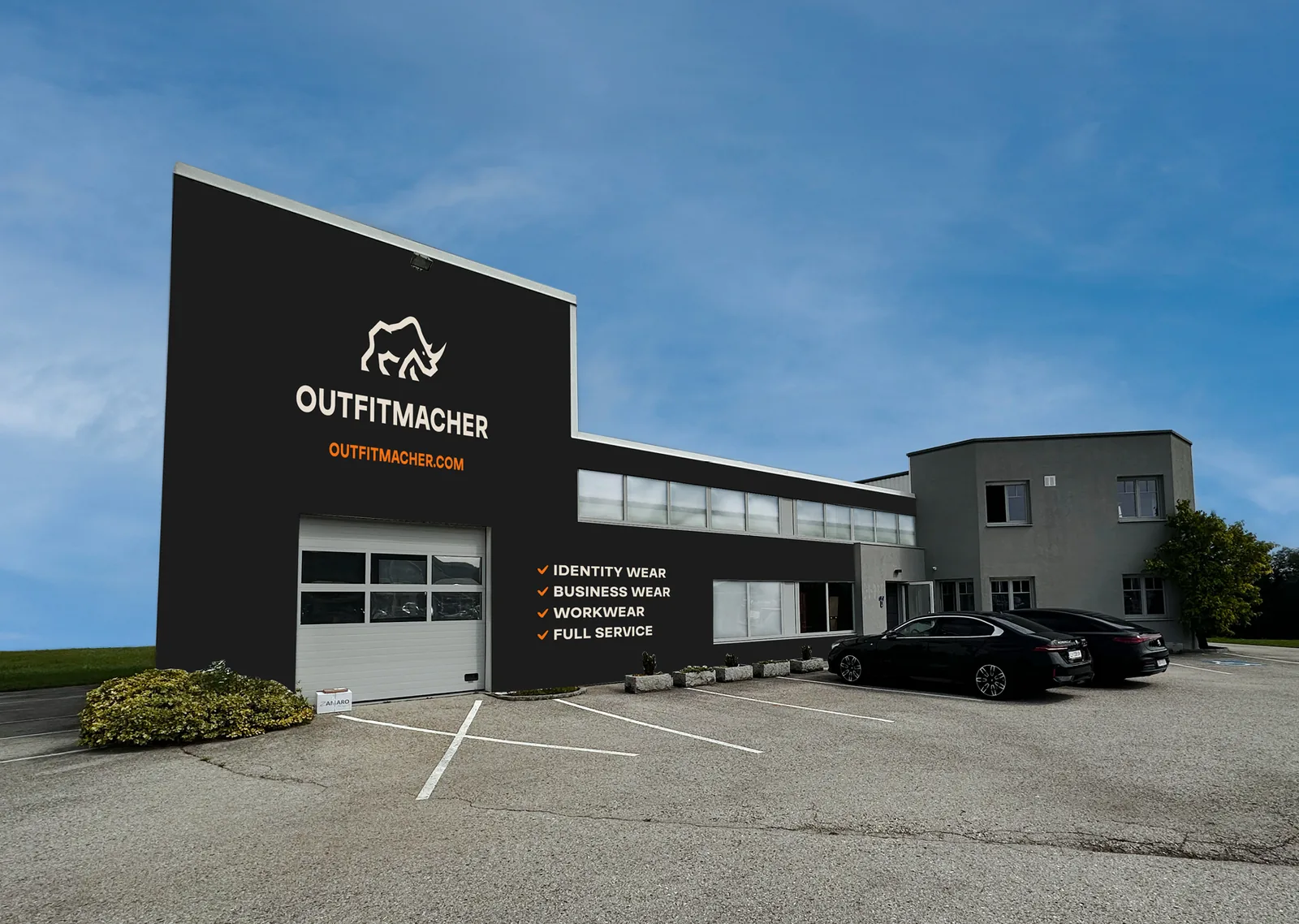
On the company building, the logo, lettering and brand colours carry the new identity into public space. The vehicle livery continues the same design on the road, making the fleet clearly identifiable even from a distance. Both applications show how the corporate design works at large scale and makes OUTFITMACHER recognisable beyond its own communication channels. The presence stays consistent – from reception to the street.

OUTFITMACHER signage 1 – MOREMEDIA®
OUTFITMACHER signage 2 – MOREMEDIA®
OUTFITMACHER signage 3 – MOREMEDIA®
01
03
Vehicle livery

Dark surfaces. Orange accents. Bold typography.

On the website, the design elements come together: dark surfaces, orange accents, bold typography and the animal hybrids as recurring motifs. From this, we developed a digital presence that makes OUTFITMACHER recognisable at first glance. The same visual language remains visible from the homepage through to the individual service pages, so visitors find their way quickly. Visual distinctiveness combines with a clear presentation of the offering.

Clear services. Clear product lines.

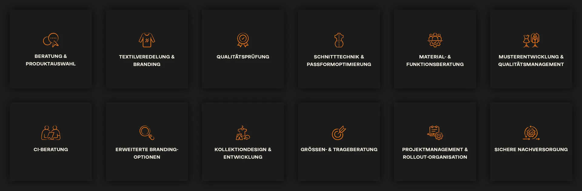
The services overview makes it easy to follow how corporate fashion comes together: from consulting and product selection through design and fit to quality assurance and after-sales support. Interested companies can inform themselves about each step and get in touch directly. The product lines, from essentials to private-label production, are also clearly distinguishable on the website. Design and navigation adapt to different screen sizes – so the presence holds together on mobile too.

How we worked

From the colour world to the finished website – in four steps building on one another.

01 — Brand core
Starting from the furry rhino as the brand mark, we defined the brand’s character for every application.

02 — Colour world & typography
Dark surfaces, orange accents and the typeface pairing of Buvera and Brother brought together into a distinctive identity.

03 — Icons & imagery
Designed custom icons for the services and integrated the animal hybrids of each product line into the imagery.

04 — Business collateral & website
Rolled out the corporate design from business card to vehicle livery and implemented it in the new website.