Client

Verein Chronisch Krank

Digital association platform for ChronischKrank®

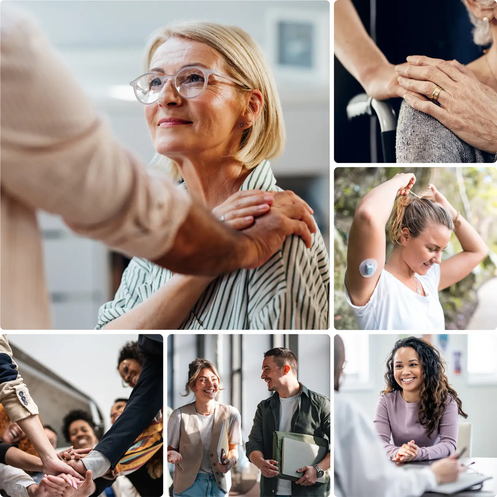
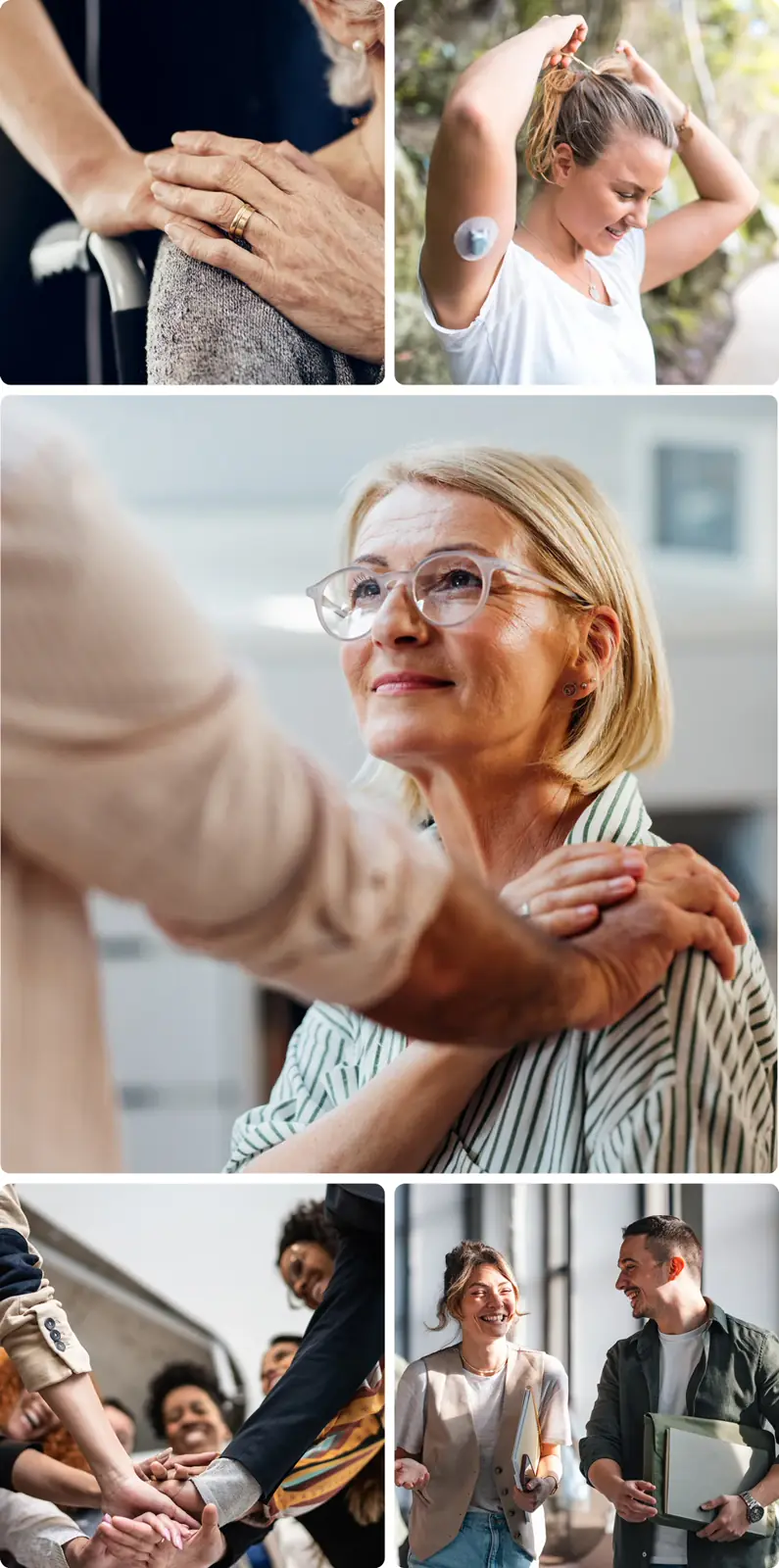
Digital support for people with chronic illnesses

The association ChronischKrank® Österreich is a central point of contact for people with chronic illnesses and disabilities as well as their families. It offers comprehensive advice and support in social, financial, psychological, social-security, nutritional, legal, medical, and administrative matters. Its goal is to help those affected assert their claims and make it easier for them to access the resources they need.

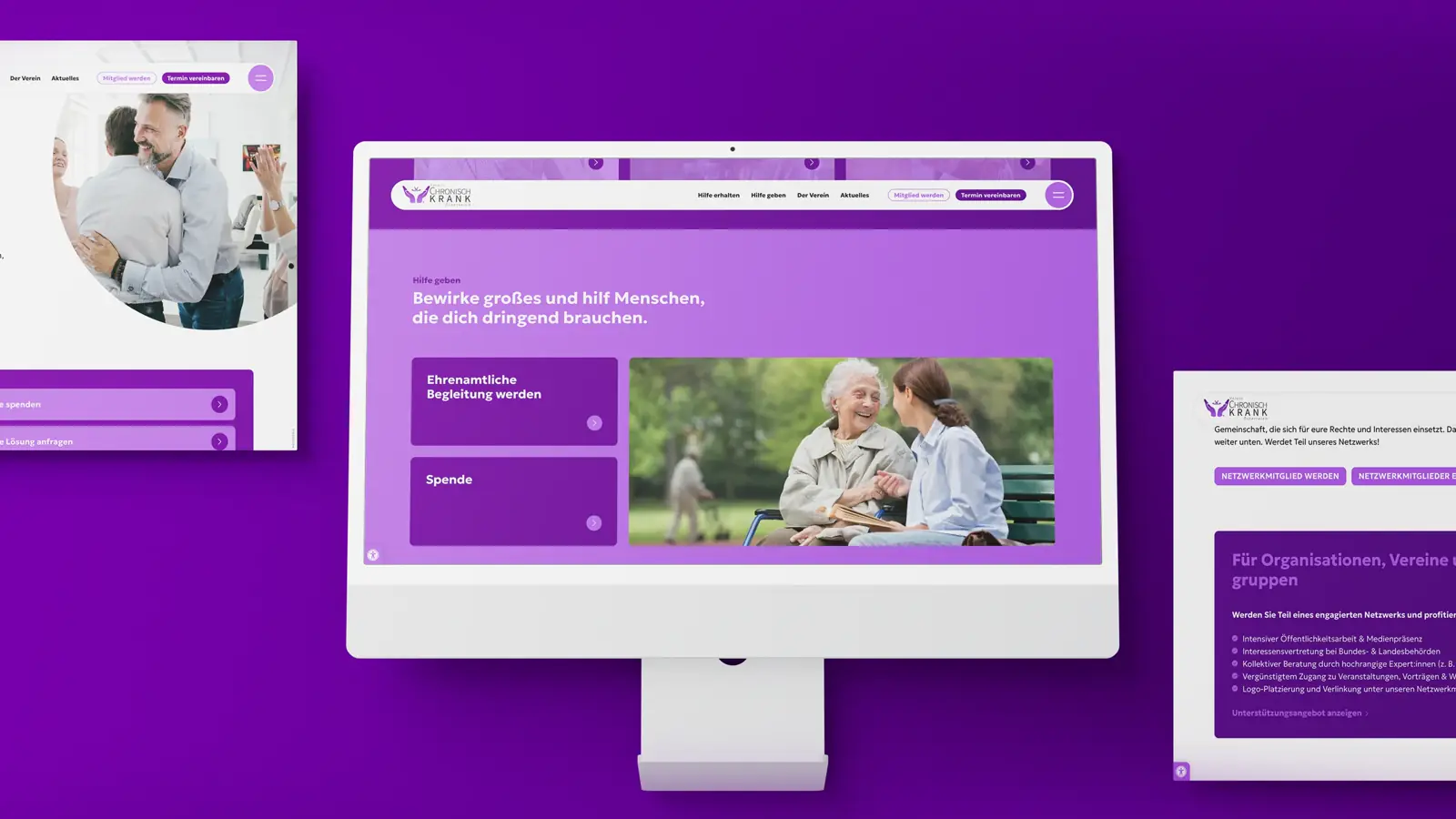
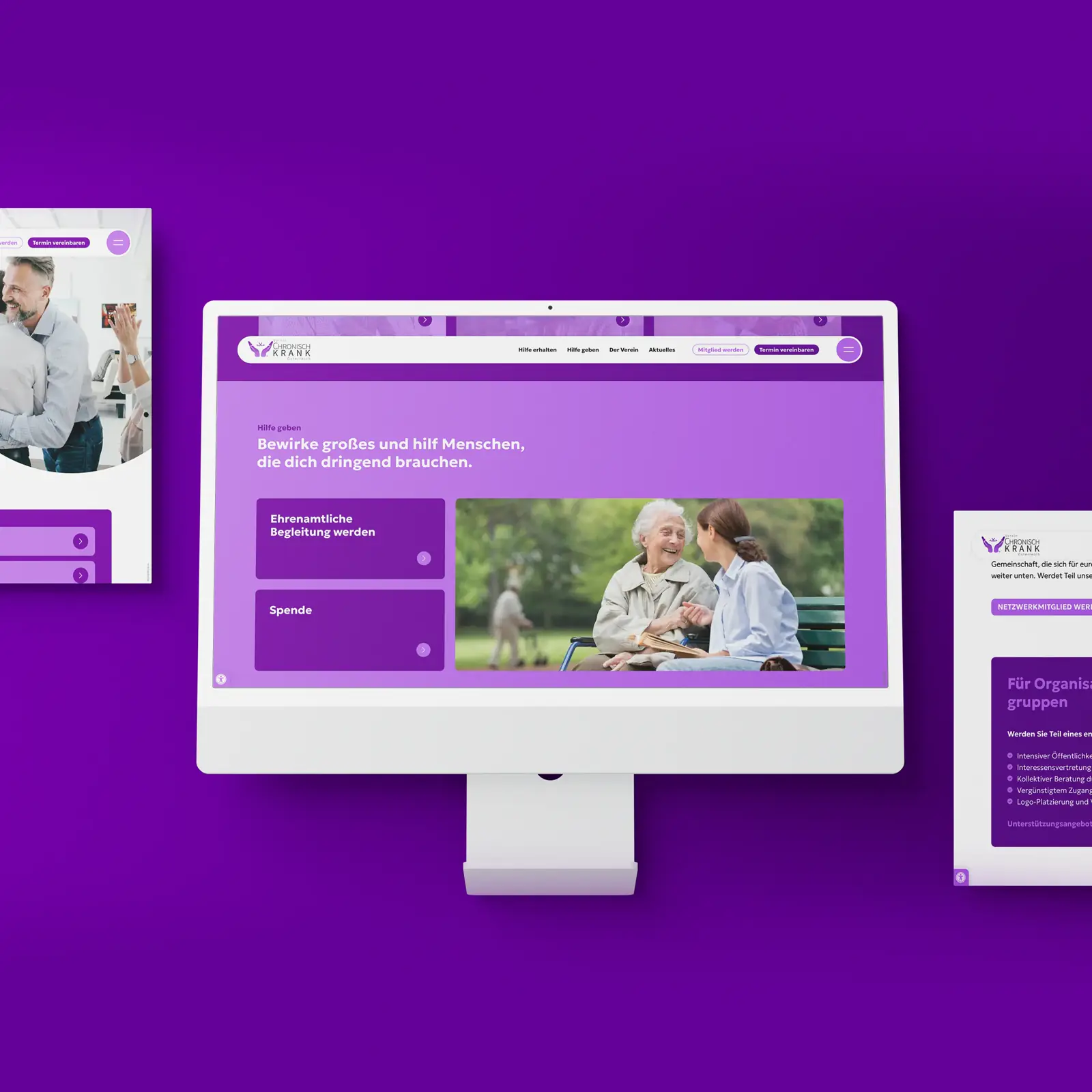
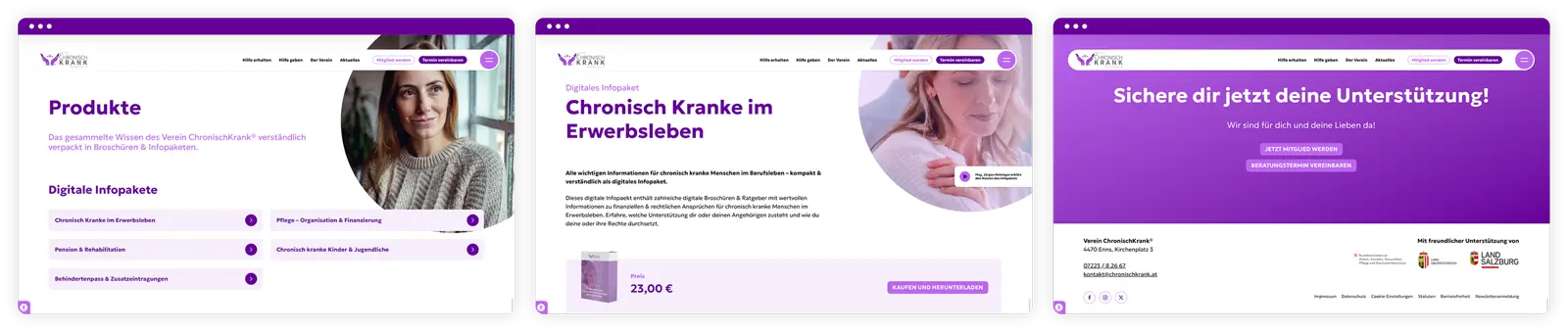
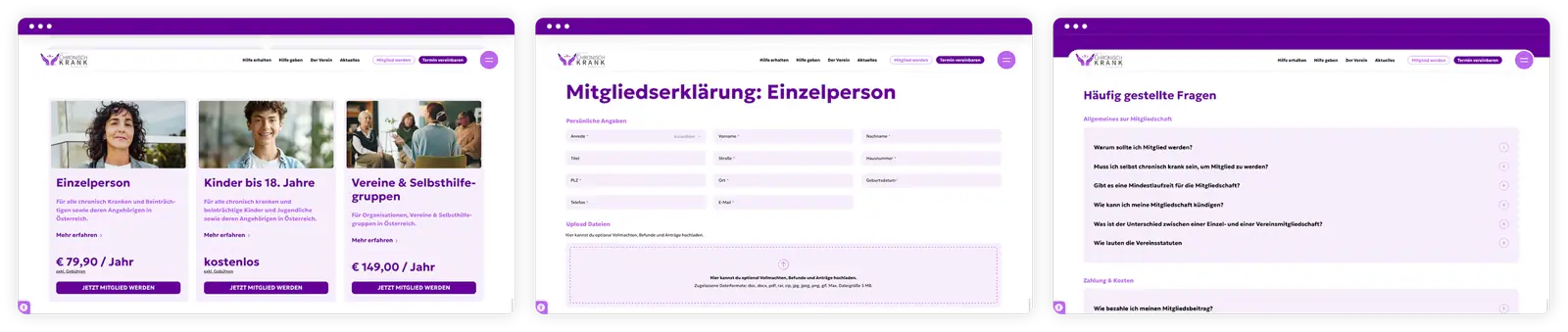
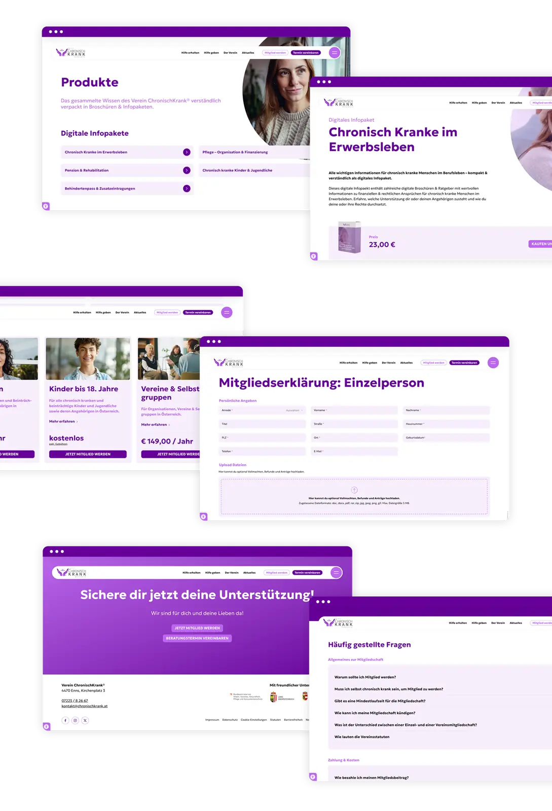
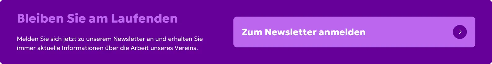
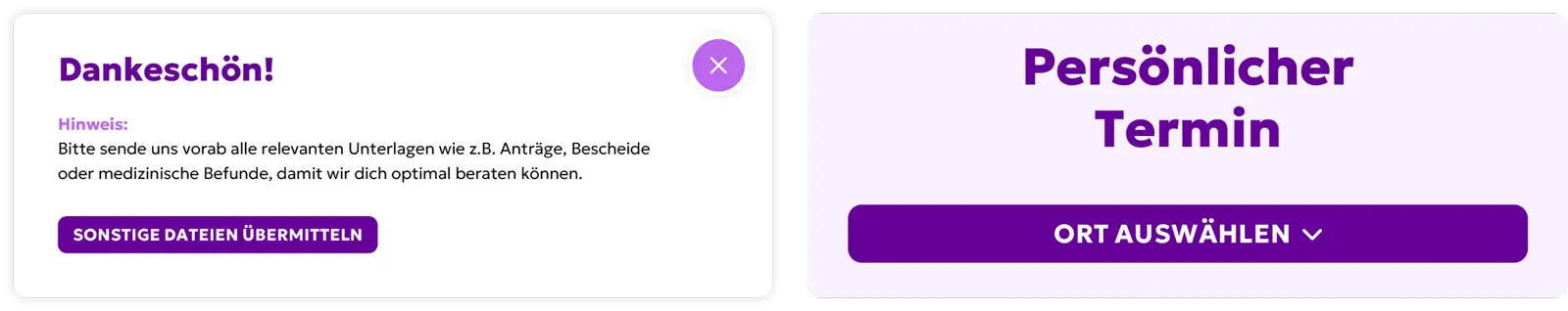
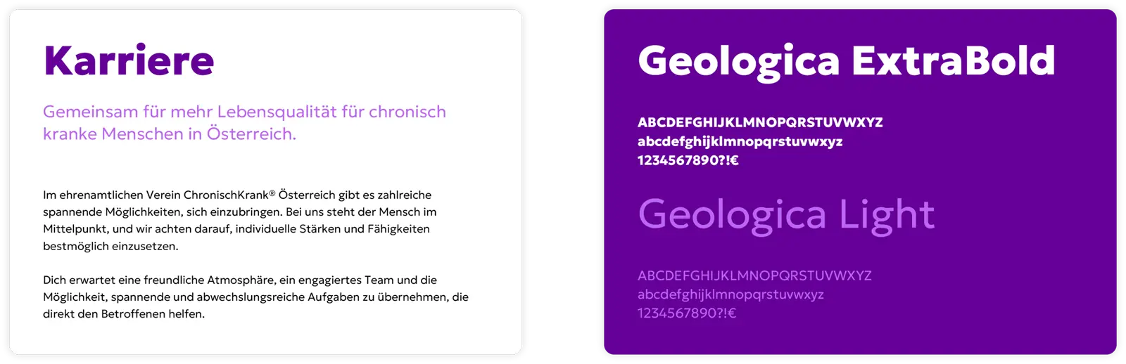
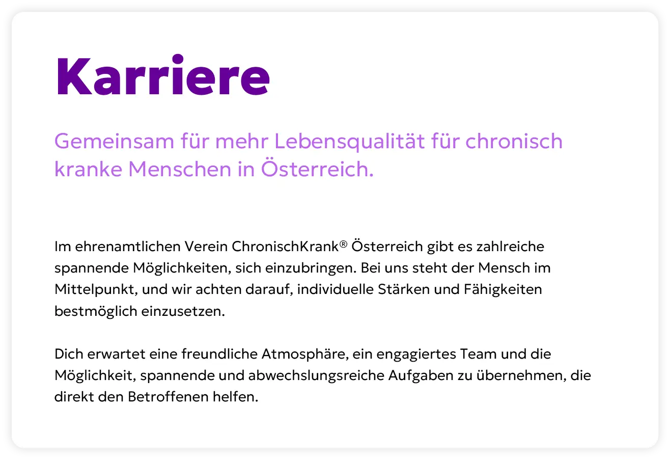
The website redesign focused on usability and accessibility to give all user groups easy access to the new club platform. The integration of member management and payment processing for membership fees and donations digitizes and simplifies previously manual processes. The modern design follows the club's corporate design, which was visually refined and sharpened during the website development. Technologically, the platform runs on Drupal — the low-maintenance, easy-to-use open-source CMS regarded worldwide as the first choice for long-lasting business websites.

Manual club processes fully digitalized — from member management to donations.

Visit website

chronischkrank sitemap 2
chronischkrank sitemap 2 mobile
chronischkrank web mockup desktop
chronischkrank web mockup mobile
chronischkrank homepage mockup 3

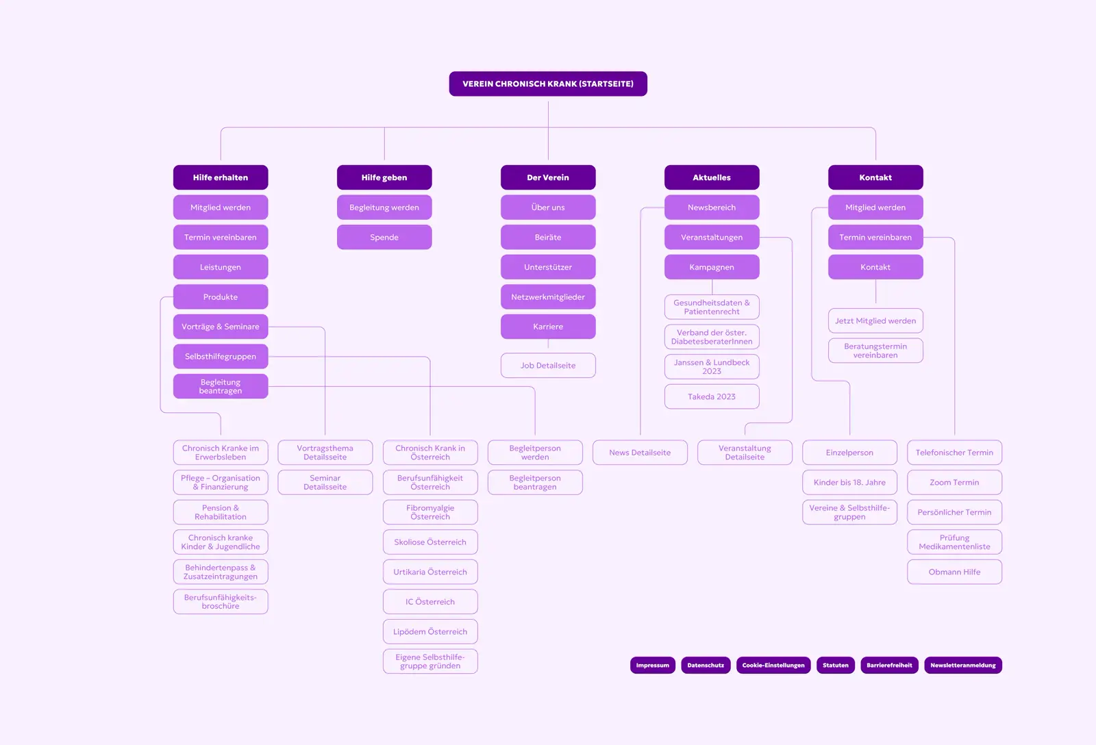
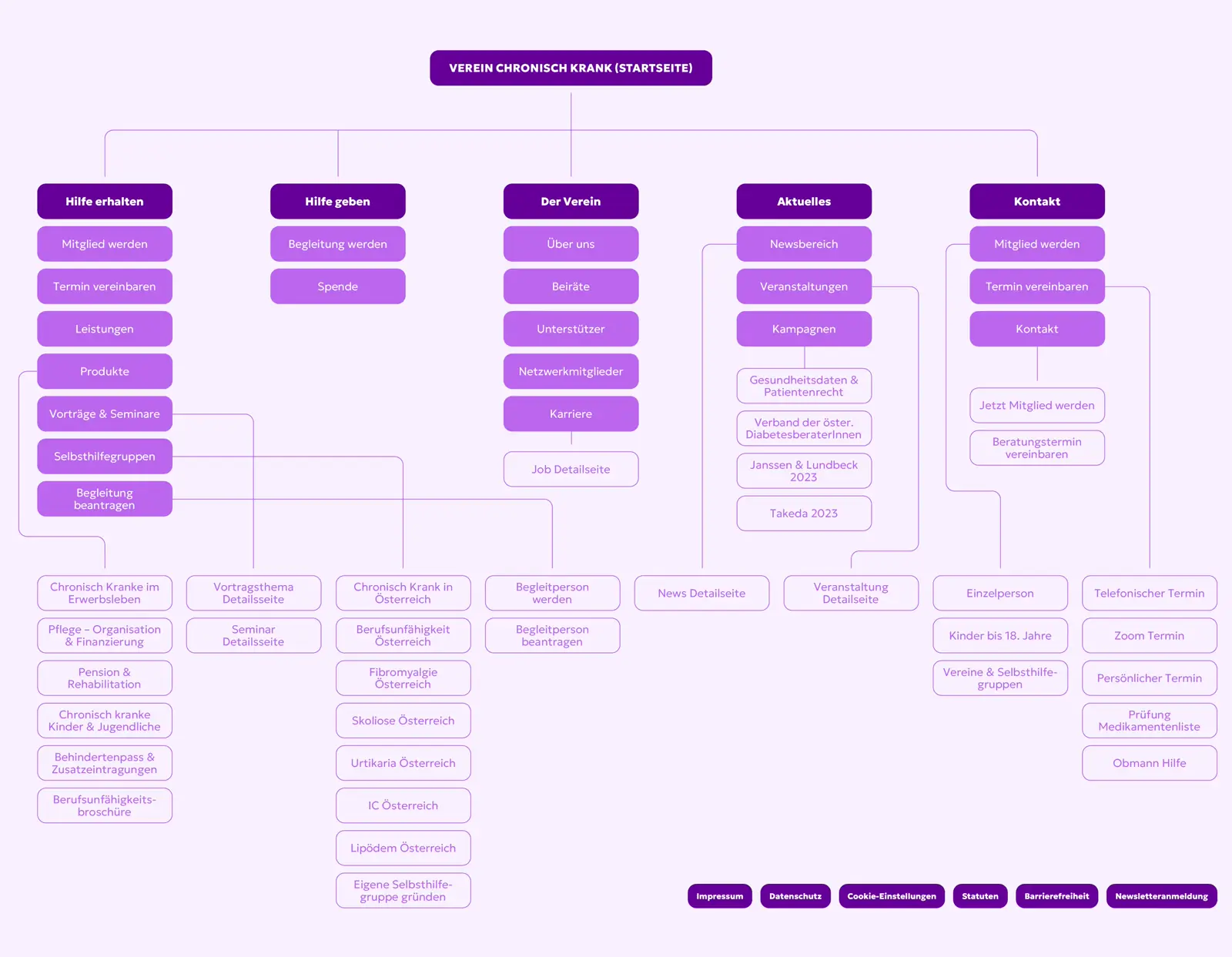
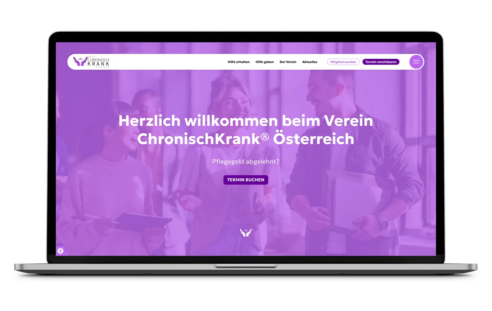
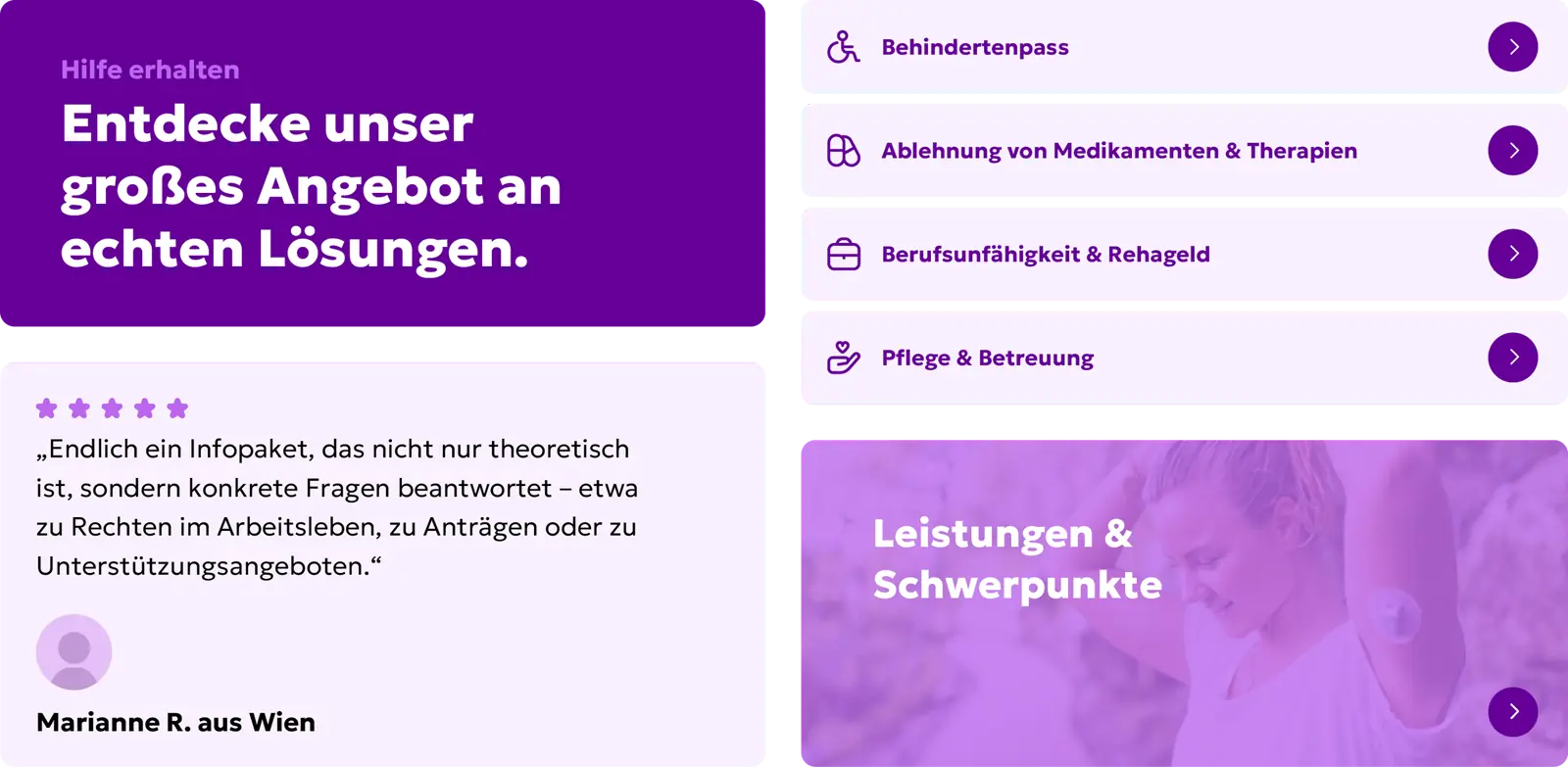
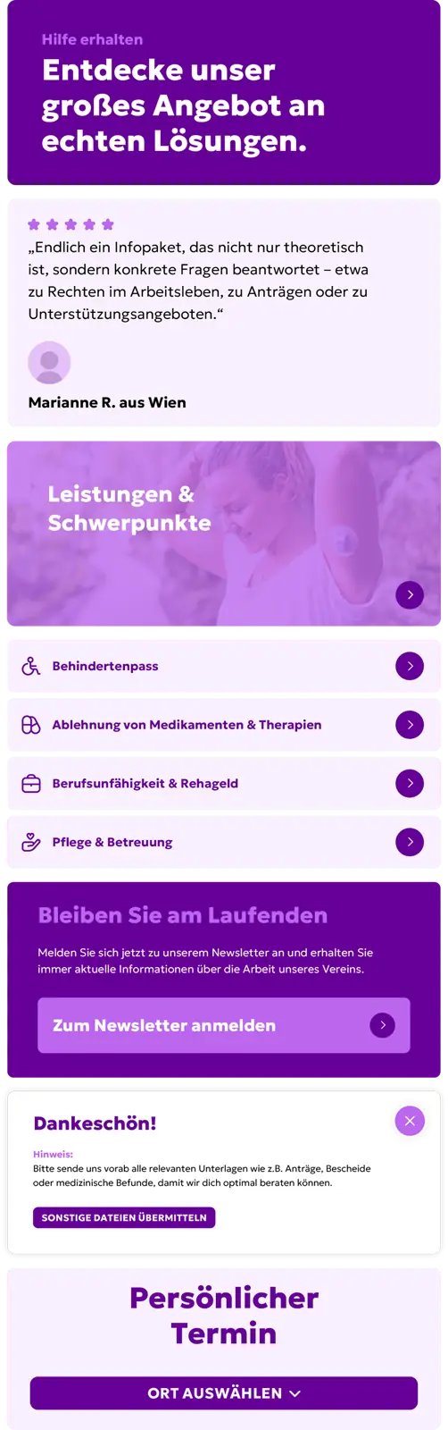
Structure that takes the load off.

People seeking help need clarity, not complexity. That's exactly what the new website delivers, with a logically structured page architecture and targeted user guidance. Instead of fighting through cluttered menus, visitors are guided step by step to the right information – no detours, no overwhelm. The website thinks along – and takes a large part of the orientation work off its users' shoulders.

chronischkrank web screens 1
chronischkrank web screens 2
chronischkrank web screens 4

Intuitively to the right content

The new website of the ChronischKrank® association was built so that visitors land exactly where they find the information relevant to their individual situation with just a few clicks. A multi-level navigation – organized by concern, life situation, and topic focus – guides affected individuals, family members, and interested visitors in a structured way through the extensive offering. Especially given the great depth of content, it was important to us to create clarity: the user guidance provides orientation and reduces complex topics to understandable entry points. This way, all target groups – regardless of age, technical affinity, or prior experience – find their way easily and receive support quickly.

chronischkrank web elements desktop 1
chronischkrank web elements desktop 2
chronischkrank web elements desktop 3
chronischkrank web elements desktop 4
chronischkrank web elements mobile

A design that builds trust.

The visual language of the new website was carefully evolved and precisely aligned with the association's values. Authentic imagery puts people and their stories at the center – honest, empathetic, and approachable. The visual language is complemented by individually designed icons that make complex content visually tangible and provide additional orientation.

For the typographic design, the Geologica type family is used: in the Extra Bold and Light weights, it creates a clear contrast between headline and body copy — modern, approachable, and highly legible.

Rounded corners run consistently through the entire design – from buttons and containers to the icons – and, combined with the soft color palette, convey a friendly, inviting overall impression. The result is a cohesive look that communicates both clarity and humanity and lastingly strengthens the association's digital presence.

chronischkrank imagery desktop
chronischkrank imagery mobile
chronischkrank icons desktop
chronischkrank icons mobile
chronischkrank text typography
chronischkrank text
chronischkrank typography

A website like this needs more than beautiful design. It needs empathy, orientation, and respect for the everyday reality of its users. Our goal was to make all of that visible and tangible.

As a volunteer-run, non-profit social association, we found that Moremedia more than exceeded our expectations with the implementation of our new homepage. The easy maintenance and the graphic design delight us and our members!
Mag. Jürgen E. Holzinger |

Source: Google

How we worked

From the first briefing to the result — structured and transparent in clearly defined steps.

01 — Concept
Captured the needs of the association and those affected, and planned the structure.

02 — Design
Developed a trust-building visual language with authentic imagery.

03 — Member Tool
Implemented the digital member administration.

04 — Website
Published the clearly guided, user-friendly presence.