Client

DDr. Kovac

Digital purism for the practice of DDr. Kovac

Elegance meets functionality: The new website for Dr. Kovac

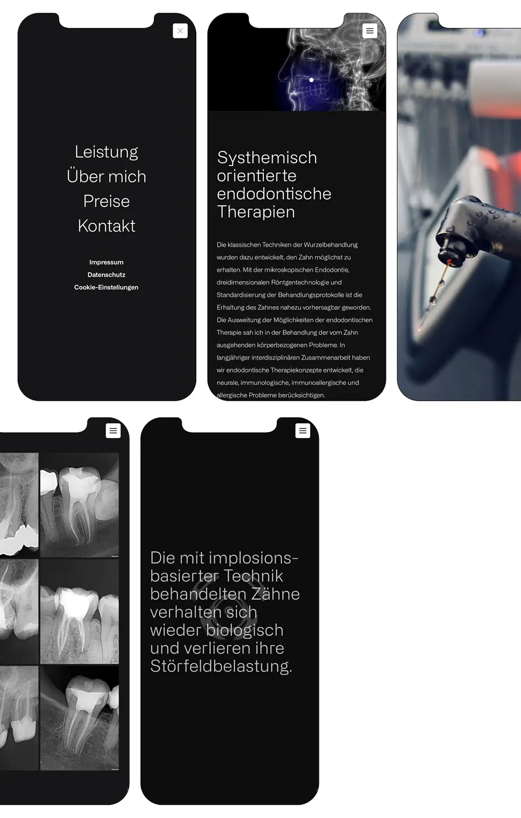
At a time when the digital world is often marked by a flood of information, effects, and overloaded designs, our goal was to create a website that deliberately stands apart. With a clear focus on purist elegance, reduction, and precise functionality, we created a digital presence that convinces through its simplicity and directs the eye to what matters. At endoko.at, we present Dr. Kovac's new website, which authentically and precisely reflects state-of-the-art technology, the highest professional expertise, and an outstanding practice environment.

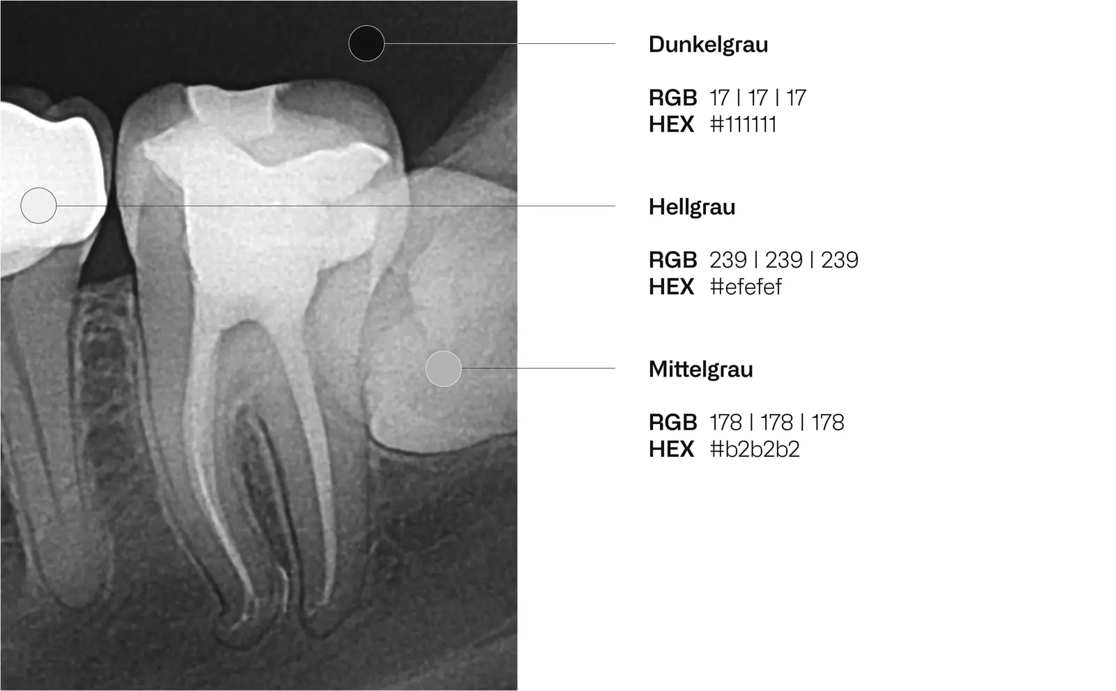
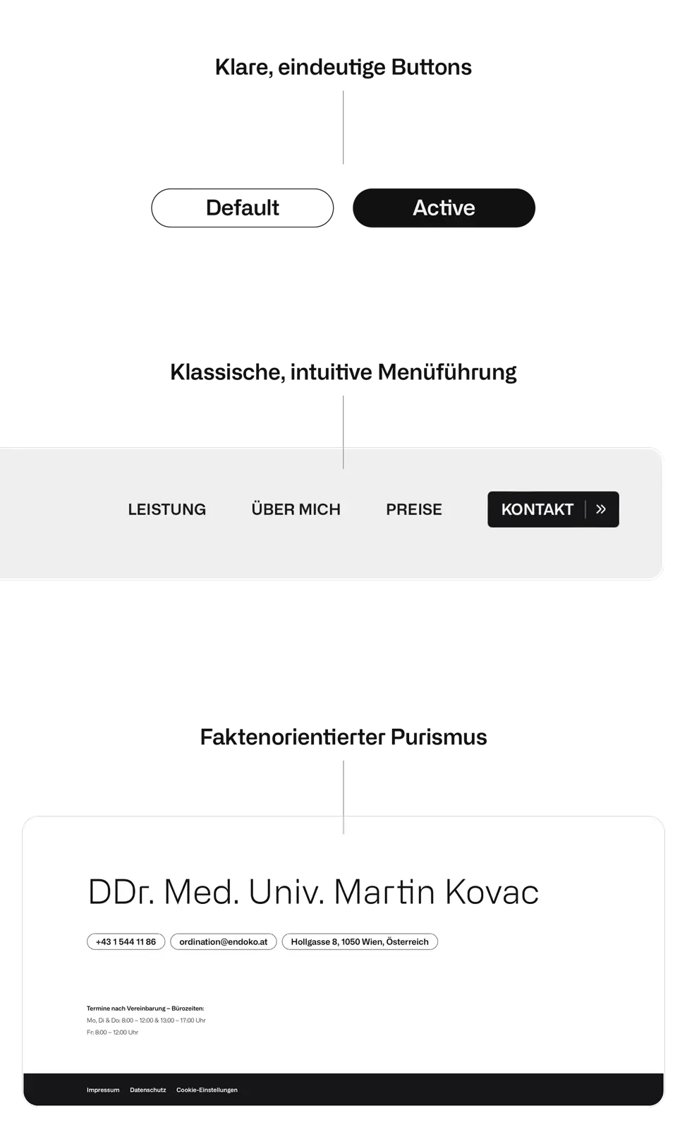
As part of the website development, we not only designed a clearly structured and user-friendly site but also developed a basic digital corporate design. This includes a restrained yet distinctive wordmark that visually conveys Dr. Kovac's values — precision, trust, and progress. Every design decision was made deliberately to avoid distractions and give visitors clear, unambiguous navigation through the content.

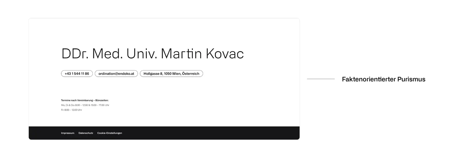
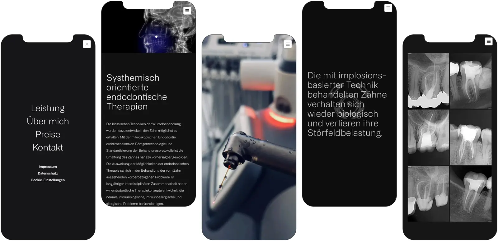
The website conveys all the key information about Dr. Kovac's way of working, the services offered, and his field of expertise precisely and understandably. We deliberately avoid superfluous design elements, complicated animations, or unnecessary frills. Instead, we rely on a reduced aesthetic that radiates calm and builds trust – fully in keeping with a modern medical practice focused on quality.

Trust through design, clarity through consistency — for one of Austria’s most renowned plastic surgery practices.

Visit website

moremedia advertising agency linz kovac logo light gray

Shades of gray in focus: the minimalist color world

Instead of a colorful, playful palette, we deliberately chose a range of fine gray tones reduced to the essentials. This decision is far more than an aesthetic preference – it reflects Dr. Kovac's values: clarity, precision, and the highest level of professionalism. The targeted use of different shades of gray creates a calm, elegant atmosphere that consistently directs the focus to the content and the practice's medical excellence.

The understated color scheme not only supports the minimalist and modern aesthetic of the new website, but also conveys professionalism and trust. Without visual overload, visitors can concentrate fully on the essential information, which is presented in a clearly structured and precise way. The reduced color world harmonizes perfectly with the purist typography and the clear design language, helping to create a digital presence that radiates calm, competence, and innovative strength – exactly the qualities that also characterize Dr. Kovac's work.

moremedia advertising agency linz kovac color palette

“Purism is the art of omission. It's not about what you add, but what you leave out. In a world full of excess and distraction, true beauty finds its expression in simplicity and clarity. The entire design of Endoko.at embodies this philosophy perfectly, creating a space where essence and purpose can unfold without distraction.”

Intuitive, clear, pure: user interface design

Clear structures, intuitive navigation, and a deliberate reduction to a subtle color palette form the foundation of the new website, ensuring visitors find their way instantly. Every section is logically organized, every piece of information precisely placed – turning the search for relevant content into an effortless, pleasant experience. Instead of cluttered menus or visual gimmicks, we rely on a well-thought-out, user-friendly architecture that lets visitors find the information they need quickly and purposefully.

Every single element of the user interface was designed with the clear ambition of providing a smoothly functioning, efficient, and aesthetically pleasing user experience. The reduced design deliberately draws the eye to the essentials, supports orientation, and avoids any form of distraction. This not only optimizes the flow of information but also strengthens the brand image of Dr. Kovac – as a practice that convinces through professionalism, clarity, and the highest quality.

moremedia advertising agency linz kovac ux 1 new
moremedia advertising agency linz kovac ux 2 new
moremedia advertising agency linz kovac ux 3 new
moremedia advertising agency linz kovac ux mobile new
moremedia advertising agency linz kovac screens mobile
moremedia advertising agency linz kovac screens mobile portrait1

How we worked

From the first briefing to the result — structured and transparent in clearly defined steps.

01 — Briefing
Clarified the practice's requirements, target audience, and standards.

02 — Branding & Color Palette
Developed a reduced, professional color palette of fine gray tones.

03 — UI Design
Designed a clear, intuitive interface with calm user guidance.

04 — Website
Implemented the presence — structured, clear, and trust-building.