
Highly resistant safety glass from Austria
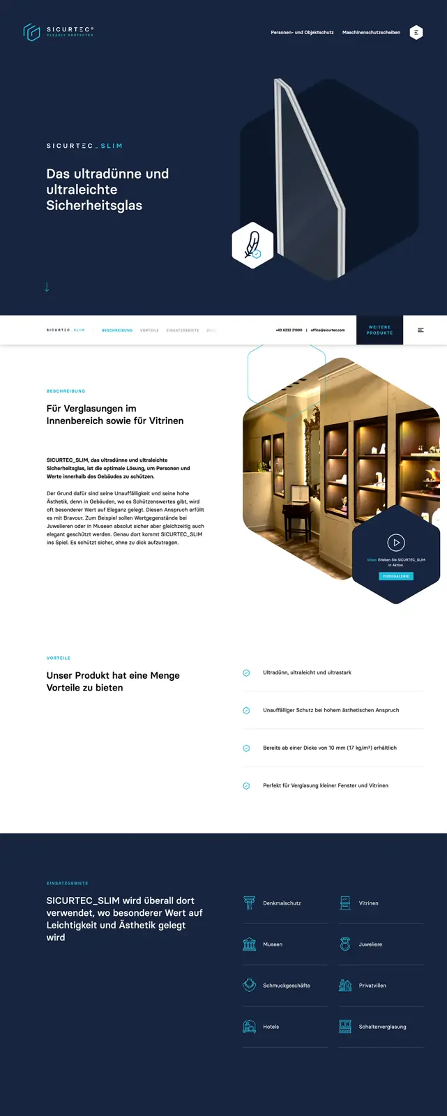
SICURTEC® is an Austrian family business and an internationally leading manufacturer of highly resistant security glass. Through the unique combination of extremely hard silicate glass and highly elastic polycarbonate, SICURTEC® has been setting new benchmarks for decades in two security-critical fields: personal and property protection, and protective panels for machine tools.
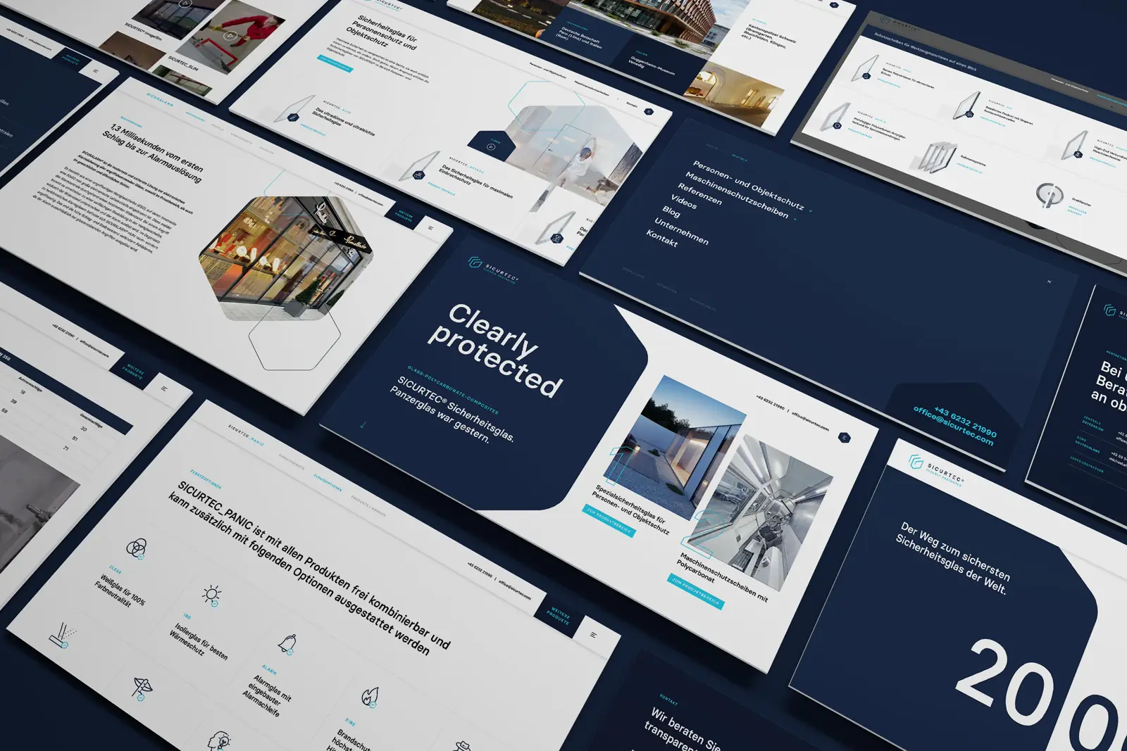
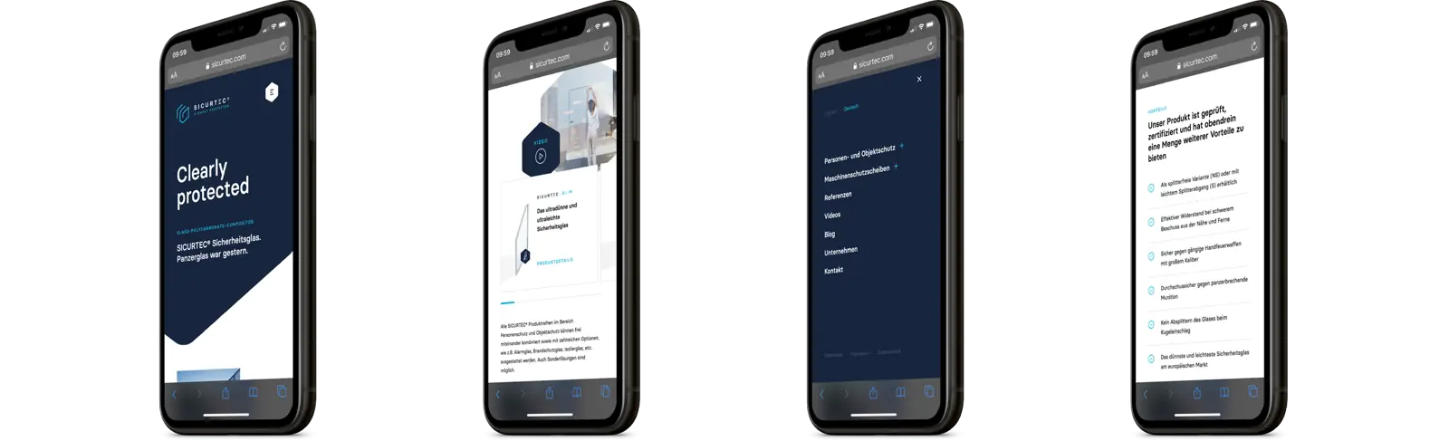
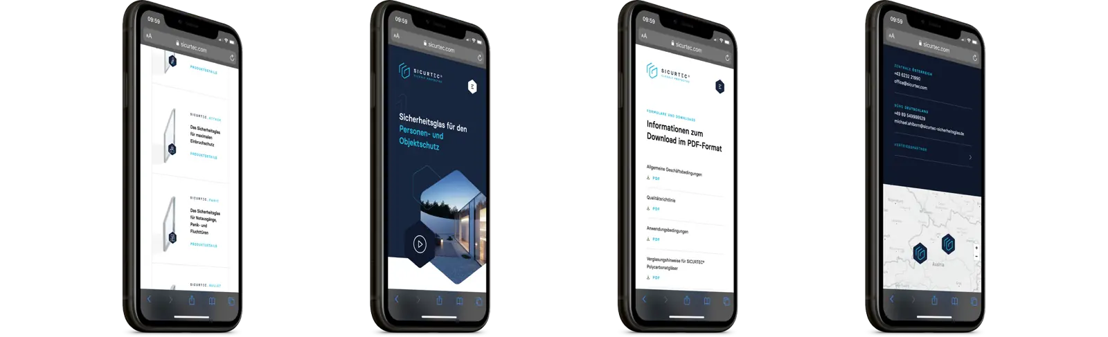
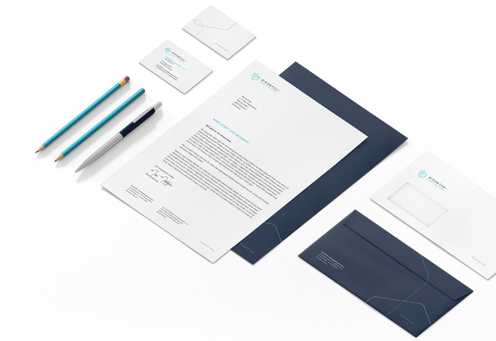
We had the special honor of holistically redesigning the entire corporate presence of SICURTEC®.
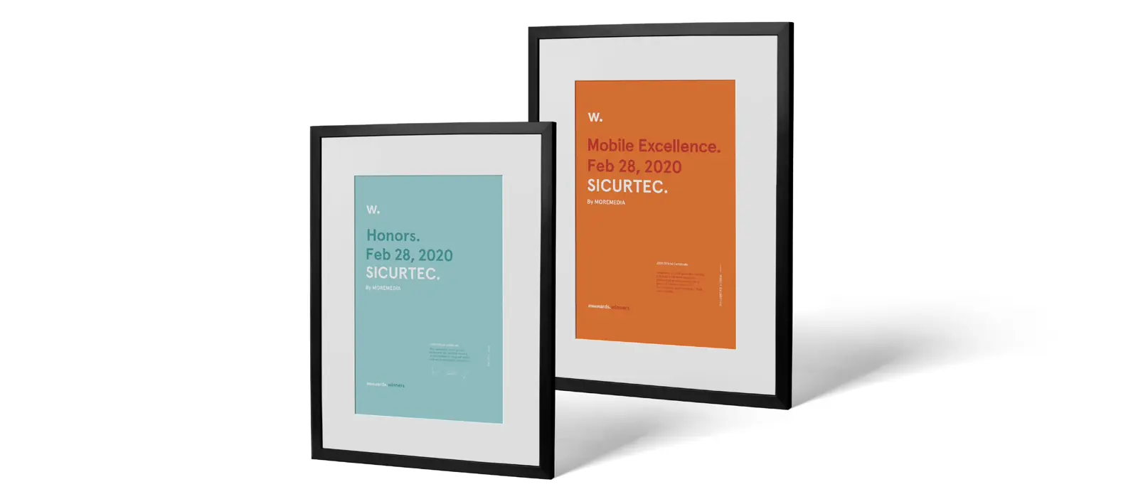
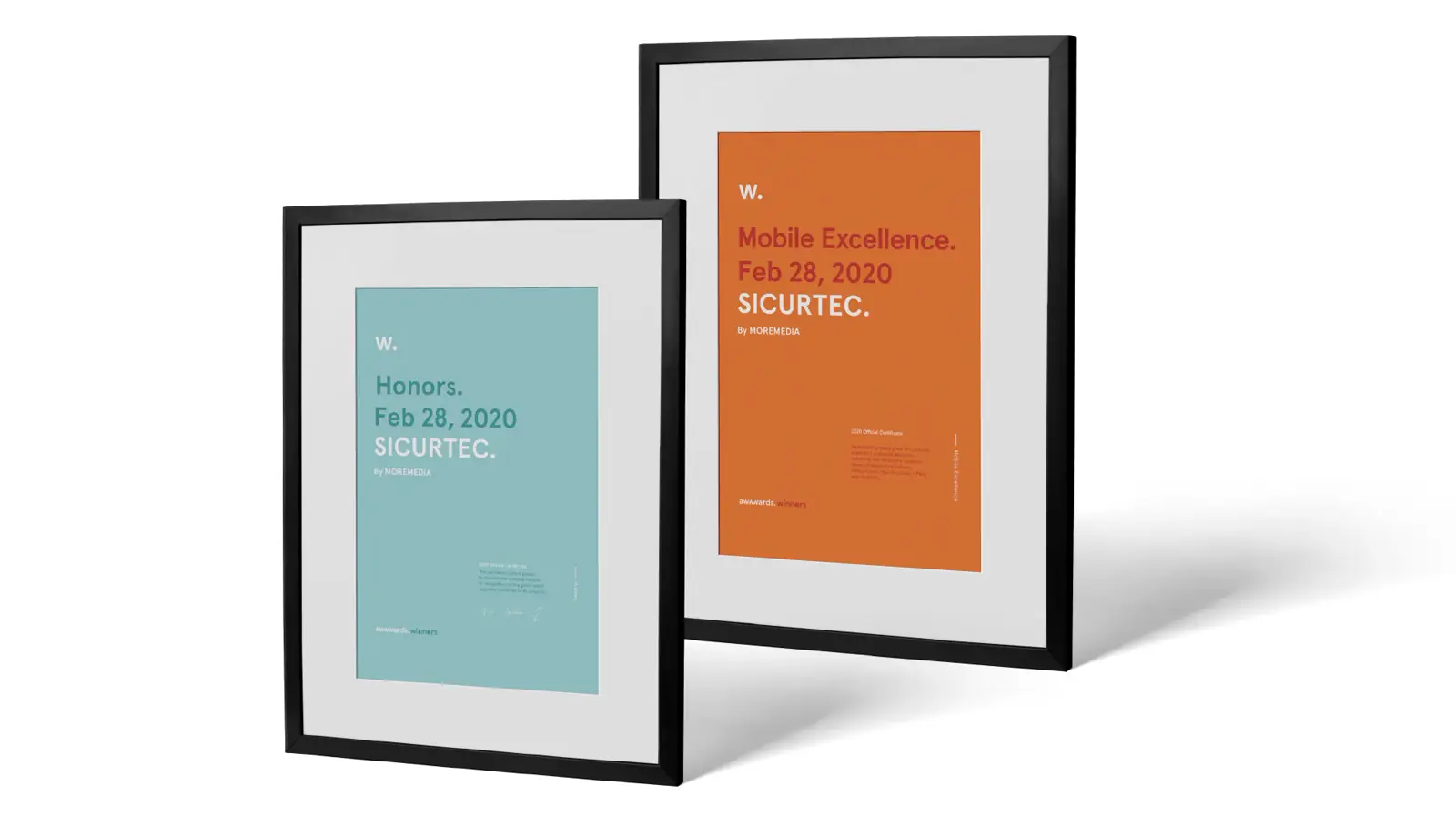
Awwwards Honorable Mention and Mobile Excellence Award — international design recognition for an Austrian security company.
Visit website


Old logo
A new logo
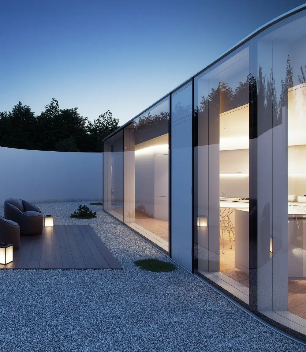


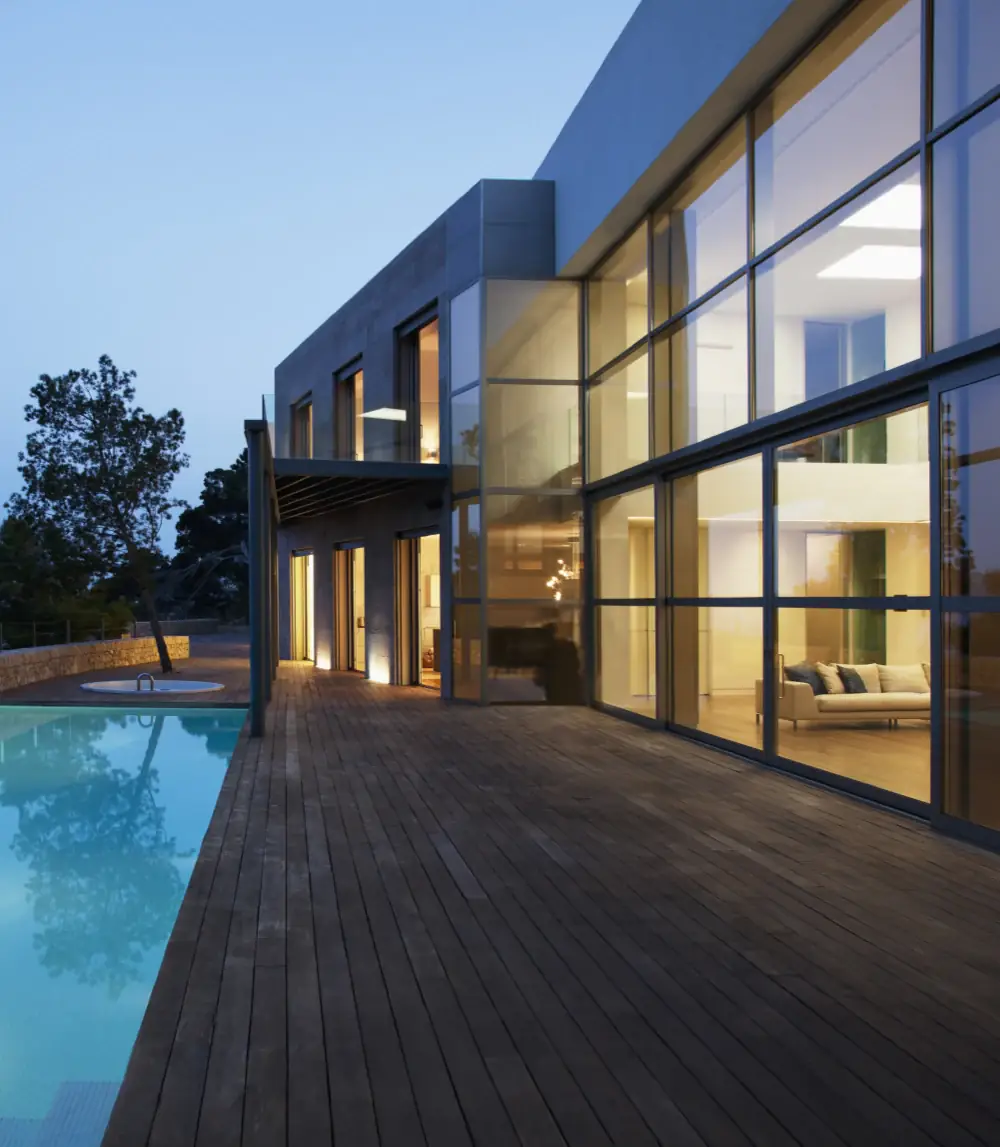
More interesting
references

